다중 분류 문제
- 클래스가 기존에 우리가 다룬 데이터와 같이 0과 1로 이루어진 2개인 이항분류 문제가 아닌, 3개 이상의 여러개의 답중 하나를 고르는 것이 바로 다중분류문제이다.
- 문제점: 3개의 클래스가 각각 숫자가 아닌 문자열 형태로 되어있어 딥러닝 학습을 적용시키기에 적합하지 않음 ➡️ one-hot encoding
from tensorflow.keras.models import Sequential
from tensorflow.keras.layers import Dense

!git clone https://github.com/taehojo/data.git

df = pd.read_csv('./data/iris3.csv')

import seaborn as sns
import matplotlib.pyplot as plt

sns.pairplot(df, hue='species')  # 상관도 그래프 출력. hue 옵션에는 어떤 카테고리를 중심으로 그래프를 그릴 지를 넣어주면 됨.
plt.show()
One-Hot encoding
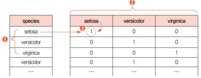
- 여러 개의 값으로 된 문자열을 0과 1로만 이루어진 형태로 만들어주는 과정
get_dummies()함수로 간단히 처리 가능
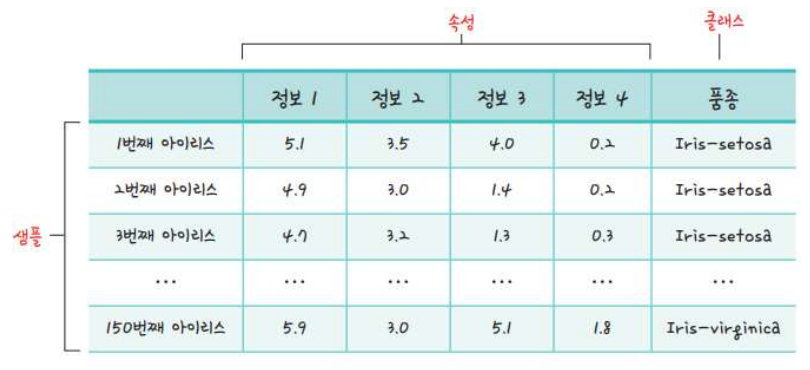
class의 종류는 3개이다. 이 때, 각 class의 이름으로 3개의 열을 만든 후, class의 이름이 열의 속성과 일치하는 열의 값만 1로, 나머지 두 열의 값은 0으로 할당한다.
# dividing data into X, y
X = df.iloc[:, 0:4]
y = df.iloc[:, 4] # the type is str: we need to change it into numbers

# One-Hot encoding
y = pd.get_dummies(y)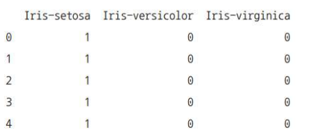
print(y[0:5])- One-hot encoding 실행 결과
Softmax
# 모델 설정
model = Sequential()
model.add(Dense(12, input_dim = 4, activation = 'relu'))
model.add(Dense(8, activation = 'relu'))
model.add(Dense(1, activation = 'softmax'))
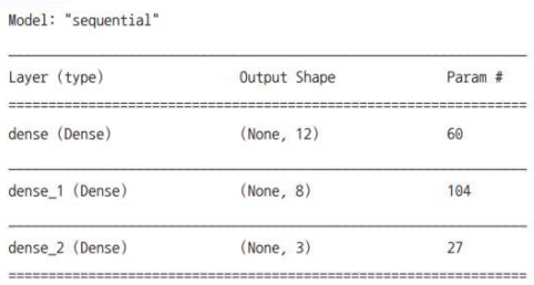
#model.summary() # 층과 층간의 연결을 시각화
# 모델 컴파일
model.compile(loss = 'categorical_crossentropy', optimizer = 'adam', metrics = ['accuracy'])
history = model.fit(X, y, epochs=50, batch_size = 5)< 피마 인디언 모델과의 차이점 >
- 출력층의 노드 수: 1 ➡️ 3
- 출력층의 활성화 함수: sigmoid ➡️ softmax
(1) 기존의 시그모이드 함수는 예를 들어 값이 0.5보다 크면 당뇨이고 작으면 정상이라는 식으로 판단
(2) 그러나 이 모델은 3가지 카테고리의 확률을 모두 구해야 하며, 3가지 카테고리의 확률의 합은 1이어야 함. - 손실함수: binary_crossentropy ➡️ categorical_crossentropy
model.summary()