피마 인디언 데이터 분석하기
- 비만의 원인: 자기관리와 유전 둘 다의 문제임
- 피마 인디언은 1950년대까지만해도 비만인 사람이 단 한명도 없는 민족이었음.
그러나 지금은 전체 부족의 60%가 당뇨, 80%가 비만으로 고통받고 있음
-> 이유? 영양분을 체내에 저장하는 뛰어난 능력(생존스킬)을 물려받은 인디언이 미국의 패스트푸드 문화를 만났기 때문
import pandas as pd
import matplotlib.pyplot as plt
import seaborn as sns

!git clone https://github.com/taehojo/data.git # 깃허브에 준비된 데이터 가져오기
df = pd.read_csv('./data/pima-indians-diabetes3.csv') # 피마 데이터셋 불러오기
df.head(5)

df["diabetes"].value_counts() # diabetes 컬럼의 값은 0, 1이 존재하고, 각각 0은 500개, 1은 268개라고 출력될 것임.

df.describe() # count(정보 별 샘플 수), mean, std(표준편차), min, 25%, 50%, 75%, max

df.corr() # 각 항목이 어느정도의 상관관계를 가지고 있는지
# corr() 시각화하기
colormap = plt.cm.gist_heat # 그래프의 색상 구성 선정
plt.figure(figsize=(12, 12)) # 그래프의 크기 설정

sns.heatmap(df.corr(), linewidths=0.1, vmax=0.5, cmap=colormap, linecolor = 'white', annot = True)
plt.show() # vmax - 색상의 밝기 조절, cmap - 색상값 불러옴
# 결과 그래프에서 가장 주목해야 할 부분: diabetes 항목
# 그래프를 통해 plasma(공복혈당농도), BMI가 diabetes와 상관도가 높음을 알 수 있음

# 아래 코드를 통해 plasma와 diabetes만 비교할 수 있음. BMI도 이와 같이 시각화 가능(plasma를 bmi로 바꾸기)
plt.hist(x=[df.plasma[df.diabetes == 0], df.plasma[df.diabetes == 1]], bins = 30, histtype = 'barstacked', label = ['normal', 'diabetes'])
plt.legend()- csv(comma separated values): 쉼표로 구분된 데이터들의 모음
피마 인디언의 당뇨병 예측하기
iloc[]: 데이터프레임에서 대괄호 안에 정한 범위만큼을 가져와 저장하게 함
!git clone https://github.com/taehojo/data.git # 깃허브에 준비된 데이터 가져오기
df = pd.read_csv('./data/pima-indians-diabetes3.csv') # 피마 데이터셋 불러오기
X = df.iloc[:, 0:8] # 세부정보
y = df.iloc[:, 8] # 당뇨병 여부

# ** 모델 구조 설정 **
model = Sequential()
model.add(Dense(12, input_dim = 8, activation = 'relu', name = 'Dense_1'))
model.add(Dense(8, activation = 'relu', name = 'Dense_2'))
model.add(Dense(1, activation = 'sigmoid', name = 'Dense_3'))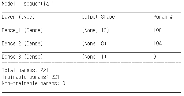
model.summary() # 층과 층간의 연결을 시각화-
이전에 비해 은닉층이 하나 더 추가된 모델
-
모델 구조 설명
-
layer: 층의 이름과 유형을 나타냄. 층의 이름(층의 유형) 형태로 출력됨. 층의 이름은
name = "층 이름"으로 설정 가능함. -
output shape:
(행, 열)
행의 크기는batch size에 정의한 만큼 입력되므로 딥러닝 모델에서는 이를 따로 세지 않아,None으로 출력함.
열의 크기는 최초 input이 8개이고, 첫번째 은닉층을 지나며 12개가 되고, 두번째 은닉층을 지나며 8개가 되며, 출력층에서 1개의 출력으로 바뀌어 출력된다는 것을 알 수 있음. -
param: 총 가중치와 바이어스 수의 합을 나타냄
(8 + 1) 12 = 108: 8개의 입력값 + 1개의 바이어스 12개의 노드 -
Trainable param: 학습을 진행하며 update가 된 param들.
-
input, output의 개수는 정해져있지만 은닉층, 노드의 개수의 정답은 없음
# model compile
model.compile(loss='binary_crossentropy', optimizer='adam', metrics=['accuracy'])
# activate model
history = model.fit(X, y, epochs=100, batch_size=5)