
Titanic 데이터셋을 이용하여, 이중 feature별로 중요도를 판단하고, 파생변수를 만들어 시각화하고 분석하는 활동을 한 뒤 발표하였다.
원본 Titanic 데이터프레임 만들기
https://www.kaggle.com/c/titanic
import numpy as np
import pandas as pd
import matplotlib.pyplot as plt
import seaborn as sns
%matplotlib inline

titanic_df = pd.read_csv('train.csv')
titanic_df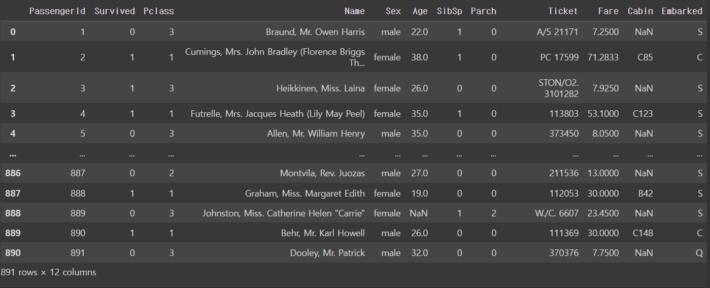
시각화할 변수 선택
선택한 변수: Survive, Pclass, Sex, age
변수 선택 이유:
- Survive: 생존 여부는 반드시 알아야 함. 앞으로 제시할 것들이 독립변수라면, 생존률은 종속변수가 될 것.
- Pclass: 해당 승객이 낸 티켓 가격이 어느 정도인지 직관적으로 알려주는 지표로 선실 class를 선택함.
- sex: 성별에 따라 생존률이 유의미하게 달라졌음.
- age: 연령대에 따라 생존률이 달라질 것으로 보여 선택함. 다만 데이터에 결측치가 많고, 전처리 과정에서 결측치를 평균으로 메꿨기 때문에 상관관계가 정확하게 측정되지 않을 위험성이 있음.
파생변수 만들기
파생변수: 동승객 유무 alone
선정 이유: SibSp, Parch 등 동행 가족의 수를 재는 변수가 있는데, 두 변수를 통합하여 동행 가족의 유무를 묻는 변수로 통합해보기로 함.
titanic_df['families'] = titanic_df['SibSp'] + titanic_df['Parch']

titanic_df['alone'] = np.where(titanic_df['families'] > 0, 1, 0)
titanic_df1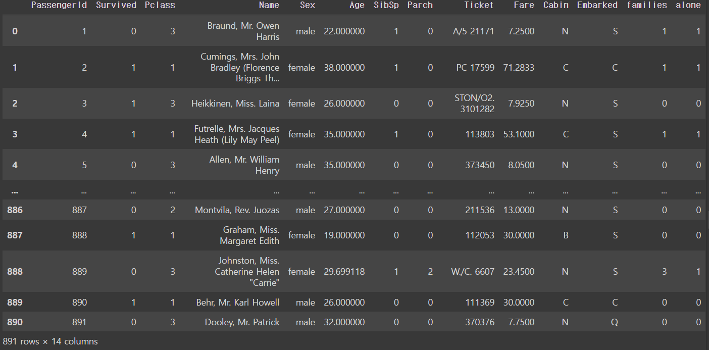
시각화
import plotly.express as px
import plotly.graph_objects as go

titanic_df1 = titanic_df.copy()
df = titanic_df1
data = go.Bar(x=df['Pclass'], y=df['Survived'])
layout = go.Layout(title='Pclass-Survived')

fig = go.Figure(data=data, layout=layout)
fig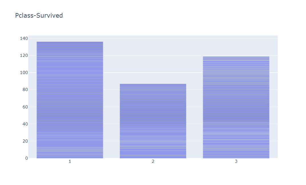
titanic_df1['families'] = titanic_df1['SibSp'] + titanic_df1['Parch']
sns.barplot(x='families', y='Survived', data=titanic_df1, ci=None)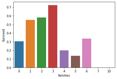
df = titanic_df1
data = go.Bar(x=df['alone'], y=df['Survived'])
layout = go.Layout(title='alone-Survived')

fig = go.Figure(data=data, layout=layout)
fig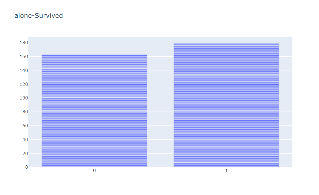

데이터 만지는 개발자를 향하여