matplotlib 그래프 기본 형태
plt.figure(figsize=(a, b))
plt.plot(x, y)
plt.show
plt.figure(figsize=(10, 6))
plt.plot([0, 1, 2, 3, 4, 5, 6, 7, 8, 9], [1, 1, 2, 3, 4, 2, 3, 5, -1, 3])
plt.show()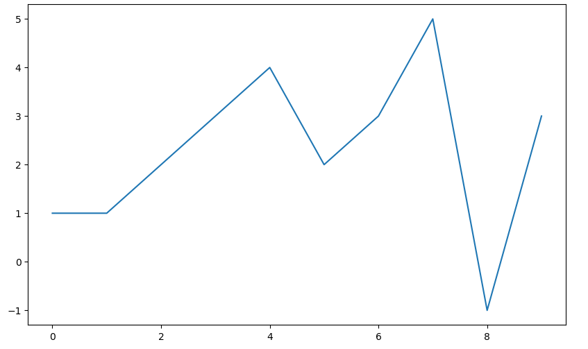
예제1: 그래프 기초
삼각함수 그리기
- np.arange(a, b, s): a부터 b까지 s의 간격
- np.sin(value)
import numpy as np

t = np.arange(0, 12, 0.01)
y = np.sin(t)

plt.figure(figsize=(10, 6))
plt.plot(t, np.sin(t))
plt.plot(t, np.cos(t))
plt.show()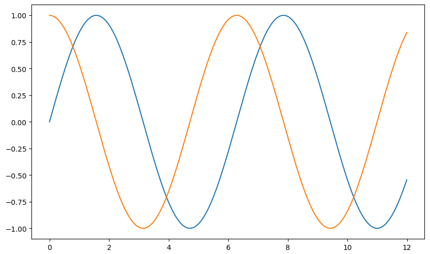
- 격자무늬 추가
- 그래프 제목 추가
- x축, y축 제목 추가
- 주황색, 파란색 선 데이터 의미 구분
def drawGraph():

    plt.figure(figsize=(10, 6))
    plt.plot(t, np.sin(t), label="sin")
    plt.plot(t, np.cos(t), label="cos")
    plt.grid(True)
    plt.legend(loc=2)
    plt.title("Example of sinewave")
    plt.xlabel("time")
    plt.ylabel("Amplitude")
    plt.show()

drawGraph()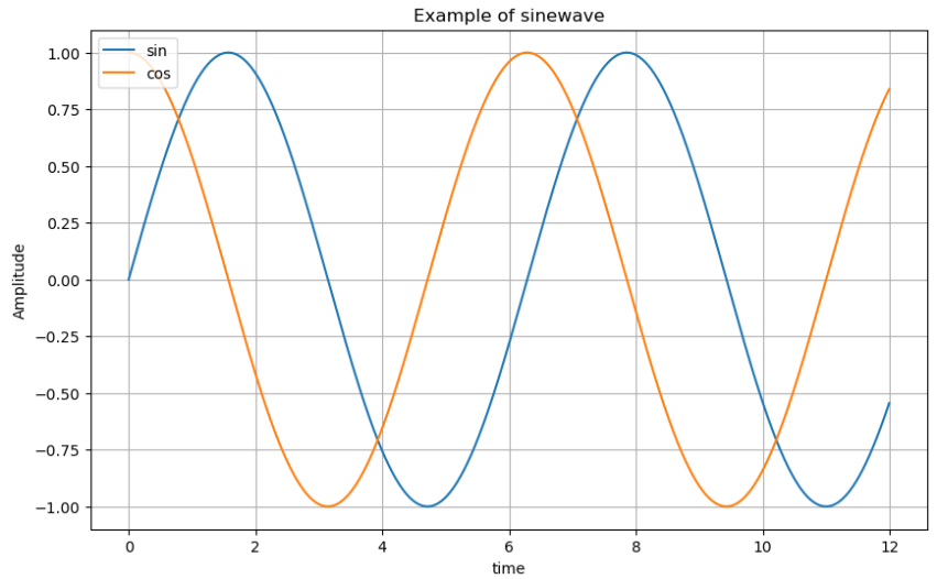
예제2: 그래프 커스텀
t = np.arange(0, 5, 0.5)

plt.figure(figsize=(10, 6))
plt.plot(t, t, "r--")
plt.plot(t, t ** 2, "bs")
plt.plot(t, t ** 3, "g>")
plt.show()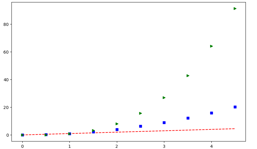
t = list(range(0, 7))
y = [1, 4, 5, 8, 9, 5, 3]

def drawGraph():

    plt.figure(figsize=(10, 6))
    plt.plot(
        t,
        y,
        color="red",
        linestyle="--",
        marker="o",
        markerfacecolor="blue",
        markersize=10,
    )

    plt.xlim([-0.5, 6.5])
    plt.ylim([0.5, 9.5])
    plt.show()

drawGraph()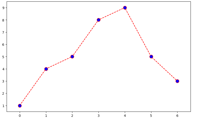
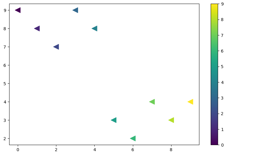
예제3: scatter plot
t = np.array(range(0, 10))
y = np.array([9, 8, 7, 9, 8, 3, 2, 4, 3, 4])

def drawGraph():

    plt.figure(figsize=(10, 6))
    plt.scatter(t, y)
    plt.show()

drawGraph()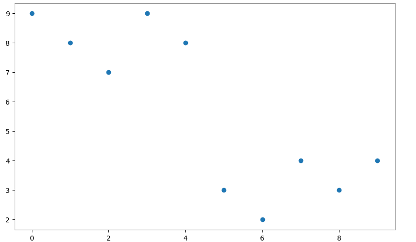
colormap = t

def drawGraph():

    plt.figure(figsize=(10, 6))
    plt.scatter(t, y, s=150, c=colormap, marker="<")
    plt.colorbar()
    plt.show()

drawGraph()