velopert 리액트 컴포넌트 스타일링 학습 정리
🎨 Sass
- Syntactically Awesome Style Sheets: 문법적으로 짱 멋진 스타일시트
- CSS pre-processor 전처리기
- 복잡한 작업을 쉽게 할 수 있음
- 코드의 재활용성, 가독성 높여주어 유지보수 쉽게 해줌
className 동적으로 설정
className 에 CSS 클래스 이름을 동적으로 넣어주고 싶을 때 사용하는 방법
className={['Button', size].join(' ')}
className={`Button ${size}`}
조건부로 클래스를 넣어주고 싶을 때는
문자열을 직접 조합하는 것보다 classnames 라이브러리 사용하기
함수 인자에 문자열, 배열, 객체 등을 전달하여
손쉽게 문자열을 조합할 수 있다.
classNames('foo', 'bar'); // => 'foo bar'
classNames('foo', { bar: true }); // => 'foo bar'
classNames({ 'foo-bar': true }); // => 'foo-bar'
classNames({ 'foo-bar': false }); // => ''
classNames({ foo: true }, { bar: true }); // => 'foo bar'
classNames({ foo: true, bar: true }); // => 'foo bar'
classNames(['foo', 'bar']); // => 'foo bar'

// 동시에 여러개의 타입으로 받아올 수 도 있습니다.
classNames('foo', { bar: true, duck: false }, 'baz', { quux: true }); // => 'foo bar baz quux'

// false, null, 0, undefined 는 무시됩니다.
classNames(null, false, 'bar', undefined, 0, 1, { baz: null }, ''); // => 'bar 1'

// 컴포넌트 사용 예시
// <Button size="medium", color="blue", outline fullWidth> 버튼 </Button>
// => 'Button, medium, blue, outline, fullWidth, 커스텀className'
function Button({ children, size, color, outline, fullWidth, className, ...rest }) {
  return (
    <button
      className={classNames('Button', size, color, { outline, fullWidth }, className)}
      {...rest}
    >
      {children}
    </button>
  );
}
버튼 붙어있을 때 여백 설정
-
버튼에 좌우 마진을 주고
가장 처음이나 마지막의 한쪽 마진을 제거하는 방식 -
형제 선택자 사용
.Button + .Button
sass 를 사용한다면 & + & 을 통해
margin-left 만 적용
&:not(:first-child)선택자 사용
색상 고민해결 사이트
mixin, sass내장함수 사용
$blue: #228be6;
$gray: #495057;
$pink: #f06595;

@mixin button-color($color) {
  background: $color;
  &:hover {
    background: lighten($color, 10%);
  }
  &:active {
    background: darken($color, 10%);
  }
  &.outline {
    color: $color;
    background: none;
    border: 1px solid $color;
    &:hover {
      background: $color;
      color: white;
    }
  }
}


.Button {
  // ...

  // 색상 관리
  &.blue {
    @include button-color($blue);
  }

  & + & {
    margin-left: 1rem;
  }
}
🎨 CSS Module
.module.css확장자 사용- sass 에서 사용할 때는
module.scss확장자 사용 - CSS 클래스 중첩 방지 -> 클래스명이 모두 고유함
- 클래스명 고유화하지 않고 전역 클래스명을 사용하고 싶은 경우
:global사용
-:global .my-global-name {}- sass 에서는
:global { .my-global-name{...}}사용
- sass 에서는
- CSS Module 사용하지 않는 곳(일반
.css파일)에서 특정 클래스만 고유이름을 만들어 사용하고 싶다면:local사용
-:local .make-this-local
react-icons
react-icons 라이브러리 설치하면
Font Awesome, Ionicons, Material Design Icons, 등의 아이콘들을 컴포넌트 형태로 쉽게 사용할 수 있다.
import { MdCheckBox, MdCheckBoxOutlineBlank } from 'react-icons/md';

<MdCheckBox className={styles.checked} />
CSS Module 다중 클래스 적용 - classnames.bind 사용
CSS Module을 사용하면 고유한 클래스명을 만들어주지만
styles.checked 처럼 styles객체안의 값을 조회해야 한다.
만약 클래스명에 -가 들어간다면 styles['my-class']로 사용한다.
클래스명이 여러개라면 ${styles.one} ${styles.two}
조건부 스타일링을 한다면 ${styles.one} ${condition ? styles.two : ''}
처럼 작성해야 하는데, 위에서 사용했던 classnames 라이브러리의
bind 기능을 사용하면 쉽게 작성할 수 있다.
import { MdCheckBox, MdCheckBoxOutlineBlank } from 'react-icons/md';
import classNames from 'classnames/bind';

const cx = classNames.bind(styles);

<MdCheckBox className={cx('checked')} />

// 다른 예시
// cx('one', 'two')
// cx('my-component', {
//  condition: true
//})
// cx('my-component', ['another', 'classnames'])
🎨 CSS in JS
- JS 안에 CSS 작성하기
CSS in JS관련 리액트 라이브러리에는styled-components,emotion,styled-jsx,jss등이 있다.
Tagged Template Literal 문법
Template Literal 은 문자열 조합을 쉽게 할 수 있는 ES6 문법이다.
문자열에 키보드 숫자 1 키 옆에 있는 ` 백틱 기호를 사용하고, ${} 안에 변수를 넣을 수 있다.
const name = 'react';
const message = `hello ${name}`;

console.log(message); // "hello react"
템플릿 리터럴에서 ${} 안에 일반 문자열이나 숫자가 아닌 객체를 넣으면 다음과 같이 동작한다.
const object = { a: 1 };
const text = `${object}`
console.log(text); // "[object Object]"

const fn = () => true
const msg = `${fn}`;
console.log(msg); // "() => true"
템플릿리터럴 사용하면서, 객체값도 조회하고 싶을 때
Tagged Template Literal 문법을 사용한다.
const color = '빨간색';
const colorObj = {blue: '파란색'};
const colorFn = () => '#000';

function taggedFn(texts, ...values) {
  console.log(texts);
  console.log(values);
}

taggedFn`문자열도 ${color}, 객체도 ${colorObj}, 함수도 ${colorFn} 사용할 수 있습니다.`

// ['문자열도 ', ', 객체도 ', ', 함수도 ', ' 사용할 수 있습니다.']

// ['빨간색', {…}, ƒ]
// 0: "빨간색"
// 1: {blue: '파란색'}
// 2: () => '#000'
결과를 보면 템플릿리터럴 안의 문자열이
${}을 기준으로 쪼개져 첫번째 인자로 들어가고
${}의 변수값이 나머지 인자로 들어간다.
함수를 실행하는 예제
function sample(texts, ...fns) {
  const mockProps = {
    title: '안녕하세요',
    body: '내용은 내용내용 입니다.'
  };
  return texts.reduce((result, text, i) => `${result}${text}${fns[i] ? fns[i](mockProps) : ''}`, '');
}
sample`
  제목: ${props => props.title}
  내용: ${props => props.body}
`
/*
"
  제목: 안녕하세요
  내용: 내용은 내용내용 입니다.
"
*/
🎨 styled-components
- sass 의 nested css 처럼 { } 내부에 css 설정 가능
- sass 처럼
&를 통해 자기 자신 선택 가능
-& + &에서 적용안되는 경우 이슈 참고
✅ styled-components 라이브러리 설치
$ yarn add styled-components
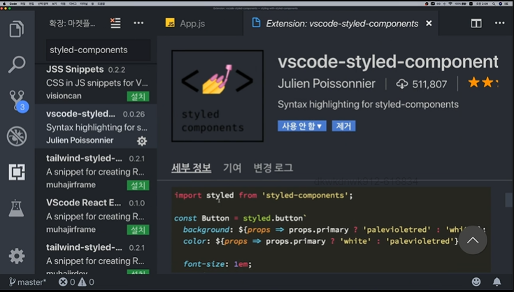
✅ vscode 확장프로그램 설치
vscode 마켓플레이스에서 styled-components를 검색하여
vscode-styled-component 확장프로그램을 설치한다.
js파일안에서도 css코드의 색상이 표시되고, 자동완성도 지원된다.
✅ Tagged Template Literal 문법 사용
styled.div 에 tagged 템플릿 리터럴 문법을 사용해
스타일을 입력하면, 해당 스타일을 가진
div 요소 컴포넌트를 생성할 수 있다.
import styled from 'styled-components';

const Circle = styled.div`
  width: 5rem;
  height: 5rem;
  background: ${props => props.color || 'black'};
  border-radius: 50%;
`;

function App() {
  return <Circle color="blue" />;
}
✅ css helper - props 사용
-
${props => props.color || 'black'};props를 사용하는 함수를 전달하여 스타일링을 할 수 있다. -
만약 함수 안에서 여러줄의 스타일을 사용해야 한다면
단순히 템플릿 리터럴을 사용할 경우,
내부에서 함수를 전달할 수 없으므로(props 사용x)
styled-components 라이브러리에서css를 불러와 사용해야 한다.
css`..`으로 사용하면
tagged 템플릿 리터럴을 사용하게 되므로
내부에서 다른 props를 조회할 수 있다.
import styled, { css } from 'styled-components';

const Circle = styled.div`
  width: 5rem;
  height: 5rem;
  background: ${props => props.color || 'black'};
  border-radius: 50%;
  ${props =>
    props.huge &&
    css`
      width: 10rem;
      height: 10rem;
    `}
`;

function App() {
  return <Circle color="red" huge />;
}
✅ 스타일 이외 props 전달
styled-components로 만들어진 컴포넌트를 한번 감싸줘야 한다...!
import styled from 'styled-components';

const StyledButton = styled.button`
  cursor: pointer;
  padding-left: 1rem;
`;

function Button({ children, ...rest }) {
  return <StyledButton {...rest}>{children}</StyledButton>;
}
✅ polished 라이브러리 사용
sass 내장 함수로 lighted(), darken()을 사용할 수 있었다.
CSS in JS 에서도 스타일 관련 유틸 함수를 사용하고 싶다면 polished 라이브러리를 사용할 수 있다.
설치 : $ npm install --save polished
- lighted, darken
${lighten(0.2, '#FFCD64')}
색상의 20% 밝거나 어두운 색으로 변경
// styled-components usage
const div = styled.div`
  background: ${lighten(0.2, '#FFCD64')};
  background: ${lighten('0.2', 'rgba(204,205,100,0.7)')};
`

// CSS in JS Output

element {
  background: "#e5e6b1";
  background: "rgba(229,230,177,0.7)";
}
- opacify
색상의 투명도를 증가(0~1)
${opacify(0.1, 'rgba(255, 255, 255, 0.9)')}
투명도 0.9 ➡ 0.1 증가 ➡ 투명도 1 #fff
// styled-components usage
const div = styled.div`
  background: ${opacify(0.1, 'rgba(255, 255, 255, 0.9)')};
  background: ${opacify(0.2, 'hsla(0, 0%, 100%, 0.5)')},
  background: ${opacify('0.5', 'rgba(255, 0, 0, 0.2)')},
`

// CSS in JS Output

element {
  background: "#fff";
  background: "rgba(255,255,255,0.7)";
  background: "rgba(255,0,0,0.7)";
}
- transparentize
색상의 투명도를 감소(0~1)
// styled-components usage
const div = styled.div`
  background: ${transparentize(0.1, '#fff')};
  background: ${transparentize(0.2, 'hsl(0, 0%, 100%)')},
  background: ${transparentize('0.5', 'rgba(255, 0, 0, 0.8)')},
`

// CSS in JS Output

element {
  background: "rgba(255,255,255,0.9)";
  background: "rgba(255,255,255,0.8)";
  background: "rgba(255,0,0,0.3)";
}
- cover
영역을 꽉채우는 스타일
// styled-components usage
const div = styled.div`
  ${cover()}
`

// CSS as JS Output

div: {
  'position': 'absolute',
  'top': '0',
  'right: '0',
  'bottom': '0',
  'left: '0'
}
- ellipsis
text-overflow: ellipsis 스타일을 사용하면
한 줄에서 글자수가 넘어갈 때 ... 생략부호를 표시했던 것과 같은 역할
// styled-components usage
const div = styled.div`
  ${ellipsis('250px')}
`

// CSS as JS Output

div: {
  'display': 'inline-block',
  'maxWidth': '250px',
  'overflow': 'hidden',
  'textOverflow': 'ellipsis',
  'whiteSpace': 'nowrap',
  'wordWrap': 'normal'
}
✅ ThemeProvider 사용
import styled, { ThemeProvider } from 'styled-components';

function App() {
  return (
    <ThemeProvider
      theme={{
        palette: {
          blue: '#228be6',
          gray: '#495057',
          pink: '#f06595'
        }
      }}
    >
      <Button color="pink">BUTTON</Button>
    </ThemeProvider>
  );
}
theme을 적용할 컴포넌트를
<ThemeProvider> 컴포넌트로 감싼다.
<ThemeProvider> 내부에 렌더링된 (자식)컴포넌트 중
styled-components 로 만든 컴포넌트에서
theme props 로 지정한 값을 사용할 수 있다.
ThemeProvider 내부는 하나의 리액트 엘리먼트로 감싸져있어야 한다.
import styled, { css } from 'styled-components';

const StyledButton = styled.button`
  ${props => {
    const selected = props.theme.palette[props.color];
    return css`
      background: ${selected};
      `;
  }}
`;

function Button({ children, color, ...rest }) {
  return <StyledButton color={color} {...rest}>{children}</StyledButton>;
}ThemeProvider로 설정한 값은
props.theme으로 조회할 수 있다.
리팩토링
- 비구조화 할당
${({ theme, color }) => {
    const selected = theme.palette[color];
    return css`
      background: ${selected};
    `;
}}- 코드 분리
import styled, { css } from 'styled-components';

const colorStyles = css`
  ${({ theme, color }) => {
    const selected = theme.palette[color];
    return css`
      background: ${selected};
    `;
  }}
`;

const StyledButton = styled.button`
  /* 공통 스타일 */
  display: inline-flex;
  outline: none;
  ...

  /* 색상 */
  ${colorStyles}
`;

function Button({ children, color, ...rest }) {
  return <StyledButton color={color} {...rest}>{children}</StyledButton>;
}
✅ 코드 분리
사이즈, 색상 등 서로 관련된 코드를 분리하면
유지보수가 편리하다.
바로 위에서 색상 스타일 분리한 것 같이
사이즈 스타일도 분리해본다.
import styled, { css } from 'styled-components';

const sizes = {
  large: {
    height: '3rem',
    fontSize: '1.25rem'
  },
  medium: {
    height: '2.25rem',
    fontSize: '1rem'
  },
  small: {
    height: '1.75rem',
    fontSize: '0.875rem'
  }
};

const sizeStyles = css`
  ${({ size }) => css`
    height: ${sizes[size].height};
    font-size: ${sizes[size].fontSize};
  `}
`;

const StyledButton = styled.button`
  /* 공통 스타일 */
  display: inline-flex;
  outline: none;
  ...

  /* 크기 */
  ${sizeStyles}

  /* 색상 */
  ${colorStyles}
`;

function Button({ children, color, size, ...rest }) {
  return (
    <StyledButton color={color} size={size} {...rest}>
      {children}
    </StyledButton>
  );
}

Button.defaultProps = {
  color: 'blue',
  size: 'medium'
};

export default Button;
✅ Nested CSS 문법 사용
import styled from 'styled-components';

const DialogBlock = styled.div`
  width: 320px;
  padding: 1.5rem;
  background: white;
  border-radius: 2px;
  h3 {
    margin: 0;
    font-size: 1.5rem;
  }
  p {
    font-size: 1.125rem;
  }
`;

function Dialog({ title, children, confirmText, cancelText }) {
  return (
      <DialogBlock>
        <h3>{title}</h3>
        <p>{children}</p>
      </DialogBlock>
  );
}
h3, p 요소 스타일링 할 때
따로 styled 컴포넌트를 만들어주지 않고
nested css 문법을 사용할 수 있다.
// styled-component 생성
const Title = styled.h3``;
const Description = styled.p``;

// nested css 사용
const DialogBlock = styled.div`
  h3 {}
  p {}
`;
✅ styled-component 상속
import styled from 'styled-components';
import Button from './Button';

const ShortMarginButton = styled(Button)`
  & + & {
    margin-left: 0.5rem;
  }
`;

function Dialog({ title, children, confirmText, cancelText }) {
  return (
     <ShortMarginButton color="gray">{cancelText}</ShortMarginButton>
  );
}
styled.div 가 html 요소를 스타일링한 컴포넌트를 반환한다면
styled(MyComponent) 를 사용하여 리액트 요소를 스타일링한 컴포넌트를 사용할 수 있다.
MyComponent 컴포넌트를 상속받아서 특정 스타일을 덮어쓰는 방식으로 커스터마이징할 수 있다.
이 때, 해당 컴포넌트에서 className props가 내부 요소에 전달되어야 한다.
...rest를 통해 전달 가능
const MyComponent = ({ className }) => {
  return <div className={className}></div>
};

const ExtendedComponent = styled(MyComponent)`
  background: black;
`;
✅ keyframes 유틸 사용
CSS 애니메이션 keyframes 사용하여 transition 효과 적용
import styled, { keyframes } from 'styled-components'

const fadeIn = keyframes`
  0% {
    opacity: 0;
  }
  100% {
    opacity: 1;
  }
`

const FadeInButton = styled.button`
  animation: 1s ${fadeIn} ease-out;
`
css helper 사용하여 스타일 조합
import styled, { css, keyframes } from 'styled-components'

const pulse = keyframes`
  0% {
    opacity: 0;
  }
  100% {
    opacity: 1;
  }
`

const animation = props =>
  css`
    ${pulse} ${props.animationLength} infinite alternate;
  `

const PulseButton = styled.button`
  animation: ${animation};
`
dialog 에서 transition 적용하기
-
if (!visible) return null;
➡ display: none 대신 요소를 렌더링 하지 않기 -
Dialog 컴포넌트에서 animate, localVisible 상태값이 필요하다.
- if (localVisible && !visible) 에서
localVisible 상태를 사용하는 이유는
true -> false 로 전환되는 시점을 캐치하기 위해서이다. - props로 받아온 visible만 사용하여
!visible 일때 애니메이션을 적용하면
컴포넌트가 처음 렌더링 될때도
visible 값이 false이기 때문에
animate가 실행됨.
- if (localVisible && !visible) 에서
✅ Transient props
props가 스타일을 위해 지정한 props 가
하위 노드의 속성에 포함되지 않기를 원하면
props명 앞에 달러사인($)을 붙인다.
const Comp = styled.div`
  color: ${props =>
    props.$draggable || 'black'};
`;

render(
  <Comp $draggable="red" draggable="true">
    Drag me!
  </Comp>
);