[Microsoft Data School] 10일차 - 데이터 시각화, 시계열 데이터 전처리, pandas dataframe func
Microsoft Data School 3기

Seaborn
이런 함수들을 그래프로 그릴 수 있다.
matplotlib과 다르게 통계적인 내용도 포함시켜 알아서 그려줌
다만 고수준 특성상, 상세하게 설정하려면 역시 matplotlib을 사용하긴 해야한다.
함수의 분류
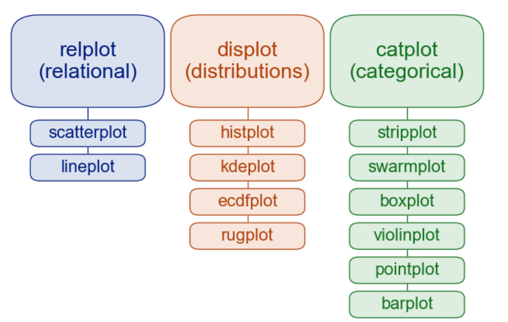
- Flat namespace: 모든 함수는 Top Level
- 시각화 목적에 따른 Module 분류
- Figure Level
- Axes Level
| Relational | 변수 간 관계를 보여줌(2개 이상) | 키-몸무게 관계 |
| Distributions | 단일 변수 또는 비교 대상 변수의 분포 표현 | 시험 점수 분포 |
| Categorical | 범주형 변수에 따른 값의 분포/비교 | 성별에 따른 구매량 |
Axes-level 함수
Scatter
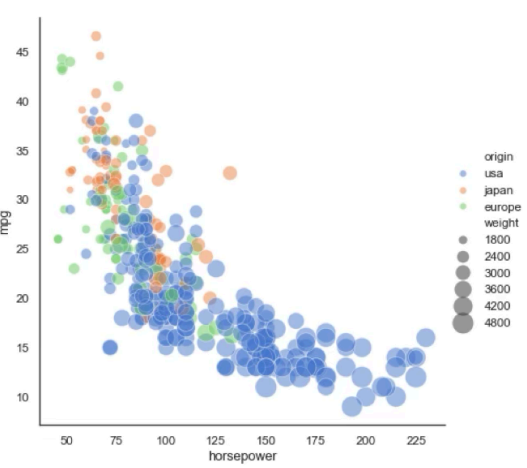
- relational: 두 변수 간의 관계를 점으로 표현
- 상관관계, 분포 범위 확인
Line
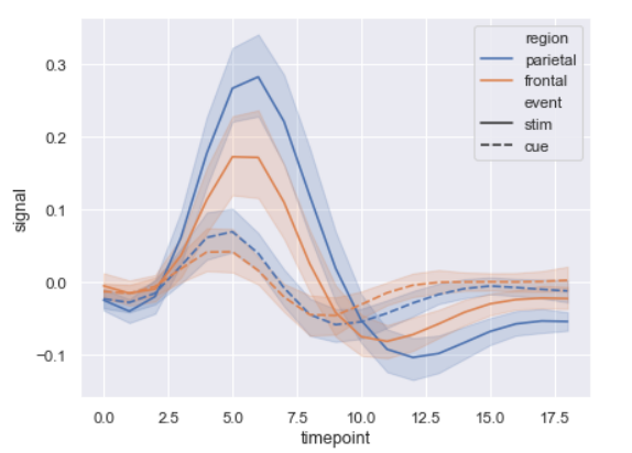
- relational
- 시간 순 변화/추세 확인
Histogram
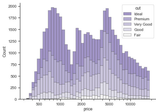
- 데이터를 구간별로 나누어 빈도 표시
- 값이 어떤 범위에 많이 분포하는지 확인
KDE(Kernel Dnesity Estimation)
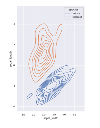
- 곡선으로 데이터의 밀도(분포) 표시
- 일변수계(univariant) 혹은 이변수계(bivariant)의 분포를 표시
- 이상치 확인시 용이
ECDF(Empirical Cumulative Distribution function)
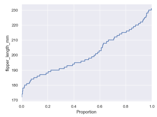
- 누적 분포 함수(CDF) 시각화
- 데이터가 특정값 이하일 확률을 확인 할 때
- 데이터가 어느지점에 많이 몰려있는지 확인 가능(증가값이 가파른 곳이 분포 ↑)
- 50점 이하가 몇명이야 → 바로 수치 확인 가능(히스토그램은 이전값까지 더해야함)
RUG
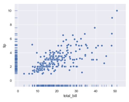
- x, y축쪽에 각각 x는 y, y는 x값에 상관없이 점을 찍음
- 데이터 위치를 축 위에 작은 선으로 표현
- 데이터 밀도를 직관적으로 파악
- 다른 plot과 함께 사용
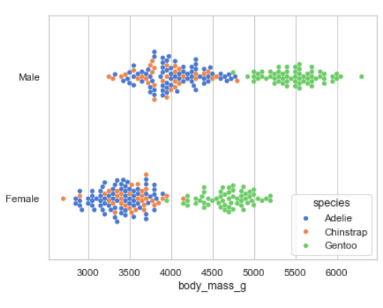
Strip

- 변수별 개별 값을 점으로 시각화
- 데이터 분포의 밀도와 개별 값 확인
- box/violin plot과 함께
Swarm
- Strip과 비슷하지만 겹치지 않게(위아래로) 배치
- 값 분포 + 밀도 표현
Box
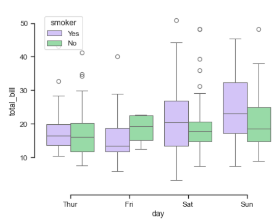
- 중앙값, 사분위, 이상치를 포함하는 상자
- 변수 범위 및 이상치 확인
Violin
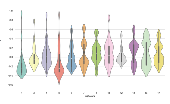
- Box plot에 KDE 추가
- 분포 형태와 중앙값을 동시에 보고 싶을 때
Point
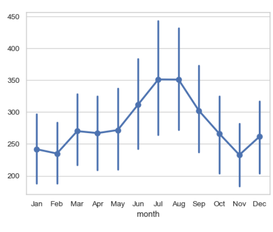
- 범주별 평균과 통계적 추정을 선과 점으로 표시
- 여러 범주의 평균 비교 및 변화 추이
- 위아래로 긴 선은 Error Bar
Bar
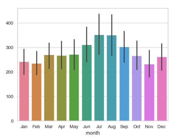
- 평균과 통계적 추정을 막대형을 표현
- 범주형 변수 간 평균 비교
- 직선은 Error Bar
통계적 추정과 Error bar
- 일부 데이터 시각화는 요약 통계를 구하기 위한 통합이나 추정 과정 포함
- Error bar 는 이러한 요약 통계가 얼마나 data를 잘 반영하고 있는지 보여준다.
- 짧을수록 잘 표현하는 것
- Error bar는 다음 둘 중 하나를 보여줌
- 추정치의 불확실성 범위
- data의 퍼짐 정도
- 위 두가지는 서로 연관
- 동일 sample size인 경우, data가 더 넓게 퍼져 있다면 추정치는 더 불확실
- sample size ↑ = 불확실성 ↓, 퍼짐 정도는 그렇지 않다.
Error bar 구성 방식
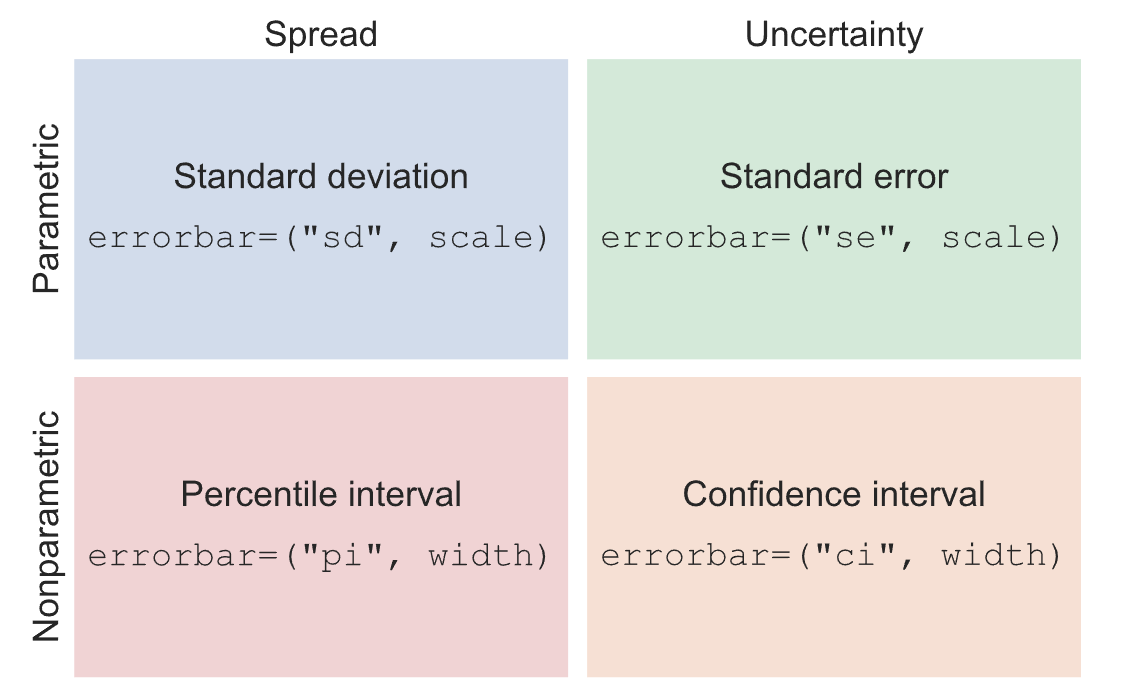
Parametric
- 분포 모양에 대한 가정을 전제로 한 식을 사용하는 방식
- 퍼짐: 정규 분포를 따른다고 가정
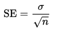
- 불확실성:
Nonparametric
- 주어진 데이터만을 사용하는 방식
- 퍼짐: Percentile 표시(정규 분포 x)
- 불확실성: confidence interval 계산
분류 외 Figure level 함수
Lmplot
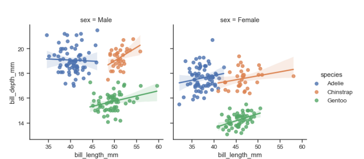
- Linear regression model
- 분포값을 보고 선을 그음
Joinplot
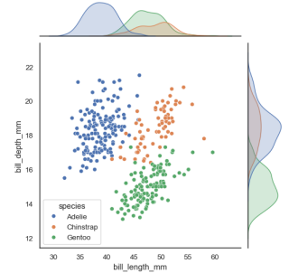
- 두 변수의 일변수계(위쪽)와 이변수계(Scatter)를 함께 표시
pairplot
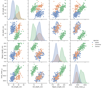
- 두 변수쌍의 관계를 모두 표시
- 대각선으로는 일변수계가 그려짐
Folium(0.19.5)
Python에 의해 정제된 data를 Leaflet.js를 이용하여 지도 위에 표시하는 패키지
- 여러 tileset 지원: OpenStreetMap(무료), Mapbox, custom tileset
- 구글, 네이버, 다음 전부 지도가 살짝씩 다른 것은 독자적인 tileset을 구축하고 있기 때문
- Overlay 지원: Image, Video, GeoJSON, TopoJSON, build-in vector layers
- video 예: 날씨예보
- GeoJSON: 지도 위에 선을 그을때 사용(ex: 가현동 등 동 분리)
Map tile & Zoom level

map tile 개수=4**zoom-level- 각각의 zoom-level마다 모든 타일이 있어야 함 → zoom-level 16이면 4**16개의 타일 필요
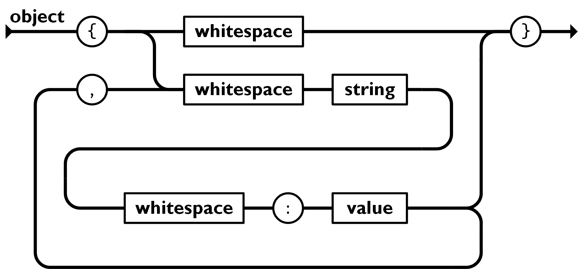
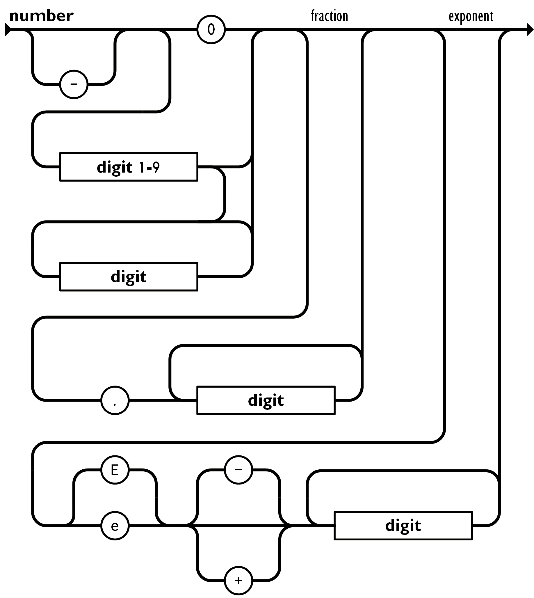
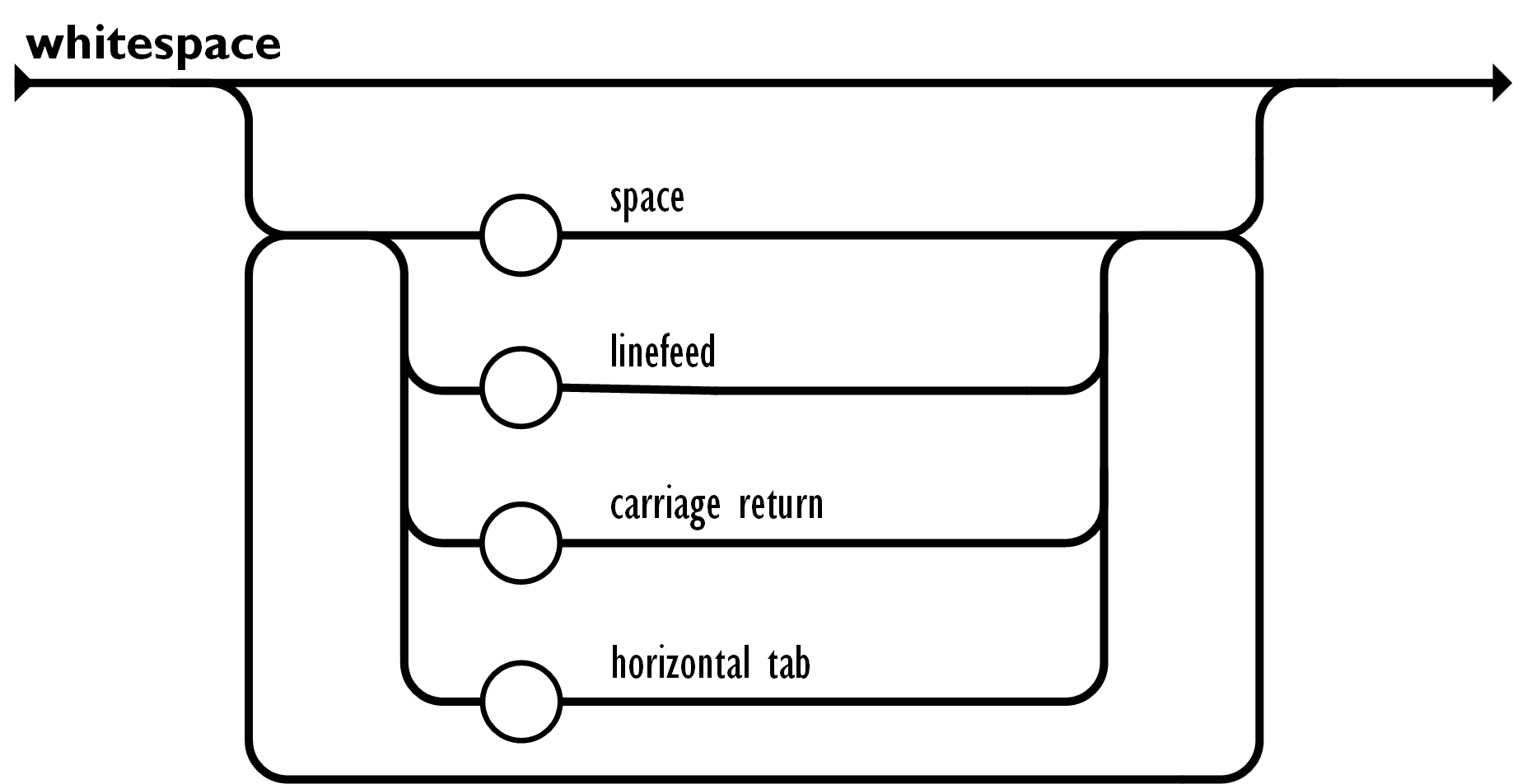
JSON
JavaScript Object Notation
https://www.json.org/json-ko.html
- a lightweight data-interchange format
object
array

value

- single quotation 안쓰는걸 주의
string

number
whitespace
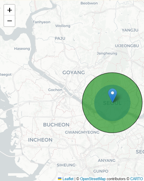
Folium 지도 및 마커 표시
Map 표시
m = folium.Map(location=(37.56685, 126.978), zoom_start=16, width=400, height=500)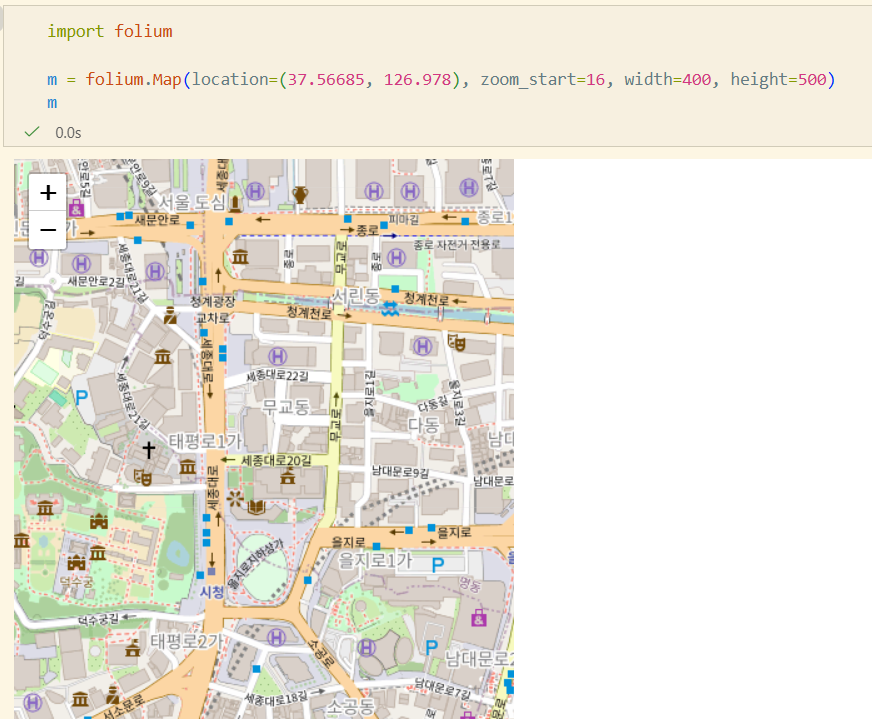
Tile 변경
m = folium.Map(location=(37.56685, 126.978), tiles='cartodb positron', zoom_start=16,
width=400, height=500)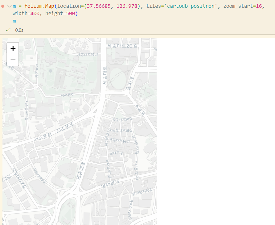
Marker 추가
folium.Marker([37.56685, 126.978], popup='City Hall', tooltip='click').add_to(m)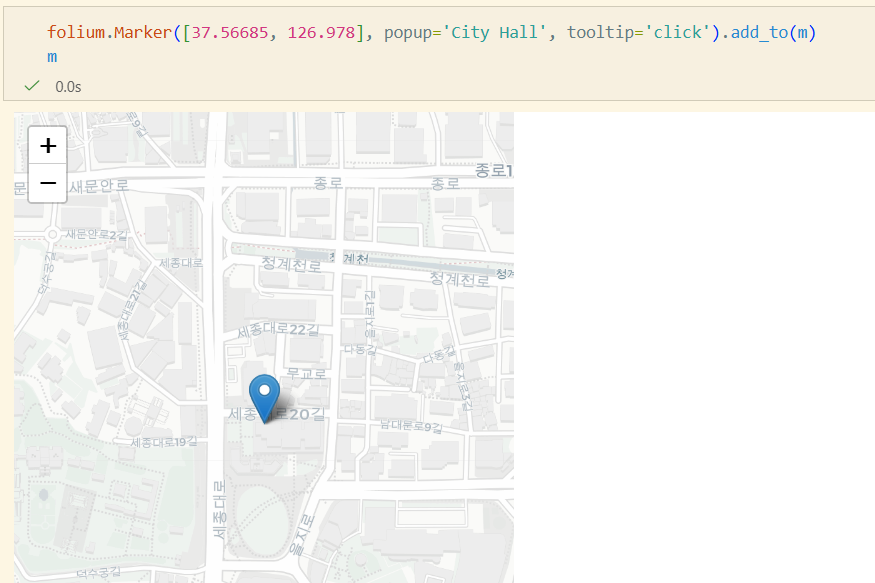

- tooltip, popup
Folium 도형 추가
CircleMarker
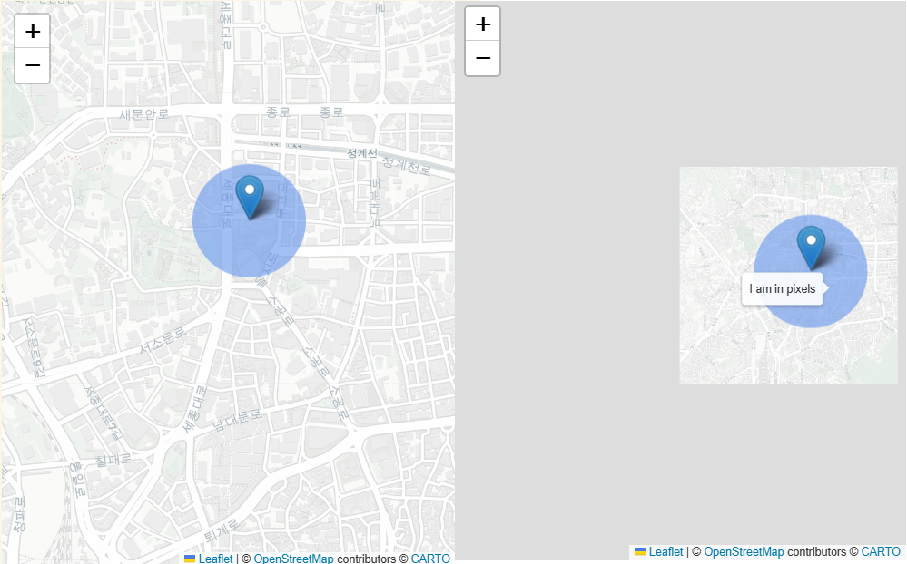
radius = 50
folium.CircleMarker(
	location=[37.56685, 126.978],
	radius=radius,
	color="cornflowerblue",
	stroke=False,
	fill=True,
	fill_opacity=0.6,
	opacity=1,
	popup="{} pixels".format(radius),
	tooltip="I am in pixels",
).add_to(m)- 크기 고정. radius = Pixel
Circle
radius = 10000
folium.Circle(
	location=[-27.551667, -48.478889],
	radius=radius,
	color="black",
	weight=1,
	fill_opacity=0.6,
	opacity=1,
	fill_color="green",
	popup="{} meters".format(radius),
	tooltip="I am in meters",
).add_to(m)- 영역 고정. radius = meter
Polyline, Rectangle, Polygon, ColorLine
Choropleth Map
지도에 지역별 특성을 색깔로 나타낸 그림
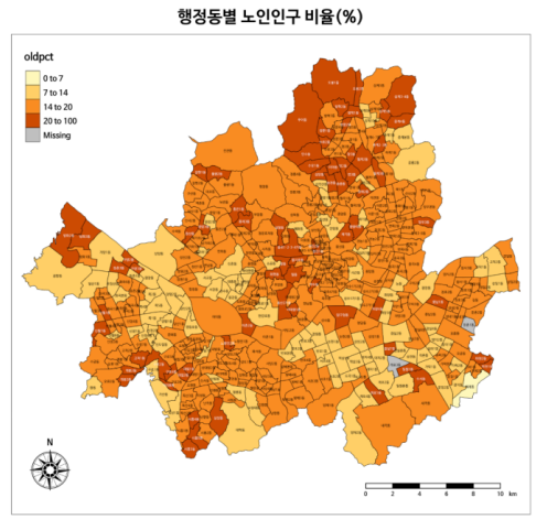
- GeoJson 데이터
- 통계 데이터
import pandas as pd
import requests

# GeoJson
us_states = requests.get("https://raw.githubusercontent.com/python-visualization/folium-example-data/main/us_states.json").json()

# 실업율 통계
state_data = pd.read_csv("https://raw.githubusercontent.com/python-visualization/folium-example-data/main/us_unemployment_oct_2012.csv")
messed_up_data = state_data.drop(0)
messed_up_data.loc[4, "Unemployment"] = float("nan")
m = folium.Map([43, -100], zoom_start=4)
folium.Choropleth(
geo_data=us_states,
data=state_data,
columns=["State", "Unemployment"],
key_on="feature.id", #features 리스트에 id라는 elem이 있고, 그걸 키로 삼는다
fill_color="YlGn",
fill_opacity=0.7,
line_opacity=0.2,
nan_fill_color="purple",
nan_fill_opacity=0.4,
legend_name="Unemployment Rate (%)",
highlight=True, #마우스오버하면 하이라이트됨
show=True, #True여야 Choropleth가 보임
).add_to(m)
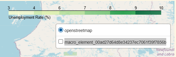
folium.LayerControl(collapsed=True).add_to(m)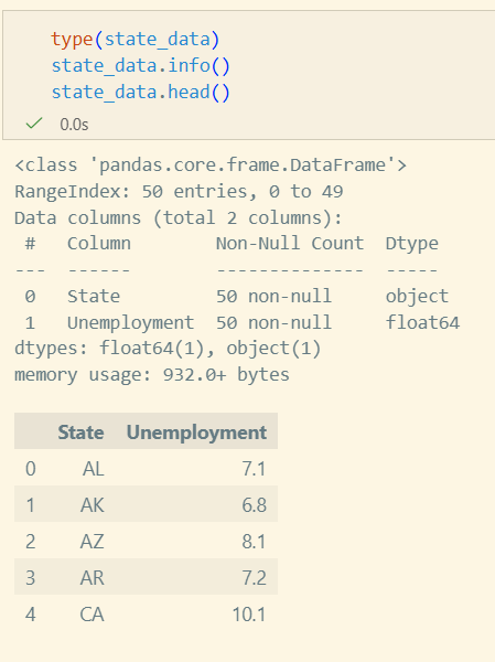
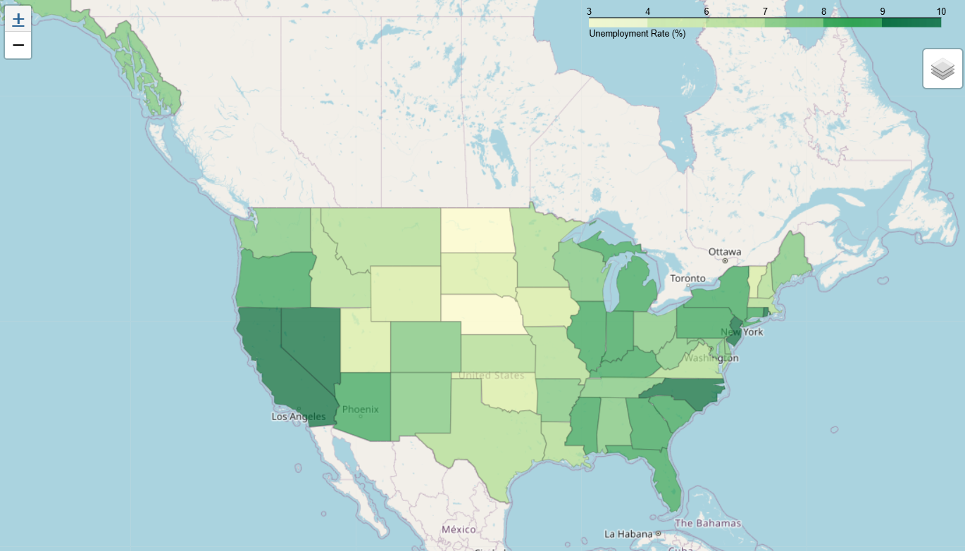
- data를 messed_up_data로 사용한 경우(data=messed_up_data)
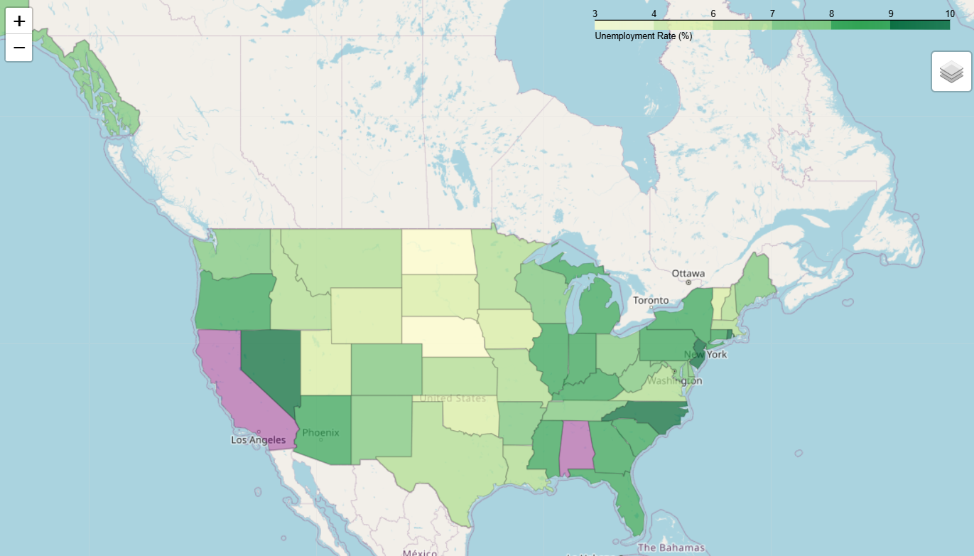
- LayerControl 추가하면 Choropleth 표시 토글 가능
- 메뉴 이름도 파라미터로 조정 가능
실습
따릉이 데이터 분석과 시각화
- 반납이 많은 지역에서 대여가 많은 지역으로 자전거를 옮긴다던가 하는 아이디어를 수강생분께서 내주셨다.
데이터 수집
- 서울 열린 데이터 광장: https://data.seoul.go.kr/
- Download 받아야 할 자료
- 서울시 공공자전거 대여이력 정보
- 서울시 공공자전거 대여서 정보
matplotlib 폰트추가
print(matplotlib.matplotlib_fname())프린트된 디렉토리 안에 ttf 파일을 넣으면 된다.
참고로 ttf만 지원된다.
이후 matplotlib의 캐시에 반영되어야하므로
print(matplotlib.get_cachedir())해당 디렉토리의 fontlist 캐시파일을 삭제해주어야 한다.
그러고나서 재시작해주면 반영된다.
데이터 전처리
필요한 라이브러리 임포트
import os
import pandas as pd
import seaborn as sns
import matplotlib.pyplot as plt
import folium
csv 파일 읽기
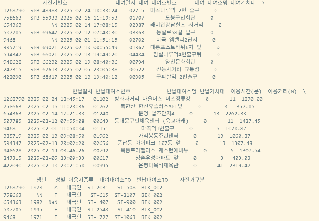
df = pd.read_csv("data/bike_2502.csv",
    encoding="cp949",
    parse_dates=["대여일시", "반납일시"],
    date_format="%Y-%m-%d %H:%M:%S",
)

print(df.info())
print(df.sample(10))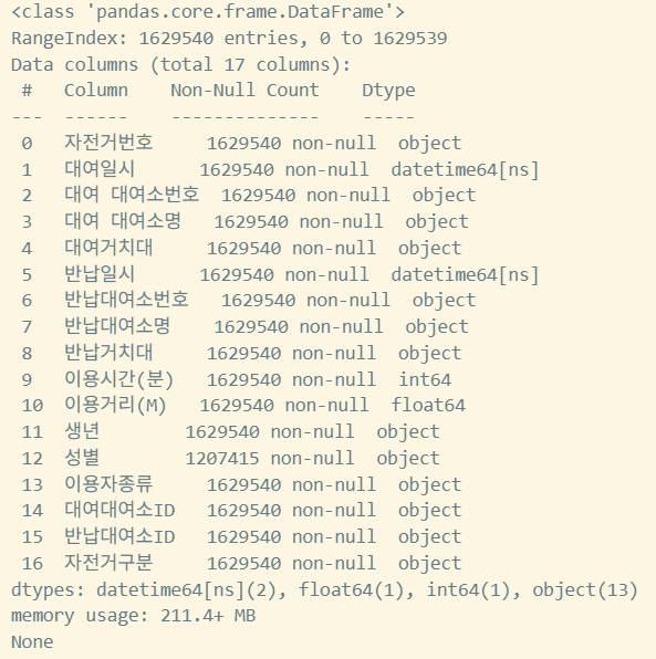
대여장소 excel파일 읽기
rent_location = pd.read_excel(
    "data/bike_rent_location_2512.xlsx",
    sheet_name="대여소현황",
    skiprows=5, #파일의 첫 5줄 무시
    engine="openpyxl",
    header=None,
    index_col=None,
    names=[
        "대여소번호",
        "대여소명",
        "자치구",
        "상세주소",
        "위도",
        "경도",
        "설치시기",
        "LCD",
        "QR",
        "운영방식",
    ],
)
print(rent_location.info())
print(rent_location.head())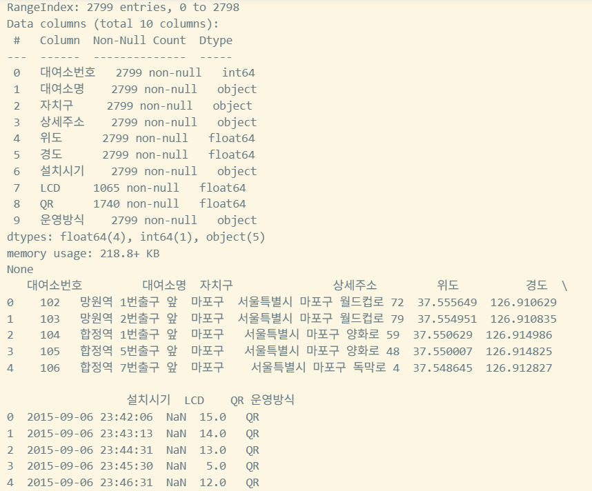
위도, 경도를 dataframe에 추가하기
def add_lat_lon_to_rent(rent, location):
    location = location.copy()

    #키값을 일치시키는 작업
    location["대여소번호"] = location["대여소번호"].apply(lambda x:f"{x:05d}")

    loc_cols = ["대여소번호","자치구","위도","경도"]

    rent = rent.merge(
        # col 이름이 달라 merge를 위해 이름 변경
        location[loc_cols].rename(
            columns={
                "대여소번호": "대여 대여소번호",
                "자치구": "대여 자치구",
                "위도": "대여 위도",
                "경도": "대여 경도"
            }
        ),
        on="대여 대여소번호",
        how="left"
    )

    rent = rent.merge(
        location[loc_cols].rename(
            columns={
                "대여소번호": "반납대여소번호",
                "자치구": "반납 자치구",
                "위도": "반납 위도",
                "경도": "반납 경도"
            }
        ),
        on="반납대여소번호",
        how="left"
    )
    return rent

combined_with_location = add_lat_lon_to_rent(df, rent_location)
print(combined_with_location.info())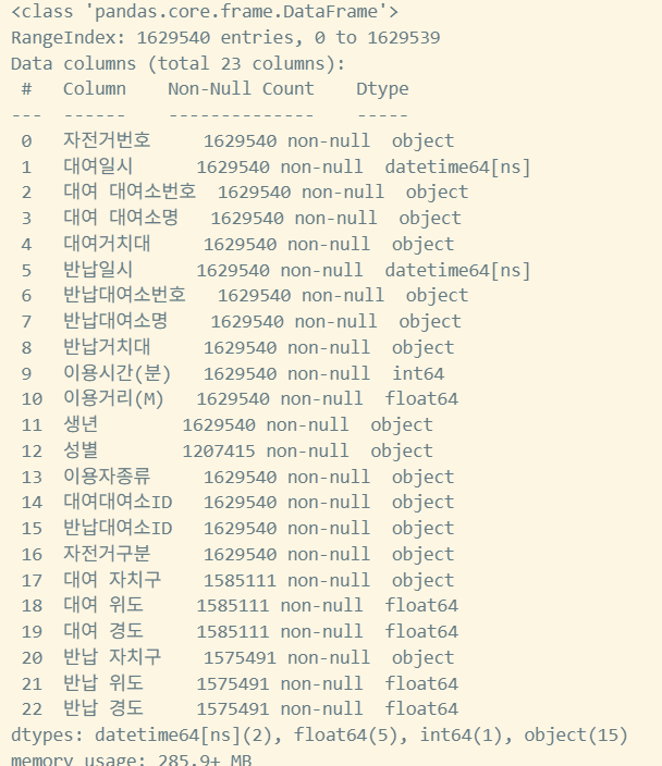
요일별 대여정보 확인을 위해 요일데이터 전처리
def add_dayofweek_and_weekend(df):
    days_kr = ["월", "화", "수", "목", "금", "토", "일"]
    #dt는 날짜정보의 func로, 년월시 리턴됨(Pandas.Series.dt)
    df["요일"] = df["대여일시"].dt.dayofweek.map(lambda x: days_kr[x])
    df["주말"] = df["대여일시"].dt.dayofweek >= 5
    return df

combined_with_location = add_dayofweek_and_weekend(combined_with_location)
print("Combined DataFrame with location and day columns:")
print(combined_with_location[["대여일시", "요일", "주말"]].head())
print(combined_with_location.info())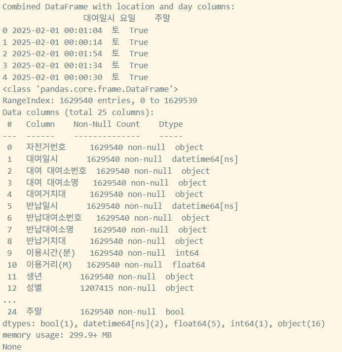
데이터 시각화
matplotlib 임포트
import matplotlib
matplotlib.rc("font", family="NanumGothic")
요일별 대여 건수 히스토그램
def plot_dayofweek_count(df):
    plt.figure(figsize=(8, 5))
    order = ["월", "화", "수", "목", "금", "토", "일"]
    sns.countplot(data=df, x="요일", order=order)
    plt.title("요일별 대여 건수")
    plt.xlabel("요일")
    plt.ylabel("건수")
    plt.show()

plot_dayofweek_count(combined_with_location)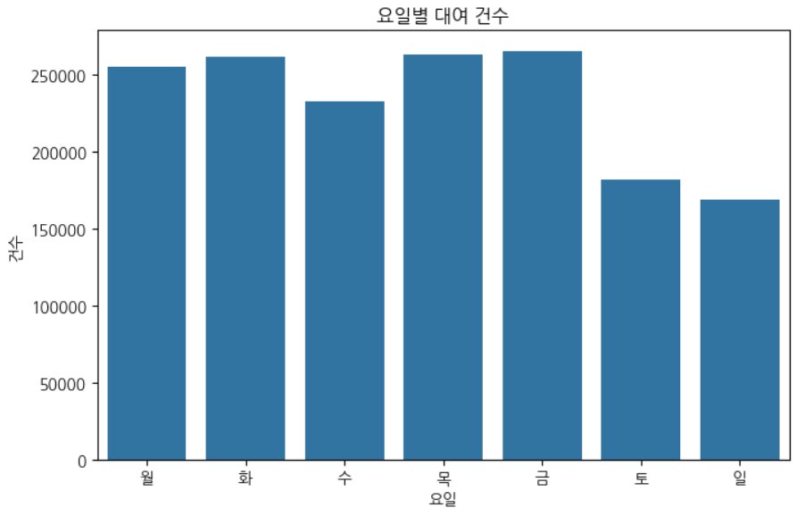
대여 시간대별로 대여 건수 확인
#대여시간대 col 추가
def make_pivot_by_hour_and_day(df):
    df["대여시간대"] = df["대여일시"].dt.hour
    #요일별 시간대 확인 → size로 대여 건수 확인 → unstack으로 x축은 요일, y축은 시간대로 값은 count인 dataframe이 만들어짐
    #unstack은 2칼럼은 x,y축으로 나누는것
    pivot = df.groupby(["대여시간대", "요일"]).size().unstack(fill_value=0)
    return pivot

pivot_df = make_pivot_by_hour_and_day(combined_with_location)
print(pivot_df.head())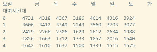
- 가나다순으로 요일이 sorting 됨
히트맵 그리기
def draw_heatmap(pivot_df, title, xlabel, ylabel):
    plt.figure(figsize=(10,6))
    sns.heatmap(
        pivot_df,
        annot=True,
        fmt="d",
        cmap="YlGnBu",
        cbar_kws={"label":"건수"},
        xticklabels=True,
        yticklabels=True,
    ).set(title=title, xlabel=xlabel, ylabel=ylabel)
    plt.show()

draw_heatmap(pivot_df, "대여시간대별 요일별 대여 건수 Heatmap", "요일", "대여시간대")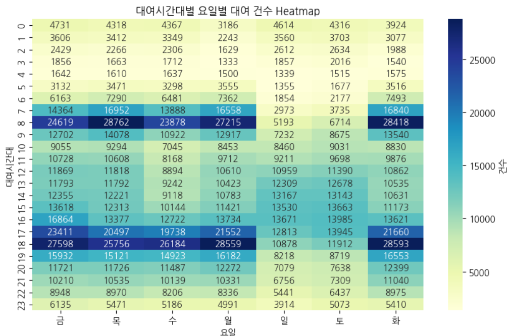
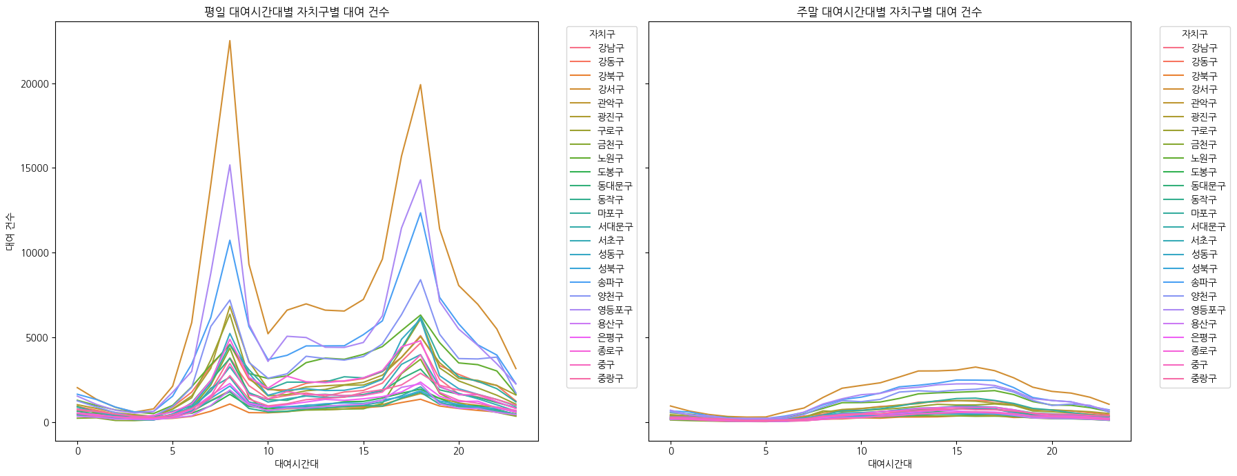
각 자치구별 대여횟수 그래프 그리기
def plot_usage_by_weekend(df):
    plt.figure(figsize=(18,7))
    df_grouped = (
        df.groupby(["대여시간대","주말","대여 자치구"])
        .size()
        .reset_index(name="count")
    )
    print(df_grouped)

    weekday = df_grouped[df_grouped["주말"] == False]
    weekend = df_grouped[df_grouped["주말"] == True]

    fig, axes = plt.subplots(1, 2, figsize=(18, 7), sharey=True)
    sns.lineplot(data=weekday, x= "대여시간대", y="count", hue="대여 자치구", ax=axes[0])
    axes[0].set_title("평일 대여시간대별 자치구별 대여 건수")
    axes[0].set_xlabel("대여시간대")
    axes[0].set_ylabel("대여 건수")
    axes[0].legend(title="자치구", bbox_to_anchor=(1.05, 1), loc="upper left")

    sns.lineplot(data=weekend, x="대여시간대", y="count", hue="대여 자치구", ax=axes[1])
    axes[1].set_title("주말 대여시간대별 자치구별 대여 건수")
    axes[1].set_xlabel("대여시간대")
    axes[1].set_ylabel("대여 건수")
    axes[1].legend(title="자치구", bbox_to_anchor=(1.05, 1), loc="upper left")

    plt.tight_layout()
    plt.show()

plot_usage_by_weekend(combined_with_location)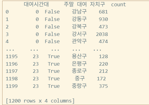
각 자치구별 대여 Choropleth 그리기
def draw_choropleth_by_gu(df, geojson_path, value_col, legend_name):
    data_by_gu = df.groupby("대여 자치구")[value_col].count().reset_index()
    data_by_gu.columns = ["대여 자치구", value_col]

    seoul_center = [37.5665, 126.9780]
    m = folium.Map(location=seoul_center, zoom_start=11, tiles='cartodb positron')

    folium.Choropleth(
        geo_data=geojson_path,
        data=data_by_gu,
        columns=["대여 자치구", value_col],
        key_on="feature.properties.name",
        fill_color="YlGnBu",
        fill_opacity=0.7,
        line_opacity=0.2,
        legend_name=legend_name,
    ).add_to(m)

    return m


m = draw_choropleth_by_gu(
    combined_with_location, "data/05-seoul.json", "자전거번호", "대여 건수"
)
m
# m.save('seoul_bike_choropleth.html')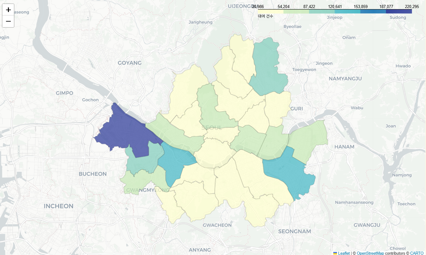
시계열 데이터 전처리
시계열 데이터
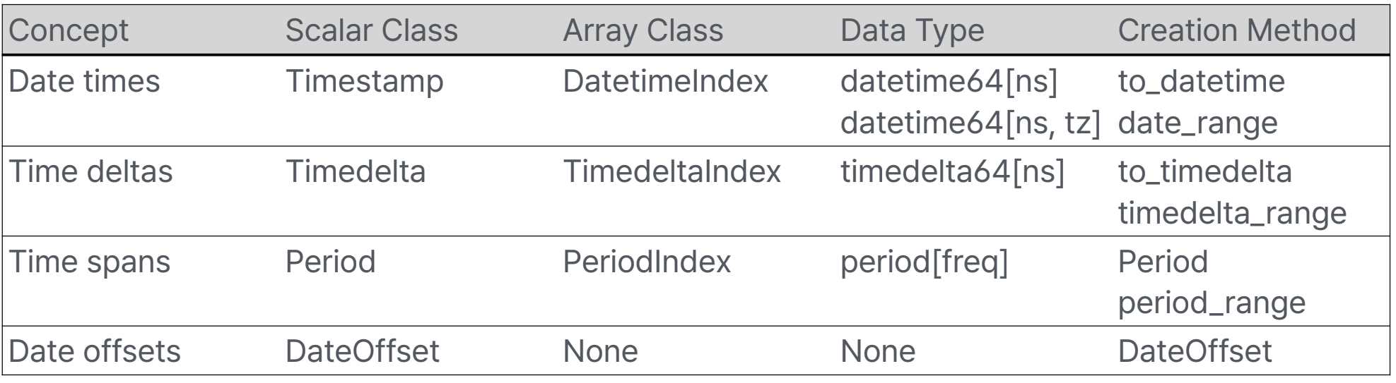
- Date time: 특정 날짜와 시간(with Timezone)
- Time delta: 절대적 기간(time duration) (2월14일의 한달뒤는 3월 14일이나, 절대적값으로는 28일. seconds로 표현)
- Time span: 한 시점과 빈도로 정의된 기간
- Date offset: 달력상의 계산을 하는 상대적 기간 (한달뒤)
특징
- Time series는 Index로 사용 가능
In [19]: pd.Series(range(3), index=pd.date_range("2000", freq="D", periods=3))
Out[19]:
2000-01-01 0
2000-01-02 1
2000-01-03 2
Freq: D, dtype: int64- NaT 지원(Not a Time = None값)
- 참고: memory 위치 비교
a is b, 값 비교a == b
- 참고: memory 위치 비교
In [24]: pd.Timestamp(pd.NaT)
Out[24]: NaT
In [25]: pd.Timedelta(pd.NaT)
Out[25]: NaT
In [26]: pd.Period(pd.NaT)
Out[26]: NaT

In [27]: pd.NaT == pd.NaT #NaT끼리 같지 않다
Out[27]: False
to_datetime
date를 구성하는 Series 리턴
pandas.to_datetime(arg, errors='raise', dayfirst=False, yearfirst=False, utc=False, format=None, exact=<no_default>, unit=None, infer_datetime_format=<no_default>, origin='unix', cache=True)arg: int, float, str, datetime, list, tuple, 1-d array, Series, DataFrame/dicterrors: 'ignore', 'raise', 'coerce'dayfirst,yearfirst: boolutc: bool → 서버 코딩은 무조건 UTC로 하는 버릇을 들여라format: str, 'ISO8601', 'mixed'unit: str - (D, s, ms, us, ns)origin: 'unix', Timestamp convertible
예제
- DataFrame/dict가 입력으로 들어오면 특정 column을 조합해서 반환
- required: year, month, day
- optional: hour, minute, second, milisecond, microsecond, nanosecond
>>> df = pd.DataFrame({'year': [2015, 2016],
... 'month': [2, 3],
... 'day': [4, 5]})
>>> pd.to_datetime(df)
0 2015-02-04
1 2016-03-05
dtype: datetime64[ns]- Integer값이 입력되면 nano second로 인식 → unit 설정
>>> pd.to_datetime(1490195805, unit='s')
Timestamp('2017-03-22 15:16:45')
>>> pd.to_datetime(1490195805433502912, unit='ns')
Timestamp('2017-03-22 15:16:45.433502912')- Integer값이 들어 왔을 때, 1970-01-01 자정부터 계산
- origin을 설정하여 이를 변경할 수 있음
>>> pd.to_datetime([1, 2, 3], unit='D', # [0, 1, 2]하면 1960-01-01부터
... origin=pd.Timestamp('1960-01-01'))
DatetimeIndex(['1960-01-02', '1960-01-03', '1960-01-04'],
dtype='datetime64[ns]`, freq=None)- utc=True로 설정하여 서로다른 Timezone에 있는 시간을 정리할 수 있음
>>> pd.to_datetime(['2018-10-26 12:00 -0530', '2018-10-26 12:00 -0500'],
... utc=True)
DatetimeIndex(['2018-10-26 17:30:00+00:00', '2018-10-26 17:00:00+00:00'],
	dtype='datetime64[ns, UTC]', freq=None)
date_range
특정 시작 날짜와 종료 날짜 사이의 균일한 간격을 가진 날짜 및 시간 시퀀스(DatetimeIndex)를 생성
https://pandas.pydata.org/pandas-docs/stable/user_guide/timeseries.html#offset-aliases
pandas.date_range(start=None, end=None, periods=None, freq=None, tz=None, normalize=False, name=None, inclusive='both', *, unit=None, **kwargs)start: str, datetimeend: str, datetimeperiods: intfreq: str, Timedelta, datetime.timedelta, DateOffset, default'D'normalize: True인 경우 start/end를 자정으로 맞춤inclusive: 'both', 'neither', 'left', 'right'unit: str
bdate_range
특정 시작일과 종료일 사이의 영업일(business days)로 구성된 날짜 범위를 생성하는 데 사용
pandas.bdate_range(start=None, end=None, periods=None, freq='B', tz=None, normalize=True, name=None, weekmask=None, holidays=None, inclusive='both', **kwargs)weekmask: str. None → 'Mon Tue Wed Thu Fri'holidays: list (휴일이 언제인지 직접 설정 가능)
In [89]: weekmask = "Mon Wed Fri"
In [90]: holidays = [datetime.datetime(2011, 1, 5), datetime.datetime(2011, 3, 14)]
In [91]: pd.bdate_range(start, end, freq="C", weekmask=weekmask, holidays=holidays)
Out[91]:
DatetimeIndex(['2011-01-03', '2011-01-07', '2011-01-10', '2011-01-12',
	'2011-01-14', '2011-01-17', '2011-01-19', '2011-01-21',
	'2011-01-24', '2011-01-26',
...
	'2011-12-09', '2011-12-12', '2011-12-14', '2011-12-16',
	'2011-12-19', '2011-12-21', '2011-12-23', '2011-12-26',
	'2011-12-28', '2011-12-30'],
	dtype='datetime64[ns]', length=154, freq='C') # Custom holidays이기 때문
DatetimeIndex
timestamp로 파싱 가능한 string으로 Indexing/Slicing 가능
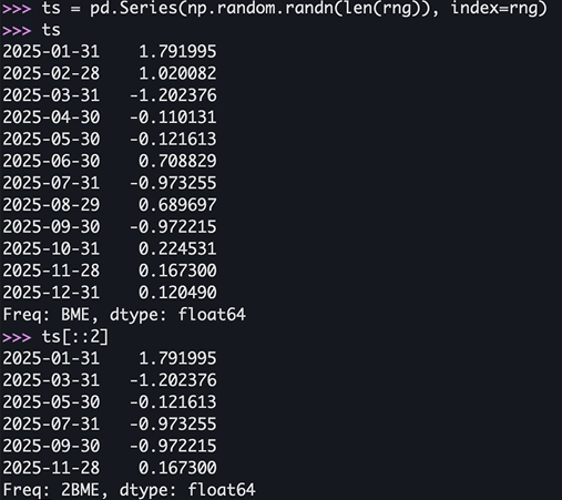
>>> start = datetime.datetime(2025, 1, 1)
>>> end = datetime.datetime(2025, 12, 31)
>>> rng = pd.date_range(start, end, freq="BME")
>>> ts = pd.Series(np.random.randn(len(rng)), index=rng)
>>> ts[::2].index
DatetimeIndex(['2025-01-31', '2025-03-31', '2025-05-30', '2025-07-31',
		'2025-09-30', '2025-11-28'],
		dtype='datetime64[ns]', freq=‘2BME')

>>> ts['5/30/2025']
np.float64(0.37875684785407626)

>>> ts[datetime.datetime(2025, 11, 15):]
2025-11-28 1.180612
2025-12-31 0.554140
Freq: BME, dtype: float64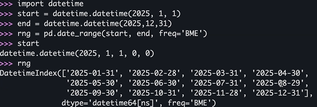
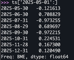
부분 문자열 인덱싱
https://pandas.pydata.org/docs/user_guide/timeseries.html#slice-vs-exact-match
- index의 Resolution에 따라서 exact match 혹은 slice가 선택되어진다.
- resolution보다 작은 값을 인덱스로 넣으면 exact한 값이 나오고, 큰 값을 넣으면 Series가 나온다.
>>> ts.index.resolution
>>> ts[‘2025']
>>> ts[‘2025-6’]- DataFrame.loc에도 동일하게 작동
>>> dft_minute.index.resolution
'minute'
>>> dft_minute.loc["2011-12-31 23:59"]
a 1
b 4
Name: 2011-12-31 23:59:00, dtype: int64
>>> dft_minute.loc["2011-12-31"]
					a b
2011-12-31 23:59:00 1 4
Resampling
Time-based Groupby로 주기를 변경
- 예를 들어 초단위 data를 5분 단위 data로 변경
- 반드시 시계열 Index를 가지고 있거나 column이 존재해야 함
- resample()을 호출하여 수행하고 Resampler 반환
- GroupBy()를 통해 사용가능한 built-in 함수들 사용 가능
- Upsampling: 더 작은 단위로 쪼개는 작업 - 추가되는 값의 처리를 지정할 수 있음
>>> rng = pd.date_range("1/1/2025", periods=900, freq="s") #1초단위로 900개를 만들라는 의미
>>> ts = pd.Series(np.random.randint(0, 500, len(rng)), index=rng)
>>> ts.resample("5Min").mean()
2025-01-01 00:00:00 261.620000
2025-01-01 00:05:00 244.256667
2025-01-01 00:10:00 247.480000
Freq: 5min, dtype: float64
resample
DataFrame.resample(rule, axis=<no_default>, closed=None, label=None, convention='start', kind=<no_default>, on=None, level=None, origin='start_day', offset=None, group_keys=False)rule: DateOffset, Timedelta, strclosed: 'right'→ 'ME', 'YE', 'QE', 'BME', 'BA', 'BQE', 'W' / 나머진 'left' → 구간의 끝값을 포함하느냐, 시작값을 포함하느냐label: 'right', 'left' → 리샘플된 결과의 시간 인덱스를 어디에 찍을지on: str 어느칼럼이 시계열데이터를 가진 칼럼이냐(기본값인 인덱스가 아닐때)level: str, int 멀티인덱스일때 멀티인덱스에서 몇번째가 시계열 데이터인가origin: Timestamp, 'epoch', 'start', 'start_day', 'end', 'end_day'offset: Timedelta, strgroup_keys: bool
Resampler
groupby와 비슷
https://pandas.pydata.org/pandas-docs/stable/reference/resampling.html
pandas.api.typing.Resampler- apply, aggregate, transform, pipe
- ffill(forware fill), bfill, nearest, fillna, asfreq, interpolate
- count, unique, first, last, max, mean, median, min, ohlc, prod, size, sem, std, sum, var, quantile
>>> ts[:2].resample("250ms").ffill(limit=2) #forward-fill로 2개까지만 채우기
2025-01-01 00:00:00.000 463.0
2025-01-01 00:00:00.250 463.0
2025-01-01 00:00:00.500 463.0
2025-01-01 00:00:00.750 NaN
2025-01-01 00:00:01.000 315.0
Freq: 250ms, dtype: float64
DataFrame
shift
DataFrame.shift(periods=1, freq=None, axis=0, fill_value=<no_default>, suffix=None)- periods: int, Sequence 밀 칸 수
- freq: DataOffset, tseries.offsets, timedelta, str 인덱스가 밀림
- axis: 0 or 'Index', 1 or 'columns'
- fill_value: object 밀려서 빈 곳을 어떻게 채울거냐
- suff: str.periods가 sequence로 주어졌을 때 유효
>>> df = pd.DataFrame({"Col1": [10, 20, 15, 30],
... "Col2": [13, 23, 18, 33],
... "Col3": [17, 27, 22, 37]},
... index=pd.date_range("2020-01-01", “2020-01-04"))

>>> df.shift(periods=2)
		  Col1 Col2 Col3
2020-01-01 NaN NaN NaN
2020-01-02 NaN NaN NaN
2020-01-03 10.0 13.0 17.0
2020-01-04 20.0 23.0 27.0>>> df.shift(periods=1, axis="columns")
Col1 Col2 Col3
2020-01-01 NaN 10 13
2020-01-02 NaN 20 23
2020-01-03 NaN 15 18
2020-01-04 NaN 30 33
>>> df.shift(periods=3, freq="D")
Col1 Col2 Col3
2020-01-04 10 13 17
2020-01-05 20 23 27
2020-01-06 15 18 22
2020-01-07 30 33 37Rolling & Expanding
- Rolling
- 고정된 크기의 윈도우를 순차적으로 이동하며 데이터를 분석하는 방법
- 과거의 데이터를 기반으로 미래예측에 유용
- 예시: 7일 이동 평균
- Expanding
- 윈도우 크기를 점차 확장하며 데이터를 분석하는 방법
- 예시: 누적 평균/합계
expanding보단 rolling이 더 자주 쓰인다.
rolling
DataFrame.rolling(window, min_periods=None, center=False, win_type=None, on=None, axis=<no_default>, closed=None, step=None, method='single')window: int, timedelta, str, offset, BaseIndexermin_periods: int. windows로 입력되는 값의 type에따라 default값이 달라짐center: bool. Right edge를 label로win_type: str. None이 주어지면 모든 값이 동일하게 다루어짐on: str.DataFrame에서 Column nameclosed: 'right', 'left', 'both', 'neither'step: intmethod: 'single', 'table'