
Pandas 데이터 전처리
DataFrame 재구조
Pivot
DataFrame.pivot(*, columns, index=<no_defualt>, values=<no_default>)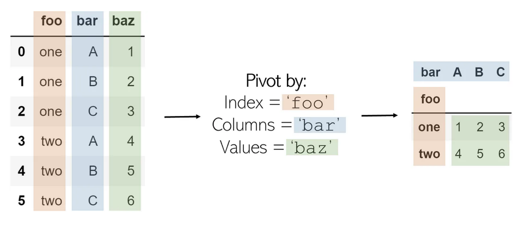
Melt
pivot의 반대
DataFrame.melt(id_vars=None, value_vars=None, var_name=None, value_name='value',col_level=None, ignore_index=True)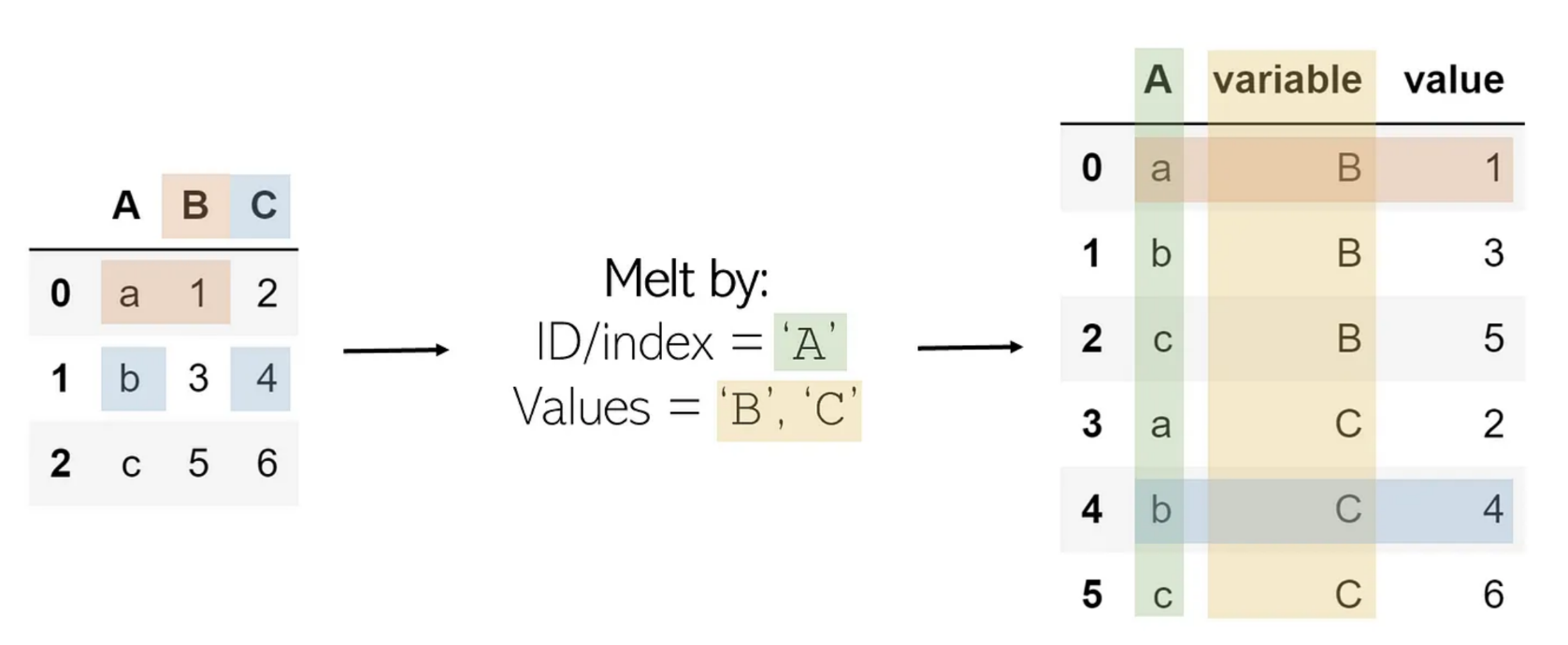
Explode
한 값이 리스트로 있을때, 이를 풀어서 저장
DataFrame.explode(column, ignore_index=False)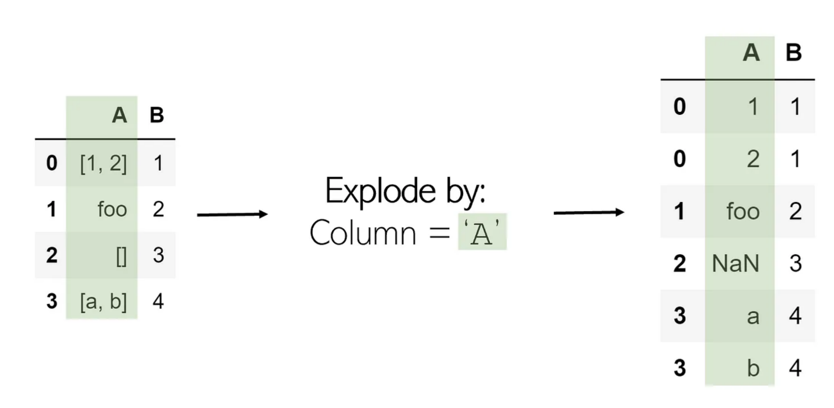
Stack
Melt와 비슷
DataFrame.stack(level=-1, dropna=<no_default>, sort=<no_default>, future_stack=False)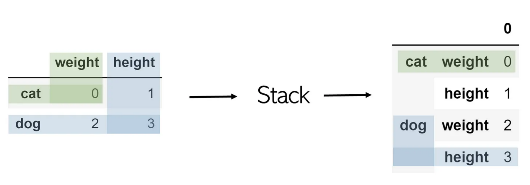
Unstack
DataFrame.unstack(level=-1, fill_value=None, sort=True)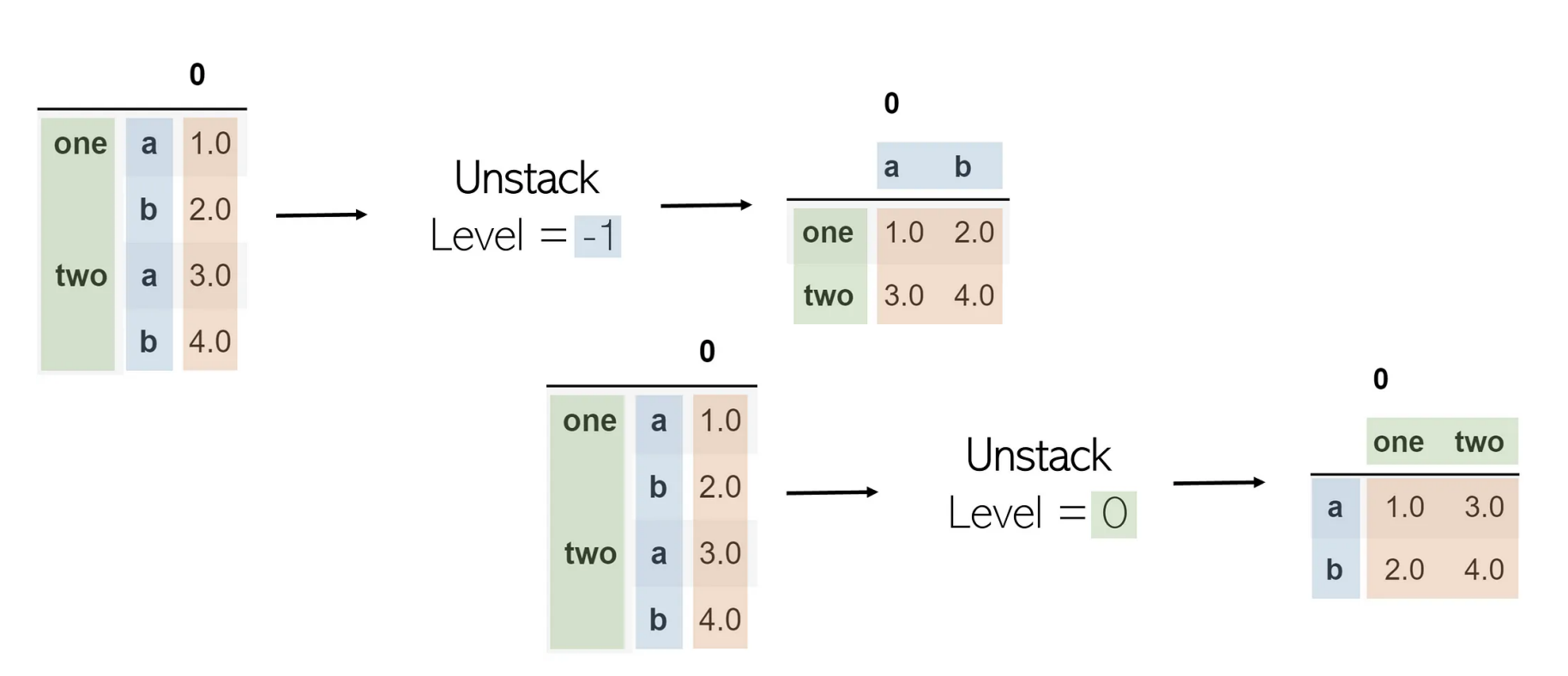
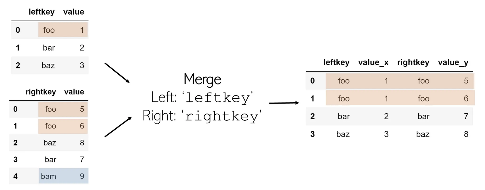
Merge
join과 동일
DataFrame.merge(right, how='inner', on=None, left_on=None, right_on=None, left_index=False, right_index=False, sort=False, suffixes=('_x','_y'), copy=None)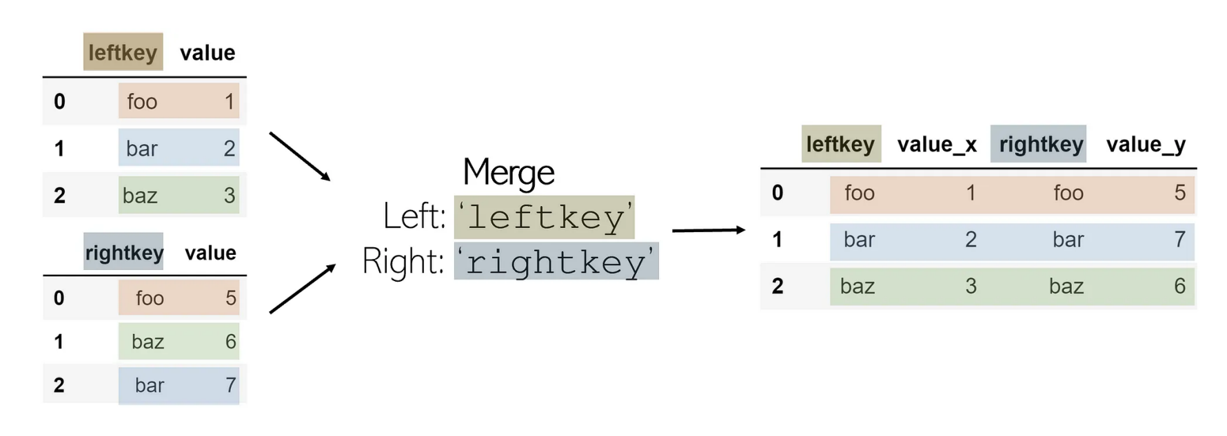
Concat
pandas.concat(objs, *, axis=0, join='outer', ignore_index=False, keys=None, levels=None, names=None, verify_integrity=False, sort=False, copy=None)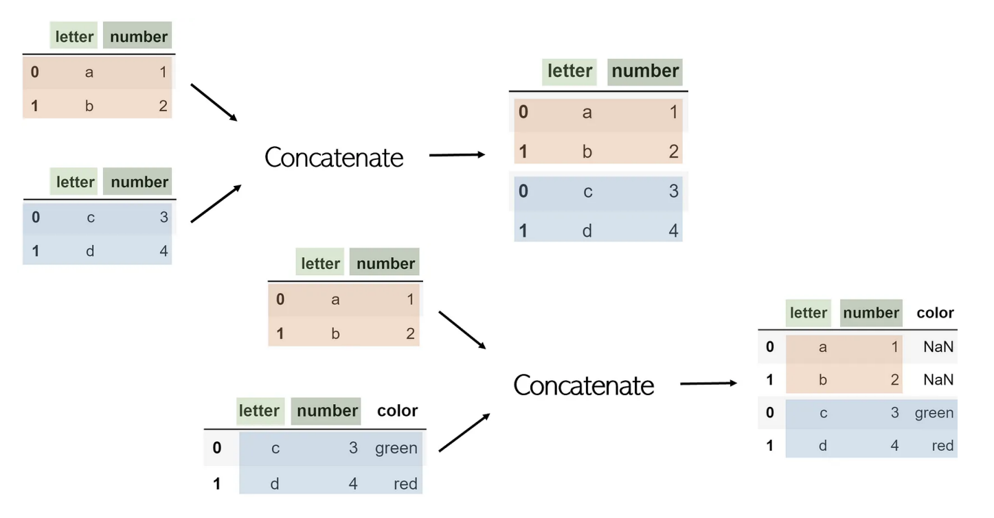
상관 분석(Correlation Analysis)
두 변수 간의 관계 정도와 방향을 수치화 하는 통계 기법
- ≠인과관계
- 이상치의 영향을 받음
- 이상치: outlier
종류
- Pearson: 두 변수간의 선형적 관계를 측정 (가장 흔함)
- Spearman: 변수의 순위 관계를 기반으로 측정
- Kendall: Spearman과 유사, 이상치에 대한 영향을 줄이는 특징
선형회귀(Linear Regression)
하나의 값이 주어졌을 때 다른 값을 예측하는 모델을 만드는 기법(≠상관 분석)
상관관계가 이미 있다고 가정하고 시작
y = ax + b를 구함- a: 회귀 계수
- x: 독립 변수
- y: 종속 변수
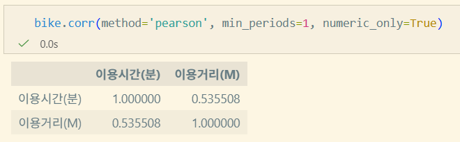
pandas.DataFrame.corr
DataFrame.corr(method='pearson', min_periods=1, numeric_only=False)method: pearson, spearman, kendall, callable(사용자 정의 메소드)min_periods: intnumeric_only: bool
데이터 분석과 Python
데이터 분석 방법론
- Data Engineering: 데이터를 안정적이고(보안) 빠르게 전달/저장하기 위한 분야
- Data Analytics: 데이터세트를 처리하고 통계적으로 분석
- Data Science: 인사이트 도출 + 기대 결과 예측하는 것을 목표(이론적인 것이 포커싱)
Data Mining
대규모 데이터에서 유의미한 패턴을 발견, 예측 모델을 구축하는 과정
- 기업의 전략적 결정, 운영 효율성, 비즈니스 기회 발굴을 위해 필요
CRSIP_DM
CRoss Industry Standard Process for Data Mining
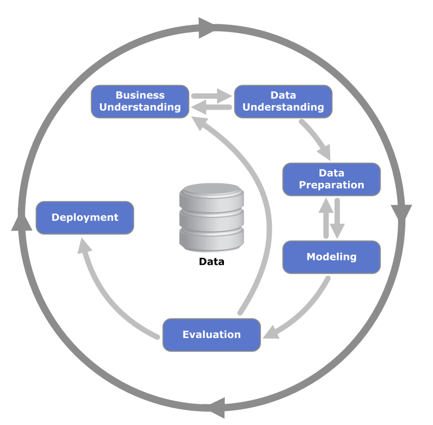
- 프로젝트의 일반적인 6단계, 각 단계별 태스크 정의
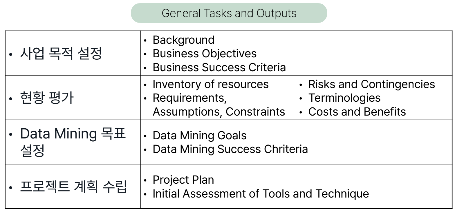
- Phase✅
- General Tasks✅
- Special Tasks
- Process Instances
- Special Tasks
- General Tasks✅
- AI가 발달할수록 인간의 커뮤니케이션, 협업이 중요해진다.
Buisiness Understanding
사업 관점에서 프로젝트 목적과 요구사항을 이해하기 위한 단계
Data Understanding
초기 통찰력, 숨겨진 정보에 대한 가설을 얻을 수 있도록 데이터를 수집하고 친숙해지는 단계
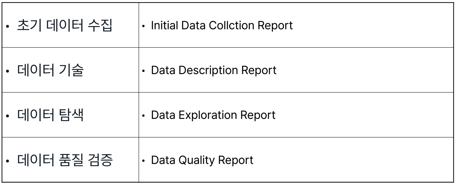
- 데이터가 너무 허접하면 다시 Buisness Understanding 단계로 돌아가 목표 재정립
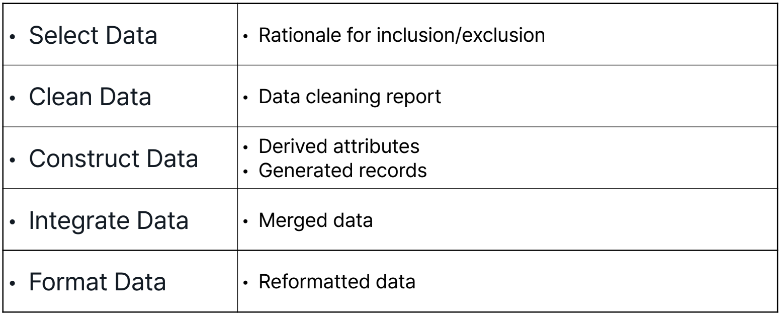
Data Preparation
목적에 맞게 초기 원시 데이터로부터 최종 Dataset을 구하는 단계
*Dataset: 모델을 학습, 검증시킬때 입력되는 데이터 → Data Processing
Modeling
모델링 기법을 적용하여 모델을 구축하고 평가하는 단계
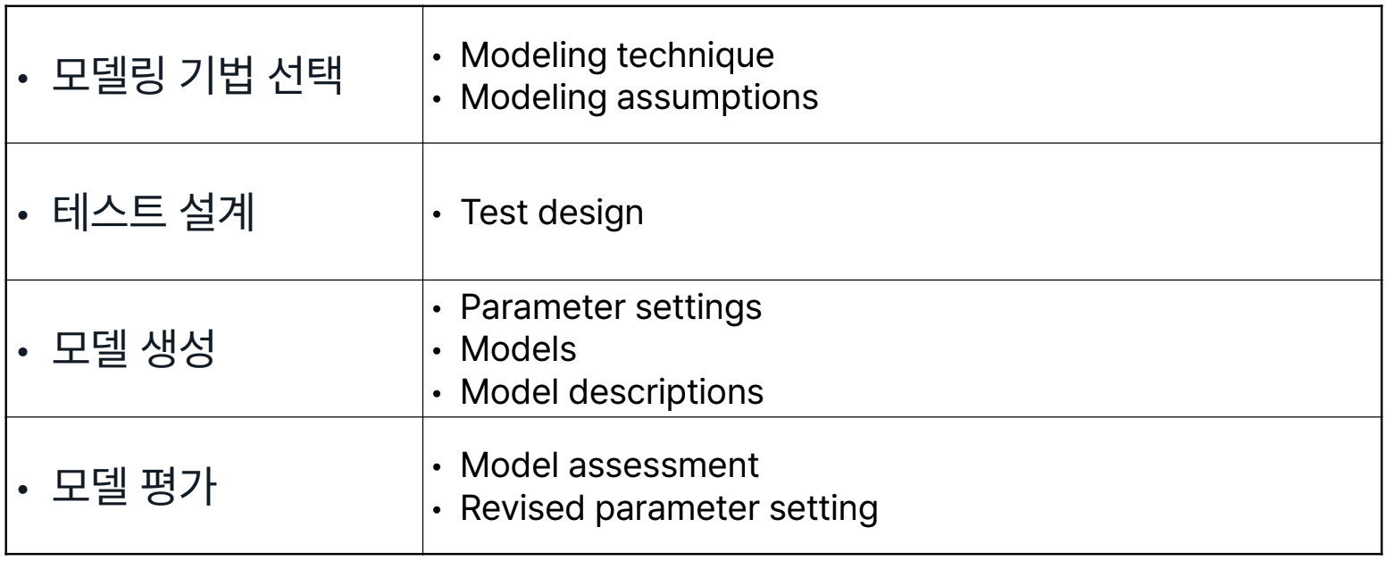
- Data Preparation 단계와 자주 반복하는 단계
Evaluation
모델이 사업 목적을 달성할지 평가하는 단계
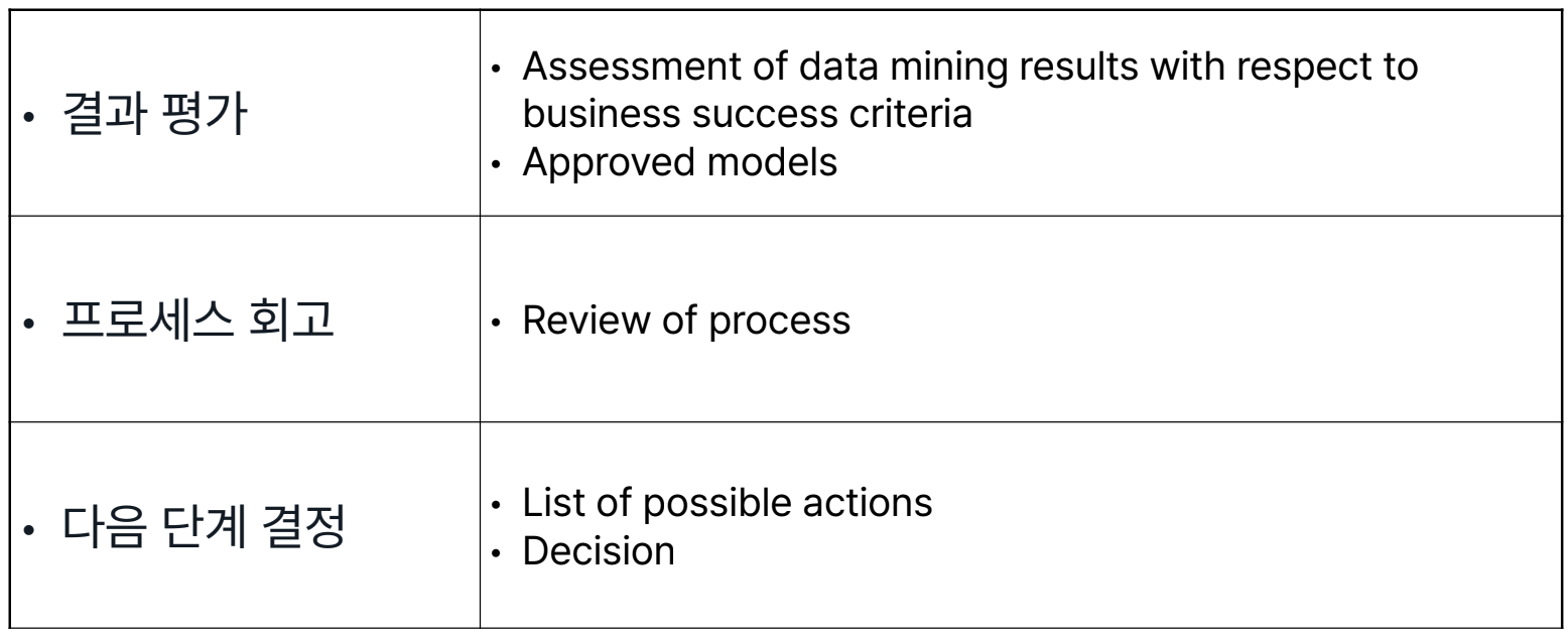
- 전체 프로세스 리뷰도 포함됨
- 아예 엎고 다시 Buisness Understanding 단계로 돌아가는 경우도 존재
Deployment
모델을 적용하여 고객이 결과를 이용할 수 있도록 하는 단계
실습
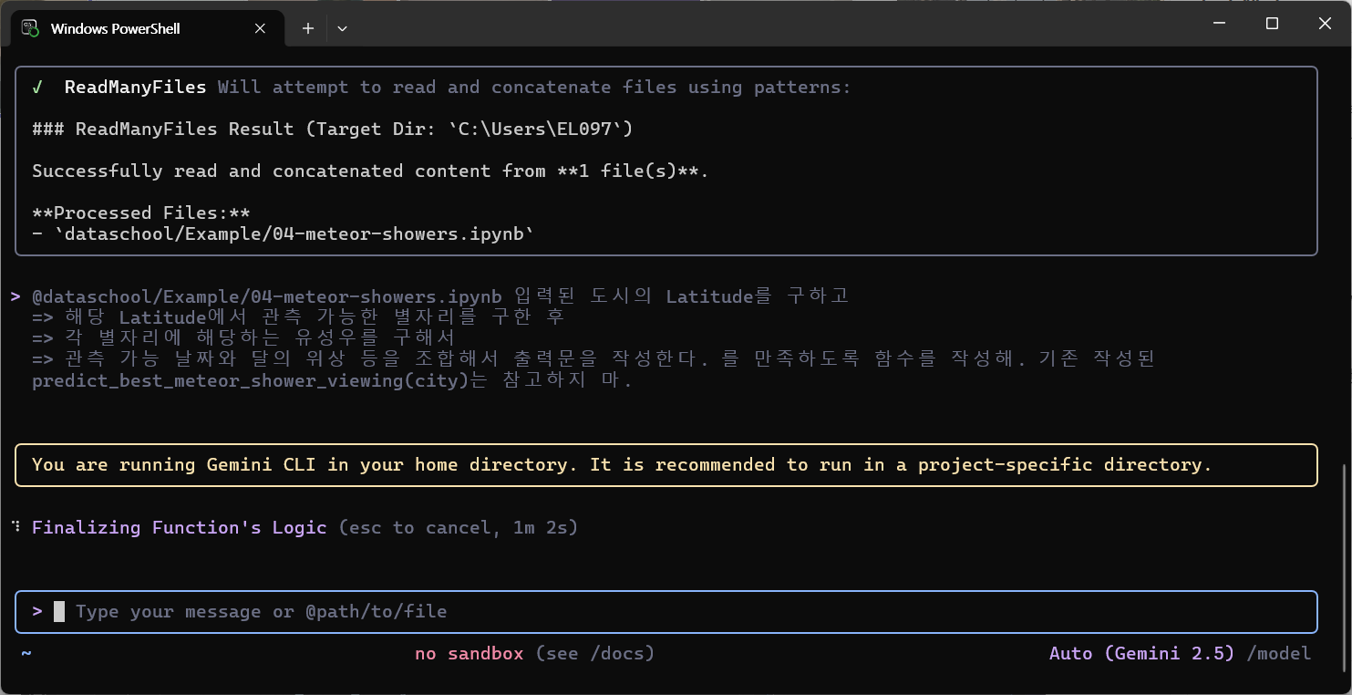
유성우 예측
https://github.com/drguthals/learnwithdrg/tree/main/OverTheMoon/meteor-showers/data
- concat
constellations = pd.concat([constellations, pd.DataFrame([draco_constellation])], ignore_index=True)- map
# 상관관계 예측을 위해선 month를 Int형으로 변환해야 함
# meteor_showers[bestmonth] == meteor_showers.bestmonth (type: Series)
months = {'january':1, 'february':2, 'march':3, 'april':4, 'may':5, 'june':6, 'july':7, 'august':8, 'september':9, 'october':10, 'november':11, 'december':12}
meteor_showers.bestmonth = meteor_showers.bestmonth.map(months)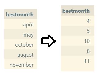
# 원래는 1, 2, 3으로 하는것이 바람직하다. 비트 연산을 위함(1: 01 2: 10 3: 11)
hemispheres = {'northern':0, 'southern':1, 'northern, southern':3}
meteor_showers.hemisphere = meteor_showers.hemisphere.map(hemispheres)- to_datetime
#월과 일을 묶어 날짜로 변환
#2020 → 20200000, 4 → 400, 1 → 20200401
meteor_showers['startdate'] = pd.to_datetime(2020*10000+meteor_showers.startmonth*100+meteor_showers.startday,format='%Y%m%d')- drop
# 데이터 처리 중 중복되게된 column 삭제
# 혹은 모두 같은 값을 가지고 있다면 비교함에 있어 무의미 → 삭제
constellations = constellations.drop(['besttime'], axis=1)- linspace
- 값이 비어있는 곳을 앞과 뒤의 값을 기준으로채우기
- 값이 비어있는 곳을 어떻게 알지?
- 어떻게 채우지?
- 값이 비어있는 곳을 앞과 뒤의 값을 기준으로채우기
non_null_indices = moon_phases[moon_phases['percentage'].notnull()].index.tolist()
for i in range(len(non_null_indices) - 1):
    start_idx = non_null_indices[i]
    end_idx = non_null_indices[i + 1]
    start_val = moon_phases.at[start_idx, 'percentage']
    end_val = moon_phases.at[end_idx, 'percentage']
    num_missing = end_idx - start_idx - 1
    if num_missing > 0:
        fill_values = np.linspace(start_val, end_val, num_missing + 2)[1:-1]
        moon_phases.loc[start_idx + 1:end_idx - 1, 'percentage'] = fill_values

moon_phases.info()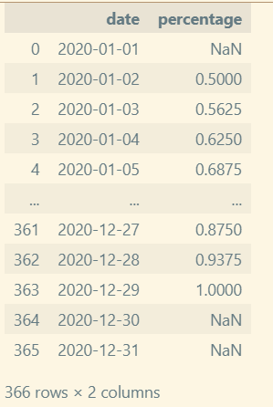
#AI Assistant로 더 나은 알고리즘으로 재작성해보라고 한 코드
def fill_moon_phases(moon_phases_df):
    """
    - date 컬럼을 인덱스로 삼아 일별(asfreq('D'))로 정렬
    - pandas의 time 보간으로 연속성(시간 기반)을 유지하면서 선형 보간
    - 보간 후에도 남는 NaN은 forward/backward fill로 채움(엣지 케이스 처리)
    - 결과는 0~1 범위로 클리핑하고 원래 형태로 반환
    """
    df = moon_phases_df.copy()
    df['date'] = pd.to_datetime(df['date'])
    df = df.set_index('date').sort_index()
    df = df.asfreq('D')  # 날짜가 빠져있어도 일단 일단위로 맞춰줌
    s = df['percentage'].astype(float)

    if s.notna().sum() == 0:
        # 알려진 값이 하나도 없으면 그대로 반환
        return df.reset_index()

    # 시간 기준 선형 보간(시계열 보간은 date 인덱스를 사용)
    s_filled = s.interpolate(method='time', limit_direction='both')

    # 여전히 남아있는 NaN은 인접 값으로 채움 (한 점만 있는 경우 등)
    s_filled = s_filled.fillna(method='ffill').fillna(method='bfill')

    # 경계값 보정
    s_filled = s_filled.clip(0.0, 1.0)

    df['percentage'] = s_filled
    return df.reset_index()

# 사용 예: 기존 루프 대신 호출
moon_phases = fill_moon_phases(moon_phases)
moon_phases.info()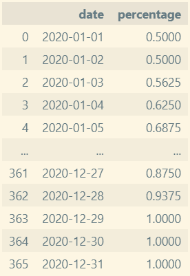
- 예측 함수
- 입력된 도시의 Latitude 구하기
- 해당 Latitude에서 관측 가능한 별자리를 구하기
- 각 별자리에 해당하는 유성우를 구하기
- 관측 가능 날짜와 달의 위상을 조합해서 출력문 작성하기
def predict_best_meteor_shower_viewing(city):
    # Create an empty string to return the message back to the user
    meteor_shower_string = ""

    if city not in cities.values:
        meteor_shower_string = "Unfortunately, " + city + " isn't available for a prediction at this time."
        return meteor_shower_string

    # Get the latitude of the city from the cities dataframe
    latitude = cities.loc[cities['city'] == city, 'latitude'].iloc[0]

    # Get the list of constellations that are viewable from that latitude
    constellation_list = constellations.loc[(constellations['latitudestart'] >= latitude) & (constellations['latitudeend'] <= latitude), 'constellation'].tolist()

    # If no constrllations are viewable, let the user know
    if not constellation_list:
        meteor_shower_string = "Unfortunately, there are no meteor showers viewable from "+ city + "."

        return meteor_shower_string

    meteor_shower_string = "In " + city + " you can see the following meteor showers:\n"

    # Iterate through each constellation that is viewable from the city
    for constellation in constellation_list:
        # Find the meteor shower that is nearest that constellation
        meteor_shower = meteor_showers.loc[meteor_showers['radiant'] == constellation, 'name'].iloc[0]

        # Find the start and end dates for that meteor shower
        meteor_shower_startdate = meteor_showers.loc[meteor_showers['radiant'] == constellation, 'startdate'].iloc[0]
        meteor_shower_enddate = meteor_showers.loc[meteor_showers['radiant'] == constellation, 'enddate'].iloc[0]

        # Find the moon phases for each date within the viewable timeframe of that meteor shower
        moon_phases_list = moon_phases.loc[(moon_phases['date'] >= meteor_shower_startdate) & (moon_phases['date'] <= meteor_shower_enddate)]

        if meteor_shower == 'Chang\'e':
            # For the film meteor shower, find the date where the moon is the most visible
            best_moon_date = moon_phases_list.loc[moon_phases_list['percentage'].idxmax()]['date']

            # Add that date to the string to report back to the user
            meteor_shower_string += "Though the moon will be bright, the " + meteor_shower + " is best seen if you look towards the " + constellation + " constellation on " +  best_moon_date.to_pydatetime().strftime("%B %d, %Y") + ".\n"
        else:
            # Find the first date where the moon is the least visible
            best_moon_date = moon_phases_list.loc[moon_phases_list['percentage'].idxmin()]['date']

            # Add that date to the string to report back to the user
            meteor_shower_string += meteor_shower + " is best seen if you look towards the " + constellation + " constellation on " +  best_moon_date.to_pydatetime().strftime("%B %d, %Y") + ".\n"

    return meteor_shower_string
# AI Assistant's Version
def predict_best_meteor_shower_viewing(city):
if city not in cities['city'].values:
return f"Unfortunately, {city} isn't available for a prediction at this time."
latitude = cities.loc[cities['city'] == city, 'latitude'].iloc[0]
# latitude가 latitudestart와 latitudeend 사이에 있는 행만 선택 (순서에 무관)
lat_min = constellations[['latitudestart', 'latitudeend']].min(axis=1)
lat_max = constellations[['latitudestart', 'latitudeend']].max(axis=1)
viewable = constellations[(lat_min <= latitude) & (lat_max >= latitude)]
if viewable.empty:
return f"Unfortunately, there are no meteor showers viewable from {city}."
result_lines = [f"In {city} you can see the following meteor showers:"]
for constellation in viewable['constellation'].tolist():
showers = meteor_showers[meteor_showers['radiant'] == constellation]
if showers.empty:
continue
for _, ms in showers.iterrows():
name = ms['name']
start = ms['startdate']
end = ms['enddate']
moon_range = moon_phases[(moon_phases['date'] >= start) & (moon_phases['date'] <= end)]
if moon_range.empty:
best_date = start
note = " (no moon data; using start date)"
date_str = best_date.to_pydatetime().strftime("%B %d, %Y")
result_lines.append(f"{name} is around {constellation} (approx. {date_str}){note}.")
continue
if name.lower().startswith("chang"):
best_date = moon_range.loc[moon_range['percentage'].idxmax()]['date']
date_str = best_date.to_pydatetime().strftime("%B %d, %Y")
result_lines.append(f"Though the moon will be bright, the {name} is best seen if you look towards the {constellation} constellation on {date_str}.")
else:
best_date = moon_range.loc[moon_range['percentage'].idxmin()]['date']
date_str = best_date.to_pydatetime().strftime("%B %d, %Y")
result_lines.append(f"{name} is best seen if you look towards the {constellation} constellation on {date_str}.")
return "\n".join(result_lines)
Gemini cli 설치
실습중 copilot의 무료 한도에 도달해서 Gemini cli 를 설치했다.
1. node.js 설치
https://nodejs.org/ko/download
2. npm으로 gemini 설치
npm install -g @google/gemini-cli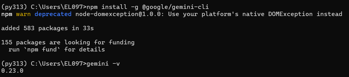
3. gemini 실행
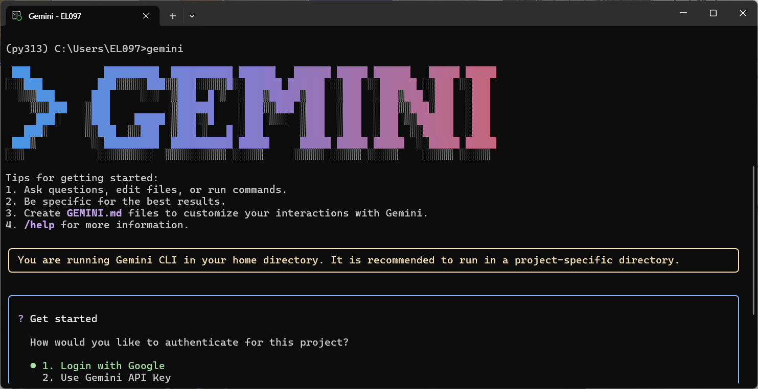
4. authentication
1번 구글로그인으로 진행했다.
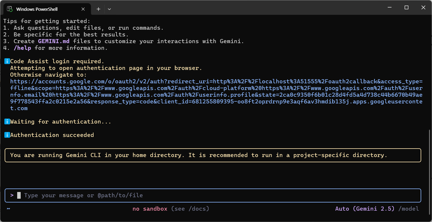
5. 사용
- 파일은 @를 사용해서 제시하면 된다.
6. VSCode에 Extension 추가
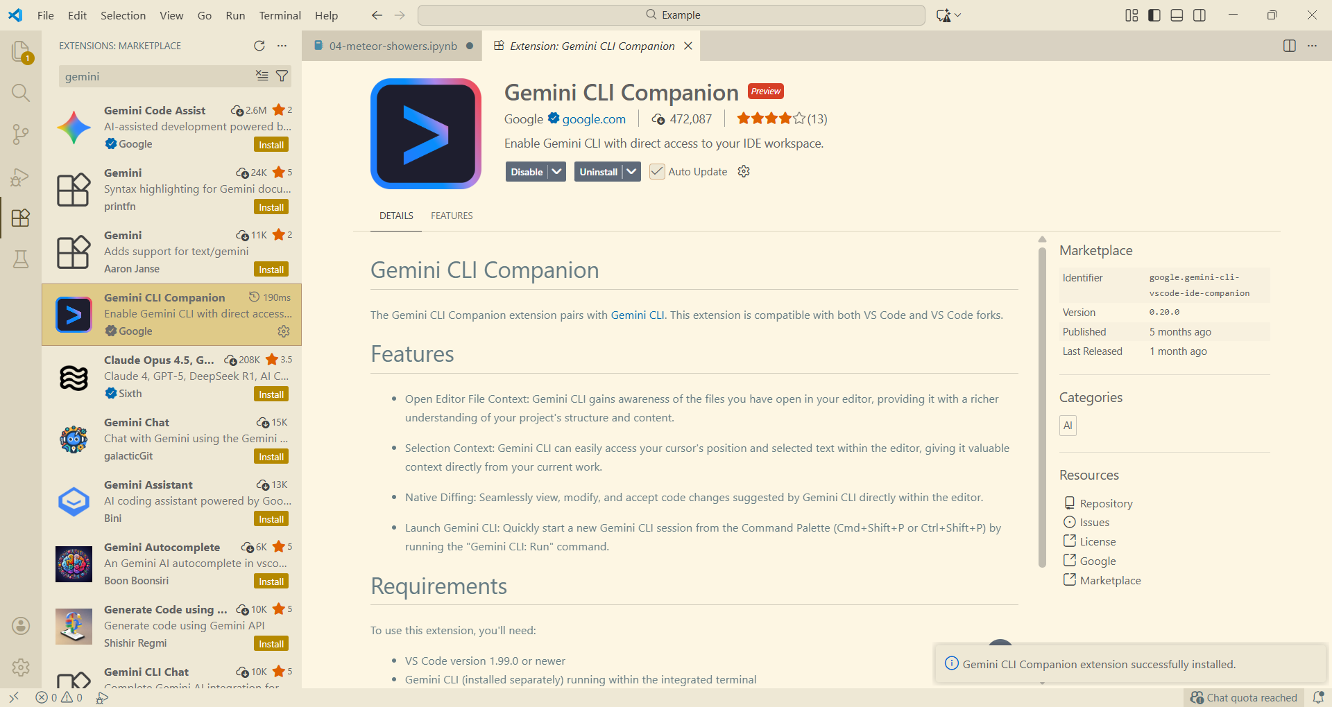
- 이후 터미널창을 새로 추가하여 작업하면 된다.
데이터 시각화
필요성
- 복잡한 데이터 직관적 이해
- 패턴, 트렌드, 이상치 발견
- 전체 데이터의 구조와 분포를 빠르게 탐색
- 효과적인 커뮤니케이션
- 의사결정자, 비전문가도 쉽게 이해 가능
- ex) 현재 사용자 급증 그래프를 제시하며 추가적 서버비 지출 필요 보고
- 상대방이 듣고싶은 얘기를 해주는게 보고임. 내가 하고싶은 말을 하는게 아님 ㅋㅋ
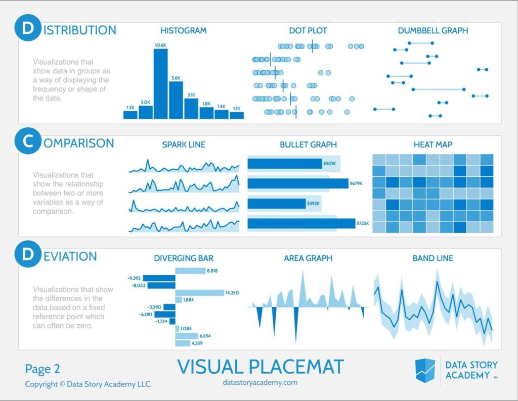
유형
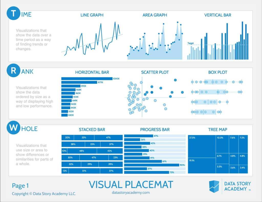
- Time
- Rank
- Box Plot은 이상치를 보여줄 때 많이 사용
- Whole
- Distribution
- Dot Plot의 선은 average
- Comparison
- Spark Line은 시간의 흐름에 따라 튀는 값을 볼 때 용이
- Deviation
- 변폭
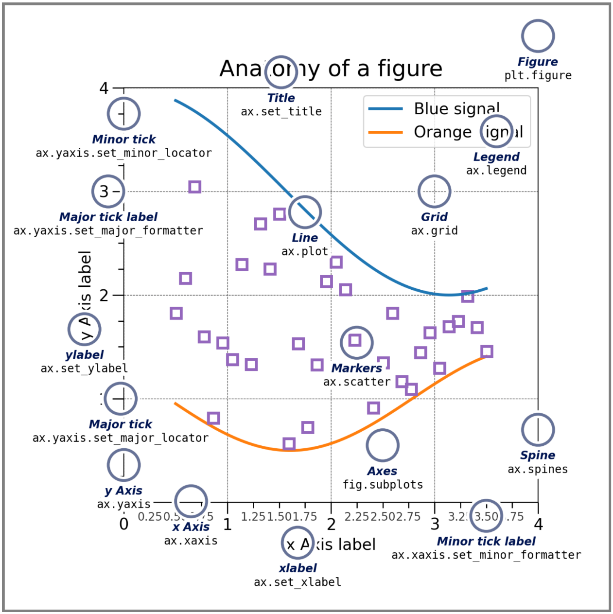
matplotlib
구성요소
- Figure: 표
- Axes: 그래프 하나하나
- Axis: 축
- Artist: 그래프 안에 들어가는 잡다구리 한것
Coding Style
pyplot-style
pyplot에 생성/관리 등을 일임하여 시각화
x = np.linspace(0, 2, 100) #sample data. 0~2까지 100개

plt.figure(figsize=(5, 2.7), layout='constrained')
plt.plot(x, x, label='linear') # y = x
plt.plot(x, x**2, label='quadratic')
plt.plot(x, x**3, label='cubic')
plt.xlabel('x label')
plt.ylabel('y label')
plt.title("Simple Plot")
plt.legend()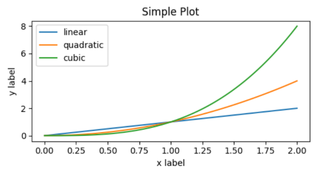
OO-style
Figure와 Axes를 명시적으로 생성하여 method를 호출
x = np.linspace(0, 2, 100) #sample data

fig, ax = plt.subplots(figsize=(5, 2.7), layout='constrained')
ax.plot(x, x, label='linear')
ax.plot(x, x**2, label='quadratic')
ax.plot(x, x**3, label='cubic')
ax.set_xlabel('x label')
ax.set_ylabel('y label')
ax.set_title("Simple Plot")
ax.legend()
subplot
- Axes를 추가하거나 선택
subplot(nrows, ncols, index, **kwargs)
subplot(pos, **kwargs)
subplot(**kwargs)
subplot(ax)plt.subplot(221)
ax1 = plt.subplot(2, 2, 1) # equivalent but more general
# add a subplot with no frame
ax2 = plt.subplot(222, frameon=False)
# add a polar subplot
plt.subplot(223, projection=‘polar’)
# add a red subplot that shares the x-axis with ax1
plt.subplot(224, sharex=ax1, facecolor=‘red')
# delete ax2 from the figure
plt.delaxes(ax2)
# add ax2 to the figure again →여기 맥락에서는 ax2는 이미 axes(그래프)가 되었으므로 에러발생
plt.subplot(ax2) #→ plt.add_axes(ax2)
# make the first Axes "current" again
plt.subplot(221)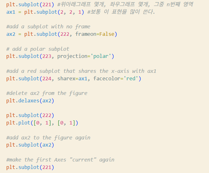
사용 팁
https://matplotlib.org/stable/gallery/index.html#examples-index
https://matplotlib.org/stable/tutorials/index
- 자료의 특성을 보고 어떤 차트를 그릴 것인지 먼저 결정해야 한다.
- 차트의 종류와 특징에 대한 이론공부 필요
plot
https://matplotlib.org/stable/api/_as_gen/matplotlib.pyplot.plot.html#matplotlib.pyplot.plot
matplotlib.pyplot.plot(*args, scalex=True, scaley=True, data=None, **kwargs)x,y: array, floatfmt: str, <color>,<marker>,<line> 순서 상관 X. kwargs로 대체 가능scalex,scaley: booldata: indexable object. 주어지는 경우 x,y에 label name이 와야 함
plot(x, y) # plot x and y using default line style and color
plot(x, y, 'bo') # plot x and y using blue circle markers 블루의 ㅇ 마커
plot(y, 'r+') # plot y using x as index array 0..N-1 레드의 플러스 마커

plot(x, y, 'go--', linewidth=2, markersize=12) #아래와 동일한 의미
plot(x, y, color='green', marker='o', linestyle=‘dashed', linewidth=2, markersize=12)

plot('xlabel', 'ylabel', data=obj)
plot multiple sets
반복 호출
- 사실 걍 이거만 써도 되긴 한다네요
plot(x1, y1, 'bo')
plot(x2, y2, 'go')
2-d array
x = [1, 2, 3]
y = np.array([[1, 2], [3, 4], [5, 6]])
plot(x, y)
한꺼번에
plot(x1, y1, 'g^', x2, y2, ‘g-')bar/barh
https://matplotlib.org/stable/api/_as_gen/matplotlib.pyplot.bar.html
https://matplotlib.org/stable/api/_as_gen/matplotlib.pyplot.barh.html
matplotlib.pyplot.bar(x, height, width=0.8, bottom=None, *, align='center', data=None, **kwargs)x: float, arrayheight: float, arraywidth: float, arraybottom: float, array, default=0align: 'center', 'edge'. edge는 bar의 왼쪽을 맞춤. 오른쪽을 맞추려면 width를 음수로.
bar(range(3), [1, 2, 3], tick_label=['A', 'B', ‘C'])
bar(['A', 'B', 'C'], [1, 2, 3]) # 위와 동일
scatter
https://matplotlib.org/stable/api/_as_gen/matplotlib.pyplot.scatter.html
matplotlib.pyplot.scatter(x, y, s=None, c=None, *, marker=None, cmap=None, norm=None, vmin=None, vmax=None, alpha=None, linewidths=None, edgecolors=None, colorizer=None, plotnonfinite=False, data=None, **kwargs)[source]scatter는 기본 circle로 그려짐
x,y: float, array (shape(n,))s: float, array. 제곱값(원으로 그려지니까...)c: array, list of color, colormarker: MarkerStyle, Default 'o'cmap: str, Colormapnorm: str, Normalizealpha: float[0,1]. Transparency
np.random.seed(19680801)

N = 50
x = np.random.rand(N)
y = np.random.rand(N)
colors = np.random.rand(N)
area = (30 * np.random.rand(N))**2 # 0 to 15 point radius
plt.scatter(x, y, s=area, c=colors, alpha=0.5)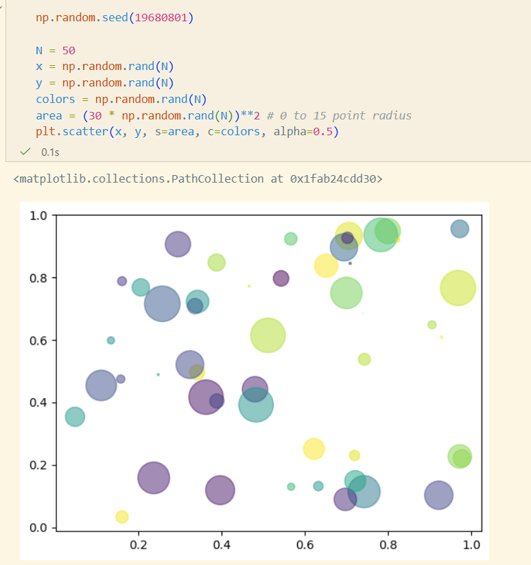
Color & ColorMap
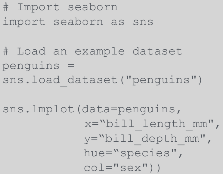
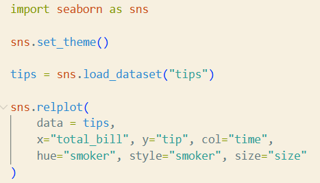
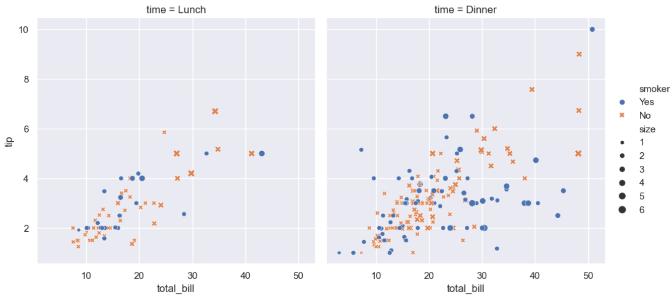
seaborn
Matplotlib 위에서 동작하는 고수준 시각화 라이브러리
https://seaborn.pydata.org/examples/index.html
- 더 세련되고 일관된 기본 스타일
- 통계 시각화에 강함
- DataFrame 친화적
- 복잡한 시각화를 간단한 코드로
- matplotlib과 완벽한 호환
Dataset
예제 데이터셋
https://www.kaggle.com/code/heemalichaudhari/a-clear-approach-on-seaborn
tips
sns.load_dataset("tips")
dots
sns.load_dataset("dots")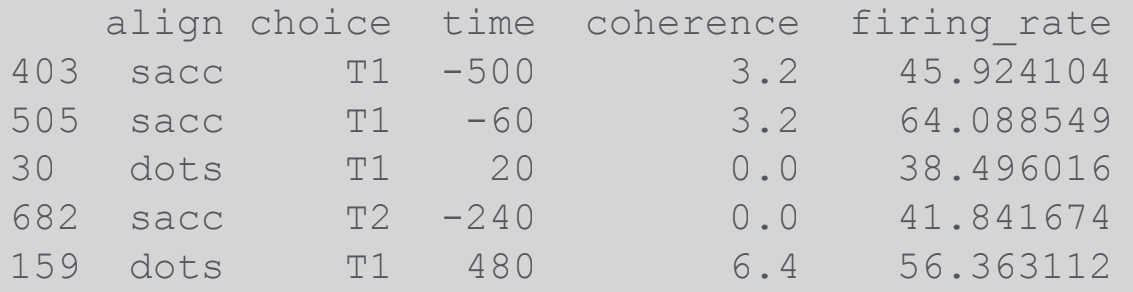
실습
total_bill의 영역(0~10, 10~20, 20~30, ..)을 x축으로 하고 tip을 y축으로 하는 violin 그래프를 어떻게 그릴 수 있을지 copilot을 이용하여 coding해보고, hue="size"도 추가해보자
- copilot은 한도초과로 인해 gemini를 사용했다.
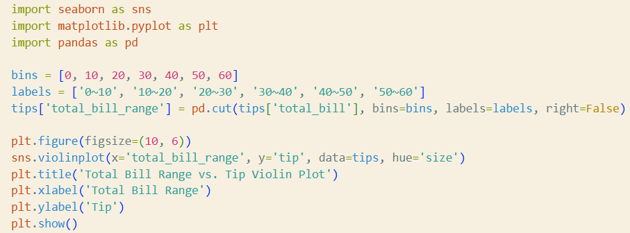
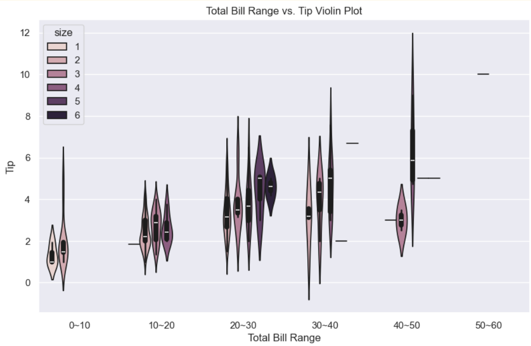
- violin 그래프: 값의 범위와 분포를 한 눈에 파악할 수 있도록 해주는 그래프