
📒 transform(전환)
- transform: 변환함수1 변환함수2 변환함수3...;
- transform의 단축함수
📍 transform: 원근법 이동 크기 회전 기울임;
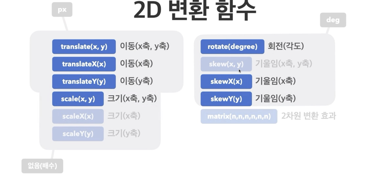
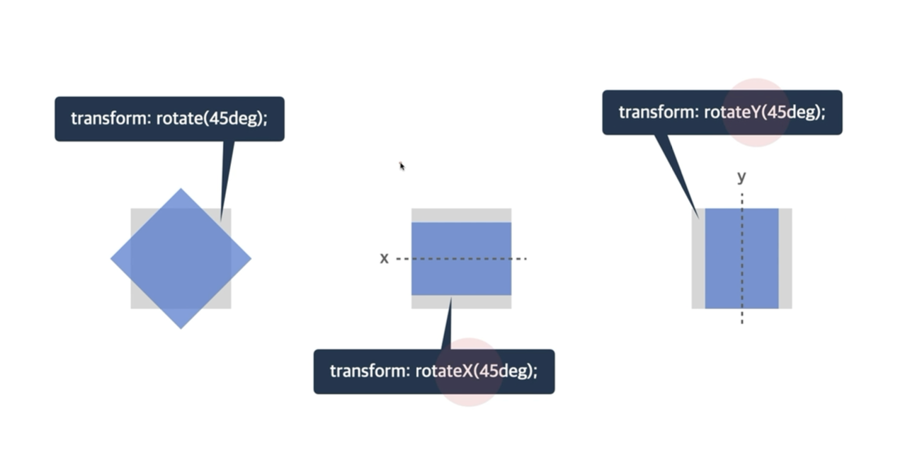
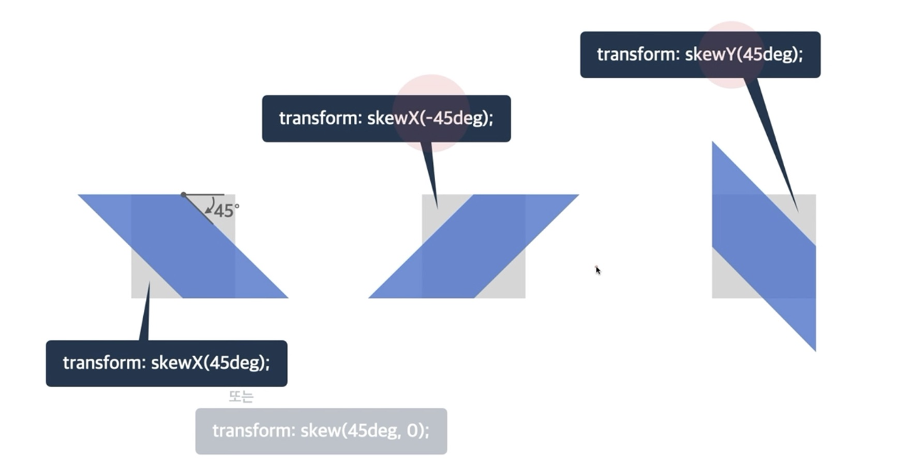
1. 2D 변환 함수
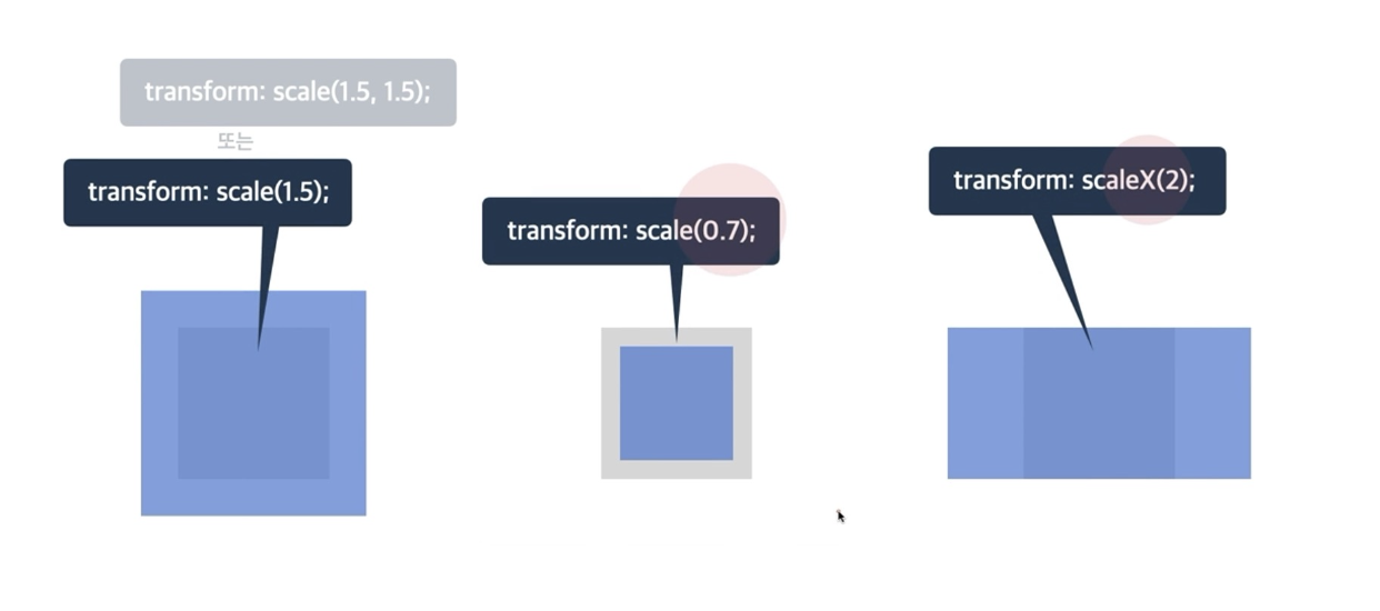
➡️ scale 은 1보다 크면 크게 만들고 1보다 작아지면 작게 만든다.
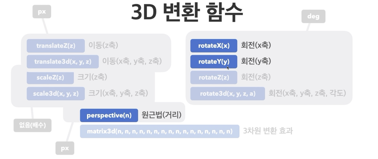
2. 3D 변환 함수
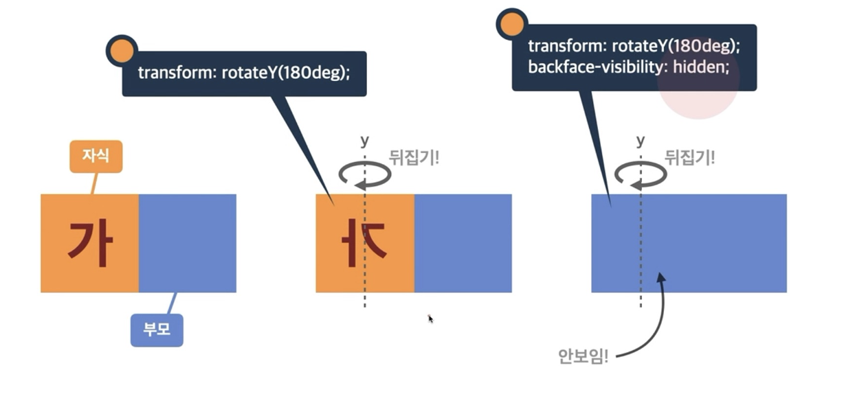
3. backface-visibility
- 3D 변환으로 회전된 요소의
뒷면 숨김 여부
예시코드
- 간단하게 어떤식으로 쓰이는지 css파일만 첨부
img{
  width: 300px;
  height: 300px;
}
.main{
  width: 300px;
  height: 300px;
  background-color: red;
}
/* translate : 이동 */
transform: translate(50px, 50px);
transform: translateX(20px);
transform: translate(65px,50px);

/*  -쪽으로도 움직일 수 있음*/
transforn: translate(-10px,20px)

/* scale : 크기조절 */
transform: scale(0.7);
transform: scaleX(1.5);

/* rotate : 회전 */
transform: rotate(45deg); 시계방향
/* -붙으면 반시계방향  */
transform:rotateX(45deg) : x축으로 회전

/* skew: 기울기 */
transform: skew(10deg, 237deg);
transform:skewX(10deg)
/* -> x축으로만 기울어짐   */


/* 3d */
transform: rotate3d(1, 1, 1, 1045deg);
/* x,y,z축임 */

/* 뒤집어졌을때 이미지를 안보여지게 하는 속성 */
transform: rotateY(180deg);
backface-visibility: hidden;
예시코드(transform)
<!DOCTYPE html>
<html lang="en">
<head>
    <meta charset="UTF-8">
    <meta name="viewport" content="width=device-width, initial-scale=1.0">
    <title>Document</title>
    <link rel="stylesheet" href="examtransform.css">
</head>
<body>
    <div class="main">
        <div class="image img1">
            <img src="naver.png" alt="naver">
        </div>
        <div class="image img2">
            <img src="git.png" alt="git">
        </div>
        <div class="image img3">
            <img src="velog.png" alt="velog">
        </div>
    </div>
</body>
</html>
img {
width: 300px;
height: 300px;
}
.main {
position: relative;
}
.image {
position: absolute;
transform: skewY(20deg);
}
.img1 {
top: 180px;
left: 100px;
z-index: 10;
}
.img2 {
top: 150px;
left:350px;
z-index: 5;
}
.img3 {
top: 120px;
left: 600px;
}실행결과
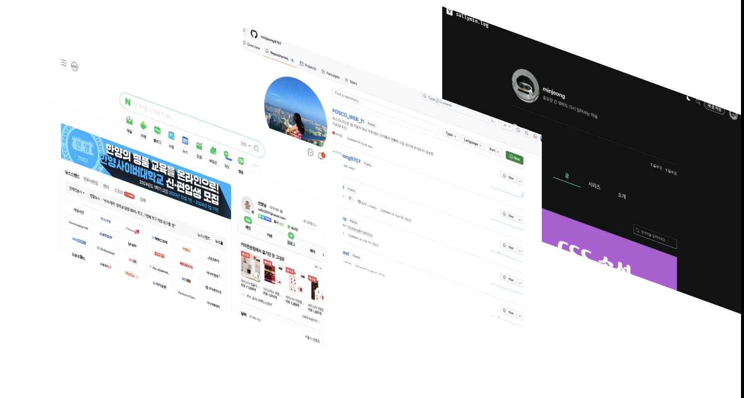
➡️ 구조적으로 생각해서 하는 연습을 꼭 해야한다.
📕 transition(전환)
- 요소의
전환(시작과 끝)효과를 지정하는 단축 속성 - 단축속성
transition하면 자동으로 어떤 자리에 어떤 값을 써야하는지 나오긴 한다.transition: 속성명 지속시간 타이밍함수 대기시간;
1. transition-duration (지속시간)
- 기본 단위가
초(s)이다.
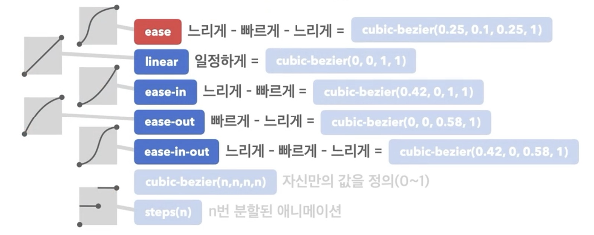
2. transition-timing-function (타이밍함수)
- 전환 효과의
타이밍(Easing)함수를 지정한다.
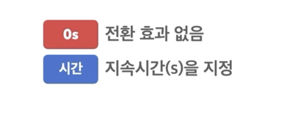
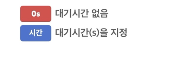
3. transition-delay (대기시간)
- 전환 효과가 몇 초 뒤에 시작할지 대기시간을 지정한다.
예시코드
<!-- transition 실습 -->
<!DOCTYPE html>
<html lang="en">
<head>
  <meta charset="UTF-8">
  <meta name="viewport" content="width=device-width, initial-scale=1.0">
  <title>Document</title>
  <link rel="stylesheet" href="index2.css">
</head>
<body>
  <h1>CSS transition</h1>
  <div class="box box1"></div>
  <div class="box box2"></div>
  <div class="box box3"></div>
  <div class="box box4"></div>

</body>
</html>.box{
height: 100px;
width: 100px;
cursor: pointer;
}
.box1:hover{
width: 400px;
background-color: brown;
opacity: 0.5;
transition-duration: 1s;
transition-timing-function: ease;
/* 마우스커서가 다가가면 0.5초있다가 변한다는 것 */
transition-delay: 0.5s;
}
.box2:hover{
background-color: pink;
transform:rotate(180deg);
transition: all 1s ease-in-out;
}
.box3:hover{
transform:scale(3) translate(100px,100px);
transition: all 3s ease-in-out;
}
.box4:hover{
transform:translate(-5px, -15px);
/* 영역에다가 그림자 효과(음영생김)
(x축,y축, 얼마나 뿌옇게할거냐(숫자올라가수록 더 진해짐),그림자색상) */
box-shadow: 4px 4px 10px #000800;
transition: all 0.2s ease-in;
}
.box1{
background-color: aquamarine;
}
.box2{
background-color: yellow;
}
.box3{
background-color: gray;
}
.box4{
background-color: palegoldenrod;
}
실행결과
🖊️ 동영상으로 결과를 보이기위해 port주소를 첨부하겠다.
https://minjeong9707.github.io/POSCO_WEB_11/video_comp/transition.html
📗 Animation
- 애니메이션에서 가장 중요한 것은
@keyframes이다.
1. @keyframes
- CSS의 애니메이션 효과를 개발자가 직접 지정하는 기능이다.
- 애니메이션의 중간 지점마다 CSS 속성 값을 지정하여 세밀하게 애니메이션 조절하는 기능이다.
- 키프레임을 변수에 선언하고 해당 변수를 CSS 에서 불러와서 사용할 수 있다!
- Keyframes 로 설정되는 값
- to/from
-from: 애니메이션의 시작 상태
-to: 애니메이션의 마지막 상태 - 0% ~ 100%
- to/from
2. Animation 속성
animation-name: keyframes로 지정한 애니메이션 이름animation-duration: 애니메이션 지속 시간animation-delay: 애니메이션이 작동되기까지 지연되는 시간(이 시간이 지나고 애니메이션 작동됌)animation-iteration-count: 애니메이션의 반복 횟수를 지정한다. 소수점 가능하고infinite으로도 설정가능하다.animation-timing-function: 애니메이션의 반복 형태
🖍️ 이 속성은transition-timing-function에서 쓰인 내용과 동일하다.animation-direction: 애니메이션의 방향
🖍️ 세부사항에는normal,reverse,alternate,alternate-reverse있다.
3. Animation 단축속성
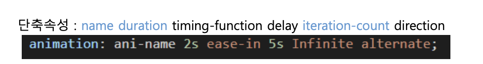
➡️ 파랑색 글씨는 필수속성이고 검은색 글씨는 선택속성이다.
예시코드_1
<!-- animation 실습 -->
<!DOCTYPE html>
<html lang="en">
<head>
  <meta charset="UTF-8">
  <meta name="viewport" content="width=device-width, initial-scale=1.0">
  <title>Document</title>
  <link rel="stylesheet" href="index3.css">
</head>
<body>
  <h1>animation</h1>
  <div class="box"></div>
  <div class="bounce-ball1"></div>
  <div class="bounce-ball2"></div>
</body>
</html>.box{
width: 100px;
height: 100px;
background-color:red;
position: relative;
animation-name: my-ani;
animation-duration: 2s;
animation-delay: 1s;
animation-iteration-count: 2;
animation-timing-function: ease-in-out ;
}
@keyframes my-ani{
0%{
left : 0px;
}
25% {
left:200px;
}
50%{
left: 400px;
}
75% {
left : 600px;
}
100%{
left: 0px;
}
}
.bounce-ball1{
position:relative;
left: 100px;
top: 0;
width: 100px;
height: 100px;
border-radius: 50%;
background-color: aquamarine;
/* animation 풀어쓰기 */
animation-name: bounce1;
animation-duration: 1s;
animation-timing-function: ease-in;
/* normal, reverse, alternate, alternate-reverse */
animation-direction: alternate;
animation-iteration-count: infinite;
/* 단축속성 */
animation: bounce1 1s ease-in infinite alternate;
}
@keyframes bounce1{
/* 0% */
to{
top:50px;
}
/* 100% */
from{
top:300px;
}
}
.bounce-ball2{
width: 50px;
height: 50px;
border-radius: 50%;
position: absolute;
background-color: pink;
animation: bounce2 2s infinite ;
}
/* 더 공이 튀기는 모양으로 보여짐 */
@keyframes bounce2{
/* 시작할때는 끝에 붙어있는 것 */
from,
to{
bottom: 0px;
animation-timing-function: ease-out;
}
/* 속도가 중간까지 느리게갔다가 빠르게 내려오고.. */
50%{
bottom: 300px;
animation-timing-function: ease-in;
}
}실행결과
📌 animation-timing-function의 세부사항에 따라 변화가 어떠한지, from/to 와 0~100%를 사용했을때의 차이, animation의 단축속성을 어떻게 쓰는지, 두개의 ball의 속도는 어떠한지 등을 중점으로 이 예시를 보면 좋을 것 같다.
https://minjeong9707.github.io/POSCO_WEB_11/video_comp/animation_ball.html
예시코드_2
- 실험 조건
: 키프레임을 사용해서 왼쪽 상단에서 시작해서 시계방향으로 사각형을 그리는 애니메이션을 완성해라.
단, 애니메이션 대상은 원이고 지속시간은 3초, 6번 반복된다.
예시코드_3
<!DOCTYPE html>
<html lang="en">
<head>
  <meta charset="UTF-8">
  <meta name="viewport" content="width=device-width, initial-scale=1.0">
  <title>Document</title>
  <link rel="stylesheet" href="prac3_animation.css">
</head>
<body>
  <div class="content">
    "As I relax on the sofa and gaze around a room a thought hits me: this is exactly the place I’ve been looking for all my life. A little hideaway in some sinkhole somewhere. I’d always thought of it as a secret, imaginary place, and can barely believe that it actually exists. I close my eyes and take a breath, and wonder of it all settles over me like a gentle cloud."
  </div>

</body>
</html>.content{
animation: text 2s linear 1s 1 ;
/* 아래 순서에 해당한다 참고. */
/* animation: name duration timing-function delay iteration-count; */
position: relative;
}
@keyframes text{
/* 애니메이션의 시작상태 */
from{
right:0;
width: 200%;
}
/* 애니메이션의 마지막 상태 */
to{
left: 0;
width: 100%;
}
}실행결과
https://minjeong9707.github.io/POSCO_WEB_11/video_comp/prac3_animation.html
마무리
css가 끝이 났다. 확실히 animation이나 transform 등을 적용하니 굉장히 입체로워진 것을 확인할 수 있었다.
트리구조를 생각하면서 레이아웃을 구성하는게 중요한데, 이게 익숙해질때까지 계속해서 코드를 보고 작성해봐야할 것 같다.
결론, 역시 css는 재밌다!

중요한 건 꺾여도 다시 일어서는 마음