레이아웃 할 때 중요한 부분이니 유의깊게 봐야한다!
1️⃣ 요소 쌓임 순서(stack order)
- 어떤 요소가 사용자와 더 가깝게 있는지(위에 쌓이는지) 결정한다.(기본값 static제외)
- static은 고정된 값이어서 z-index가 높은 수여도 위에 쌓이지 않음
- 1번의 조건과 같은 경우, z-index속성의 숫자 값이 높을수록 위에 쌓인다.
- 1번과 2번 조건까지 같은 경우, HTML의 다음 구조일수록 위에 쌓인다.
- 요소들을 겹치려면
position:relative와position:absolute를 빼먹지 말것!
(1) z-index
- 요소의 쌓임 정도를 지정한다.
static에서는 적용되지 않는다.- 쌓이는 것이기 때문에
position:relative와position:absolute가 필요하다.
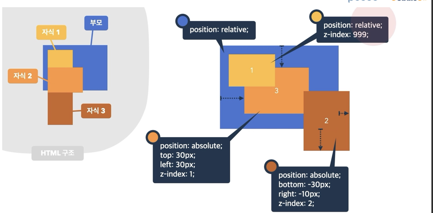 ➡️ 숫자가 높은 순서대로 앞으로 지정된다.
📌 position 속성의 값으로 absolute,fixed가 지정된 요소는 display 속성이 block으로 변경된다.
➡️ 즉, display:block를 하지 않아도 알아서 block 처리해준다.
예시 코드
<!-- z-index 예시 -->
<!DOCTYPE html>
<html lang="en">
<head>
  <meta charset="UTF-8">
  <meta name="viewport" content="width=device-width, initial-scale=1.0">
  <title>Document</title>
  <link rel="stylesheet" href="index.css">
</head>
<body>
  <div class="parent">
    <div class="circle circle1"></div>

    <div class="circle circle2"></div>
    <div class="circle circle3"></div>
    <div class="circle circle4"></div>
    <div class="circle circle5"></div>
  </div>
</body>
</html>.parent{
width: 500px;
height: 200px;
background-color: beige;
position: relative;
}
.circle{
border-radius: 50%;
width: 100px;
height: 100px;
position:absolute;
}
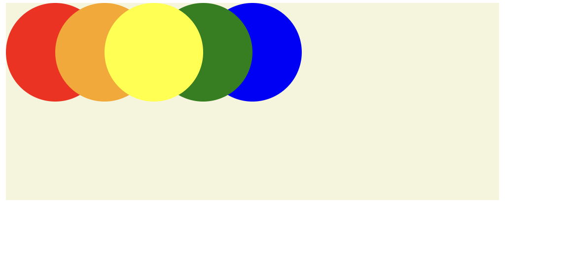
.circle1{
background-color: red;
left:0px;
z-index: 1;
}
.circle2{
background-color: orange;
left:50px;
z-index: 2;
}
.circle3{
background-color: yellow;
left:100px;
z-index: 3;
}
.circle4{
background-color: green;
left: 150px;
z-index: 2;
}
.circle5{
background-color: blue;
left: 200px;
z-index: 1;
}실행결과
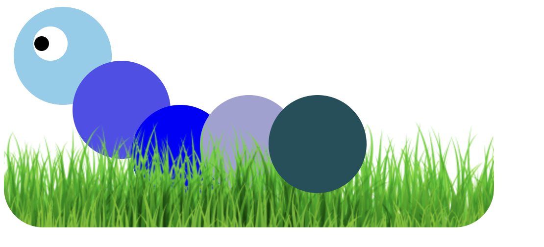
애벌레 만들기 실습 예시코드
<!-- 애벌레 -->
<!DOCTYPE html>
<html lang="en">
<head>
  <meta charset="UTF-8">
  <meta name="viewport" content="width=device-width, initial-scale=1.0">
  <title>Document</title>
  <link rel="stylesheet" href="ex_z-index2.css">
</head>
<body>
  <!--구조를 잘 생각해서 하위구조로 넣을 수 있는건 넣자-->
  <div class="parent">
    <div class="circle circle1">
      <div class = "eye-white">
        <div class = "eye-black"></div>
      </div>
    </div>

    <div class="circle circle2"></div>
    <div class="circle circle3"></div>
    <div class="circle circle4"></div>
    <div class="circle circle5"></div>
    <div class="circle circle6"></div>
    <div class="circle circle7"></div>
    <img src="grass.png" alt="잔디사진">
  </div>

</body>
</html>.parent{
position: relative;
}
.circle{
border-radius: 50%;
width: 100px;
height: 100px;
position: absolute;
}
.circle1{
left: 10px;
top:10px;
background-color: skyblue;
}
.eye-white{
border-radius: 50%;
/* 후손도 모두 따라오기 때문에 이땐, realative, absolute 상관없다. */
position: relative;
z-index: 5;
left:20px;
top:20px;
height: 35px;
width: 35px;
background-color: white;
}
.eye-black{
border-radius: 50%;
position: relative;
z-index: 6;
left: 1px;
top: 10px;
height: 15px;
width: 15px;
background-color: black;
}
.circle4{
z-index: 2;
background-color: rgb(79, 79, 237);
left:70px;
top:65px;
}
.circle5{
z-index: 3;
background-color: blue;
left: 130px;
top: 110px;
}
.circle6{
z-index: 4;
background-color: rgb(161, 161, 212);
left: 200px ;
top: 100px;
}
.circle7{
z-index: 5;
background-color: rgb(21, 80, 92);
left: 270px;
top:100px;
}
img{
z-index: 4;
border-radius: 40px;
top:110px;
position:relative;
}실행결과
2️⃣ 배경
1. background-color
transparent: 투명함- 색상만 넣으면 해당 색이 배경색으로 변경
2. 백그라운드에 그라데이션 삽입
📍 background : linear-gradient()
• 색상1|색상2:상하로 색 2개 지정
• 방향|색상1|색상2 : 해당방향으로 색상 2개 지정(ex: 90deg blue red)
• 방향|색상1|색상1의 비중|색상2 : 색상1의 비중을 %로 지정
• 방향|색상1|색상2|색상3:색상 3개 사용
예시 코드
<!DOCTYPE html>
<html lang="en">
<head>
  <meta charset="UTF-8">
  <meta name="viewport" content="width=device-width, initial-scale=1.0">
  <title>그라데이션</title>
  <link rel="stylesheet" href="index2.css">
</head>
<body>
  <div>
    <div class = "grad grad-1"></div>
    <div class = "grad grad-2"></div>
    <div class = "grad grad-3"></div>
    <div class = "grad grad-4"></div>
    <div class = "grad grad-5"></div>

  </div>
</body>
</html>.grad{
width: 300px;
height: 300px;
margin-bottom: 30px;
}
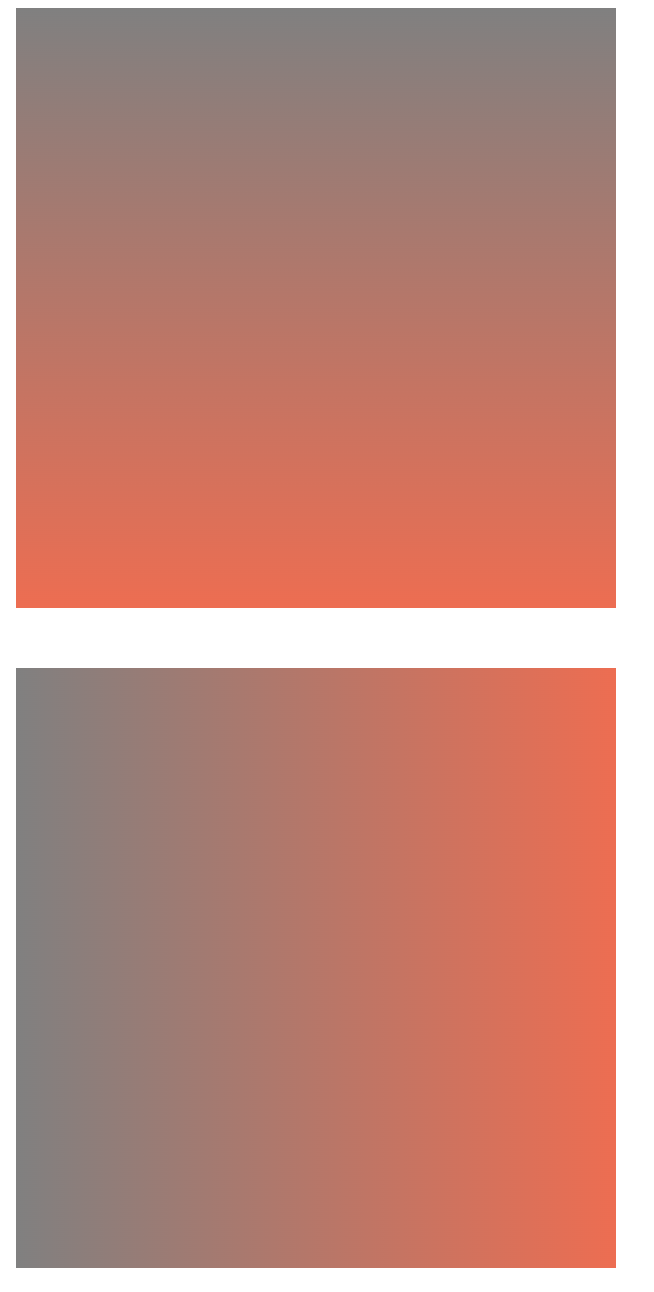
.grad-1{
background: linear-gradient(gray, tomato);
}
.grad-2{
/* 90도 돌려서 보임 */
background: linear-gradient(90deg, gray, tomato);
}
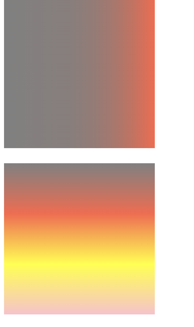
.grad-3{
/* 영역비중을 설정할 수 있음 */
background: linear-gradient(90deg, gray,80%,tomato);
}
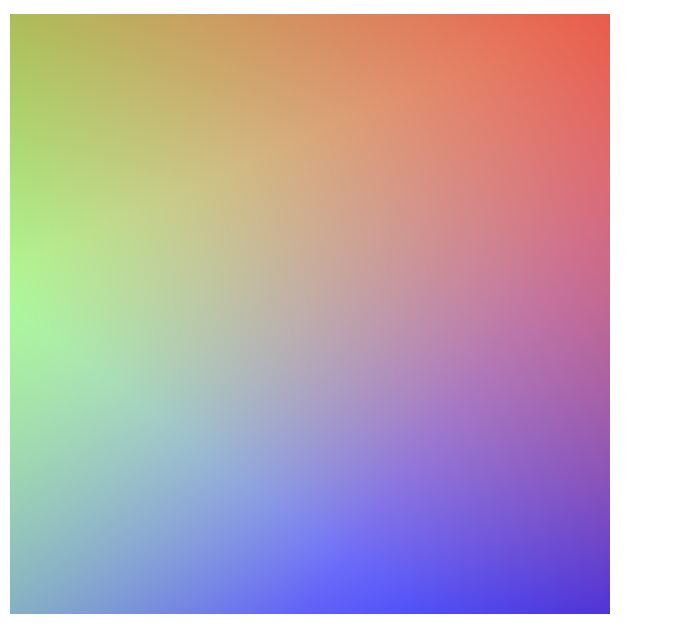
.grad-4{
/* 위에서부터 쭉 내려오는거 확인가능 */
background: linear-gradient(gray,tomato,yellow,pink);
}
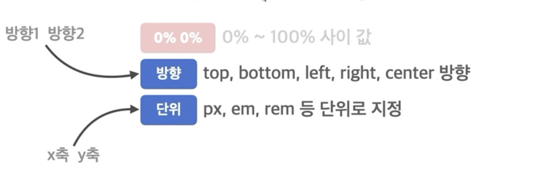
.grad-5{
background: linear-gradient(217deg, rgba(255,0,0,.8), rgba(255,0,0,0) 70.71%),
linear-gradient(127deg, rgba(0,255,0,.8), rgba(0,255,0,0) 70.71%),
linear-gradient(336deg, rgba(0,0,255,.8), rgba(0,0,255,0) 70.71%);}
실행결과
➡️ 코드 순으로 결과이다.
3. background-image
- 요소의 배경이미지 삽입
none: 이미지 없음url("경로"): 이미지 경로
4. background-repeat
- 요소의 배경이미지 반복
repeat: 이미지를 수직, 수평 반복(기본값)repeat-x: 이미지를 수평 반복repeat-y: 이미지를 수직 반복no-repeat: 반복 없음
5. background-position
- 요소의 배경이미지 위치
6. background-size
- 요소의 배경이미지 크기
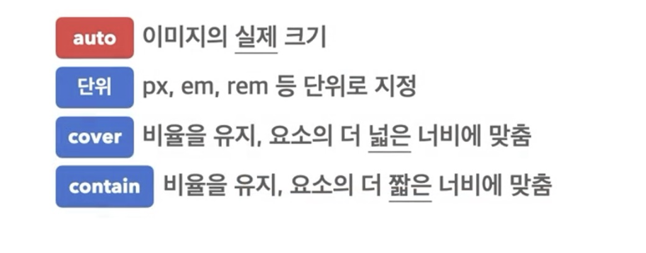
📌cover와contain차이점
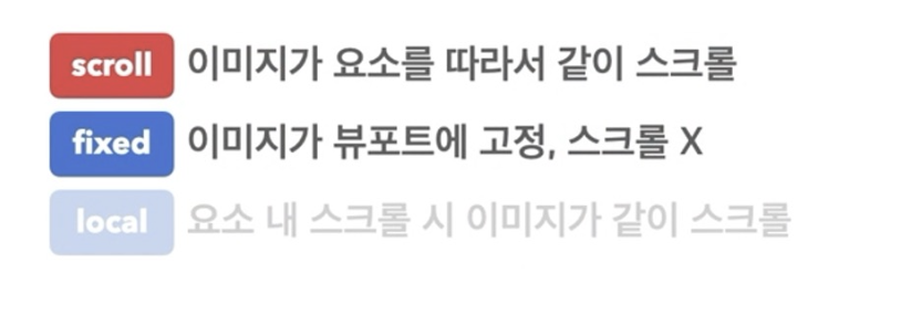
7. background-attachment
- 요소의 배경이미지 스크롤 특성
예시코드
<!DOCTYPE html>
<html lang="en">
<head>
  <meta charset="UTF-8">
  <meta name="viewport" content="width=device-width, initial-scale=1.0">
  <title>Document</title>
  <link rel="stylesheet" href="ex_background.css">
</head>
<body>
  <div></div>
</body>
</html>div{
/*background-image의 기본값은 이미지가 반복됌 */
background-color: orange;
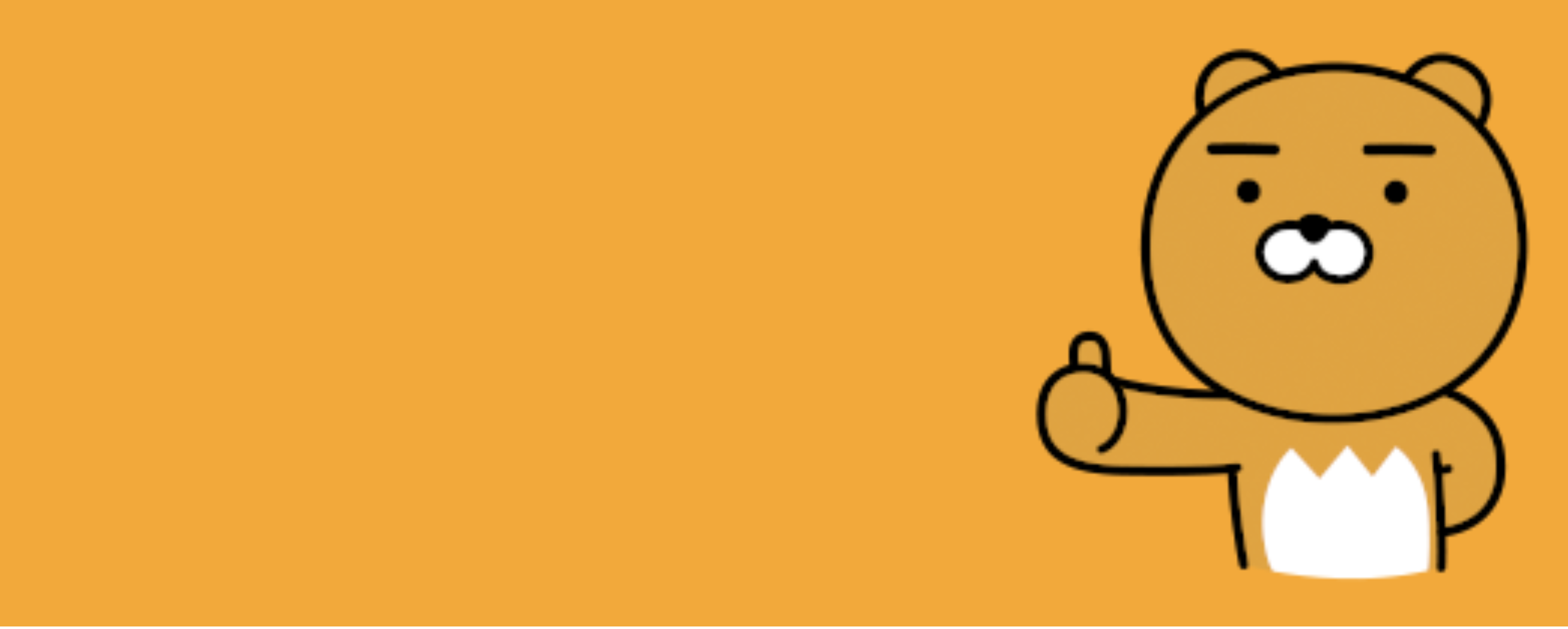
background-image: url("https://item.kakaocdn.net/do/d84248170c2c52303db27306a00fb861f604e7b0e6900f9ac53a43965300eb9a");
/* 100%, 100vw하면 너비의 전체에 이미지가 다 보여짐. */
width: 100vw;
height: 500px;
background-repeat: no-repeat;
/* background-position : 배경 이미지 위치 설정 */
background-position: bottom right;
/* background-repeat : 배경이미지 반복에 대해 설정가능 */
/* background-repeat: repeat-x; */
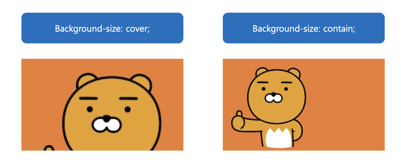
background-size: cover;
/* background-attachment : 배경이미지 스크롤 설정 */
background-attachment: scroll;
}실행결과
(1) background-size: cover; & background-attachment: scroll; 했을 경우
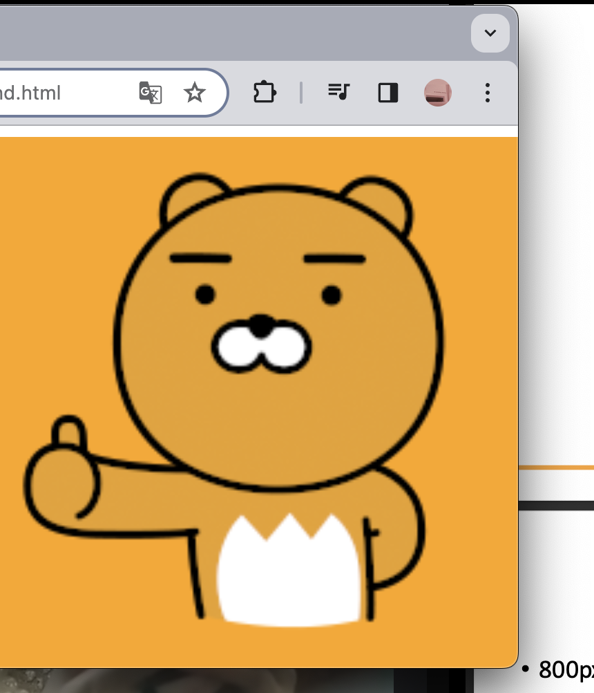
(2) background-size: contain; & background-attachment: scroll; 경우
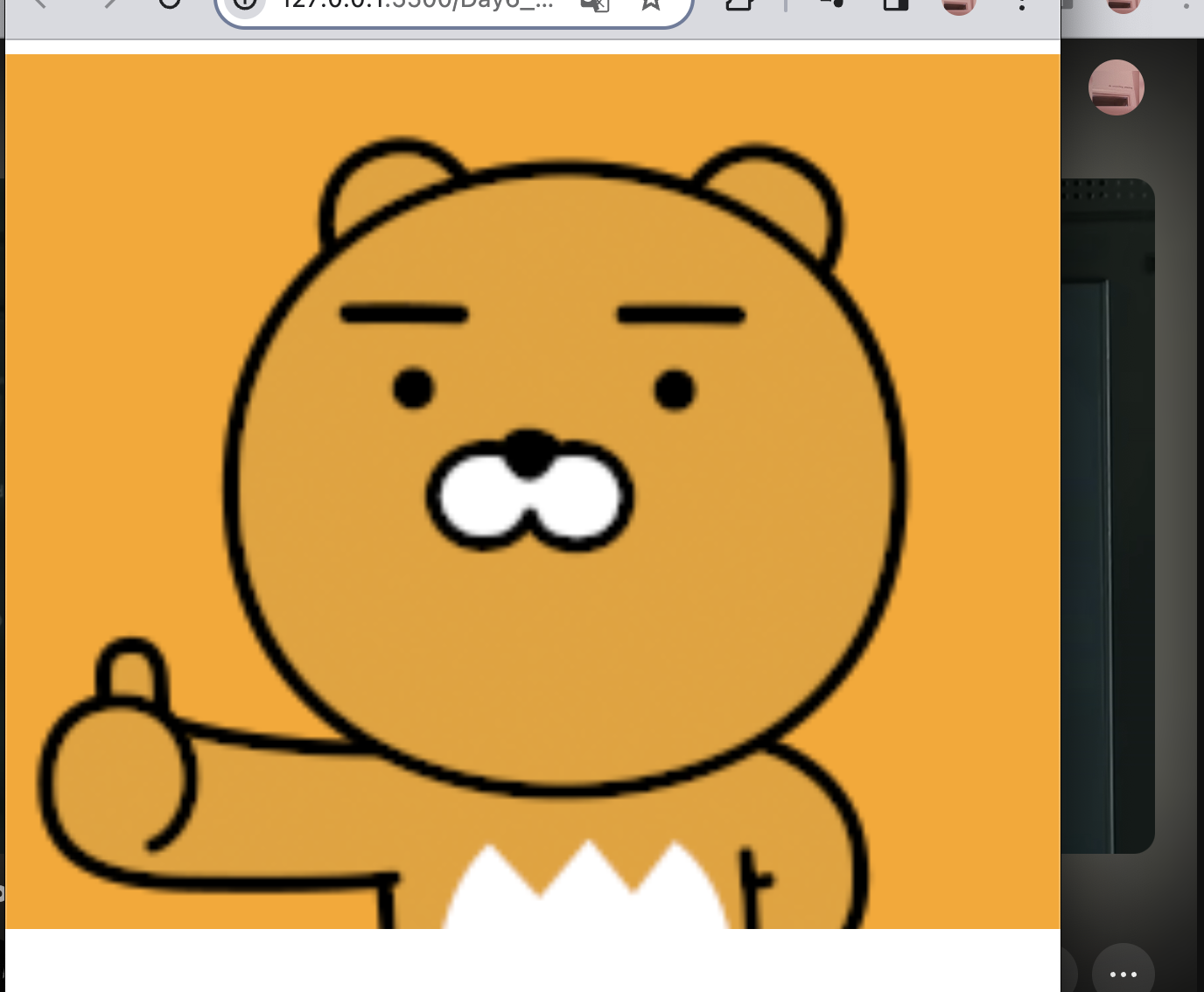
(3) background-size: contain; & background-attachment: fixed ; 경우
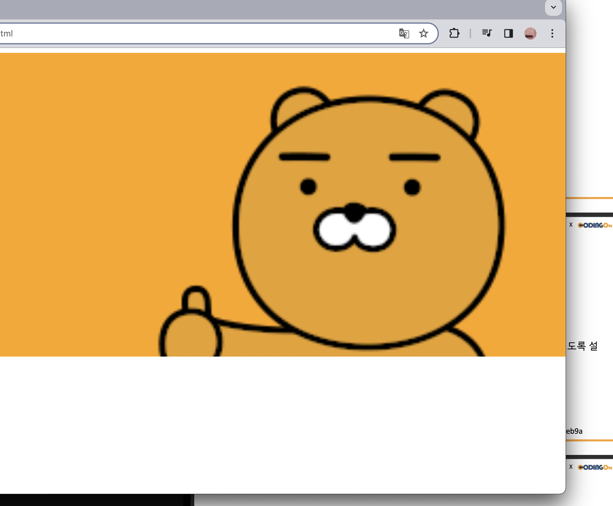 ➡️ 화면을 늘렸을 때 모습
 ➡️ 화면을 줄여도 라이언 전체 모습이 다 보임
(4) background-size: cover; & background-attachment: fixed;
 ➡️ 뷰포트를 계속해서 움직였을때 더 넓은 너비에 맞추기 때문에 라이언이 다 보이지 않고 계속해서 움직인다.(뒤에 배경을 통해 계속 뷰포트의 크기를 변경했음을 확인할 수 있다.)
3️⃣ display
부모에다가 display:flex 를 써야 자식들이 정렬이 된다.
(마치 inline-block처럼)
1. flex
📌 flex는 레이아웃을 구성할 때 매우! 중요한 요소이다. 완벽숙지를 해야할 필요가 있다.
- flex로 안하면 display가 모두 block 형태여서 수평 정렬하려면 추가 작업이 필요했다.
- 하지만,
display:flex;를 사용하면 수평정렬, 수직정렬, 센터 배치 등 편하게 할 수 있다.
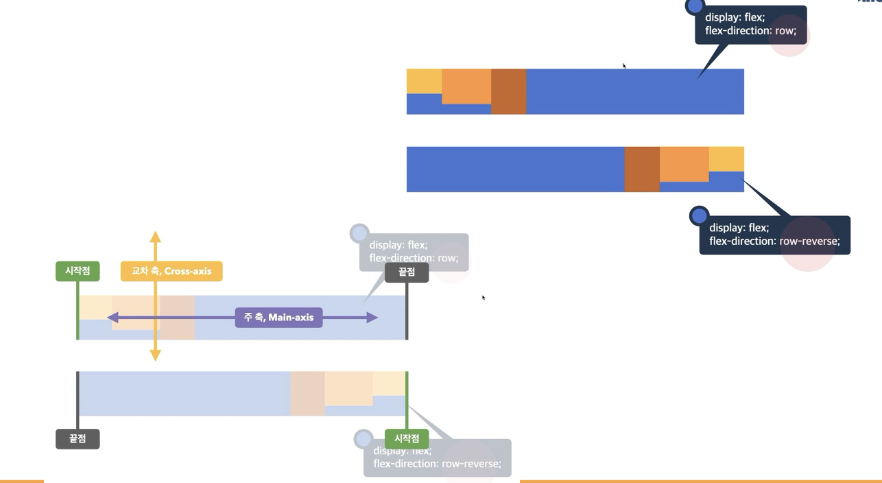
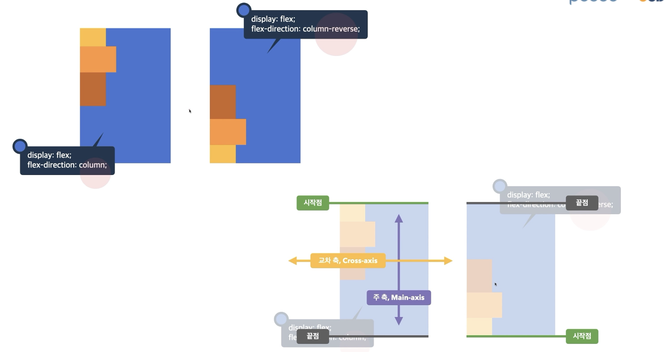
2. flex-direction
- 주 축을 설정
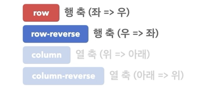 ➡️ 기본값은 row이다.
예시코드
<!DOCTYPE html>
<html lang="en">
<head>
  <meta charset="UTF-8">
  <meta name="viewport" content="width=device-width, initial-scale=1.0">
  <title>Document</title>
  <link rel="stylesheet" href="prac_flex1.css">
</head>
<body>
  <div class = "container">
    <div class = "item1"></div>
    <div class = "item2"></div>
    <div class = "item3"></div>
  </div>
</body>
</html>.container{
background-color: bisque;
width: 500px;
height: 500px;
display: flex;
/* flex-direction : row가 기본값 */
/* 세로 방향에서 끝점을 기준으로 쌓이도록 설정 */
flex-direction: column-reverse;
/* 세로 방향에서 시작점을 기준으로 쌓이도록 설정 */
/* flex-direction: column; */
/* 가로 방향에서 끝점을 기준으로 쌓이도록 설정 */
/* flex-direction: row-reverse; */
}
.item1{
width: 100px;
height: 100px;
background-color: rebeccapurple;
}
.item2{
width: 100px;
height: 100px ;
background-color: aquamarine;
}
.item3{
width: 100px;
height: 100px;
background-color: burlywood;
}실행결과
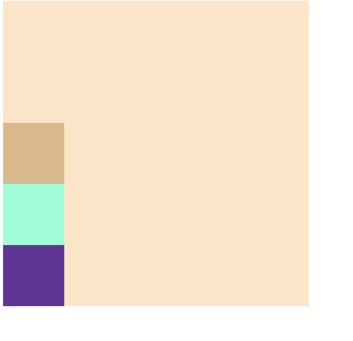
flex-direction: column-reverse; 해당
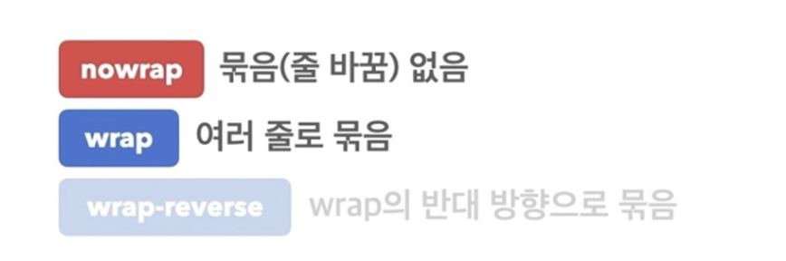
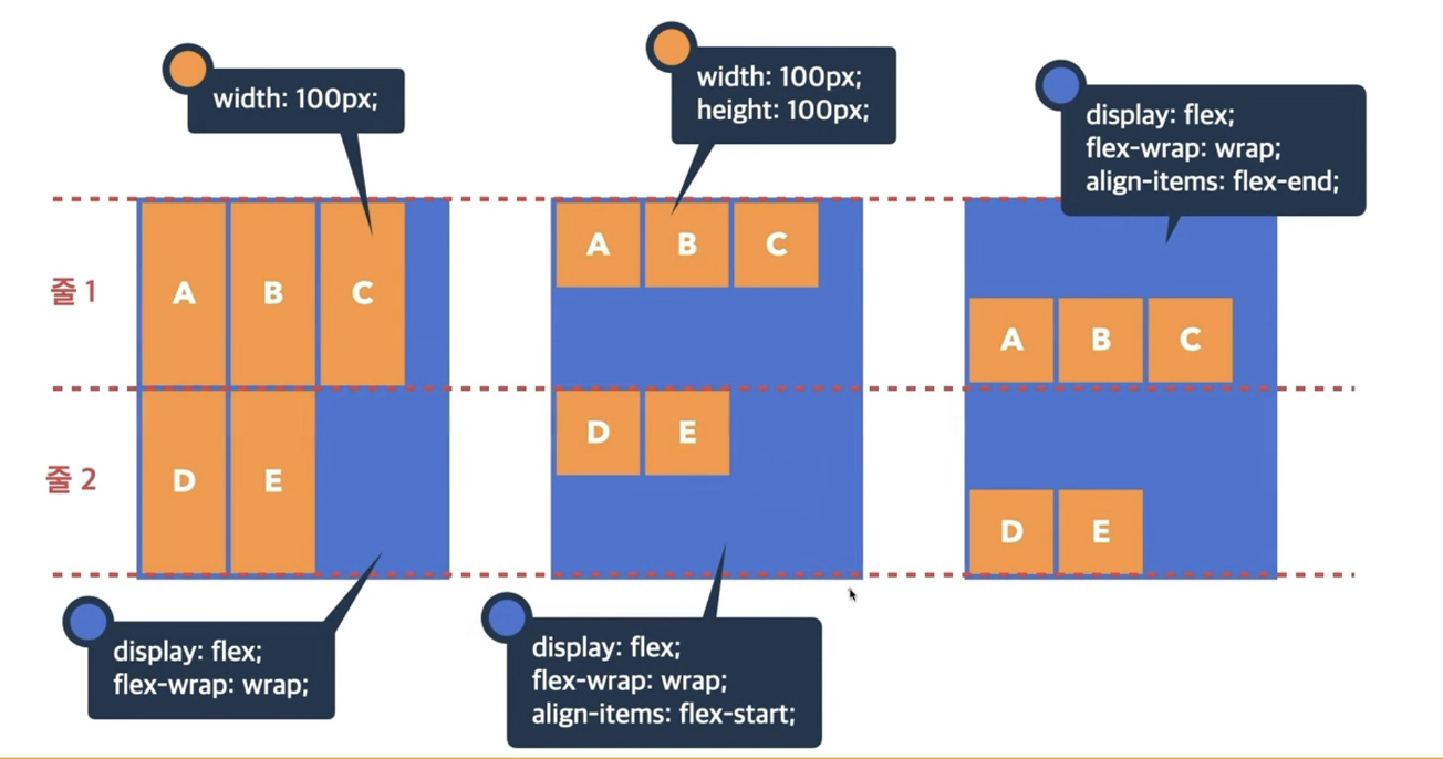
3. flex-wrap
- flex items 묶음(줄 바꿈) 여부
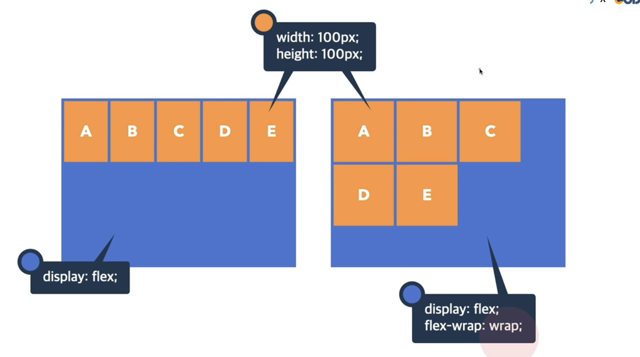 ➡️ 왼쪽 그림처럼
 wrap을 하지 않으면 뷰포트를 줄였을 때, items의 형태가 망가지면서 의도하는 바와 다르게 된다.
➡️ 따라서,flex-wrap:wrap;을 통해 줄바꿈을 하더라도 items의 형태가 변화가 없게 만들 때 쓰인다.
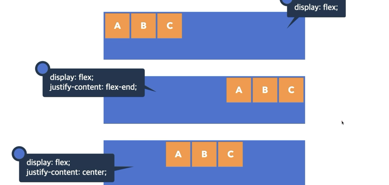
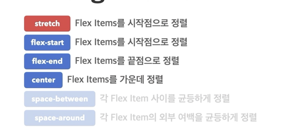
4. justify-content
- 주 축의 정렬 방법
- 말그대로 주 컨텐츠의 정렬 방법이다.
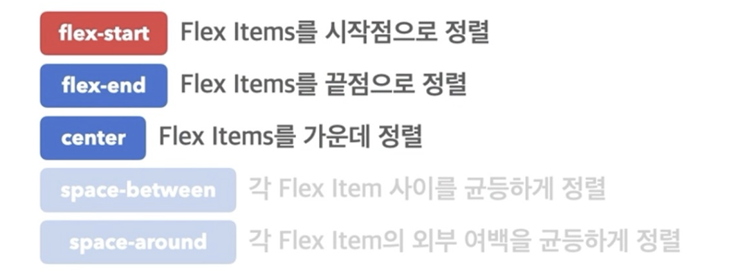
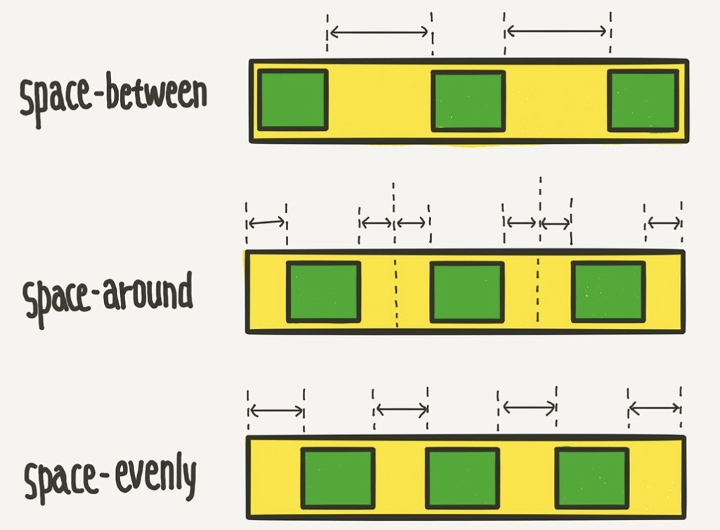
➡️justify-content: space-between;: 양 끝에 여백 동일하게 해서 붙는다. (축의 정렬을 flex-direction과 헷갈리지 말것)
➡️justify-content: space-evenly;: 여백이 완전히 균등하게 배분된다.
➡️justify-content: space-around;: 각 flex item의 외부 여백을 균등하게 정렬한다.
[주의]
📌 justify-content: flex-end; : 이 방법은 끝점에 순서대로 뒤에 붙지만, flex-direction에서 끝점을 기준으로 쌓으려면 reverse(row-reverse)를 사용해야해서 순서가 뒤바뀐다(=시작점이 다름).
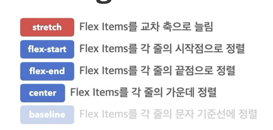
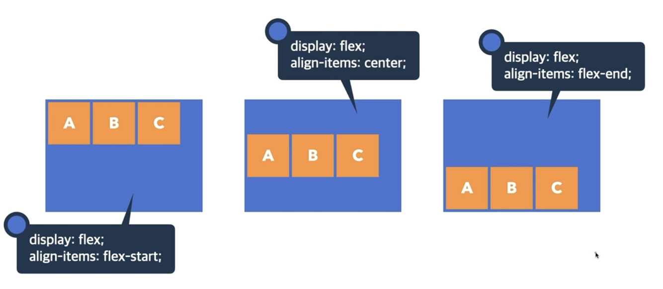
5. align-items
- 교차 축의 한 줄 정렬 방법
 ➡️
➡️ flex-start는 기본값이다.
➡️ 단 한 줄 일때, 위아래 축을 정렬한다.
6. align-content
- 교차 축의 여러 줄 정렬 방법
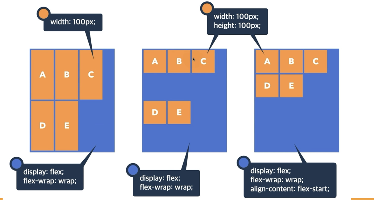
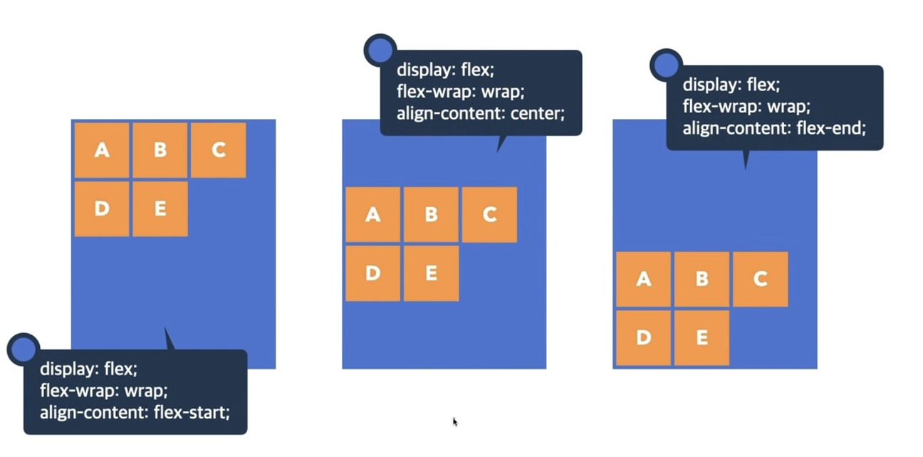 ➡️ 여러줄일때, 위아래 축의 정렬을 설정한다.
➡️ 여러줄이기 때문에, 형태가 변할 수 있어서flex-wrap:wrap;을 같이 써야한다.
📌 당연히 align-items과 align-content는 둘 중 하나만 쓰는 것이다.
예시 코드
<!DOCTYPE html>
<html lang="en">
<head>
  <meta charset="UTF-8">
  <meta name="viewport" content="width=device-width, initial-scale=1.0">
  <title>Document</title>
  <link rel="stylesheet" href="prac_display.css">
</head>
<body>
  <div class = "container">
    <div class = "item item1"></div>
    <div class = "item item2"></div>
    <div class = "item item3"></div>
    <div class = "item item4"></div>
    <div class = "item item5"></div>
    <div class = "item item6"></div>
    <div class = "item item7"></div>
    <div class = "item item8"></div>


  </div>

</body>
</html>.container{
width: 500px;
height: 500px;
display: flex;
background-color: beige;
/* direction으로 방향설정, 공통 */
flex-direction: column;
justify-content: center;
/* 컨테이너 안에 한줄이 되도록 설정*/
/* flex-wrap:nowrap; */
/* align-items: center; */
/* justify-content: center; */
/* 컨테이너 안에 두줄이 되도록 설정 */
/* 하나로 뭉치기 */
/* align-content: center;
flex-wrap:wrap; */
/* 각각의 flex 줄에 적용 */
align-items: center;
flex-wrap: wrap;
}
.item{
width: 100px;
height: 100px;
/* border-color: black; */
border: 2px solid black;
}
.item1{
background-color: red;
}
.item2{
background-color: orange;
}
.item3{
background-color: yellow;
}
.item4{
background-color: green;
}
.item5{
background-color: blue;
}
.item6{
background-color: peru;
}
.item7{
background-color: palegreen;
}
.item8{
background-color: purple;
}실행결과
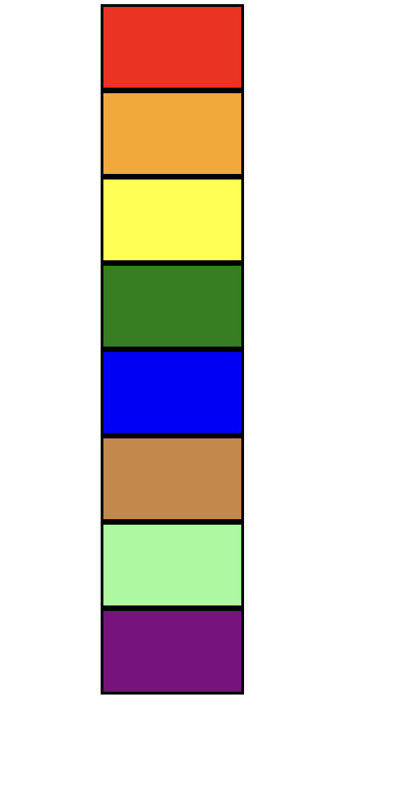
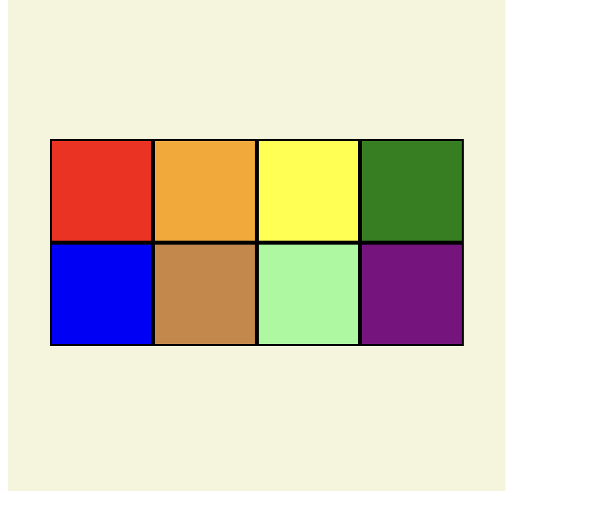
(1) 컨테이너 안에 한줄이 되도록 설정했을 경우(가로)
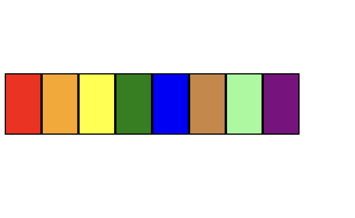
(2) 컨테이너 안에 한줄이 되도록 설정했을 경우(세로)
(3) 컨테이너 안에 두줄이 되도록 설정했을 경우(세로) & 각각의 flex줄에 정렬
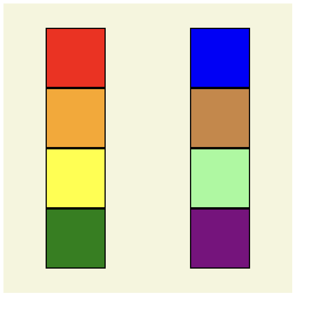
(4) 컨테이너 안에 두줄이 되도록 설정했을 경우(가로) & 각각의 flex줄에 정렬
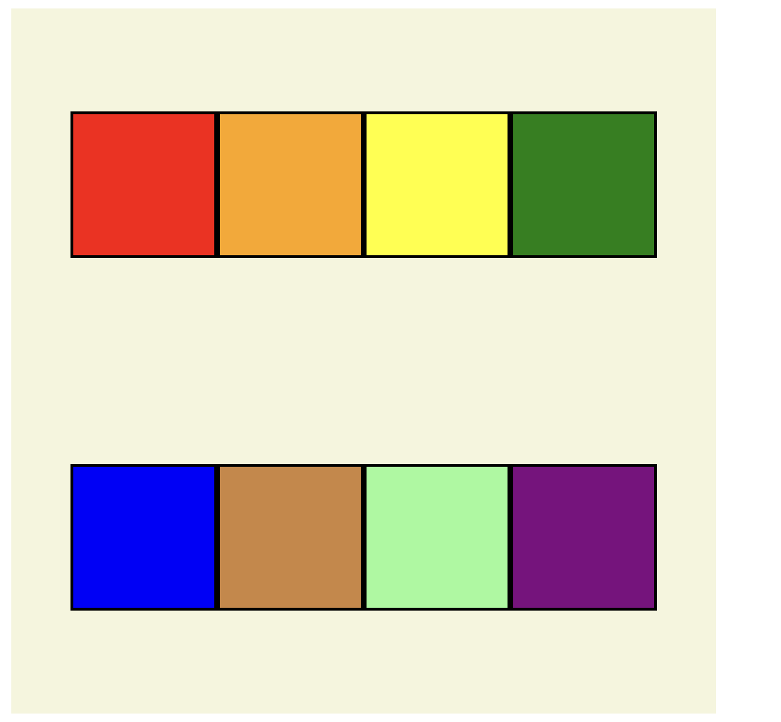
(5) 컨테이너 안에 두줄이 되도록 설정했을 경우(세로) & 해당 아이템을 하나로 뭉쳐서 정렬
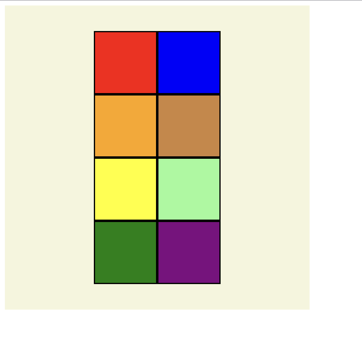
(6) 컨테이너 안에 두줄이 되도록 설정했을 경우(가로) & 해당 아이템을 하나로 뭉쳐서 정렬
예시코드
<!-- flex를 이용한 header만들기 실습 -->
<!DOCTYPE html>
<html lang="en">
<head>
  <meta charset="UTF-8">
  <meta name="viewport" content="width=device-width, initial-scale=1.0">
  <title>flex이용한 header만들기</title>
  <link rel="stylesheet" href="flex_prac2.css">
</head>
<body>
  <h3>Flex를 이용해 여러 종류의 Header를 만들어보자!</h3>
  <div class = "container1">
      <div class = "logo1">LOGO</div>
      <div class = "menu1">
        <div>MENU1</div>
        <div>MENU2</div>
        <div>MENU3</div>
    </div>
  </div>

  <div class="container2">
    <div class = "menu1">MENU1</div>
    <div class = "menu2">MENU2</div>
    <div class = "menu3">MENU3</div>


  </div>
  <div class="container3">
    <div class = "logo2">LOGO</div>
    <div class = "menu7">
      <div>MENU1</div>
      <div>MENU2</div>
      <div>MENU3</div>
    </div>
    <div class = "logo3">LOGIN</div>

  </div>
  <div class = "head">
     <div>header4는 선택입니다!</div>
  </div>

  <div class="container4">
    <div class  = "menu4">
      <div>LOGO</div>
      <div>MENU1</div>
      <div>MENU2</div>
      <div>MENU3</div>
    </div>
    <div class = "login4">
      <div>LOGIN</div>
      <div>SIGNUP</div>
    </div>


  </div>

</body>
</html>
body > div{
margin-left: 0px;
font-weight: bold;
}
h3{
text-align: center;
}
.container1{
background-color: rgb(207, 204, 204);
width: 100vw;
height: 50px;
display: flex;
justify-content: space-between;
align-items: center;
padding: 0px 10px;
}
.menu1{
/* 한줄(일자)로 만들 수 있음 */
display: flex;
}
.menu1 div:nth-child(2){
margin: 0px 10px;
}
.container2{
background-color: rgb(207, 204, 204);
width: 100vw;
height: 50px;
display: flex;
justify-content: space-between;
align-items: center;
padding: 0px 10px;
margin-top: 10px;
}
.container3{
background-color: rgb(207, 204, 204);
width: 100vw;
height: 50px;
display: flex;
justify-content: space-between;
align-items: center;
padding: 0px 10px;
margin-top: 10px;
}
.container3 .menu7{
display: flex;
}
.container3 div:nth-child(2){
margin:0px 10px;
}
.container4{
background-color: rgb(207, 204, 204);
width: 100vw;
height: 50px;
display: flex;
/* 양 옆으로 붙음 */
justify-content: space-between;
align-items: center;
/* 양쪽 끝에 padding값이 들어감 */
padding: 0px 10px;
margin-top: 10px;
}
.menu4{
display: flex;
}
.menu4 div:nth-child(2n){
margin:0px 10px;
}
.login4 div:first-child{
margin: 0px 10px;
}
.login4{
display:flex;
}
.head {
width: 100vw;
height: 25px;
display:flex;
justify-content: center;
background-color: pink;
align-items: center;
padding: 0px 10px;
margin-top: 10px;
}
실행결과
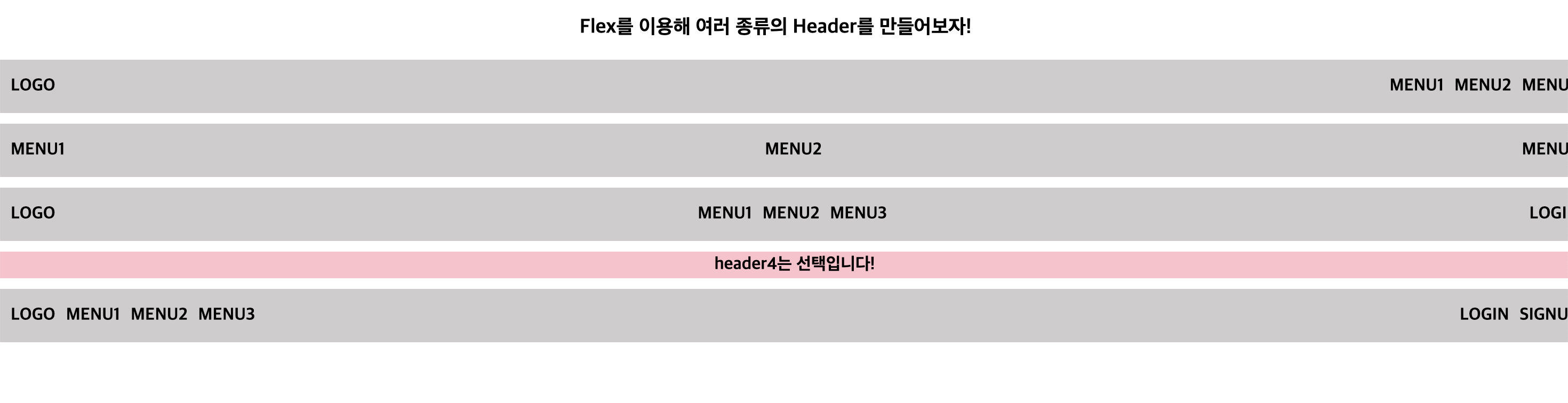
➡️ position을 쓰지 않고도 만들 수 있다.
➡️ 중간에 주석처리로 많이 설명해놨으니 꼭 참고하자.
마무리
css가 마무리 되어간다.. flex가 정말 많이 쓰인다고 들었다. 웹사이트를 하나 정해서 똑같이 만들어보는 연습을 시작할 수 있을 것 같다.
레전드 zindex랑 position 찾다가 너 글 나왔네 ㅋㅋㅋㅋㅋㅋㅋㅋㅋㅋㅋㅋㅋㅋㅋㅋㅋㅋㅋㅋㅋ