
" 기술통계와 추론통계란 "
기술통계
수집한 데이터를 하나의 값으로 정리 / 요약 / 해석 / 표현,
ex) 평균, 중앙값, 분산, 표준편차 등
한 눈에 파악할 수 있어 흐름을 빠르게 이해하고 결정할 수 있음
추론통계
표본으로 전체를 "추정"
- 장점 : 전체를 조사하지 않아도 됨
- 단점 : 항상 불확실성이 존재 (표본 오류 등)
모집단 : 내가 알고 싶은 전체 대상
전수조사 : 모집단을 전부 다 조사
- 현실적으로 불가능, 시간/비용/노력의 한계
표본 : 모집단의 일부
표본조사 : 모집단에서 일부만 추출하여 조사, 모집단을 추정
표본을 잘 뽑는 것이 중요 !
- 표본이 모집단을 대표할 수 있어야 함
- 분석의 정확성과 결과의 신뢰성에 영향을 미침
" 데이터 분석의 3가지 목적 "
" 요약 "
많은 데이터를 하나로 요약하여 한 번에 파악하기 위함
방법
- 숫자 : 평균, 중앙값, 최빈값 등
- 그림 : 막대그래프, 히스토그램 등
- 모양과 패턴 즉시 확인 가능
" 설명 "
"무슨 일이 일어났는지" 보다는 "왜 그런 일이 일어났는지 찾는 것"
- 내부요인과 외부요인 모두 탐색 필요
" 예측 "
기존(과거) 데이터를 기준으로 예측, 확률적 패턴 기반 추정
- 100% 확실하지는 않음
" 도수분포표 "
요약 도구
- 패턴 확인 : 도수분포표
- 모양 확인 : 시각화
- 대표값 : 평균, 중앙값, 최빈값
도수분포표
- 숫자 더미를 구간(계급)별 표로 바꿔 패턴을 드러냄
단계
- min & max 찾기 : 범위(range) 확인
- 구간(bins, 계급)나누기 : 5cm, 10점 등 일정 간격
- 계급값 정하기 : 구간의 대표값 (ex. 145 ~ 150 → 147)
- 도수 세기 : 각 구간의 개수 (=각 구간에 속하는 data 개수)
- 합산 = 전체 data 개수
- 상대도수 : 구간 비율 (= 도수 / 전체)
- 누적도수 : 아래에서 위로 누적된 비율
- 마지막 값이 1이어야 함
data = {
    '계급' : ['145~150', '150~155', '155~160', '160~165', '165~170', '170~175'],
    '도수' : [1, 15, 54, 85, 39, 6]
}
df = pd.DataFrame(data)
df['상대도수'] = df['도수']/(df['도수'].sum())
df['누적도수'] = df['상대도수'].cumsum()  # cumsum() = 누적합 함수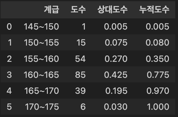
도수분포표를 히스토그램으로 변환
- 도수분포표 : '숫자' → '표', 히스토그램 : '표' → '그림'
- 도수분포표의 각 행 = 히스토그램 막대 1개
- 구간(가로축)과 도수(세로축)만 있으면 즉시 시각화 가능
fig = plt.figure(figsize=(8,6), facecolor='k')
ax= fig.add_subplot()
ax.patch.set_facecolor('k')
plt.bar(df['계급'], df['도수'], color = '#7FFFD4')
plt.title('중학생 키 도수분포표', color = 'white')
plt.xlabel('키 구간 (cm)', color = 'white')
plt.xticks(color='white')
plt.ylabel('학생 수', color = 'white')
plt.yticks(color = 'white')
plt.gca().set_axisbelow(True)
plt.grid(axis='y', color = 'lightgray', linewidth = 0.3)
plt.show()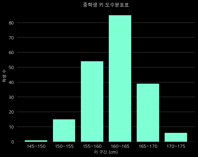
인사이트
- 최빈 구간 : 160~165, 약 42.2%
- 중앙값 : 가장 많은 구간 → 160~165 구간에 위치
- 약 97%가 170cm 미만 (누적도수 0.9698)
- 패턴 : 가운데가 두툼한 종 모양 (정규분포형)
" 시각화 조건 "
데이터 및 변수의 유형에 따라 그래프 종류가 달라짐
범주형(문자형) 변수(Categorical)
- 범주(종류, 카테고리)로만 구분되는 데이터
- 예 : 성별 (남/여), 혈액형 (A/B/O/AB), 결제수단(카드/현금) 등
- 숫자 계산 불가, 비율과 빈도로만 요약
연속형(수치형) 변수(Continuous)
- 숫자로 표현, 중간값이 무한히 존재하는 데이터
- 예 : 키 (161.1cm), 몸무게 (48.5kg) 등
- 숫자 계산 가능, 평균, 중앙값, 표준편차 등으로 요약
이산형(수치형) 변수(Discrete)
- 숫자지만 딱딱 떨어지는 값, 소수점 없음, 세어지는 값
- 예 : 주사위 (1,2,3,4,5,6), 하루 방문자 수 (10명, 20명) 등
변수의 개수에 따라 그래프 종류가 달라짐
- 일변량 : 분포와 비율
- 이변량 : 관계
- 다변량 : 추가 시각화


" 막대 그래프 "
막대 그래프
- 범주형 데이터의 빈도, 비율, 수치를 막대의 길이나 높이로 표현한 그래프
- 각 막대는 하나의 범주(category)를 나타냄
특징
- 데이터 유형
- x축 : 범주형 데이터 (예: 과일 종류, 지역, 성별 등)
- y축 : 수치형 데이터(예: 개수, 매출액, 비율 등)
- 막대 방향
- 세로형 : 가장 일반적, x축 = 범주, y축 = 값
- 가로형 : 범주 이름이 길 때 사용
- 막대 간 간격 : 막대끼리 간격이 있음 (연속형 → 히스토그램)
종류
- 단일 막대 그래프
- 그룹형(Clustered) 막대 그래프
- 한 범주 내에서 여러 값을 비교 (지역별 남/녀 인구 비교)
- 누적(Staked) 막대 그래프
- 한 막대를 여러 부분으로 나눠 구성 비율 비교
- 한 막대의 전체 길이는 실제 값의 총합
- 100% 누적 막대 그래프
- 데이터를 비율로 환산해서 반영
- 각 막대의 전체 길이는 항상 동일(=100%)
장점
- 해석이 쉽고 직관적, 범주별 비교에 적합
- 항목별 크기 차이, 우세한 카테고리, 상대적 순위 한눈에 파악
단점
- 너무 많은 범주가 있으면 복잡해짐
- 해결 : 상위 몇개만 보여주거나, 필요한 항목만 보여줌
- 시간 흐름(추세) 분석에는 선그래프(line chart)가 더 적합
# 누적 막대 그래프
fig = plt.figure(figsize=(8,6), facecolor='k')
ax= fig.add_subplot()
ax.patch.set_facecolor('k')
pay_counts = df['pay_method'].value_counts()
plt.bar(pay_counts.index, pay_counts.values, width = 0.4, edgecolor = 'black', color = '#7FFFD4')
plt.bar(pay_counts.index, pay_counts.values * 0.5,  width = 0.4, edgecolor = 'black', color = '#00BFFF')
plt.title('Payment Method Distribution', color='w')
plt.xlabel('Method', color='w')
plt.xticks(color='w')
plt.ylabel('Count', color='w')
plt.yticks(color='w')
plt.gca().set_axisbelow(True)
plt.grid(axis='y', color = 'lightgray', linewidth = 0.3)
plt.show()

# 그룹형 막대 그래프
fig = plt.figure(figsize=(8,6), facecolor='k')
ax= fig.add_subplot()
ax.patch.set_facecolor('k')
sns.countplot(data=df, x='pay_method', hue = 'gender', order = ['QuickPay', 'Cash', 'Card'], dodge=True, palette={'Male':'#7FFFD4', 'Female':'#00BFFF'})
plt.title('Payment Method Distribution', color='w')
plt.xlabel('Method', color='w')
plt.xticks(color='w')
plt.ylabel('Count', color='w')
plt.yticks(color='w')
plt.gca().set_axisbelow(True)
plt.grid(axis='y', color = 'lightgray', linewidth = 0.3)
plt.show()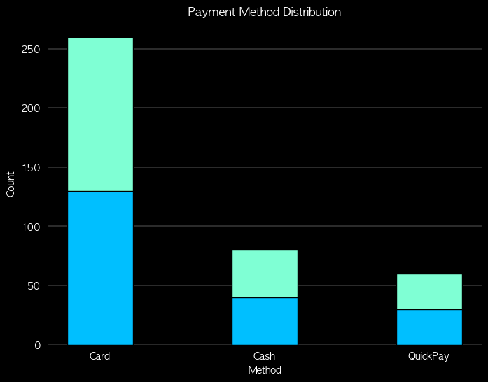 |
 |
" 원 그래프 "
원 그래프
- 파이 차트, 주로 범주형 데이터의 구성 비율 비교에 활용
- 원 전체를 100%로 보고, 각 범주의 비율을 원의 조각으로 나타낸 그래프
- 각 조각의 크기가 해당 범주의 비율(%)을 의미
특징
- 모든 조각의 데이터 값의 합 = 데이터 값 전체의 합
- 모든 조각의 데이터 비율의 합 = 100%
종류
- 도넛 차트
- 파이 차트 가운데를 뚫어서 강조, 여러 개 겹쳐 쓰기도 함
- 3D 파이차트
- 입체 효과 (하지만 시각적 왜곡 때문에 권장되지 않음)
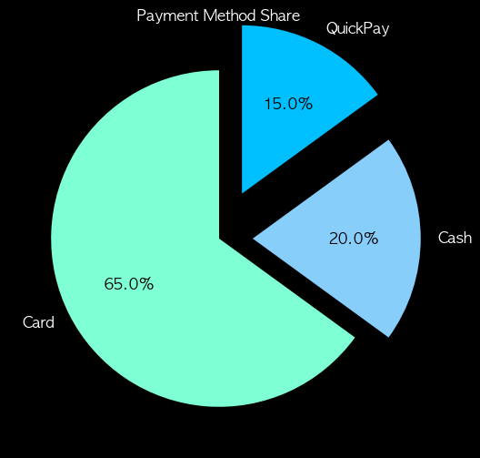
- 폭발형 파이차트
- 특정 조각을 원에서 띄워 강조
장점
- 직관적 : 전체 중 각 항목이 얼마나 차지하는지 한눈에 보임
- 강조 효과 : 특정 부분을 강조할 때 효과적 (예: 점유율 1위 기업)
- 단순함: 항목이 적을 때 비율 표현에 적합
단점
- 항목이 많을 때 해석 불가
- 조각이 많으면 글씨 겹치고 비교 어려움
- 비슷한 값 비교 어려움
- 21% vs 23% 같은 차이는 거의 안 보임
- 정확한 수치 파악에 부적합
- "얼마나 차지한다"는 감만, 정확한 수치는 막대 그래프
사용하기 적절한 경우
- 항목 개수가 3~6개 정도일 때
- “부분/전체” 관계를 보여주고 싶을 때 (시장 점유율, 예산 비율)
- 강조하려는 항목이 확실히 클 때
fig = plt.figure(figsize=(8,6), facecolor='k')
ax= fig.add_subplot()
ax.patch.set_facecolor('k')
colors = ['#7FFFD4', '#87CEFA', '#00BFFF']
wedges, texts, autotexts = plt.pie(pay_counts.values, labels=pay_counts.index, autopct='%1.1f%%', startangle=90, colors=colors, textprops={'color': 'w', 'fontsize': 12})
plt.title('Payment Method Share', color='w')
# autopct 텍스트의 색상 변경
for text in autotexts:
    text.set_color('k')
plt.show()

# 폭발형
fig = plt.figure(figsize=(8,6), facecolor='k')
ax= fig.add_subplot()
ax.patch.set_facecolor('k')
colors = ['#7FFFD4', '#87CEFA', '#00BFFF']
wedges, texts, autotexts = plt.pie(pay_counts.values, labels=pay_counts.index, autopct='%1.1f%%', startangle=90, colors=colors, textprops={'color': 'w', 'fontsize': 12}, explode = [0, 0.2, 0.3])
plt.title('Payment Method Share', color='w')
# autopct 텍스트의 색상 변경
for text in autotexts:
    text.set_color('k')
plt.show()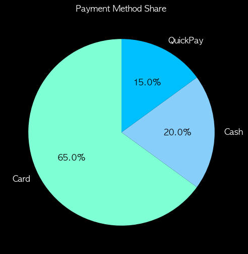 |
 |
" 기타 범주형 그래프 "
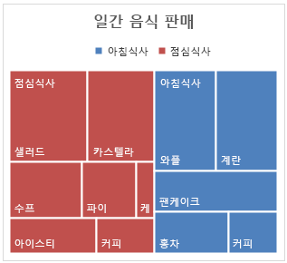
트리맵
- 범주형 데이터의 계층 구조와 비율을 사각형 면적으로 나타냄
- 전체 영역 = 전체 데이터
- 각 사각형 = 하나의 항목 또는 하위 항목
- 면적 크기 = 값 또는 비율
특징
- 계층 구조 표현 가능 → 범주 안의 하위 범주까지 표현 가능
- 비율 비교 직관적 → 큰 항목은 큰 사각형, 작은 항목은 작은 사각형
- 항목 수가 많아도 표현 가능 → 파이 차트보다 효율적
모자이크 플롯
- 범주형 데이터의 교차 분포(Cross-tab)를 시각화하는 그래프
- 각 사각형의 너비와 높이가 범주별 빈도(또는 비율)를 나타냄
- 두 개 이상의 범주 간 관계를 한눈에 볼 수 있음
특징
- 가로축, 세로축 모두 범주형 데이터
- 면적 = 관측치 개수 또는 비율
- 범주 간 상호작용, 비율 차이 확인에 유용
from statsmodels.graphics.mosaicplot import mosaic
import matplotlib.pyplot as plt

# 데이터
data_dict = {('남자','예'): 30,
             ('남자','아니오'): 70,
             ('여자','예'): 20,
             ('여자','아니오'): 80}

# 색상 매핑
colors = {
    ('남자','예'): '#B2F7EF',
    ('남자','아니오'): '#7FFFD4',
    ('여자','예'): '#66CDAA',
    ('여자','아니오'): '#00CED1'
}

# Figure 생성 (배경 검정)
fig = plt.figure(figsize=(8,6), facecolor='black')
ax = fig.add_subplot(111)
ax.set_facecolor('black')

# 모자이크 플롯
mosaic(data_dict, gap=0, ax=ax,
       properties=lambda key: {'facecolor': colors[key], 'edgecolor': None})

# 제목
plt.title("성별과 흡연 여부 모자이크 플롯 (Mint~Blue)", color='white', fontsize=16)

# 축 제거 + 텍스트 색상 흰색으로 변경
ax.tick_params(colors='white', which='both')  # 눈금, 숫자 색상 흰색
ax.xaxis.label.set_color('white')
ax.yaxis.label.set_color('white')
plt.axis('off')

plt.show()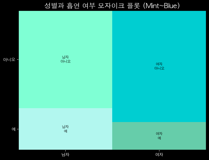
| 특징 | 모자이크 플롯 | 트리맵 |
|---|---|---|
| 용도 | 범주형 데이터의 교차 관계/빈도 | 계층적 데이터의 크기/비율 비교 |
| 변수 | 주로 범주형 값 (빈도) | 주로 수치형 값 (크기) |
| 계층 | 분할된 사각형 | 내포된 사각형 |
| 예시 | 하드 드라이브 폴더 크기 | 성별에 따른 타이타닉 생존율 |
" 히스토그램 "
히스토그램
- 연속형 데이터의 분포를 시각화하는 그래프
- 데이터를 구간(bin, 구획)으로 나누고, 각 구간에 속하는 데이터의 빈도(횟수) 또는 비율을 막대의 높이로 표현
- 연속형 데이터의 분포(모양, 중심, 퍼짐, 왜도) 직관적으로 확인
특징
- 막대그래프와의 차이점
- 막대그래프: 범주형 데이터(카테고리) 빈도를 표현
- 히스토그램: 연속형 데이터를 구간으로 나눠서 표현
- 막대가 서로 붙어 있음 (연속적이기 때문)
- 빈도 vs 상대도수
- y축 = 단순 빈도 or 전체 데이터 대비 비율(%)
- 구간(bin)의 크기 중요
- 너무 크면 → 분포가 뭉뚱그려짐, 세부적인 특성이 안 보임
- 너무 작으면 → 분포가 지나치게 세분화, 노이즈처럼 보임
- 구간 개수 k = (1 + 3.322 * log10(n)), 스터지스 공식
- 평균 / 중앙값 / 표준편차와 함께 봐야 강력함
해석
- 대칭형 → 평균 근처에 몰려 있고 정규분포 형태일 수 있음
- 왼쪽으로 치우침(왼쪽 꼬리 김) → 왜도 < 0
- 오른쪽으로 치우침(오른쪽 꼬리 김) → 왜도 > 0
- 여러 봉우리 → 다봉형 분포 (여러 집단이 섞여 있을 가능성)
fig = plt.figure(figsize=(8,6), facecolor='k')
ax= fig.add_subplot()
ax.patch.set_facecolor('k')
plt.hist(df['height_cm'], bins=15,range = (160, 180), density = True, histtype = 'bar', edgecolor='#00BFFF', color = '#7FFFD4', linewidth = 0.7)
plt.title('Histogram of Height (cm)', color='w')
plt.xlabel('Height (cm)', color='w')
plt.xticks(color='w')
plt.ylabel('Count', color='w')
plt.yticks(color='w')
plt.gca().set_axisbelow(True)
plt.grid(axis='y', color = 'lightgray', linewidth = 0.3)
plt.show()
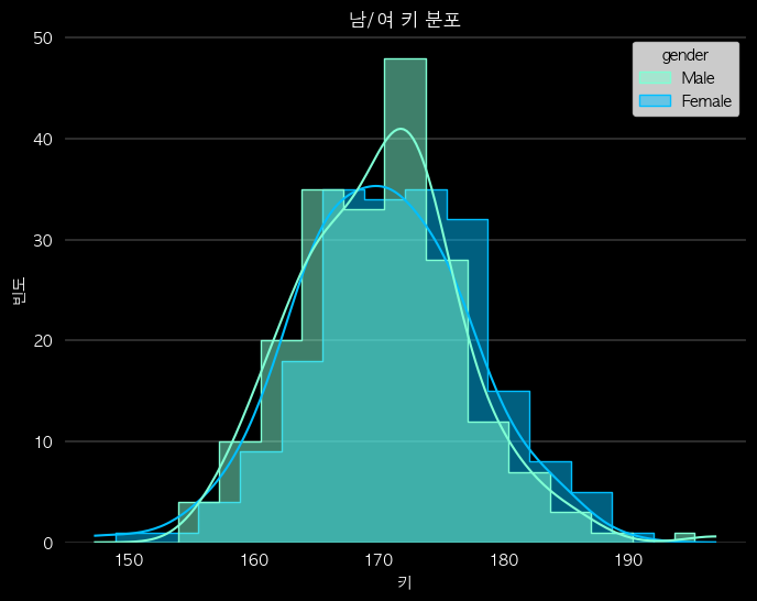
# hue로 그룹 구분 및 밀도 곡선 추가한 계단식
fig = plt.figure(figsize=(8,6), facecolor='k')
ax= fig.add_subplot()
ax.patch.set_facecolor('k')
sns.histplot(data = df, x='height_cm', bins=15, hue = 'gender', kde=True, stat='count', multiple = 'dodge', element = 'step', palette={'Male':'#7FFFD4', 'Female':'#00BFFF'})
plt.title('남/여 키 분포', color='w')
plt.xlabel('키', color='w')
plt.xticks(color='w')
plt.ylabel('빈도', color='w')
plt.yticks(color='w')
plt.gca().set_axisbelow(True)
plt.grid(axis='y', color = 'lightgray', linewidth = 0.3)
plt.show()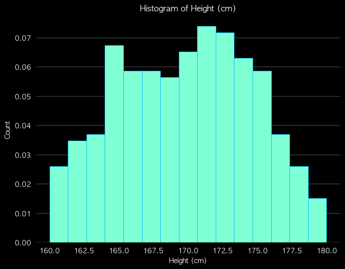 |
 |
" 박스플롯 "
박스플롯
- 연속형 데이터의 분포(흩어짐)와 중심, 이상치(outlier), 대칭성을 한눈에 볼 수 있는 그래프
- 데이터의 안정성을 직관적으로 보여줌
- 데이터를 사분위수(quartile)로 나누어 상자와 수염 형태로 표현
구성요소
- Lower Whisker (최솟값 역할)
- Q1 − 1.5 × IQR 보다 크거나 같은 값 중에서 가장 작은 값
- "극단적인 이상치" 제외 최솟값
- 제1사분위수(Q1, 25%)
- 상자(Box), 사분위수범위(IQR)
- Q1 ~ Q3 범위 → Q3 - Q1, 데이터의 중간 50%
- 상자가 길수록 데이터가 흩어져 있다는 의미
- 중앙값(Median, Q2)
- 데이터의 가운데 값 (50%)
- 상자 안쪽에 굵은 선으로 표시
- notch(노치, 홈) : 중앙값의 신뢰구간(보통 95%)
- 제3사분위수(Q3, 75%)
- Upper Whisker (최댓값 역할)
- Q3 + 1.5 × IQR 보다 작거나 같은 값 중에서 가장 큰 값
- "극단적인 이상치" 제외 최댓값
- 이상치(Outlier)
- 수염 바깥에 있는 점들 → 특이값
해석
- 박스가 작고 수염이 짧음 → 평균 근처에 몰림 (안정적)
- 박스가 크고 수염이 길음 → 들쭉날쭉 (변동성이 큼)
- 중앙값이 가운데 → 대칭적 분포
- 중앙값이 아래쪽 → 오른쪽 꼬리 (왜도 > 0)
- 중앙값이 위쪽 → 왼쪽 꼬리 (왜도 < 0)
fig = plt.figure(figsize=(8,6), facecolor='k')
ax= fig.add_subplot()
ax.patch.set_facecolor('k')
colors = ['#7FFFD4', '#00BFFF']
grouped = [df.loc[df['gender']=='Male','spend_10k'],
           df.loc[df['gender']=='Female','spend_10k']]
bplot = plt.boxplot(grouped, labels=['Male','Female'], showfliers=True, patch_artist=True, whiskerprops=dict(linewidth=0.7), capprops=dict(linewidth=0.7), medianprops={'color': 'w', 'linewidth':0.7}, notch = True)
for patch, color in zip(bplot['boxes'], colors):
    patch.set_facecolor(color)
for whisker, color in zip(bplot['whiskers'], [colors[0], colors[0], colors[1], colors[1]]):
    whisker.set(color=color, linewidth=1.2)
for cap, color in zip(bplot['caps'], [colors[0], colors[0], colors[1], colors[1]]):
    cap.set(color=color, linewidth=1.2)
for flier, color in zip(bplot['fliers'], colors):
    flier.set(marker='o', markeredgecolor=color, markersize=3)
plt.title('Spend (10k KRW) by Gender', color='w')
plt.xlabel('Gender', color='w')
plt.xticks(color='w')
plt.ylabel('Spend (10k KRW)', color='w')
plt.yticks(color='w')
plt.gca().set_axisbelow(True)
plt.grid(axis='y', color = 'lightgray', linewidth = 0.3)
plt.show()

# 결제수단별 박스플롯
import numpy as np
import matplotlib.pyplot as plt
import seaborn as sns
import matplotlib
import matplotlib.collections as mcoll

fig, ax = plt.subplots(figsize=(8,6), facecolor='k')
ax.set_facecolor('k')
ax.patch.set_facecolor('k')
colors = ['#7FFFD4', '#87CEFA', '#00BFFF']

flierprops = dict(
    marker='o',
    markerfacecolor='none',  # 내부 채우기 없애기
    markeredgewidth=0.7,
    markersize=3,
    markeredgecolor='#AFEEEE'    # 원하는 색
)

sns.boxplot(
    data=df, x='gender', y='spend_10k',
    showfliers=True, hue = 'pay_method',
    dodge = True, palette=colors, medianprops={'color': 'w', 'linewidth':0.7},
    boxprops={'edgecolor':'none'}, notch = True, flierprops=flierprops, ax=ax)

line_colors = ['#7FFFD4', '#7FFFD4','#7FFFD4', '#7FFFD4','w','k','#7FFFD4', '#7FFFD4','#7FFFD4', '#7FFFD4','w','k',
               '#87CEFA', '#87CEFA', '#87CEFA', '#87CEFA','w','k','#87CEFA', '#87CEFA', '#87CEFA', '#87CEFA','w','k',
               '#00BFFF', '#00BFFF', '#00BFFF', '#00BFFF','w','k','#00BFFF', '#00BFFF', '#00BFFF', '#00BFFF','w','k']

for i, line in enumerate(ax.lines):
    line.set_color(line_colors[i])
    line.set_linewidth(0.7)

# 스타일 정리
ax.set_title('Spend (10k KRW) by Gender', color='w')
ax.set_xlabel('Gender', color='w')
ax.set_ylabel('Spend (10k KRW)', color='w')
ax.tick_params(colors='w')
ax.grid(axis='y', color='lightgray', linewidth=0.3)
plt.show()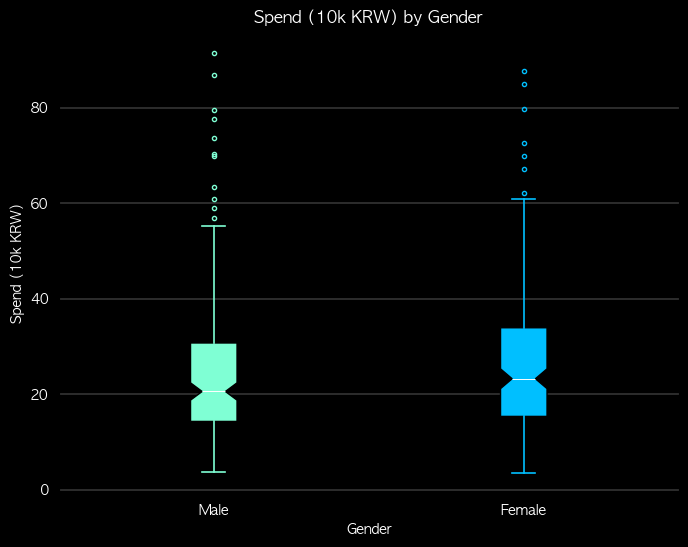 |
 |
" 산점도 "
산점도
- 두 연속형 변수 간의 관계를 시각화하는 데 사용되는 그래프
- 두 변수를 좌표평면 위에 점(dot)으로 표시하여 관계와 분포를 한눈에 파악
특징
- 상관 관계 파악 : 인과 관계는 파악할 수 없음
- 양의 상관 관계 : 우상향
- 음의 상관 관계 : 우하향
- 상관 관계가 없음 : 무작위로 흩어져있음
- 패턴 확인
- 선형 / 비선형 관계, 군집(Cluster) 등
- 이상치(Outliers) 식별
- 다른 점들과 확연히 떨어져 있는 점들을 쉽게 발견
장점
- 직관적이고 이해하기 쉬움
- 개별 데이터 포인트 확인 가능
- 색상·크기·모양으로 다차원 정보 표현 가능
- 이상치 탐지 용이
단점
- 데이터가 많으면 점이 겹쳐 혼잡
- 정량적 분석 한계 → 통계적 수치 필요
- 실제로 상관계수를 계산해보기 전에는 얼마나 강한 관계인지 알 수 없음, 추정만 가능
- 범주형 변수 2개 이상 표현에는 제한적
# 산점도
fig = plt.figure(figsize=(8,6), facecolor='k')
ax= fig.add_subplot()
ax.patch.set_facecolor('k')
colors = ['#7FFFD4', '#00BFFF']
sns.scatterplot(data=df, x='height_cm', y='weight_kg', hue='gender', palette=colors, style='pay_method')
ax.set_title('Height vs Weight', color='w')
ax.set_xlabel('Height (cm)', color='w')
ax.set_ylabel('Weight (kg)', color='w')
ax.spines['bottom'].set_color('w')
ax.spines['left'].set_color('w')
ax.tick_params(colors='w')
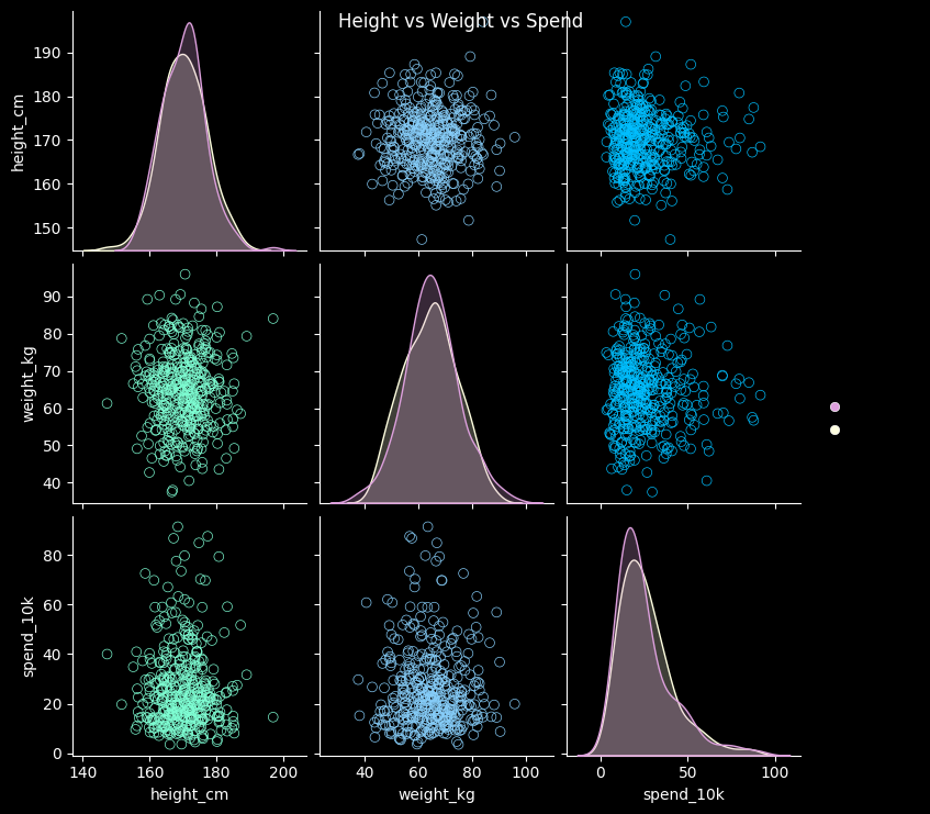
# 산점도 행렬
colors = ['#7FFFD4', '#87CEFA', '#00BFFF']
hue_colors = ['#DDA0DD', '#FFFFE0']
vars_list = ['height_cm', 'weight_kg', 'spend_10k']
g = sns.pairplot(df, vars=vars_list, diag_kind='kde', hue='gender', palette=hue_colors)
g.fig.set_facecolor('k')
for ax in g.axes.flatten():
ax.set_facecolor('k') # subplot 배경
ax.tick_params(colors='w') # 눈금 색상
ax.set_xlabel(ax.get_xlabel(), color='w')
ax.set_ylabel(ax.get_ylabel(), color='w')
for spine in ax.spines.values():
spine.set_color('w')
for i in range(len(vars_list)):
for j in range(len(vars_list)):
ax = g.axes[i,j]
color = colors[j] if i!=j else colors[i] # 대각선과 비대각선 구분
# 대각선 KDE 선 색상
if i==j:
for line in ax.lines:
line.set_color(color)
for poly in ax.collections:
poly.set_facecolor('none') # fill 제거
poly.set_edgecolor(color)
else:
# 산점도 점 색상
for pathcoll in ax.collections:
pathcoll.set_edgecolor(color)
pathcoll.set_facecolor('none')
pathcoll.set_sizes([40])
g.fig.suptitle('Height vs Weight vs Spend', color='w')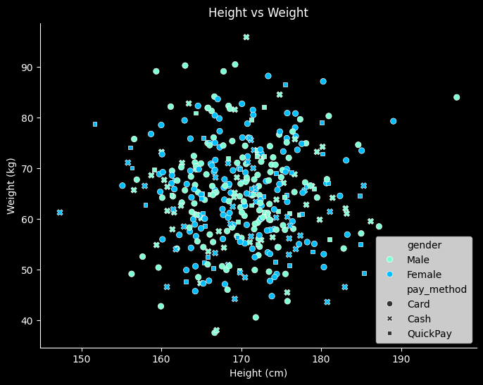 |
 |
" 선 그래프 "
선 그래프
- x축 = 시간, y축 = 값, 추세와 패턴을 나타냄
- 주로 시간 데이터(시계열)에서 사용
- 트렌드 파악, 계절성/주기성 식별, 이상치 (튀는 날) 탐지
- 일/주/월별 매출 추이, 월별 기온 변화, 일간 트래픽/방문자 수 변화 등
특징
- 변화, 추세 강조
- 시간, 거리, 순서 등에 따라 변화하는 패턴을 보여줌
- 증감 추세선, 패턴(계절성, 주말 효과), 특정 일자 이상치 (갑작스러운 급증/급감)
- 여러 변수 비교 가능
- 한 그래프에 여러 선을 그려 서로 다른 변수 또는 그룹 비교
- 예측 가능
- 누락된 값 연결, 장기 추세 분석, 단순 예측 가능
해석
- 기울기 분석
- 선이 가파르게 상승/하강 → 값이 빠르게 증가/감소
- 완만한 상승/하강 → 값이 천천히 증가/감소
- 수평 → 변화 없음
- 변곡점 확인
- 상승에서 하락으로 전환, 하락에서 상승으로 전환되는 지점
- 변화가 발생한 시점 등을 알 수 있음
- 패턴 비교
- 여러 선 비교 → 동반 상승/하락, 상관 관계 추정 가능
- 계절적 변동(Seasonality) 확인 가능
장점
- 추세 파악에 최적 : 시간에 따른 변화나 추세 확인
- 여러 데이터 비교 용이 : 다중 선으로 그룹 간 비교 가능
- 누적·비율 표현 가능 : 누적 선 그래프로 전체 변화와 구성 확인
단점
- 데이터가 많으면 선이 복잡해지고 읽기 어려움
- 개별 값보다 추세에 초점 → 세부 관찰에는 한계
- 급격한 변화나 이상치 시각화는 산점도보다 직관적이지 않음
- 범주형 데이터에는 적합하지 않음 (순서 있는 연속형에 최적)
import matplotlib.dates as mdates

fig = plt.figure(figsize=(8,6), facecolor='k')
ax= fig.add_subplot()
ax.patch.set_facecolor('k')
colors = ['#7FFFD4', '#00BFFF']

plt.plot(ts.index, ts['visitors'], color='#7FFFD4')
ax.set_title('Daily Visitors Trend', color='w')
ax.set_xlabel('Date', color='w')
ax.set_ylabel('Visitors', color='w')
ax.tick_params(colors='w')
ax.spines['bottom'].set_color('w')
ax.spines['left'].set_color('w')

# 날짜 포맷 지정 (예: '2025-06-01', '2025-07-01' …)
plt.gca().xaxis.set_major_formatter(mdates.DateFormatter('%Y-%m-%d'))

# 눈금 간격 (예: 한 달 단위)
plt.gca().xaxis.set_major_locator(mdates.MonthLocator())

plt.tight_layout()
plt.show() 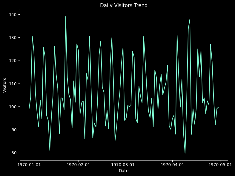
" 히트맵 "
히트맵
- 데이터를 색상으로 시각화한 2차원 그래프
- 색의 농도나 색상으로 값의 크기를 표현
- 주로 값의 크기 비교, 패턴, 상관관계 시각화에 활용
특징
- 수치의 크기에 따라 색이 변하며, 시각적으로 빠르게 비교 가능
- 행과 열로 구성된 2차원 그래프
- 특정 구간에서 값이 집중되거나 패턴이 반복되는지 쉽게 확인
해석
- 색상 농도 비교
- 진한 색 → 값이 크거나 강함, 연한 색 → 값이 작거나 약함
- 패턴 확인
- 반복적인 색 배열 → 주기성, 군집 등 패턴 발견 가능
- 이상치 탐지
- 주변 색과 크게 다른 색 → 극단값 또는 특이점
장점
- 패턴과 관계 직관적 확인 가능
- 값 비교 용이 : 숫자를 확인하지 않아도 색으로 크기 파악 가능
- 상관관계, 빈도, 집중 구간 등 다양한 분석 활용
단점
- 정확한 값 확인 어려움 : 색상만으로는 숫자 값 파악 제한
- 색상 선택 민감: 색 대비가 부족하면 해석 어려움
- 범주형 변수보다는 수치형 데이터에 최적화
import seaborn as sns
import matplotlib.pyplot as plt
from matplotlib.colors import LinearSegmentedColormap
import numpy as np
import pandas as pd

# 예시 데이터
np.random.seed(0)
data = np.random.rand(3,3)
df = pd.DataFrame(data, columns=['height_cm', 'weight_kg', 'spend_10k'])

# 상관행렬 계산
corr = df.corr()

# 사용자 색상
colors = ['#7FFFD4', '#87CEFA', '#00BFFF']
cmap = LinearSegmentedColormap.from_list("custom_cmap", colors)

# 히트맵
fig, ax = plt.subplots(figsize=(8,6))
sns.heatmap(corr, annot=True, fmt=".2f", vmin=-0.15, vmax=0.1, center=0,
            cmap=cmap, ax=ax, cbar_kws={"label": "Correlation"})

# dark theme
fig.set_facecolor('k')
ax.set_facecolor('k')

# x/y tick label (변수명) 흰색
ax.set_xticklabels(ax.get_xticklabels(), color='w')
ax.set_yticklabels(ax.get_yticklabels(), color='w')

# tick, spine
ax.tick_params(colors='w', which='both')
for spine in ax.spines.values():
    spine.set_color('w')

# 컬러바
cbar = ax.collections[0].colorbar
cbar.ax.yaxis.set_tick_params(color='w')
plt.setp(cbar.ax.yaxis.get_ticklabels(), color='w')
cbar.outline.set_edgecolor('w')

# title
ax.set_title('Height vs Weight vs Spend', color='w', fontsize=14)

plt.show()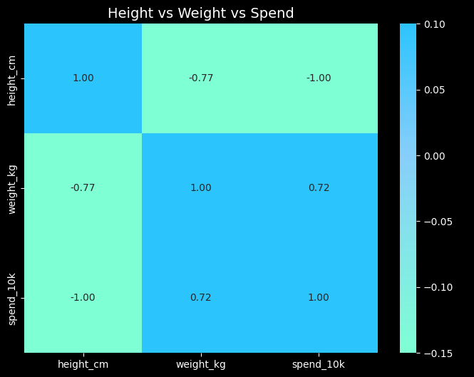

화이팅구리
불펌~♡