
" 대푯값 "
대푯값
- 데이터의 중심이나 전형적인 값을 나타내는 수치
- 데이터 전체를 하나의 값으로 요약하여 분포의 중심을 파악하는 데 사용
- 대표적 : 평균, 중앙값, 최빈값
평균 (Mean)
- 모든 데이터를 합한 후, 데이터 개수로 나눈 값
- 지렛대의 균형점, 데이터의 중심 위치 알려줌
- 장점
- 계산이 쉽고 대부분 통계 분석에서 기본 값으로 사용
- 다른 통계 수치(분산, 표준편차) 계산에 활용 가능
- 단점
- 극단값(Outlier)에 민감 → 평균이 왜곡될 수 있음
- 예시
- 데이터 : 2, 3, 4, 5, 100
- 평균 = (2+3+4+5+100) / 5 = 22.8 → 극단값 100 때문에 대표성을 잃음
중앙값 (Median)
- 데이터를 크기 순서대로 정렬했을 때 가운데 위치한 값
- 짝수 개일 경우 : 가운데 두 값의 평균을 중앙값으로 사용
- 장점
- 극단값이나 비대칭 분포에 영향을 받지 않음 → 대표성이 안정적
- 평균의 왜곡을 막고 일반적인 수준을 잘 보여줌
- 극단값이나 비대칭 분포에 영향을 받지 않음 → 대표성이 안정적
- 단점
- 데이터 전체의 변동이나 분포를 반영하지 않음
- 예시
- 데이터 : 2, 3, 4, 5, 100
- 정렬 후 가운데 값 = 4 → 극단값 영향 없음
최빈값 (Mode)
- 데이터에서 가장 많이 나타나는 값
- 실제 행동/선호를 보여줌, 소비자 선호 분석에 특히 유용
- 장점
- 범주형 데이터에서 중심 경향 파악에 유용
- 빈도 분석과 결합 가능
- 단점
- 데이터가 고르게 분포되어 있으면 최빈값이 없거나 여러 개일 수 있음
어떤 대푯값을 보느냐에 따라 해석이 달라진다
사례
평균 = 30만원, 중앙값 = 5만원, 최빈값 = 9,900원일 때, 각 대푯값 활용 방안
- 평균 : VIP 관리, 평균 이상인 고객들 대상으로 관리 등
- 중앙값 : 가격대별 프로모션, 일반적인 수준을 파악하여 활용 등
- 최빈값 : 일반 고객 전략, 소비자 선호 분석해서 활용
왜곡을 없애려면 평균 + 중앙값 + 최빈값 세트로 봐야 함
보고서에는 평균, 중앙값, 최빈값 모두 명시해야 함
df['height_cm'].mean()  # 평균
df['height_cm'].median()  # 중앙값
df['height_cm'].mode()  # 최빈값

# 데이터 로드 (CSV 파일 경로 수정 필요)
df = pd.read_excel("Online Retail.xlsx")  # UCI 데이터는 xlsx 형식

# 결측치/이상치 제거
df = df.dropna(subset=["CustomerID"])
df = df[df["Quantity"] > 0]
df["Sales"] = df["Quantity"] * df["UnitPrice"]

# 고객별 결제 금액 집계
customer_sales = df.groupby("CustomerID")["Sales"].sum()

# 대표값 계산
mean_val = customer_sales.mean()
median_val = customer_sales.median()
mode_val = customer_sales.mode().iloc[0]
std_val = customer_sales.std()

print(f"평균: {mean_val:.2f}")
print(f"중앙값: {median_val:.2f}")
print(f"최빈값: {mode_val:.2f}")
print(f"표준편차: {std_val:.2f}")

# 히스토그램 (로그 스케일)
fig = plt.figure(figsize=(8,6), facecolor='k')
ax= fig.add_subplot()
ax.patch.set_facecolor('k')
plt.hist(customer_sales, bins=50, color="#7FFFD4")
plt.xscale("log")
plt.axvline(mean_val, color="#8A2BE2", linestyle="--", label=f"Mean={mean_val:.0f}")
plt.axvline(median_val, color="#FFD700", linestyle=":", label=f"Median={median_val:.0f}")
plt.axvline(mode_val, color="#FF4500", linestyle="-.", label=f"Mode={mode_val:.0f}")
plt.legend()
ax.set_title('Online Retail - Customer Purchase Distribution', color='w')
ax.set_xlabel('Customer Total Sales (log scale)', color='w')
ax.set_ylabel('Count', color='w')
ax.tick_params(colors='w')
ax.spines['bottom'].set_color('w')
ax.spines['left'].set_color('w')
plt.show()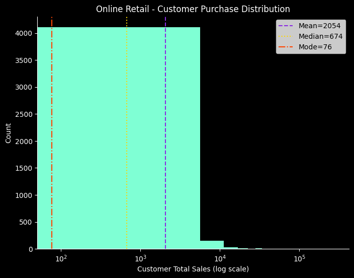
" 데이터의 흩어짐 "
편차
- 데이터가 평균에서 얼마나 떨어져 있는지 나타낸 값
- 예시 데이터 : [20,15, 17, 22, 21]
- 평균 = 19, 편차 = [+1, -4, -2, +3, +2]
- 편차의 한계
- 편차의 합은 0
- 음수 편차와 양수 편차가 서로 상쇄됨
- 평균은 데이터의 중심 위치이고 그런 평균으로부터의 ± 거리니까
- 개별 데이터의 흩어짐은 알 수 있으나 전체의 산포도 요약값으로는 쓸 수 없음
분산
- 편차의 제곱의 평균
- 분산의 한계
- 편차를 제곱하여 계산해서 원래 데이터 단위와 달라짐
- 큰 편차일수록 크게 반영되어 크기가 왜곡됨
분산을 제곱으로 계산하는 이유
- 수학적으로 다루기 쉬움
- 절대값은 미분이 불가능한 지점이 있으나 제곱은 가능함
- 큰 편차를 더 강하게 반영
- 이상치를 훨씬 크게 평가하기 위해
- 평균에서 멀리 떨어진 값 ≓ 이상치, 이상치는 데이터 전체에 큰 영향을 미치므로 그 영향을 반영시키기 위함
- 이론적 성질이 좋음
- 중심극한정리, 가우스분포(=정규분포) 등과 연관됨
표준편차
-
분산의 양의 제곱근
- 원래 단위로 복원
- 직관적 해석 가능, 비교 용이성
- 원래 단위로 복원
-
안정성과 위험을 보여주는 언어
-
평균은 분포의 위치를, 표준편차는 분포의 퍼짐을 결정함
-
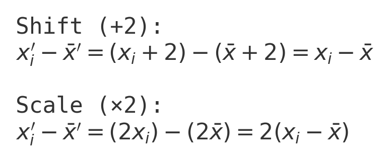
데이터 값에 2씩 더하면?
- 평균은 변해도 표준편차는 동일
-
데이터 값에 2씩 곱하면?
- 평균도 표준편차도 2배 up
df['height_cm'].var()  # 분산
df['height_cm'].std()  # 표준편차

# 데이터 만든 부분
x = np.array([2, 4, 6, 8, 10], dtype=float)
plus_a = x + 10
times_k = x * 2

std_base = float(np.std(x, ddof=1))
std_plus_a = float(np.std(plus_a, ddof=1))
std_times_k = float(np.std(times_k, ddof=1))
df_transform = pd.DataFrame({
    "dataset": ["base", "+a (a=10)", "×k (k=2)"],
    "std": [std_base, std_plus_a, std_times_k],
    "mean": [float(np.mean(x)), float(np.mean(plus_a)), float(np.mean(times_k))]
})

# Bar chart
fig = plt.figure(figsize=(8,6), facecolor='k')
ax= fig.add_subplot()
ax.patch.set_facecolor('k')
plt.bar(df_transform["dataset"], df_transform["std"], color = ['#7FFFD4', '#87CEFA', '#00BFFF'])
ax.set_title('Effect of transformations on standard deviation', color='w')
ax.set_ylabel('Standard deviation', color='w')
ax.tick_params(colors='w')
ax.spines['bottom'].set_color('w')
ax.spines['left'].set_color('w')
savefig("transform_std")
plt.show()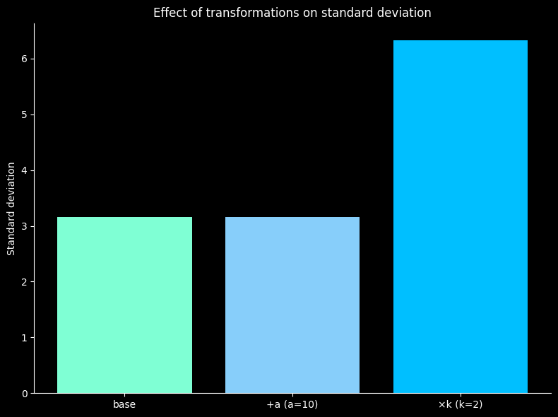
히스토그램 비교
- 팀 A (σ≈3) : 좁고 뾰족 → 안정적
- 팀 B (σ≈12) : 넓고 납작 → 변동성 큼
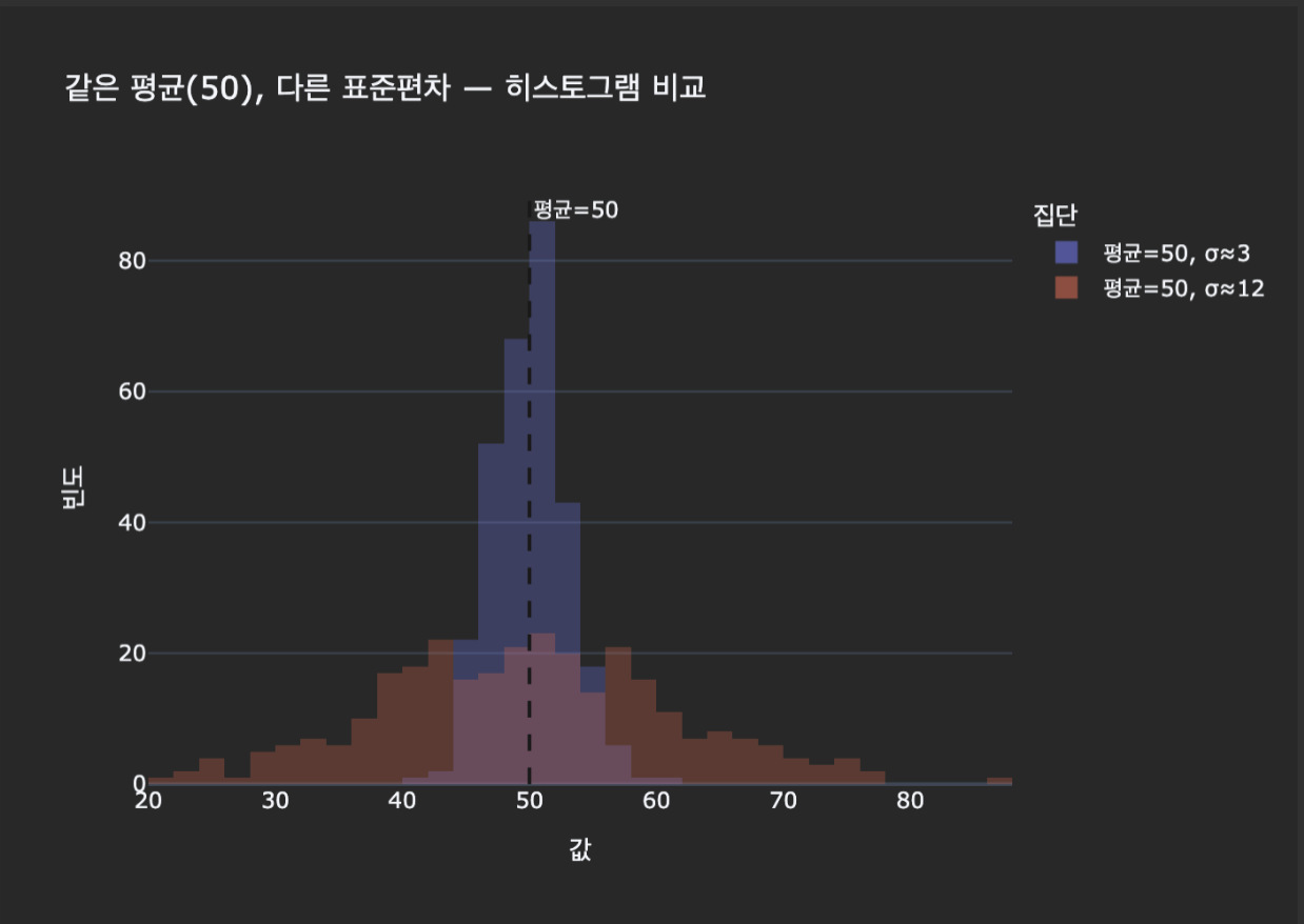
같은 평균이어도 표준편차가 다르면 안정성 / 해석 / 의사결정이 완전히 달라짐

화이팅구리
얍 1등