1. transform
transform은 특정 영역에 회전, 확대/축소, 각도 변경, 위치 변경 등의 효과를 적용할 때 사용됩니다.
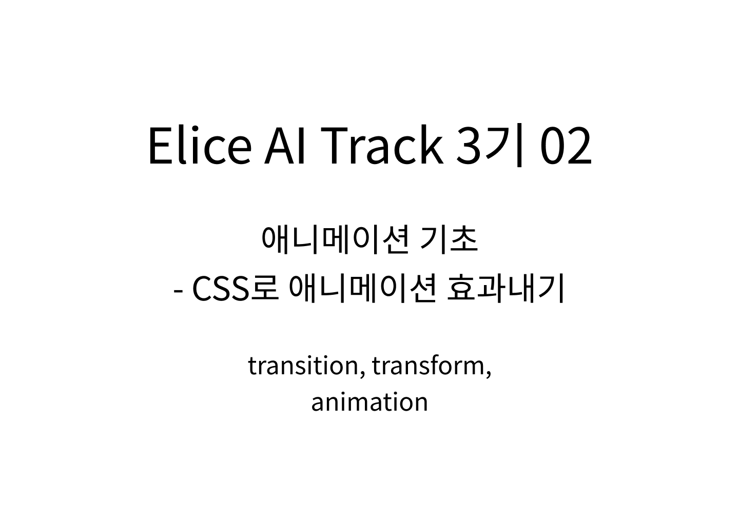
<head>
  <style>
    .box {
    	width: 100px;
    	height: 100px;
    	background-color: red;
    	// 상 우 하 좌 : 시계 방향
    	margin: 200px, 0 0 200px;
    }
  </style>
</head>
<body>
  <div class='box'></div>
</body>
상기 코드로 기본 세팅을 하면 다음과 같이 빨간 네모가 생성됩니다.
1-1. rotate()
transform의 속성 중 회전을 위한 속성값입니다.
괄호 안에 {각도}deg를 넣으면 해당 각도만큼 오른쪽으로 회전을 합니다. 음수를 넣으면 왼쪽으로 회전합니다.
<head>
  <style>
    .box {
    	width: 100px;
    	height: 100px;
    	background-color: red;
    	// 상 우 하 좌 : 시계 방향
    	margin: 200px, 0 0 200px;
    	transform: rotate(45deg);
    }
  </style>
</head>
<body>
  <div class='box'></div>
</body>
결과 화면

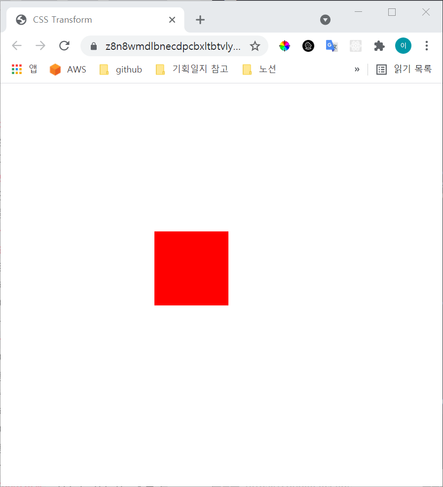
1-2. scale()
확대 또는 축소를 위해 사용되는 속성값입니다.
괄호 안에 {가로 몇 배}, {세로 몇 배}의 형태로 입력을 하면 숫자만큼 확대가 됩니다. 음수를 넣으면 해당 숫자만큼 축소됩니다.
<head>
  <style>
    .box {
    	width: 100px;
    	height: 100px;
    	background-color: red;
    	// 상 우 하 좌 : 시계 방향
    	margin: 200px, 0 0 200px;
    	transform: scale(2, 3);
    }
  </style>
</head>
<body>
  <div class='box'></div>
</body>
결과 화면
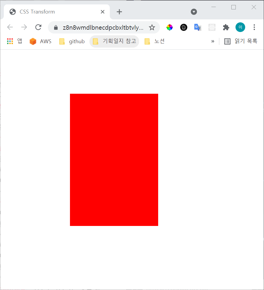
1-3. translate()
위치를 이동할 수 있는 속성값입니다.
괄호 안에 {x좌표}, {y좌표}의 형태로 입력하면, 해당 좌표로 이동합니다. 좌표의 기준은 좌측상단 꼭짓점입니다.
<head>
  <style>
    .box {
    	width: 100px;
    	height: 100px;
    	background-color: red;
    	// 상 우 하 좌 : 시계 방향
    	margin: 200px, 0 0 200px;
    	transform: translate(100px, 200px);
    }
  </style>
</head>
<body>
  <div class='box'></div>
</body>
결과화면(상자의 위치가 이동했습니다!)
1-4. skew()
각도를 비트는 속성값입니다.
괄호 안에 {x축방향 각도}, {y축방향 각도}의 형태로 입력하면 됩니다. 음수를 넣으면 반대 방향으로 비틀어집니다.
<head>
  <style>
    .box {
    	width: 100px;
    	height: 100px;
    	background-color: red;
    	// 상 우 하 좌 : 시계 방향
    	margin: 200px, 0 0 200px;
    	transform: skew(10deg, 20deg);
    }
  </style>
</head>
<body>
  <div class='box'></div>
</body>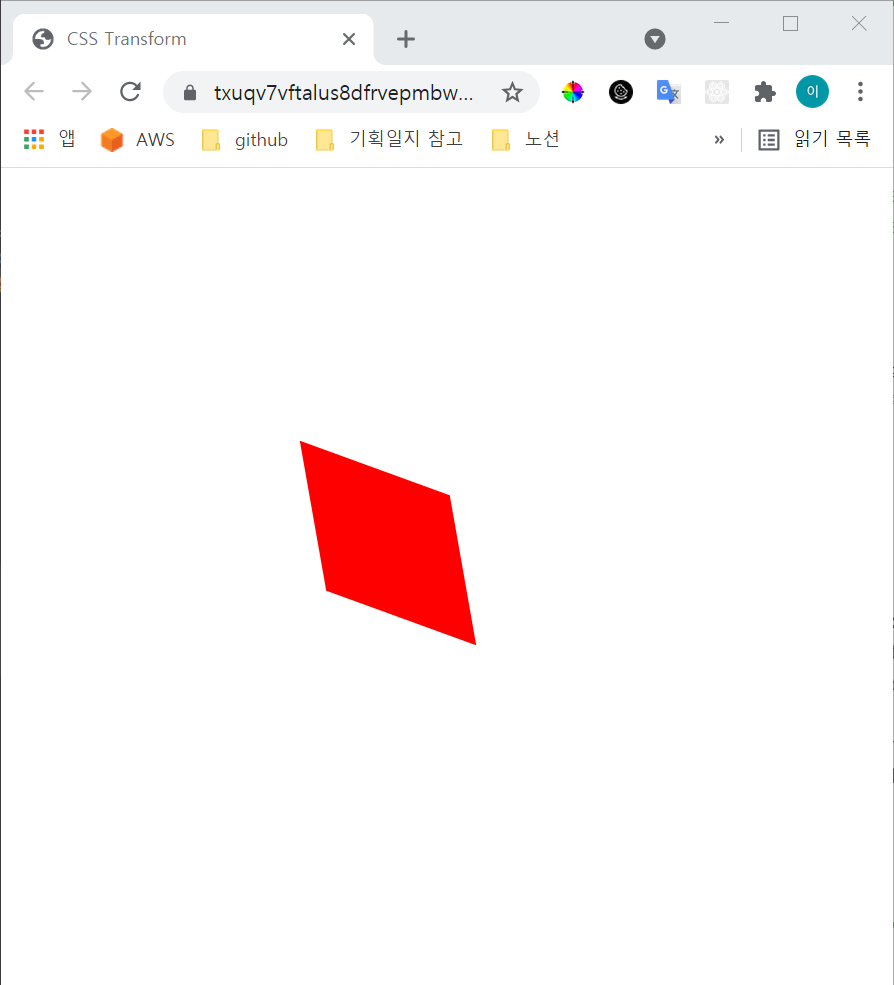
x축으로 10도만 비틀었을 때(transform: skew(10deg);)

y축으로 20도 비틀었을 때(transform: skew(0, 20deg);)

2. transition
특정 조건 하에서 애니메이션이 동작되는 과정을 보여주고자 할 때 사용됩니다.
효과를 확인하기 위해서 :hover를 추가해 마우스가 위로 올라갔을 때 변화가 나타날 수 있도록 하겠습니다.
<head>
  <style>
    .box {
    	width: 100px;
    	height: 100px;
    	background-color: red;
    	// 1번 자리
    }

    .box:hover {
    	width: 300px;
    	// 2번 자리
    }
  </style>
</head>
<body>
  <div class='box'></div>
</body>
transition: width 2s linear 1s;을 입력하면, 다음과 같은 의미가 됩니다.
width 속성이 변화하는데,
2초 동안 효과가 일어날 것이고
linear에 의해 효과 속도는 일정할 것입니다.
1초 후에 효과가 나타나도록 delay를 줍니다.
이 코드를 1번 자리에 넣게 되면
마우스를 박스 위에 올렸을 때 1초 뒤에 width가 300px로 스르륵 늘어나고, 마우스를 떼면 다시 스르륵 제자리로 돌아옵니다.
2번 자리에 넣게 되면
1번 자리에 넣었을 때와 유사하지만, 마우스를 떼었을 때 뿅! 하고 제자리로 돌아와있습니다.
목표하는 효과에 맞추어 결정하면 됩니다!
3. animation
특정 지점별로 애니메이션 효과를 적용할 때 사용됩니다.
속성의 작성 순서는 name duration timing-function delay iteration-count direction 입니다.
<head>
  <style>
    .box {
    	width: 100px;
    	height: 100px;
    	background-color: red;
    	animation: changeWidth 3s linear 1s 6 alternate;
    }
  </style>
</head>
<body>
  <div class='box'></div>
</body>
상기 코드에서 animation: changeWidth 3s linear 1s 6 alternate;를 해석해보면,
changeWidth라는 이름의 애니메이션을 만들어 3초동안 효과를 유지하게 합니다. linear를 통해 효과가 일정한 시간 분배로 일어날 수 있도록 하며 1초의 delay를 줍니다. 또한 애니메이션은 6번 반복하고 direction을 alternate로 설정하여 앞뒤로 반복하게 합니다.
하지만 상기 코드는 애니메이션을 정의했을 뿐 어떤 요소에 어떻게 효과를 실행할지에 대한 이야기가 없습니다.
@keyframes를 사용합니다.
<head>
  <style>
    .box {
    	width: 100px;
    	height: 100px;
    	background-color: red;
    	animation: changeWidth 3s linear 1s 6 alternate;
    }
    @keyframes changeWidth {
    	from {
    		width: 300px;
   		}
    	to {
    		width: 600px;
    	}
    }
  </style>
</head>
<body>
  <div class='box'></div>
</body>
changeWidth라는 이름을 가진 애니메이션에 대해서 너비를 300px에서 600px로 변화하게 하겠다는 것을 의미합니다.