[FLUS 스터디 3주차] Flutter 기초 - Single-child layout widgets(자식 위젯을 하나만 가지는 레이아웃 위젯)
flutter-study
Single-child layout widgets
플러터는 위젯으로 모든 레이아웃이 구성된다. 또한 각 위젯은 각종 자식 위젯을 가질 수 있다. 오늘 살펴볼 레이아웃 위젯의 경우에도 자식 위젯을 가질 수 있는데, 이번엔 그중 자식을 하나만 가지는 위젯들에 대해 알아보고자 한다. 모든 위젯을 확인해 볼 수는 없고, 일부 자주 사용되는 위젯에 대해 알아보자.
주의
아래 예시들은 다음 코드가 베이스로 되어있으며, 실제 body에 해당하는 부분만 변경됨
import 'package:flutter/material.dart';
void main() {
runApp(
const MaterialApp(
title: 'Flutter Tutorial',
home: TutorialHome(),
),
);
}
////////////////////
// Body에 사용되는 위젯
////////////////////
class CenterHomeWidget extends StatelessWidget {
const CenterHomeWidget({Key? key}) : super(key: key);
Widget build(BuildContext context) {
return Center(
child: Image.asset(
'images/pic1.jpeg',
width: 100,
height: 100,
));
}
}
class TutorialHome extends StatelessWidget {
const TutorialHome({super.key});
Widget build(BuildContext context) {
return Scaffold(
appBar: AppBar(
leading: const IconButton(
icon: Icon(Icons.menu),
tooltip: 'AppBar Menu',
onPressed: null,
),
title: const Text('Sucream'),
actions: const [
IconButton(
icon: Icon(Icons.search),
tooltip: 'Search',
onPressed: null,
),
],
),
body: const CenterHomeWidget(),
bottomNavigationBar: BottomNavigationBar(
items: const [
BottomNavigationBarItem(
icon: Icon(Icons.home),
label: 'Home',
),
BottomNavigationBarItem(
icon: Icon(Icons.message),
label: 'Message',
),
BottomNavigationBarItem(
icon: Icon(Icons.settings),
label: 'Settings',
),
],
),
floatingActionButton: const FloatingActionButton(
tooltip: 'Add',
onPressed: null,
child: Icon(Icons.add),
),
);
}
}
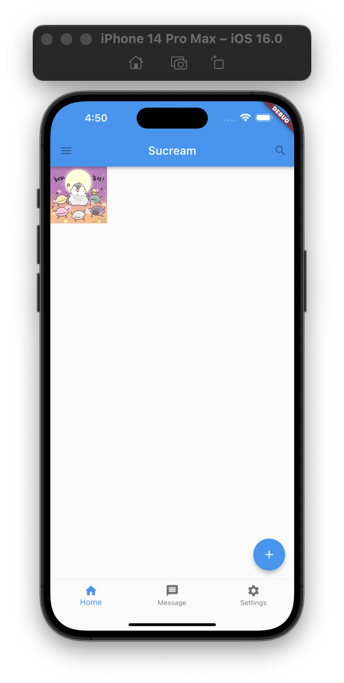
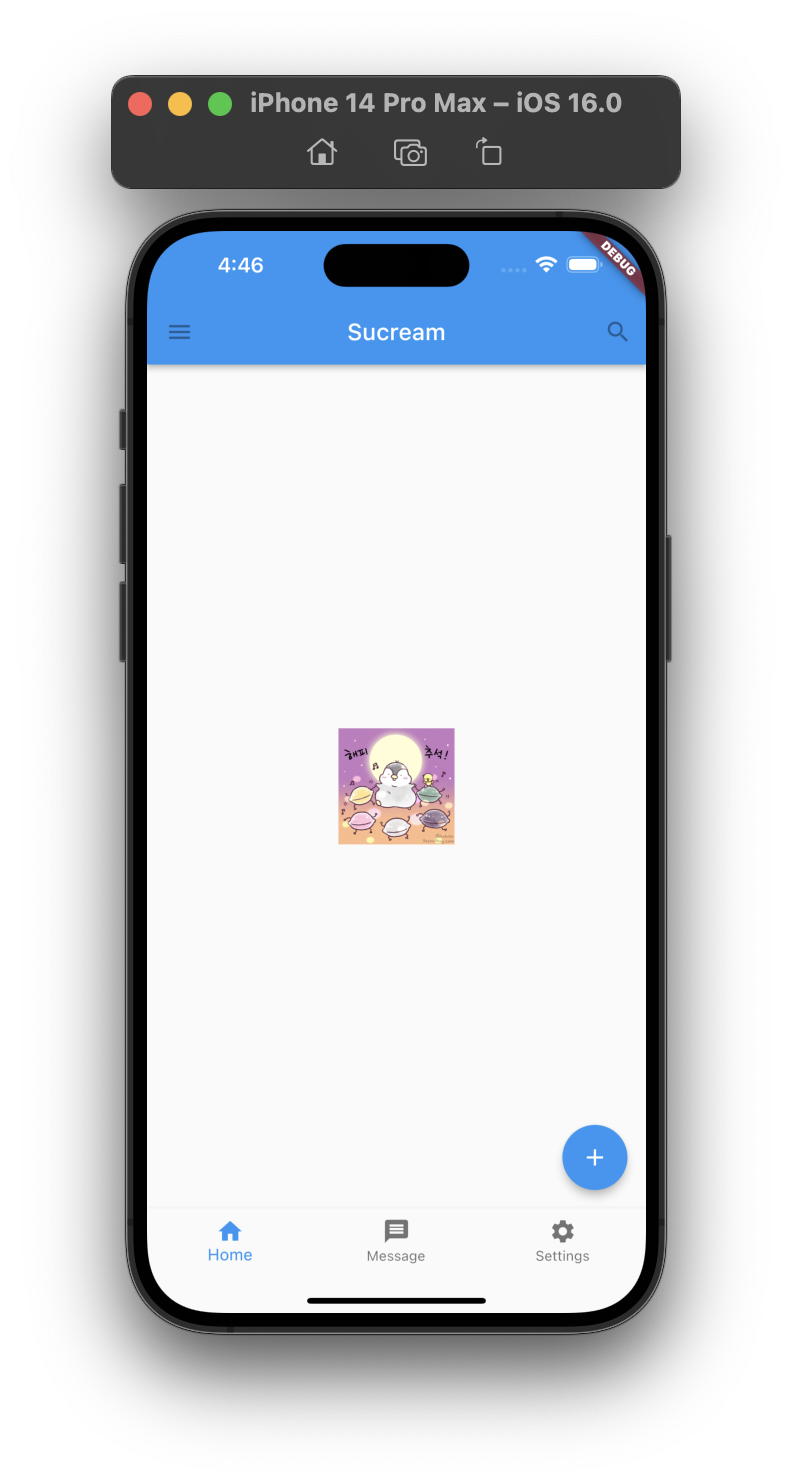
Center
A widget that centers its child within itself.
This widget will be as big as possible if its dimensions are constrained and widthFactor and heightFactor are null. If a dimension is unconstrained and the corresponding size factor is null then the widget will match its child's size in that dimension. If a size factor is non-null then the corresponding dimension of this widget will be the product of the child's dimension and the size factor. For example if widthFactor is 2.0 then the width of this widget will always be twice its child's width.
이름 그대로 위젯을 가운데에 정렬하는 레이아웃 위젯이다.
// Align 위젯 사용 예시
class AlignHomeWidget extends StatelessWidget {
const AlignHomeWidget({Key? key}) : super(key: key);
Widget build(BuildContext context) {
return Center(
child: Container(
height: 300,
width: 300,
color: Colors.purple,
child: Align(
alignment: Alignment.topRight,
child: Image.asset(
'images/pic1.jpeg',
width: 100,
height: 100,
),
),
));
}
}Center 적용 전
Center 적용 후
Container
A convenience widget that combines common painting, positioning, and sizing widgets.
자식 위젯을 위한 영역을 나타낸다고 보면 쉬울 것 같다. 모든 단일 자식을 가지는 위젯이 그렇지만, 단일 자식 아래에 많은 자식이 포함될 수 있어서, 아래 예시와 같이 다수의 위젯에 영역을 지정하고 회전하는 것도 가능하다.
// Container 위젯 사용 예시
class ContainerHomeWidget extends StatelessWidget {
const ContainerHomeWidget({Key? key}) : super(key: key);
Widget build(BuildContext context) {
return Center(
child: Container(
width: 350, // Container의 너비
height: 350, // Container의 높이
decoration: BoxDecoration(
// 컨테이너 크기 확인을 위한 데코레이터
border: Border.all(
color: Colors.black,
width: 2,
),
),
transform: Matrix4.rotationZ(0.3), // 컨테이너 회전을 위한 옵션
child: Column( // Container 자체는 하나의 Column 위젯을 자식으로 가지고 있으며, Column 위젯이 여러개의 자식을 가지고 있는 형태임
children: [
Image.asset(
'images/pic4.jpeg',
width: 300,
height: 300,
),
const Text(
'Hello World',
style: TextStyle(
fontSize: 20,
fontWeight: FontWeight.bold,
color: Colors.black,
),
),
],
),
),
);
}
}Container 적용

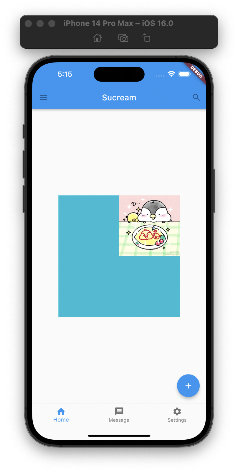
Align
A widget that aligns its child within itself and optionally sizes itself based on the child's size.
For example, to align a box at the bottom right, you would pass this box a tight constraint that is bigger than the child's natural size, with an alignment of Alignment.bottomRight.
자식 위젯을 정렬하는 레이아웃 위젯이다. 추가로 -1~1 사이의 값으로 정렬할 수도 있다.
// Align 위젯 사용 예시
class AlignHomeWidget extends StatelessWidget {
const AlignHomeWidget({Key? key}) : super(key: key);
Widget build(BuildContext context) {
return Center(
child: Container(
height: 300,
width: 300,
color: Colors.cyan,
child: Align(
alignment: Alignment.topRight,
child: Image.asset(
'images/pic3.jpeg',
width: 150,
height: 150,
),
),
));
}
}
// Align 위젯 사용 예시
class AlignHomeWidget extends StatelessWidget {
const AlignHomeWidget({Key? key}) : super(key: key);
Widget build(BuildContext context) {
return Center(
child: Container(
height: 300,
width: 300,
color: Colors.cyan,
child: Align(
// alignment: Alignment.topRight,
alignment: const Alignment(0.5, 0.5), // -1 ~ 1 사이 값으로 원하는 위치에 정렬시킬 수도 있다.
child: Image.asset(
'images/pic3.jpeg',
width: 150,
height: 150,
),
),
));
}
}
Expanded
A widget that expands a child of a Row, Column, or Flex so that the child fills the available space.
Using an Expanded widget makes a child of a Row, Column, or Flex expand to fill the available space along the main axis (e.g., horizontally for a Row or vertically for a Column). If multiple children are expanded, the available space is divided among them according to the flex factor.
An Expanded widget must be a descendant of a Row, Column, or Flex, and the path from the Expanded widget to its enclosing Row, Column, or Flex must contain only StatelessWidgets or StatefulWidgets (not other kinds of widgets, like RenderObjectWidgets).
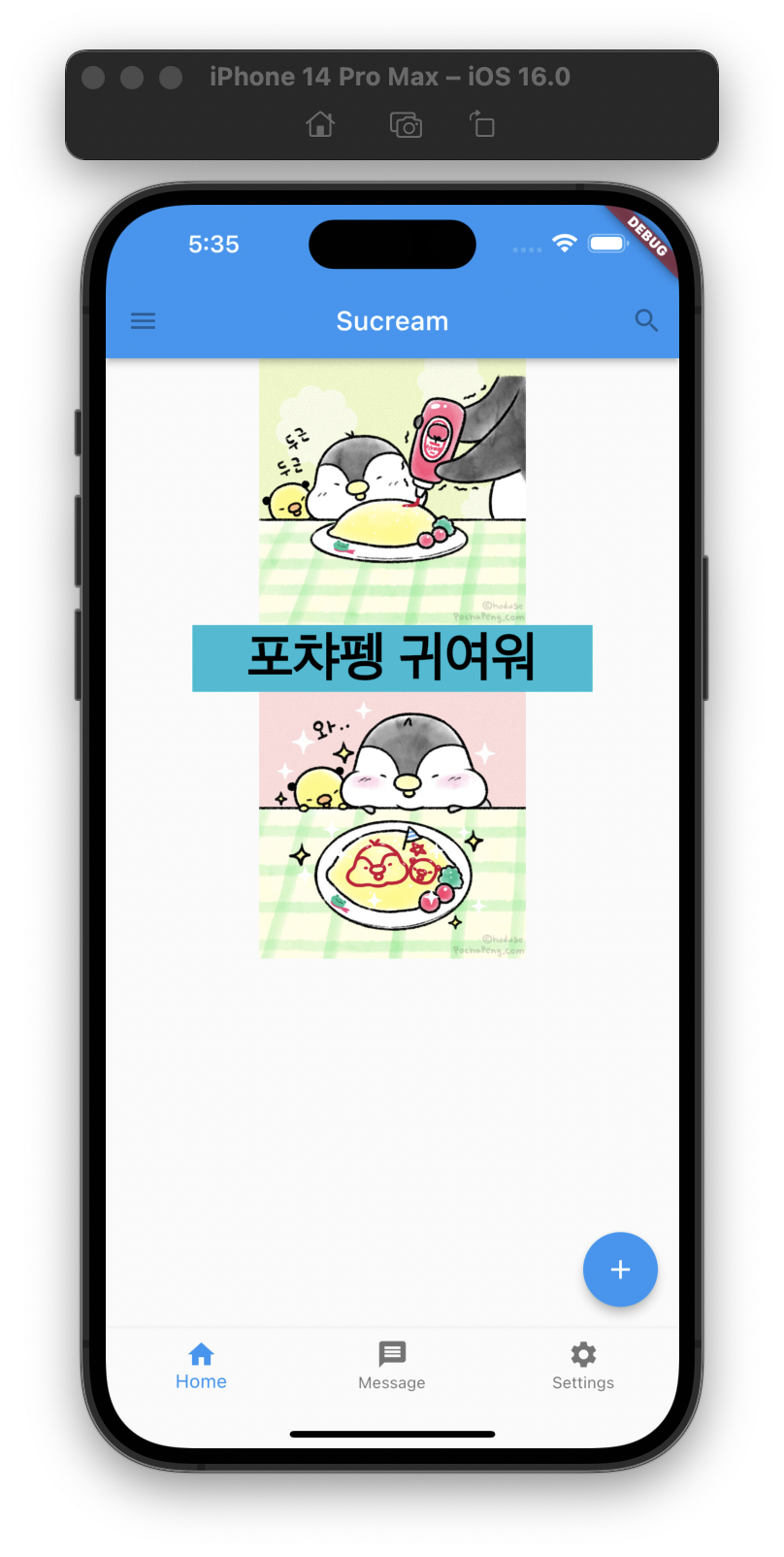
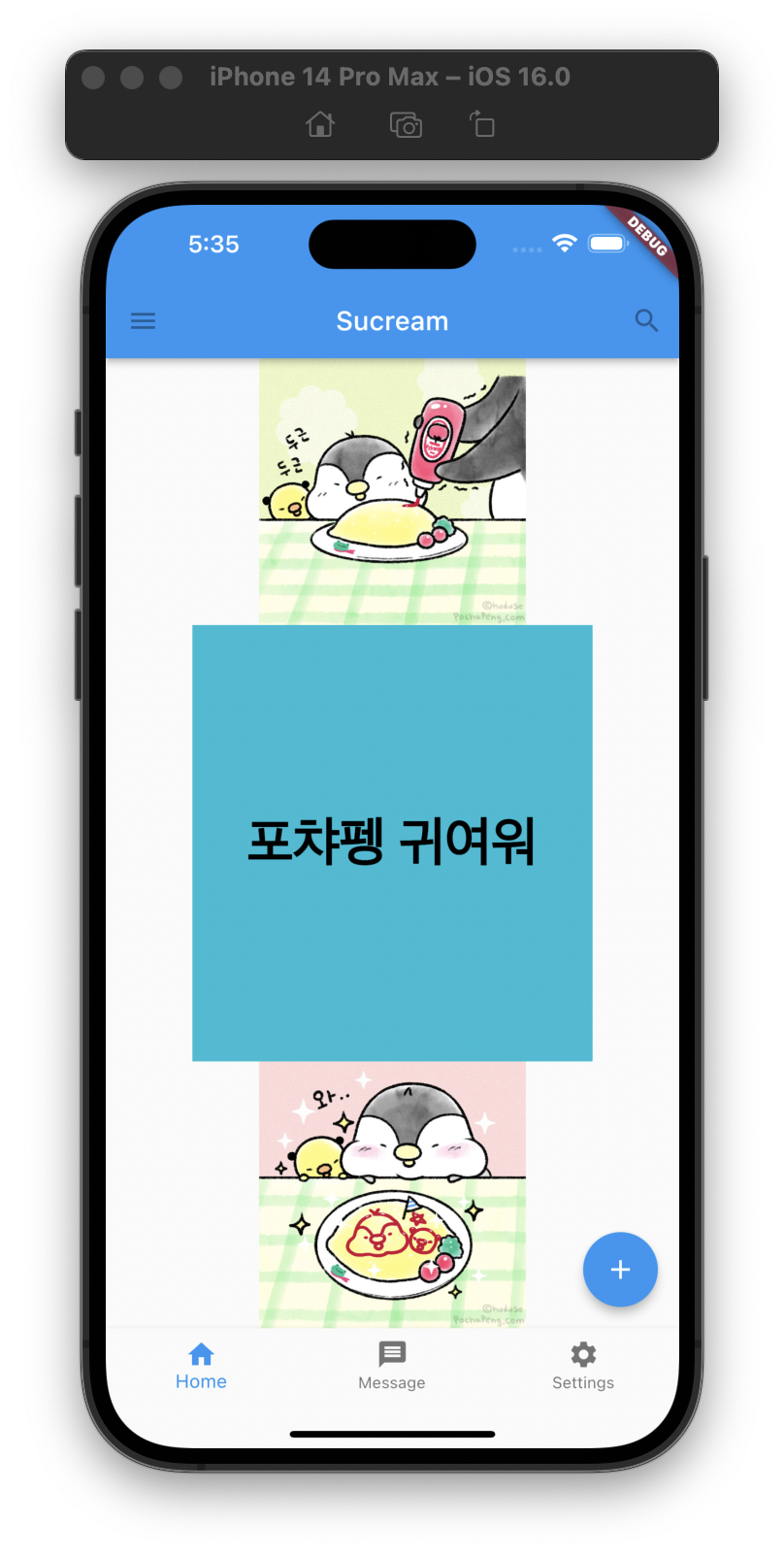
Row, Column 등의 자식 위젯이 가능한한 많은 크기를 가지도록 하는 위젯이다. 아래 예시에서 Column 위젯의 가운데 Container 자식 위젯은 별도의 높이를 지정해주지 않았다. 하지만 Expanded 레이아웃 위젯을 통해 나머지 영역을 모두 채울 수 있게 됐다.
// Expanded 위젯 사용 예시
class ExpandedHomeWidget extends StatelessWidget {
const ExpandedHomeWidget({Key? key}) : super(key: key);
Widget build(BuildContext context) {
return Center(
child: Column(
children: [
Image.asset(
'images/pic2.jpeg',
height: 200,
),
Expanded(
child: Container(
color: Colors.cyan,
width: 300,
alignment: Alignment.center,
child: const Text(
'포챠펭 귀여워',
style: TextStyle(
fontSize: 40,
fontWeight: FontWeight.bold,
color: Colors.black,
),
),
),
),
Image.asset(
'images/pic3.jpeg',
height: 200,
),
],
),
);
}
}Expanded 적용 전
Expanded 적용 후
AspectRatio
위젯의 정확한 크기가 아닌, 가로 세로에 대한 비율을 지정할 수 있는 레이아웃 위젯이다.
A widget that attempts to size the child to a specific aspect ratio.
The widget first tries the largest width permitted by the layout constraints. The height of the widget is determined by applying the given aspect ratio to the width, expressed as a ratio of width to height.
// AspectRatio 위젯 사용 예시
class AspectRatioHomeWidget extends StatelessWidget {
const AspectRatioHomeWidget({Key? key}) : super(key: key);
Widget build(BuildContext context) {
return Center(
child: Column(
mainAxisAlignment: MainAxisAlignment.spaceEvenly,
children: [
AspectRatio( // 3:2 비율의 위젯
aspectRatio: 3 / 2,
child: Container(
decoration: BoxDecoration(
// 컨테이너 크기 확인을 위한 데코레이터
border: Border.all(
color: Colors.black,
width: 2,
),
),
alignment: Alignment.center,
child: const Text(
'포챠펭 귀여워',
style: TextStyle(
fontSize: 40,
fontWeight: FontWeight.bold,
color: Colors.black,
),
),
),
),
AspectRatio( // 5:2 비율의 위젯
aspectRatio: 5 / 2,
child: Container(
decoration: BoxDecoration(
// 컨테이너 크기 확인을 위한 데코레이터
border: Border.all(
color: Colors.black,
width: 2,
),
),
alignment: Alignment.center,
child: const Text(
'포챠펭 사랑해',
style: TextStyle(
fontSize: 40,
fontWeight: FontWeight.bold,
color: Colors.black,
),
),
),
),
],
),
);
}
}
ConstrainedBox
A widget that imposes additional constraints on its child.
For example, if you wanted child to have a minimum height of 50.0 logical pixels, you could use const BoxConstraints(minHeight: 50.0) as the constraints.
FittedBox
Scales and positions its child within itself according to fit.
CustomSingleChildLayout
A widget that defers the layout of its single child to a delegate.
The delegate can determine the layout constraints for the child and can decide where to position the child. The delegate can also determine the size of the parent, but the size of the parent cannot depend on the size of the child.
Refference
- widgets library - flutter.dev