[FLUS 스터디 3주차] Flutter 기초 - Multi-child layout widgets(자식 위젯을 다수 가지는 레이아웃 위젯)
flutter-study
Multi-child layout widgets
오늘은 자식을 두개 이상 가질 수 있는 레이아웃 위젯들에 대해 알아보고자 한다. Single-child 위젯과 가장 큰 차이는 2개 이상을 자식 위젯으로 가질 수 있으며, 키값이 child가 아닌 children이라는 점이다. 모든 위젯을 확인해 볼 수는 없고, 일부 자주 사용되는 위젯에 대해 알아보자.
주의
아래 예시들은 다음 코드가 베이스로 되어있으며, 실제 body에 해당하는 부분만 변경됨
import 'package:flutter/material.dart';
void main() {
runApp(
const MaterialApp(
title: 'Flutter Tutorial',
home: TutorialHome(),
),
);
}
////////////////////
// Body에 사용되는 위젯
////////////////////
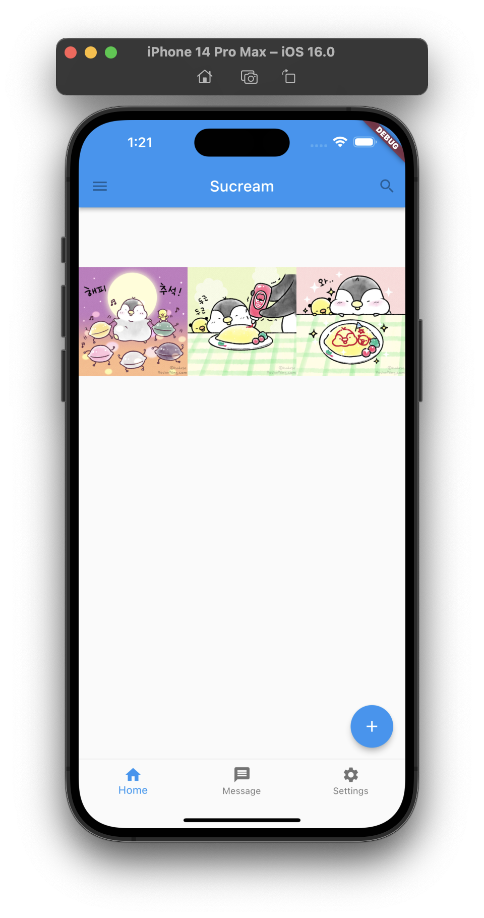
class CenterHomeWidget extends StatelessWidget {
const CenterHomeWidget({Key? key}) : super(key: key);
Widget build(BuildContext context) {
return Center(
child: Image.asset(
'images/pic1.jpeg',
width: 100,
height: 100,
));
}
}
class TutorialHome extends StatelessWidget {
const TutorialHome({super.key});
Widget build(BuildContext context) {
return Scaffold(
appBar: AppBar(
leading: const IconButton(
icon: Icon(Icons.menu),
tooltip: 'AppBar Menu',
onPressed: null,
),
title: const Text('Sucream'),
actions: const [
IconButton(
icon: Icon(Icons.search),
tooltip: 'Search',
onPressed: null,
),
],
),
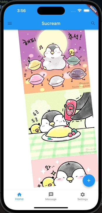
body: const CenterHomeWidget(),
bottomNavigationBar: BottomNavigationBar(
items: const [
BottomNavigationBarItem(
icon: Icon(Icons.home),
label: 'Home',
),
BottomNavigationBarItem(
icon: Icon(Icons.message),
label: 'Message',
),
BottomNavigationBarItem(
icon: Icon(Icons.settings),
label: 'Settings',
),
],
),
floatingActionButton: const FloatingActionButton(
tooltip: 'Add',
onPressed: null,
child: Icon(Icons.add),
),
);
}
}
Row
A widget that displays its children in a horizontal array.
To cause a child to expand to fill the available horizontal space, wrap the child in an Expanded widget.
The Row widget does not scroll (and in general it is considered an error to have more children in a Row than will fit in the available room). If you have a line of widgets and want them to be able to scroll if there is insufficient room, consider using a ListView.
For a vertical variant, see Column.
If you only have one child, then consider using Align or Center to position the child.
이전까지 예제들에서 수없이 써온 위젯으로, 자식 위젯들을 가로로 정렬하는 레이아웃 위젯이다.
Row 위젯은 일반적으로 스크롤을 위해 사용되지 않기 때문에, 화면에 보이는 것 이상으로 데이터를 가지는 것을 허용하지 않는다. 이를 원하면 ListView 위젯 사용을 고려해 보자.
class RowHomeWidget extends StatelessWidget {
const RowHomeWidget({Key? key}) : super(key: key);
Widget build(BuildContext context) {
return Row(
children: [ // 다수의 자식 위젯을 가질 수 있다.
Expanded( // 이미지의 크기가 커져 화면 밖으로 벗어나는 것을 방지하기 위해 Expanded 위젯을 사용했다.
child: Image.asset(
'images/pic1.jpeg',
width: 300,
height: 300,
),
),
Expanded(
child: Image.asset(
'images/pic2.jpeg',
width: 300,
height: 300,
),
),
Expanded(
child: Image.asset(
'images/pic3.jpeg',
width: 300,
height: 300,
),
),
],
);
}
}결과 화면
Column
A widget that displays its children in a vertical array.
To cause a child to expand to fill the available vertical space, wrap the child in an Expanded widget.
The Column widget does not scroll (and in general it is considered an error to have more children in a Column than will fit in the available room). If you have a line of widgets and want them to be able to scroll if there is insufficient room, consider using a ListView.
For a horizontal variant, see Row.
If you only have one child, then consider using Align or Center to position the child.
Column 역시 이전까지 예제들에서 수없이 써온 위젯으로, 자식 위젯들을 세로로 정렬하는 레이아웃 위젯이다.
// Column 위젯 사용 예시
class ColumnHomeWidget extends StatelessWidget {
const ColumnHomeWidget({Key? key}) : super(key: key);
Widget build(BuildContext context) {
return Column(
children: [
Expanded(
child: Image.asset(
'images/pic1.jpeg',
width: 300,
height: 300,
),
),
Expanded(
child: Image.asset(
'images/pic2.jpeg',
width: 300,
height: 300,
),
),
Expanded(
child: Image.asset(
'images/pic3.jpeg',
width: 300,
height: 300,
),
),
],
);
}
}결과 화면
ListView
A scrollable list of widgets arranged linearly.
ListView is the most commonly used scrolling widget. It displays its children one after another in the scroll direction. In the cross axis, the children are required to fill the ListView.
If non-null, the itemExtent forces the children to have the given extent in the scroll direction.
If non-null, the prototypeItem forces the children to have the same extent as the given widget in the scroll direction.
Specifying an itemExtent or an prototypeItem is more efficient than letting the children determine their own extent because the scrolling machinery can make use of the foreknowledge of the children's extent to save work, for example when the scroll position changes drastically.
You can't specify both itemExtent and prototypeItem, only one or none of them.
자식 위젯이 스크롤이 가능하게 해주는 위젯으로,여타 위젯처럼 명시적으로 자식 위젯을 넣는 방법과 대량의 데이터 처리에 적합한 ListView.builder 방법이 있다. 이외에도 2가지 방법이 더 있지만 여기서는 자주 사용하는 두가지를 알아보자.
기본 방법
다른 위젯처럼 children에 자식 위젯을 넣어 사용 가능하며, 기본적으로 세로축 방향으로 스크롤이 가능하다.
class ListViewHomeWidget extends StatelessWidget {
const ListViewHomeWidget({Key? key}) : super(key: key);
Widget build(BuildContext context) {
return ListView(
children: [
Image.asset(
'images/pic1.jpeg',
width: 300,
height: 300,
),
Image.asset(
'images/pic2.jpeg',
width: 300,
height: 300,
),
Image.asset(
'images/pic3.jpeg',
width: 300,
height: 300,
),
Image.asset(
'images/pic4.jpeg',
width: 300,
height: 300,
),
Image.asset(
'images/pic5.jpeg',
width: 300,
height: 300,
),
],
);
}
}결과 화면

scrollDirection: Axis.horizontal, 옵션을 통해 축 변경이 가능하다.
class ListViewHomeWidget extends StatelessWidget {
const ListViewHomeWidget({Key? key}) : super(key: key);
Widget build(BuildContext context) {
return ListView(
scrollDirection: Axis.horizontal, // 스크롤 축을 변경할 수 있다.
children: [
Image.asset(
'images/pic1.jpeg',
width: 300,
height: 300,
),
Image.asset(
'images/pic2.jpeg',
width: 300,
height: 300,
),
Image.asset(
'images/pic3.jpeg',
width: 300,
height: 300,
),
Image.asset(
'images/pic4.jpeg',
width: 300,
height: 300,
),
Image.asset(
'images/pic5.jpeg',
width: 300,
height: 300,
),
],
);
}
}결과 화면
ListView.builder를 이용한 방법
children에 직접 명시하는 대신, 해당 데이터를 생성하는 방법에 대한 bilder를 작성하는 방식이다. itemBuilder에 자식 위젯을 생성하는 방법에 대한 익명함수를 작성하여 해당 위젯이 생성되도록 할 수 있다. itemCount를 설정하여 리스트뷰의 전체 크기를 제한할 수도 있으며, 값을 지정하지 않으면 무한대로 리스트뷰가 생성될 수 있으니 주의하도록 하자.
class ListViewBuilderBuilderHomeWidget extends StatelessWidget {
ListViewBuilderBuilderHomeWidget({Key? key}) : super(key: key);
final List<String> pictures = <String>[
'pic1',
'pic2',
'pic3',
'pic4',
'pic5'
];
Widget build(BuildContext context) {
return Container(
transform: Matrix4.rotationZ(-0.1),
child: ListView.builder(
scrollDirection: Axis.vertical,
itemCount: pictures.length, // 리스트뷰의 길이를 알려주어 끝을 알려준다.
itemBuilder: (context, index) { // index를 이용하여 자식 위젯에 접근할 수 있다.
return Image.asset(
'images/${pictures[index]}.jpeg',
width: 300,
height: 300,
);
},
),
);
}
}결과 화면
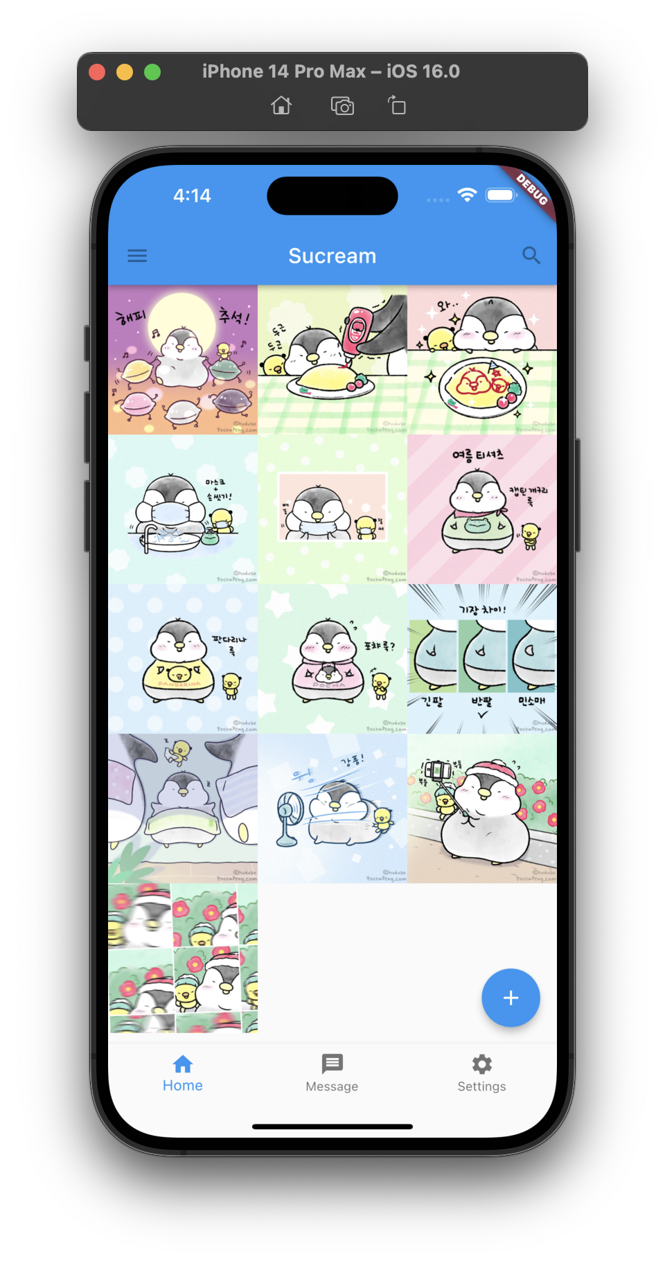
GridView
A scrollable, 2D array of widgets.
The main axis direction of a grid is the direction in which it scrolls (the scrollDirection).
The most commonly used grid layouts are GridView.count, which creates a layout with a fixed number of tiles in the cross axis, and GridView.extent, which creates a layout with tiles that have a maximum cross-axis extent. A custom SliverGridDelegate can produce an arbitrary 2D arrangement of children, including arrangements that are unaligned or overlapping.
To create a grid with a large (or infinite) number of children, use the GridView.builder constructor with either a SliverGridDelegateWithFixedCrossAxisCount or a SliverGridDelegateWithMaxCrossAxisExtent for the gridDelegate.
To use a custom SliverChildDelegate, use GridView.custom.
To create a linear array of children, use a ListView.
To control the initial scroll offset of the scroll view, provide a controller with its ScrollController.initialScrollOffset property set.
ListView와 비슷하게 사용이 가능하며, 한줄에 몇개씩 자식 위젯을 표시할건지 지정할 수 있다. GridView도 builder를 이용하여 다수의 자식 위젯을 표현할 수 있다.
기본 방법
ListView와 사용 방법이 크게 차이나지 않으며, crossAxisCount에 한줄에 표현될 자식 위젯의 수를 지정할 수 있다.
class GridViewHomeWidget extends StatelessWidget {
const GridViewHomeWidget({Key? key}) : super(key: key);
Widget build(BuildContext context) {
return GridView.count(
crossAxisCount: 2, // 한줄에 2개씩 표현
children: [
Image.asset(
'images/pic1.jpeg',
width: 300,
height: 300,
),
Image.asset(
'images/pic2.jpeg',
width: 300,
height: 300,
),
Image.asset(
'images/pic3.jpeg',
width: 300,
height: 300,
),
Image.asset(
'images/pic4.jpeg',
width: 300,
height: 300,
),
Image.asset(
'images/pic5.jpeg',
width: 300,
height: 300,
),
],
);
}
}결과 화면

GridView.builder를 이용한 방법
ViewList하던 방법과 동일하며,gridDelegate를 추가하여 한줄에 표현될 위젯의 수를 지정할 수 있다.
class GridViewBuilderHomeWidget extends StatelessWidget {
GridViewBuilderHomeWidget({Key? key}) : super(key: key);
final List<String> pictures = <String>[
'pic1',
'pic2',
'pic3',
'pic4',
'pic5',
'pic6',
'pic7',
'pic8',
'pic9',
'pic10',
'pic11',
'pic12',
'pic13',
];
Widget build(BuildContext context) {
return GridView.builder(
gridDelegate: const SliverGridDelegateWithFixedCrossAxisCount( // 한줄에 표현될 위젯의 수를 지정할 수 있다.
crossAxisCount: 3,
),
itemCount: pictures.length,
itemBuilder: (context, index) {
return Image.asset(
'images/${pictures[index]}.jpeg',
width: 300,
height: 300,
);
},
);
}
}결과 화면
Stack
A widget that positions its children relative to the edges of its box.
This class is useful if you want to overlap several children in a simple way, for example having some text and an image, overlaid with a gradient and a button attached to the bottom.
다수의 위젯을 겹칠 때 사용 가능한 위젯으로, children에 들어온 순서대로 바닥에 깔리게 된다. 즉, 뒷쪽 인덱스에 있는 자식 위젯일 수록 화면 앞쪽에 배치되게 된다.
class StackHomeWidget extends StatelessWidget {
const StackHomeWidget({Key? key}) : super(key: key);
Widget build(BuildContext context) {
return Center(
child: Stack(
children: [
Image.asset(
'images/pic1.jpeg',
width: 300,
height: 300,
),
Image.asset(
'images/pic2.jpeg',
width: 200,
height: 200,
),
Image.asset(
'images/pic3.jpeg',
width: 100,
height: 100,
),
const Text(
'포챠',
style: TextStyle(
fontSize: 40,
color: Colors.black45,
),
),
],
),
);
}
}결과 화면
CustomMultiChildLayout
A widget that uses a delegate to size and position multiple children.
The delegate can determine the layout constraints for each child and can decide where to position each child. The delegate can also determine the size of the parent, but the size of the parent cannot depend on the sizes of the children.
CustomMultiChildLayout is appropriate when there are complex relationships between the size and positioning of multiple widgets. To control the layout of a single child, CustomSingleChildLayout is more appropriate. For simple cases, such as aligning a widget to one or another edge, the Stack widget is more appropriate.
Each child must be wrapped in a LayoutId widget to identify the widget for the delegate.
Refference
- widgets library - flutter.dev