이번에는 플러터의 레이아웃에 대해 살펴보고자 한다. 앞서 말했듯이 플러터 모든것은 위젯이며, 눈에 보이지 않는 정렬, 행, 열 제스처 탐지 등도 위젯이다.

Lay out a widget
플러터는 다양한 형태의 레이아웃을 지원하며, 각 레이아웃은 Single-child layout widgets, Multi-child layout widgets, Sliver widgets으로 나뉜다.
Single-child layout widgets
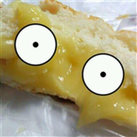
Text, Image, Icon 등의 단일 위젯을 배치하기 위해 Center, Container 등이 사용될 수 있으며, Center를 이용한 예시를 살펴보도록 하자.
// Text 위젯을 가운데로 정렬하는 Center 위젯
const Center(
	child: Text('안녕하세요.'),
),

// Image 위젯을 가운데로 정렬하는 Center 위젯
const Center(
	child: Image.asset(
    	'images/sucream.jpg',
        fit: BoxFit.cover,
    )
)

// Icon 위젯을 가운데로 정렬하는 Center 위젯
const Center(
	child: Icon(
    	Icons.star,
        color: Colors.red[500]
    )
)
Add the layout widget to the page
플러터의 대부분 위젯은 build() 메서드를 가지며, build() 메서드에 의해 인스턴스화될 때 위젯이 반환되며 화면에 표시된다.
Material apps
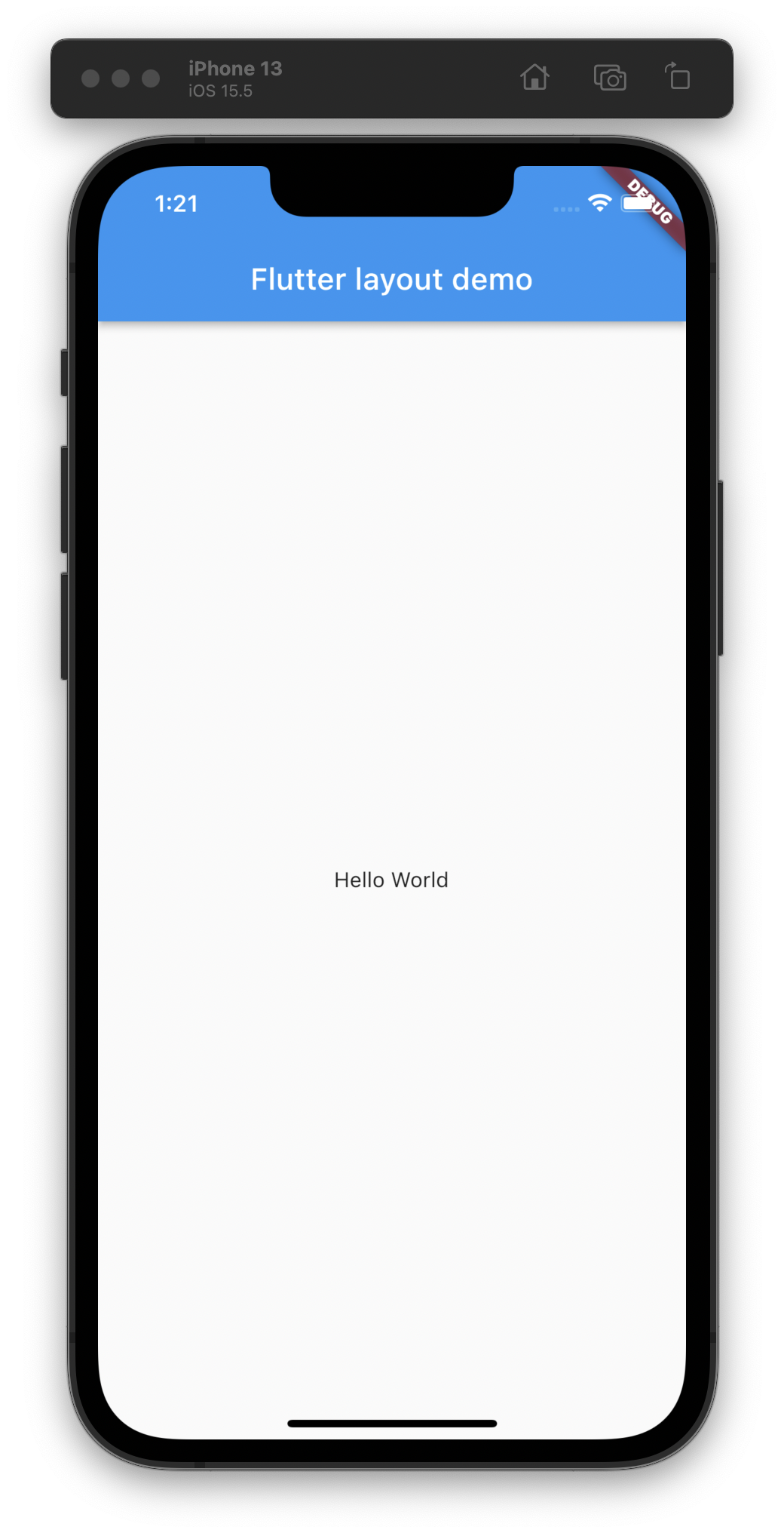
MaterialApp을 이용할 때 Scaffold를 이용하면 기본적으로 제공되는 배너, 백그라운드 컬러 및 각종 기본 API들을 이용할 수 있다. Scaffold의 인자 중 body에 우리가 원하는 위젯을 넣으면 어플리케이션의 바디 영역에 해당 위젯이 출력되게 된다.
class MyApp extends StatelessWidget {
const MyApp({super.key});
Widget build(BuildContext context) {
return MaterialApp(
title: 'Flutter layout demo',
home: Scaffold(
appBar: AppBar(
title: const Text('Flutter layout demo'),
),
// body 부분에 내가 원하는 위젯을 넣어 사용할 수 있다.
body: const Center(
child: Text('Hello World'),
),
),
);
}
}결과 화면
Non-Material apps
반드시 MaterialApp을 사용해야 하는게 아니기 때문에, 아래 예시처럼 내가 원하는 위젯을 직접 반환할 수도 있다. 다만 기본 제공되던 AppBar, 타이틀, 백그라운드 컬러가 제공되지 않기 때문에 스스로 구현해야 한다.
class MyApp extends StatelessWidget {
const MyApp({super.key});
Widget build(BuildContext context) {
// Container 위젯을 직접 리턴한다.
return Container(
decoration: const BoxDecoration(color: Colors.white),
child: const Center(
child: Text(
'Hello World',
textDirection: TextDirection.ltr,
style: TextStyle(
fontSize: 32,
color: Colors.black87,
),
),
),
);
}
}결과 화면

Lay out multiple widgets vertically and horizontally
단일 위젯을 자식으로 가지는 위젯도 있지만, 여러 위젯을 수직 혹은 수평적으로 배열하는 패턴도 자주 사용되는 패턴 중 하나이다. 플러터에서는 Row 위젯을 이용해 수평적 배치를, Column 위젯을 이용해 수직적 배치를 이용할 수 있다.
Multi-child layout widgets
Row

위 그림에서 Row 위젯은 Column과 Image 위젯을 자식 위젯으로 가진다. 따라서 위 그림으로 예상되는 Row 위젯의 예상 코드는 다음과 같을 것이다.
Row(
	children: [
    	Column(
        	children: [
            	Text(...),
                Text(...),
                ...
            ]
        ),
        Image.asset(
        'images/cake.jpg'
        )
    ]
)
Column
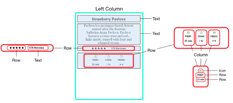
위 그림에서 Column 위젯은 총 4개의 자식 위젯을 가지는데, 아래 두 자식 위젯은 다시 Row 위젯을 자식 위젯으로 가지며, 마지막 Row 자식 위젯은 다시 Column 위젯을 자식 위젯으로 가진다. 이렇게 깊고 다양하게 반복적으로 위젯을 무궁무진하게 사용할 수 있다.
Aligning widgets

정렬을 지정할 수 있는 위젯의 경우, Main Axis와 Cross Axis를 지정할 수 있으며, Row는 가로축이 Main, Column은 세로축이 Main 축이 된다.
정렬 방법은 MainAxisAlignment 혹은 CrossAxisAlignment 내에 있는 start, end, Center, spaceBetween, spaceAround, spaceEvenly 등을 이용할 수 있다.
start
end

center
spaceBetween
spaceAround

spaceEvenly
Sizing widgets
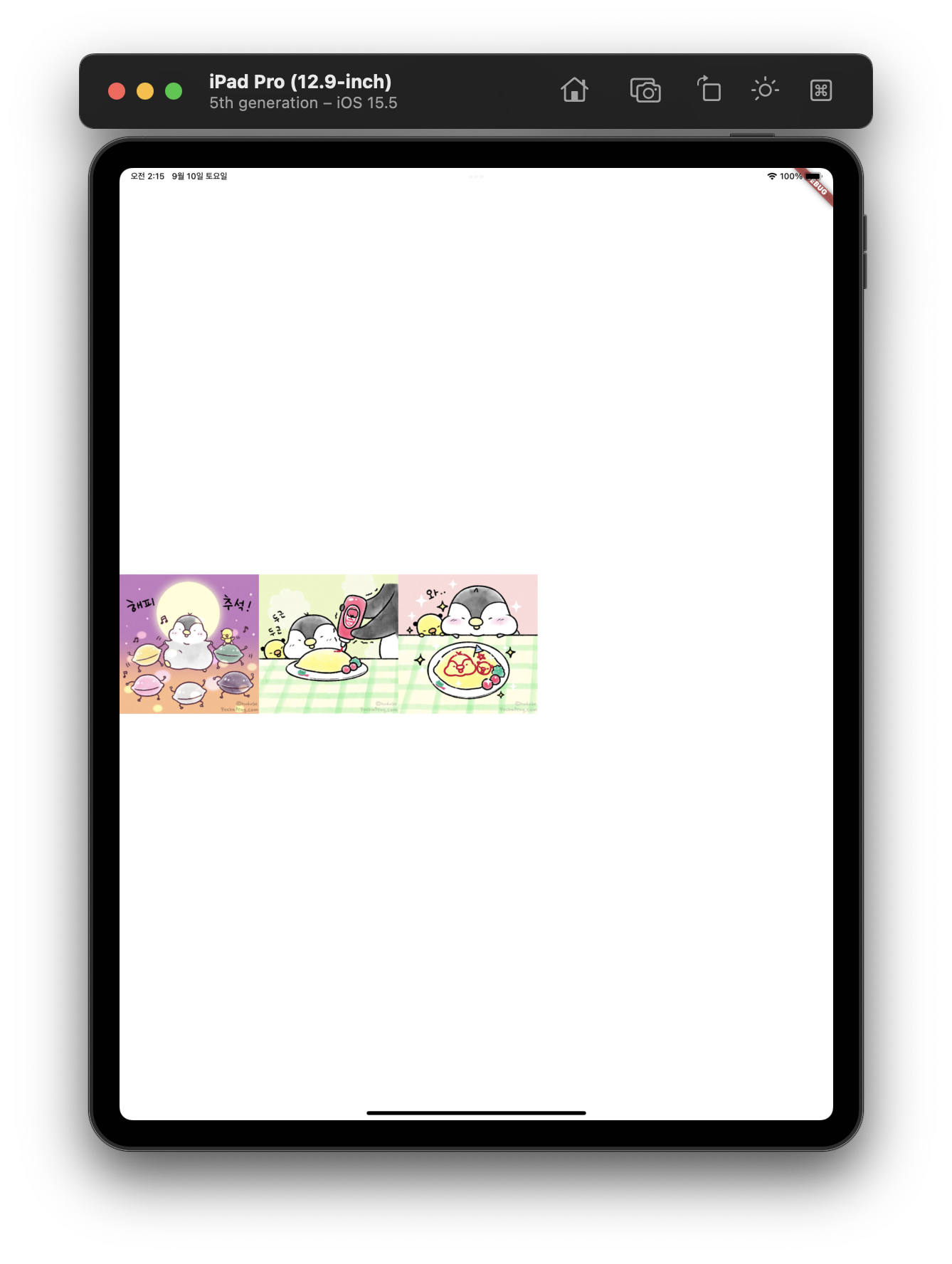
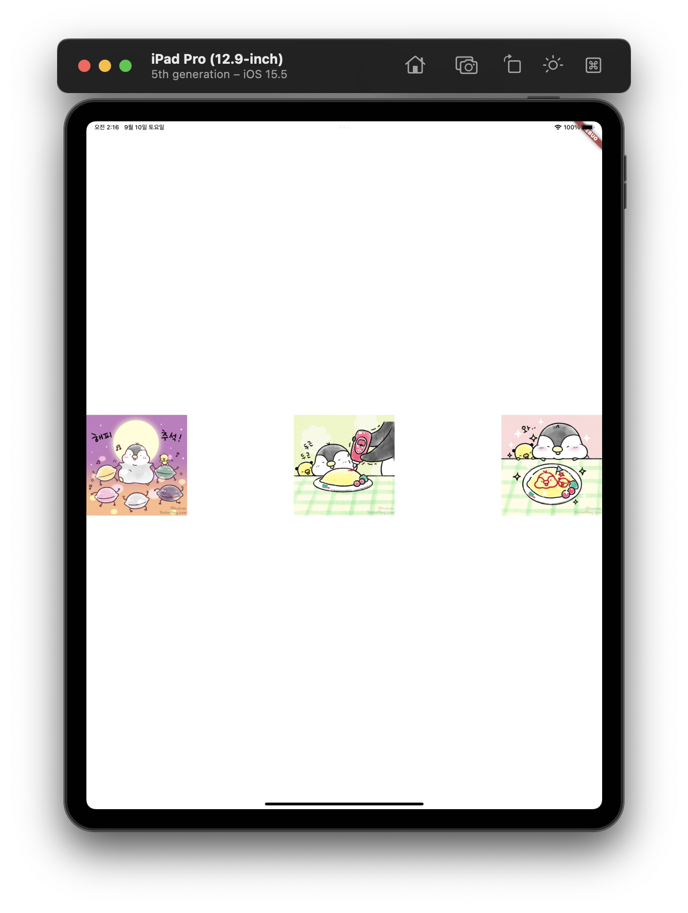
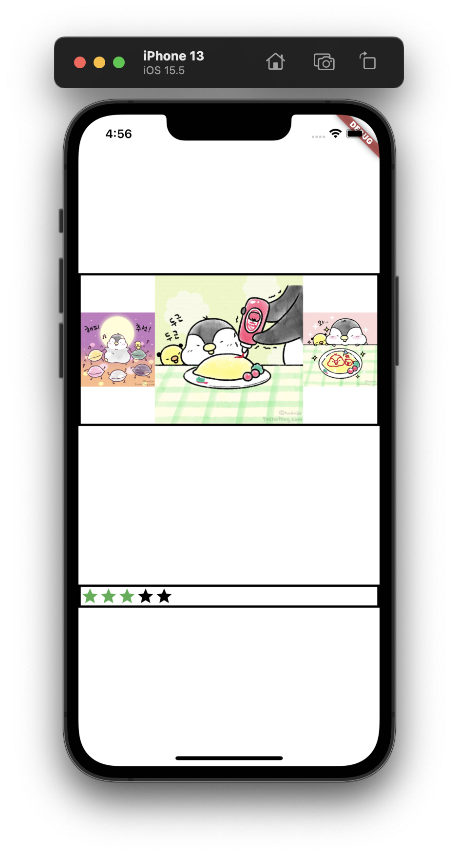
레이아웃이 디바이스의 크기를 넘어버리는 경우에는 아래 예시처럼 스트립 패턴으로 알려주게 된다.
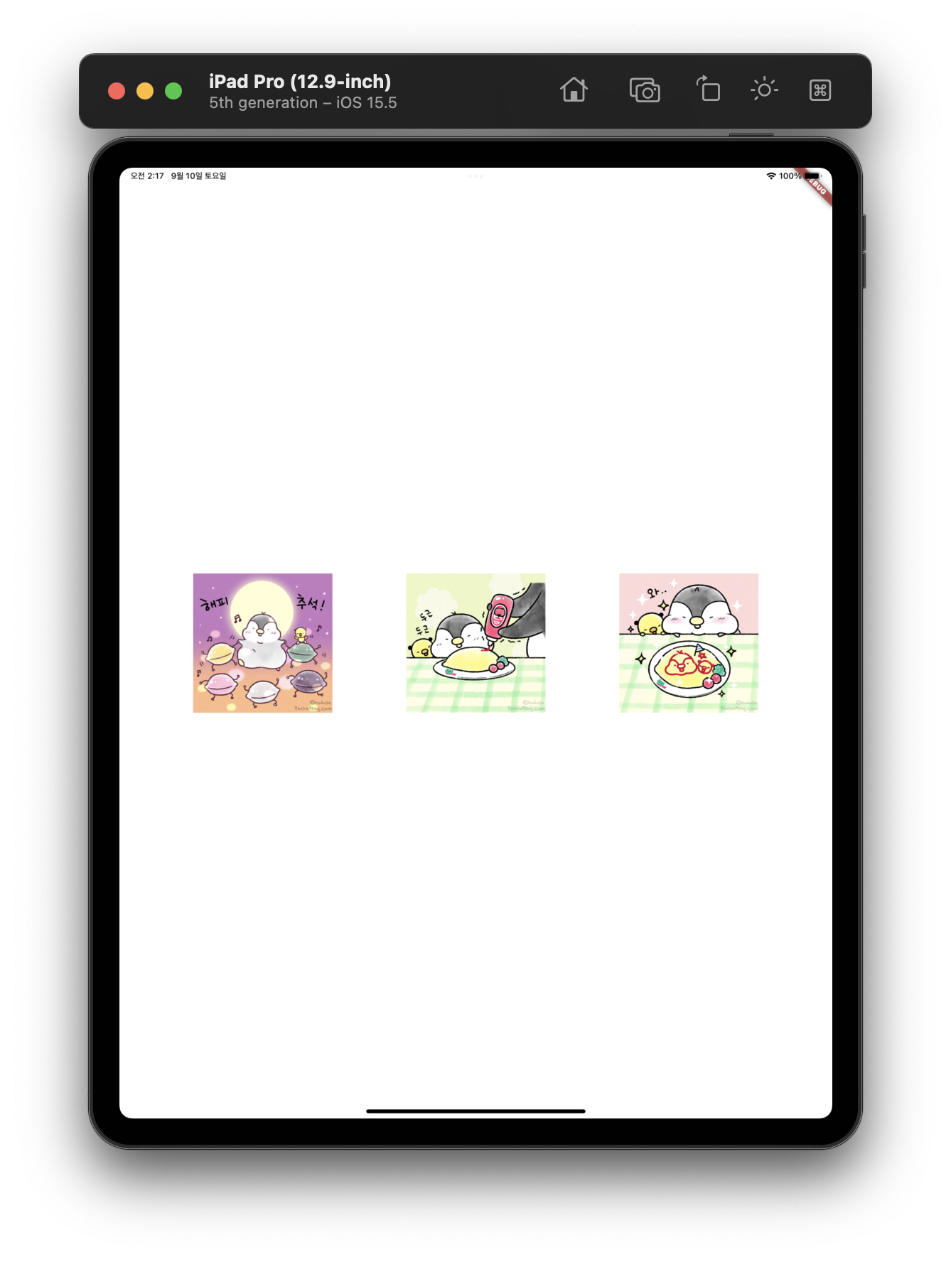
이를 해결하기 위해 위젯을 Expanded 위젯으로 감싸면 이를 해결할 수 있다.
- 문제가 발생하는 코드
Row(
  mainAxisAlignment: MainAxisAlignment.spaceEvenly,
  children: [
    Image.asset(
      'images/pic1.jpeg',
    ),
    Image.asset(
      'images/pic2.jpeg',
    ),
    Image.asset(
      'images/pic3.jpeg',
    ),
  ],
)
결과 화면

Expanded위젯을 적용한 코드
Row(
  mainAxisAlignment: MainAxisAlignment.spaceEvenly,
  children: [
    Expanded(
      child: Image.asset(
        'images/pic1.jpeg',
      ),
    ),
    Expanded(
      child: Image.asset(
        'images/pic2.jpeg',
      ),
    ),
    Expanded(
      child: Image.asset(
        'images/pic3.jpeg',
      ),
    ),
  ],
)
결과 화면
flex property
Expanded 위젯을 이용하면 flex 프로퍼티를 사용할 수 있는데, 이 프로퍼티는 자신의 영역을 유연하게 설정할 수 있도록 하는 옵션이다. 만약 위 세 이미지 중 가운데 이미지를 다른 형제 위젯들 대비 2배 더 크게 하고 싶다면 가운데 Expanded 위젯의 flex 프로퍼티의 값을 2로 주면 된다. 이는 css의 flex-grow와 유사한 것 같다.
- 가운데 이미지에 flex 2를 준 코드
Row(
  mainAxisAlignment: MainAxisAlignment.spaceEvenly,
  children: [
    Expanded(
      child: Image.asset(
        'images/pic1.jpeg',
      ),
    ),
    Expanded(
      flex: 2,  // 가운데 이미지에 해당하는 Expaneded 위젯의 flex 프로퍼티에 2를 주었다
      child: Image.asset(
        'images/pic2.jpeg',
      ),
    ),
    Expanded(
      child: Image.asset(
        'images/pic3.jpeg',
      ),
    ),
  ],
)
결과 화면

Packing widgets
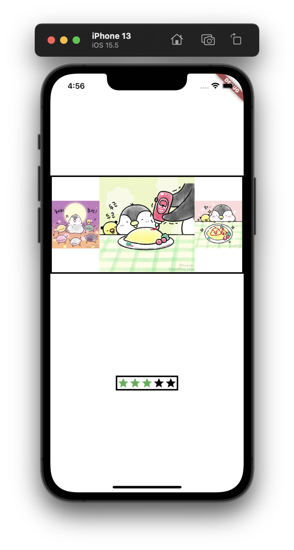
레이아웃내 위젯들의 영역 차지에 대한 기준을 줄 수 있는데, mainAxisSize를 MainAxisSize.min 혹은 MainAxisSize.max를 선택할 수 있다. 아래 예시에서는 비교를 위해 Row 위젯에 Contaier로 감싸고 Border를 주었다.
- 코드
Container(
  decoration: const BoxDecoration(color: Colors.white),
  child: Center(
    child: Column(
      mainAxisAlignment: MainAxisAlignment.spaceEvenly,
      children: [
        Container(
          decoration: BoxDecoration(
            border: Border.all(
              color: Colors.black,
              width: 3,
            ),
          ),
          child: Row(
            children: [
              Expanded(
                child: Image.asset(
                  'images/pic1.jpeg',
                ),
              ),
              Expanded(
                flex: 2,
                child: Image.asset(
                  'images/pic2.jpeg',
                ),
              ),
              Expanded(
                child: Image.asset(
                  'images/pic3.jpeg',
                ),
              ),
            ],
          ),
        ),
        Container(
          decoration: BoxDecoration(
            border: Border.all(
              color: Colors.black,
              width: 3,
            ),
          ),
          child: Row(
            // mainAxisSize: MainAxisSize.min,  // 확인을 위해 주석처리 함
            children: [
              Icon(Icons.star, color: Colors.green[500]),
              Icon(Icons.star, color: Colors.green[500]),
              Icon(Icons.star, color: Colors.green[500]),
              const Icon(Icons.star, color: Colors.black),
              const Icon(Icons.star, color: Colors.black),
            ],
          ),
        )
      ],
    ),
  ),
);MainAxisSize.min적용 전
MainAxisSize.min적용 후
Common layout widgets
플러터는 위젯이 정말 많기 때문에 자주 사용되는 위젯만 적당히 익히고 위젯 카탈로그 혹은 API 문서를 참조하는 것이 좋다고 한다. 기본적으로 플러터는 Standard widges와 Material widgets가 있다고 한다.
주의
Container,GridView,ListView,Stack등의Standard widges은 어떤 앱이든 자유롭게 이용 가능하지만,Card,ListTile등Material widgets은Material앱에서만 사용 가능하다.
플러터의 레이아웃 시스템과 관련된 제약조건
아래 링크에서 레이아웃 관련 제약조건에 대해 자세히 설명하고 있으니 한번 참고해 보면 향후 다양한 레이아웃 적용 시 발생 가능한 문제에 대비가 가능할 것 같다.
Understanding constraints
Refference
- Layouts in Flutter - flutter.dev
- Layout widgets - flutter.dev