코드 : https://github.com/PacktPublishing/Machine-Learning-for-Algorithmic-Trading-Second-Edition_Original/blob/master/06_machine_learning_process/01_machine_learning_workflow.ipynb
(퀀트 투자를 위한 머신러닝, 딥러닝 알고리즘 트레이딩)
https://www.kaggle.com/datasets/harlfoxem/housesalesprediction
목표 데이터. 2014년 5월부터 2015년 5월까지 팔린 집들을 포함한다.
from pathlib import Path
import numpy as np
import pandas as pd
import seaborn as sns
import matplotlib.pyplot as plt
from scipy.stats import spearmanr
from sklearn.neighbors import (KNeighborsClassifier,
KNeighborsRegressor)
from sklearn.model_selection import (cross_val_score,
cross_val_predict,
GridSearchCV)
from sklearn.feature_selection import mutual_info_regression
from sklearn.preprocessing import StandardScaler, scale
from sklearn.pipeline import Pipeline
from sklearn.metrics import make_scorer
from yellowbrick.model_selection import ValidationCurve, LearningCurve
필요한 함수들이다.
이 데이터 셋을 이용해 예측하고자 하는 바는, 집의 특징들이 주어졌을 때의 예상 가격이다.
데이터 csv를 보면, id, 거래일, 가격, 침실수, 화장실수, 주거 공간 넓이, 부지 넓이, 층수, 리버뷰 유무, 집의 뷰, 지의 상태, grade, 지하실 제외 평방 피트, 지하실의 넓이, 지어진 해, 재건축 해, 우편번호, 위도, 경고, 2015년 기준 집의 넓이, 2015년 기준 부지 넓이 데이터들이 있다.
이중에서 필요 없는 데이터, id, 우편번호, 위도, 경도, 날짜를 제거한다. (우편번호는 사실 체계를 이용해 세부 지역을 알 수도 있지만, 여기서는 빠졌다.)
house_sales = house_sales.drop(
['id', 'zipcode', 'lat', 'long', 'date'], axis=1) 로 제거해 준다.
sns.distplot(house_sales.price)
sns.despine()
plt.tight_layout();
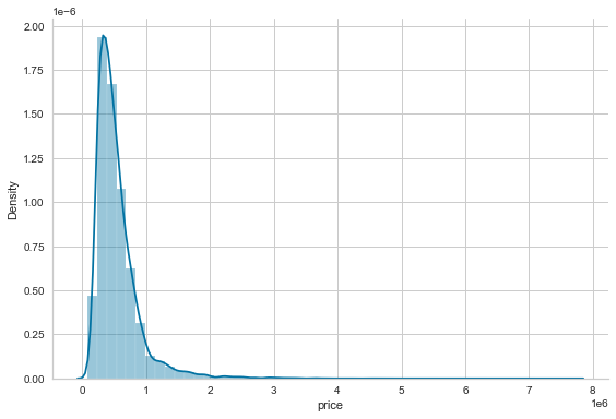
그래프로 그려 보면 위와 같이 나온다. .distplot으로 밀도함수를 그리고 테두리를 제거한 것인데, outlier 몇개가 그래프를 왜곡 시킨 것을 볼 수 있다. 정확히는 skew되어 있는 것을 확인할 수 있다.
이를 다뤄주기 위해 log변환을 해 준다.
X_all = house_sales.drop('price', axis=1)
y = np.log(house_sales.price)
독립변수 X들에서 price를 제거하고, y에 price에 log를 씌워 저장해 준다.
상호정보량에 대한 글에도 있듯, 상호정보량을 이용하면 가장 설명이 잘 되는 feature를 선택할 수 있다.
from sklearn.feature_selection import mutual_info_regression을 사용하면 된다.
mi_reg = pd.Series(mutual_info_regression(X_all, y),
index=X_all.columns).sort_values(ascending=False) 를 이용하면, 크기 순으로 결과를 확인해서 feature를 선택할 수 있다.
X = X_all.loc[:, mi_reg.iloc[:10].index]
상위 10개의 feature를 쉽게 선택할 수 있다.
mi_reg의 상위 10개(sort되어 있으므로)의 index를 추출해.loc으로 쉽게 가져온다.
이후 pairplot을 이용해 ploting을 해 본다.
g = sns.pairplot(X.assign(price=y), y_vars=['price'], x_vars=X.columns)
sns.despine();
데이터가 하나의 데이터 프레임에 있어야 하므로, X에 price라는 행을 만들어 y값을 붙여 놓은 데이터 프레임을 전달한다. 목표 y값은 price므로 전달하며, X.columns에 price가 안들어 있으므로 x_vars에 X.columns로 손쉽게 전달 할 수 있다.

그래프를 통해 상관관계 여부를 조금 명확하게 눈으로 확인할 수 있다.
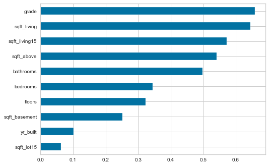
여기에 더해, X에서 spearman corr(경향성을 보았던 상관계수)을 확인해, 상관관계를 확인해 본다.
correl = X.apply(lambda x: spearmanr(x, y)[0])
X의 모든 열에 대해, spearman corr값을 계산한 값들을 모은 series이다. 참고로[1]은 p값이다.
correl.sort_values().plot.barh();
X_scaled = scale(X)
KNN을 적용하기에 앞서 scale을 해준다. scale()는 기본 가우시안 scale이다.
model = KNeighborsRegressor()
model.fit(X=X_scaled, y=y)
y_pred = model.predict(X_scaled)
이러면 모델이 완성된다.
에러를 측정하는 수많은 방법이 있다. 이에 대해 확인해 볼 것이다. 각각의 설명은 따로 조사한다.
from sklearn.metrics import (mean_squared_error,
mean_absolute_error,
mean_squared_log_error,
median_absolute_error,
explained_variance_score,
r2_score)
error = (y - y_pred).rename('Prediction Errors')
scores = dict(
rmse=np.sqrt(mean_squared_error(y_true=y, y_pred=y_pred)),
rmsle=np.sqrt(mean_squared_log_error(y_true=y, y_pred=y_pred)),
mean_ae=mean_absolute_error(y_true=y, y_pred=y_pred),
median_ae=median_absolute_error(y_true=y, y_pred=y_pred),
r2score=explained_variance_score(y_true=y, y_pred=y_pred)
)
fig, axes = plt.subplots(ncols=3, figsize=(15, 4))
sns.scatterplot(x=y, y=y_pred, ax=axes[0])
axes[0].set_xlabel('Log Price')
axes[0].set_ylabel('Predictions')
axes[0].set_ylim(11, 16)
axes[0].set_title('Predicted vs. Actuals')
sns.distplot(error, ax=axes[1])
axes[1].set_title('Residuals')
pd.Series(scores).plot.barh(ax=axes[2], title='Error Metrics')
fig.suptitle('In-Sample Regression Errors', fontsize=16)
sns.despine()
fig.tight_layout()
fig.subplots_adjust(top=.88)
error는 단순 잔차다. scores에는 각 metric을 이용한 계산 값들이 들어 있다.
그 아래의 plot을 통해 다음 그래프를 얻을 수 있다.
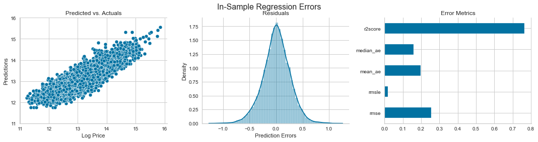
(r2는 클수록 좋다.)
cross-validation : in-sample를 이용해 만든 모델을 out-sample에 적용해 보는 것.
def rmse(y_true, pred):
return np.sqrt(mean_squared_error(y_true=y_true, y_pred=pred))
rmse_score = make_scorer(rmse)
우선 이 함수를 만들어 scorer함수를 따로 생성한다.
목적은 k값에 딸느 RMSE결과물을 보려는 것이다.
cv_rmse = {}
n_neighbors = [1] + list(range(5, 51, 5))
for n in n_neighbors:
pipe = Pipeline([('scaler', StandardScaler()),
('knn', KNeighborsRegressor(n_neighbors=n))])
cv_rmse[n] = cross_val_score(pipe,
X=X,
y=y,
scoring=rmse_score,
cv=5)
이후, rmse값들을 저장할 dictionary를 하나 생성한다.
1, 5,10... 50까지 n 값을 늘려가며, knn을 시랭해 본다.
이때 Pipeline을 통해 이를 쉽게 실행한다.
Pipeline은 기계학습을 편리하게 해주는 도구로, 데이터의 전처리 및 분류의 모든 단계를 포함하는 단일 개체를 생성해 준다. 그래서 동일 파일을 들고 있다가 서로 다른 train-test데이터를 해볼 수도 있고, 교차 검증을 쉽게 할 수 있으며, 동일 작업을 반복하는 수고를 덜어줄 수 있다. 데이터 처리 단계의 출력이 다음 입력으로 이어지는 형태로 구성되어, 여러 단계가 서로 동시 혹은 병렬적으로 수행되도록 도와준다.
위를 해석하면 이렇게 생각하면 된다. pipe라는 변수에, Pipeline객체를 넣어 놨는데, 이 pipe는 나중에 호출했을 때 StandardScalar로 전처리를 하고 KNN을 실행하는 모델인 것이다.
cross_val_score를 이용해 score를 바로 저장했는데, 그냥 모델을 따로 만들 때는
pipe.fit(X,Y)로, 사이킷런을 사용하면 자주 보는 형태로 그냥 사용해 주면 된다. cross_val_score는 k-fold 교차 검증을 실행해 주는 함수이다.
cv_rmse = pd.DataFrame.from_dict(cv_rmse, orient='index')
best_n, best_rmse = cv_rmse.mean(1).idxmin(), cv_rmse.mean(1).min()
cv_rmse = cv_rmse.stack().reset_index()
cv_rmse.columns =['n', 'fold', 'RMSE']
이렇게 나온 dictionary를 df로 바꿔주고, 평균값을 구한다. .mean(1)은 mean을 열에 대해 계산하라는 의미이다. idxmin()는 최소값의 인덱스이다. 이후 플롯팅을 위해 스택을 실시한다.
ax = sns.lineplot(x='n', y='RMSE', data=cv_rmse)
ax.set_title(f'Cross-Validation Results KNN | Best N: {best_n:d} | Best RMSE: {best_rmse:.2f}');
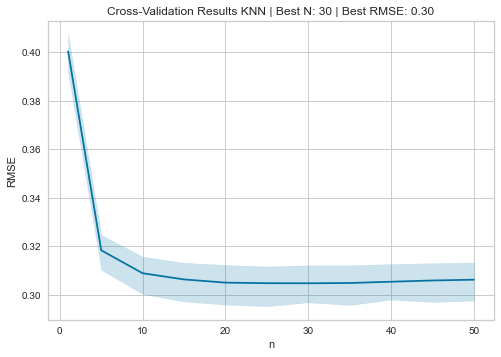
이렇게 j curve를 얻을 수 있다.
pipe = Pipeline([('scaler', StandardScaler()),
('knn', KNeighborsRegressor(n_neighbors=best_n))])
y_pred = cross_val_predict(pipe, X, y, cv=5)
ax = sns.scatterplot(x=y, y=y_pred)
y_range = list(range(int(y.min() + 1), int(y.max() + 1)))
pd.Series(y_range, index=y_range).plot(ax=ax, lw=2, c='darkred');
이러고 다시 Pipeline을 만드어 모델을 만들어 보면 쉽게 만들 수 있다.
gridsearch란, 하이퍼 파라미터를 여러 개 대입해 보면서 가장 성과가 좋은 것을 찾는 작업을 의미한다. 위에서 range를 이용해서 n값을 주었던 작업인데, 이를 자동화 해 주는 함수가 역시 사이킷 런에 들어 있다.
pipe = Pipeline([('scaler', StandardScaler()),
('knn', KNeighborsRegressor())])
n_folds = 5
n_neighbors = tuple(range(5, 101, 5))
param_grid = {'knn__n_neighbors': n_neighbors}
estimator = GridSearchCV(estimator=pipe,
param_grid=param_grid,
cv=n_folds,
scoring=rmse_score,
)
estimator.fit(X=X, y=y)
GridSearchCV에 Pipeline을 주면, 여러 파라미터를 주면서 최적의 값을 찾는다. range와 비슷하게 해 볼 값을 주기는 해야 된다.
cvresults = estimator.cv_results 저장된 결과를 이렇게 확인할 수 있다. 이후
test_scores = pd.DataFrame({fold: cv_results[f'split{fold}_test_score'] for fold in range(n_folds)},
index=n_neighbors).stack().reset_index()
test_scores.columns = ['k', 'fold', 'RMSE']
를 통해 처리하기 쉽게 구조를 바꿔 준다.
이후 k에대해 묶어준다음에, RMSE열의 데이터에 대한 평균값을 계산하고, 마찬가지로 최소 값과 인덱스를 추출한다.
mean_rmse = test_scores.groupby('k').RMSE.mean()
best_k, best_score = mean_rmse.idxmin(), mean_rmse.min()
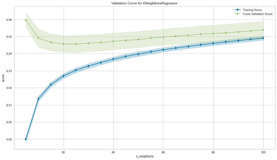
데이터를 in-sample, out-sample로 나눠서 score를 확이하는 curve가 train, validaion curve
맨 처음에 yellobrick에서 가져온 Validation curve를 이용하면 쉽게 그릴 수 있다.
fig, ax = plt.subplots(figsize=(16, 9))
val_curve = ValidationCurve(KNeighborsRegressor(),
param_name='n_neighbors',
param_range=n_neighbors,
cv=5,
scoring=rmse_score,
ax=ax)
val_curve.fit(X, y)
val_curve.poof()
sns.despine()
fig.tight_layout();
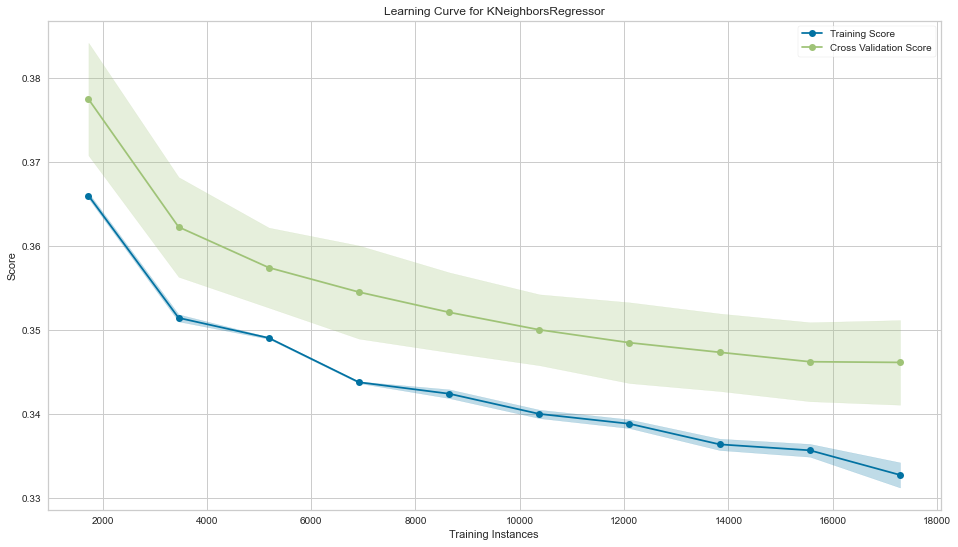
fig, ax = plt.subplots(figsize=(16, 9))
l_curve = LearningCurve(KNeighborsRegressor(n_neighbors=best_k),
train_sizes=np.arange(.1, 1.01, .1),
scoring=rmse_score,
cv=5,
ax=ax)l_curve.fit(X, y)
l_curve.poof()
sns.despine()
fig.tight_layout();
같은 문제를 임계값을 이용해서 분류문제로 변환 가능.
y_binary = (y>y.median()).astype(int)는 True False로 나오는 값을 int로 변환해준다.
n_neighbors = tuple(range(5, 151, 10))
n_folds = 5
scoring = 'roc_auc'
pipe = Pipeline([('scaler', StandardScaler()),
('knn', KNeighborsClassifier())])
param_grid = {'knn__n_neighbors': n_neighbors}
estimator = GridSearchCV(estimator=pipe,
param_grid=param_grid,
cv=n_folds,
scoring=scoring,
)
estimator.fit(X=X, y=y_binary)
사용할 평가 척도를 가지고 pipeline생성, GridSearchCV를 돌린다.
bestk = estimator.best_params['knn__n_neighbors']
fig, ax = plt.subplots(figsize=(16, 9))
val_curve = ValidationCurve(KNeighborsClassifier(),
param_name='n_neighbors',
param_range=n_neighbors,
cv=n_folds,
scoring=scoring,
ax=ax)
val_curve.fit(X, y_binary)
val_curve.poof()
sns.despine()
fig.tight_layout();
똑같은 방식으로 최적값을 찾고 validation curve를 플롯팅한다.
fig, ax = plt.subplots(figsize=(16, 9))
l_curve = LearningCurve(KNeighborsClassifier(n_neighbors=best_k),
train_sizes=np.arange(.1, 1.01, .1),
scoring=scoring,
cv=5,
ax=ax)
l_curve.fit(X, y_binary)
l_curve.poof()
sns.despine()
fig.tight_layout();
learning curve도 플롯팅이 가능하다.
분류 문제에 대해서도 굉장히 많은 metric이 있다.
from sklearn.metrics import (classification_report,
accuracy_score,
zero_one_loss,
roc_auc_score,
roc_curve,
brier_score_loss,
cohen_kappa_score,
confusion_matrix,
fbeta_score,
hamming_loss,
hinge_loss,
jaccard_score,
log_loss,
matthews_corrcoef,
f1_score,
average_precision_score,
precision_recall_curve)
다른 글에서 다루지 않은 metric도 있어 추후 조사가 필요해 보인다.
y_score = cross_val_predict(KNeighborsClassifier(best_k),
X=X,
y=y_binary,
cv=5,
n_jobs=-1,
method='predict_proba')[:, 1]
위에서 찾은 값을 바탕으로 예측 모델을 만든다.
pred_scores = dict(y_true=y_binary,y_score=y_score) 정리된 score
roc_auc_score(**pred_scores)를 바탕으로 score를 계산할 수 있다.
cols = ['False Positive Rate', 'True Positive Rate', 'threshold']
roc = pd.DataFrame(dict(zip(cols, roc_curve(**pred_scores))))
precision, recall, ts = precision_recall_curve(y_true=y_binary, probas_pred=y_score)
pr_curve = pd.DataFrame({'Precision': precision, 'Recall': recall})
f1 = pd.Series({t: f1_score(y_true=y_binary, y_pred=y_score>t) for t in ts})
best_threshold = f1.idxmax()
다른 것도 비슷하게 계산할 수 있다.
fig, axes = plt.subplots(ncols=3, figsize=(15, 5))
ax = sns.scatterplot(x='False Positive Rate', y='True Positive Rate', data=roc, size=5, legend=False, ax=axes[0])
axes[0].plot(np.linspace(0,1,100), np.linspace(0,1,100), color='k', ls='--', lw=1)
axes[0].fill_between(y1=roc['True Positive Rate'], x=roc['False Positive Rate'], alpha=.5,color='darkred')
axes[0].set_title('Receiver Operating Characteristic')
sns.scatterplot(x='Recall', y='Precision', data=pr_curve, ax=axes[1])
axes[1].set_ylim(0,1)
axes[1].set_title('Precision-Recall Curve')
f1.plot(ax=axes[2], title='F1 Scores', ylim=(0,1))
axes[2].set_xlabel('Threshold')
axes[2].axvline(best_threshold, lw=1, ls='--', color='k')
axes[2].text(s=f'Max F1 @ {best_threshold:.2f}', x=.5, y=.95)
sns.despine()
fig.tight_layout();
플롯팅.
average_precision_score(y_true=y_binary, y_score=y_score) : 평균 precision score
brier_score_loss(y_true=y_binary, y_prob=y_score) : brier score
y_pred = y_score > best_threshold 사용 threshold 변경
scores = dict(y_true=y_binary, y_pred=y_pred)
fbeta_score(scores, beta=1) : f1 score
print(classification_report(scores)) 값들이 요약된 표
confusion_matrix(scores) : confusion matrix
accuracy_score(scores)
zero_one_loss(scores)
hamming_loss(scores)
cohen_kappa_score(y1=y_binary, y2=y_pred)
hinge_loss(y_true=y_binary, pred_decision=y_pred)
jaccard_score(scores)
log_loss(scores)
matthews_corrcoef(**scores)
그외 각종 metric
마지막으로 multiclass로 확장 가능
y_multi = pd.qcut(y, q=3, labels=[0,1,2])
n_neighbors = tuple(range(5, 151, 10))
n_folds = 5
scoring = 'accuracy'
pipe = Pipeline([('scaler', StandardScaler()),
('knn', KNeighborsClassifier())])
param_grid = {'knn__n_neighbors': n_neighbors}
estimator = GridSearchCV(estimator=pipe,
paramgrid=param_grid,
cv=n_folds,
n_jobs=-1
)
estimator.fit(X=X, y=y_multi)
y_pred = cross_val_predict(estimator.best_estimator,
X=X,
y=y_multi,
cv=5,
n_jobs=-1,
method='predict')
print(classification_report(y_true=y_multi, y_pred=y_pred))
방식은 비슷하다.