
Clustering (군집화)
- "비슷한 애들끼리 그룹 묶는 것"
- 근데 레이블은 없음. 즉, 비지도 학습이다.
→ "정답 없이, 데이터 자체를 분석해서 비슷한 것끼리 뭉쳐보자."는 것이 Clustering이다.
Clustering의 특징
비지도 학습→ 정답(y)이 없음패턴 탐색→ 비슷한 데이터끼리 그룹 찾기거리 기반→ 보통 거리(distance)를 사용해서 유사성 판단
사용 목적
- 데이터 안에 숨어있는 패턴 발견
- 레이블 없는 데이터 이해하기
- 마케팅에서 고객 세그멘테이션 (ex: VIP 고객군 찾기)
- 이상치(Outlier) 탐지
- 차원 축소, 추천 시스템 등에도 활용
대표적인 Clustering 알고리즘
| 알고리즘 | 특징 |
|---|---|
| K-Means | 가장 대표적인 Clustering 알고리즘. 거리 기반, 중심(k개)을 정해서 묶음 |
| Hierarchical Clustering | 계층적으로 그룹을 합치거나 쪼갬 (덴드로그램 트리로 표현 가능) |
| DBSCAN | 밀집된 지역을 클러스터로 정의, 노이즈에 강함 |
| Gaussian Mixture Model (GMM) | 데이터가 여러 개의 가우시안(정규분포)으로 이루어졌다고 가정 |
Clustering의 핵심 흐름 (예시: K-Means)
- 몇 개의 클러스터(k)를 정함
- 랜덤하게 k개의 중심(centroid)을 찍음
- 각 데이터가 가장 가까운 중심에 소속됨
- 각 클러스터의 중심을 새로 계산
- 중심이 움직이지 않을 때까지 3~4 반복
Clustering의 단점
| 문제점 | 이유 |
|---|---|
| 클러스터 개수(k) 사전에 정해야 함 (k-means) | 자동으로 안 정해줌 |
| 이상치에 민감할 수 있음 | 특히 거리 기반 알고리즘은 이상치에 약함 |
| 데이터 모양에 따라 잘 안 될 수도 있음 | 동그란 그룹은 잘 되는데, 복잡한 모양은 힘듦 |
코드 예시 (sklearn KMeans)
from sklearn.cluster import KMeans
import matplotlib.pyplot as plt
import numpy as np

# 샘플 데이터 생성
X = np.random.rand(100, 2)

# KMeans 모델 만들기
kmeans = KMeans(n_clusters=3, random_state=42)
kmeans.fit(X)

# 결과
labels = kmeans.labels_  # 데이터가 속한 클러스터
centers = kmeans.cluster_centers_  # 각 클러스터 중심

# 시각화
plt.scatter(X[:, 0], X[:, 1], c=labels, cmap='viridis')
plt.scatter(centers[:, 0], centers[:, 1], c='red', marker='X', s=200)
plt.title('K-Means Clustering')
plt.grid()
plt.show()
실습
1. Import
from sklearn.datasets import load_iris
from sklearn.cluster import KMeans
import matplotlib.pyplot as plt
2. 데이터 준비하기
# load iris
iris = load_iris()

# 전처리
cols = [each[:-5] for each in iris.feature_names]
iris_df = pd.DataFrame(iris.data, columns=cols)
iris_df.head()

# 사용할 feature 정의
features = iris_df[['petal length', 'petal width']]
features.head()
3. KMeans 불러오기
model = KMeans(n_clusters=3)
model.fit(features)
4. 결과 확인
4-1. labels 확인
- 이 결과는 iris의 라벨이 아니고, 클러스터의 결과로 인해 붙은 번호이다. 0, 1, 2 숫자에 의미가 있는 것은 아님. 이렇게 군집이 되었다는 의미.
model.labels_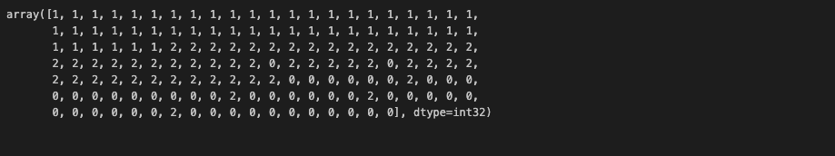
4-2. cluster center 확인
model.cluster_centers_
4-3. cluster center 포함한 시각화 (scatterplot)
# Feature와 예측값 합친 데이터프레임 생성
predict = pd.DataFrame(model.predict(features), columns=['cluster'])
feature = pd.concat([features, predict], axis=1)

# 시각화를 위해 각 cluster의 x, y 좌표값 추출
centers = pd.DataFrame(model.cluster_centers_, columns=['petal length', 'petal width'])
center_x = centers['petal length']
center_y = centers['petal width']

# 시각화
plt.figure(figsize=(10,5))
plt.scatter(feature['petal length'], feature['petal width'], c=feature['cluster'], alpha=0.5)
plt.scatter(center_x, center_y, s=50, marker='D', c='r') #군집 중심 추가
plt.show()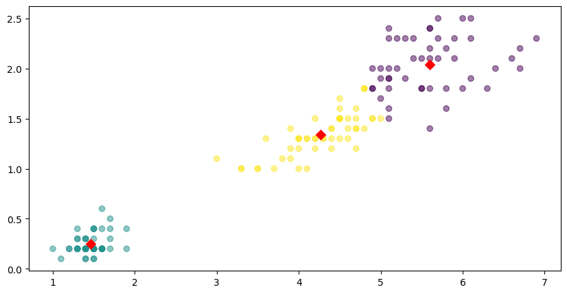
5. 군집 결과 평가
군집 결과 평가를 위해서는 실루엣 분석을 주로 활용한다.
# Import
from sklearn.metrics import silhouette_samples, silhouette_score

# 데이터 읽기
iris = load_iris()
feature_names = ['sepal length', 'sepal width', 'petal length', 'petal width']
iris_df = pd.DataFrame(iris.data, columns=feature_names)
kmeans = KMeans(n_clusters=3).fit(iris_df)

# 군집 결과 정리
iris_df['cluster'] = kmeans.labels_

# 군집 결과 평가를 위한 작업
avg_value = silhouette_score(iris_df, iris_df['cluster'])
score_values = silhouette_samples(iris_df, iris_df['cluster'])

# 실루엣 플랏 그리는 함수 정의
def visualize_silhouette(cluster_lists, X_features):

    from sklearn.datasets import make_blobs
    from sklearn.cluster import KMeans
    from sklearn.metrics import silhouette_samples, silhouette_score

    import matplotlib.pyplot as plt
    import matplotlib.cm as cm
    import math

    n_cols = len(cluster_lists)

    fig, axs = plt.subplots(figsize=(4*n_cols, 4), nrows=1, ncols=n_cols)

    for ind, n_cluster in enumerate(cluster_lists):

        clusterer = KMeans(n_clusters = n_cluster, max_iter=500, random_state=0)
        cluster_labels = clusterer.fit_predict(X_features)

        sil_avg = silhouette_score(X_features, cluster_labels)
        sil_values = silhouette_samples(X_features, cluster_labels)

        y_lower = 10
        axs[ind].set_title('Number of Cluster : '+ str(n_cluster)+'\n' \
                          'Silhouette Score :' + str(round(sil_avg,3)) )
        axs[ind].set_xlabel("The silhouette coefficient values")
        axs[ind].set_ylabel("Cluster label")
        axs[ind].set_xlim([-0.1, 1])
        axs[ind].set_ylim([0, len(X_features) + (n_cluster + 1) * 10])
        axs[ind].set_yticks([])  # Clear the yaxis labels / ticks
        axs[ind].set_xticks([0, 0.2, 0.4, 0.6, 0.8, 1])

        for i in range(n_cluster):
            ith_cluster_sil_values = sil_values[cluster_labels==i]
            ith_cluster_sil_values.sort()

            size_cluster_i = ith_cluster_sil_values.shape[0]
            y_upper = y_lower + size_cluster_i

            color = cm.nipy_spectral(float(i) / n_cluster)
            axs[ind].fill_betweenx(np.arange(y_lower, y_upper), 0, ith_cluster_sil_values, \
                                facecolor=color, edgecolor=color, alpha=0.7)
            axs[ind].text(-0.05, y_lower + 0.5 * size_cluster_i, str(i))
            y_lower = y_upper + 10

        axs[ind].axvline(x=sil_avg, color="red", linestyle="--")

# 실루엣 플랏 그리기
visualize_silhouette([2, 3, 4], iris.data)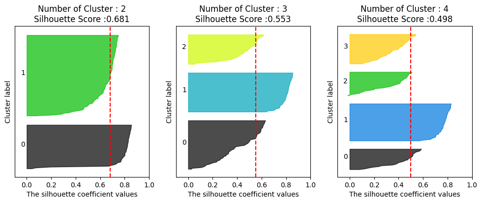
실루엣 플랏을 통해 cluster 수는 몇개가 가장 적절한지를 시각적으로 확인해볼 수 있다. 여기서 cluster 2개가 가장 적절하다고 해석할 수 있겠다. (실루엣 플랏에 대한 설명은 아래에)
실루엣 플랏이란?
클러스터링 결과가 얼마나 잘 나왔는지를 보여주는 그래프.
- 각각의 데이터 포인트가:
- 자기가 속한 클러스터 안에서 얼마나 잘 어울리는지
- 다른 클러스터와는 얼마나 멀리 떨어져 있는지를 수치화해서 보여줌
실루엣 점수
실루엣 점수는 -1 ~ 1 사이 값을 가진다.
| 점수 범위 | 해석 |
|---|---|
| 1에 가까움 | 잘 군집화됨 (다른 클러스터와 확실히 분리됨) |
| 0 근처 | 두 클러스터 경계에 걸쳐 있음 (모호) |
| 0보다 작음 | 잘못 군집화됨 (다른 클러스터에 속했어야 함) |
실루엣 플랏 해석하는 방법
- X축: 실루엣 점수 (보통 0부터 1 사이로 그려져)
- Y축: 데이터 포인트 (각 군집별로 묶어서 나열)
- 막대의 길이: 각 데이터 포인트의 실루엣 점수
- 막대 색깔: 소속된 클러스터
좋은 실루엣 플랏은?
- 막대들이 길고 오른쪽(1쪽)으로 쭉 뻗어있다 → 데이터들이 군집에 잘 맞는다는 뜻
- 클러스터별로 막대들이 일관되게 크다 → 클러스터 내부 품질이 고르게 좋음
- 클러스터끼리 막대들의 중첩이 거의 없다 → 서로 잘 분리되어 있다는 뜻
나쁜 실루엣 플랏은?
- 막대들이 짧다 → 데이터가 자기 클러스터에 딱히 잘 어울리지 않음
- 왼쪽(0 이하)으로 뻗는 막대가 많다 → 군집이 엉망임. (클러스터 잘못 묶였음)
- 클러스터마다 막대 크기 편차가 심하다 → 어떤 클러스터는 품질 좋고, 어떤 건 별로임
기타
- "k"를 정하는 좋은 방법 ➔ 엘보우 방법(Elbow Method)
- "좋은 군집"이란 ➔ 같은 군집 안 데이터는 서로 비슷하고, 군집끼리는 다르면 베스트
(이 글은 제로베이스 데이터 취업 스쿨의 강의 자료 일부를 발췌하여 작성되었습니다.)

데이터 엔지니어 도전기 / 스터디 노트