Navigation
html list 스타일 없애기
list-style: none;사용하기
Section
재사용 가능한 grid 만들기
<section class="section-how grid grid--2-cols">
  <div>Test 1</div>
  <div>Test 2</div>
  <div>Test 3</div>
  <div>Test 4</div>
</section>

<section class="section-how grid grid--3-cols">
  <div>Test 1</div>
  <div>Test 2</div>
  <div>Test 3</div>
  <div>Test 4</div>
</section>.grid{
display: grid;
gap: 9.6rem;
}
.grid--2-cols{
grid-template-columns: repeat(2,1fr);
}
.grid--3-cols{
grid-template-columns: repeat(3,1fr);
}.grid 클래스 외에 변형을 주어 원하는 column 개수 별로 그리드를 재사용할 수 있다.
재사용 가능한 container 만들기
.container{
  max-width: 120rem;
  margin: 0 auto;
}- max-wdith이 있고 중앙 정렬해주는 컨테이너이다.
- max-width로는 관습적으로 120rem 또는 1140px 로 할 때가 많다.
container 내부와 외부 색을 맞춰주어야 할 때
<section class="section-how container grid grid--2-cols">
    <div>Test 1</div>
    <div>Test 2</div>
    <div>Test 3</div>
    <div>Test 4</div>
</section>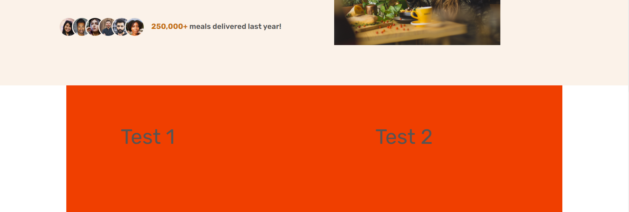
<div>를 만들어 준다.
<section class="section-how">
  <div class="container grid grid--2-cols">
    <div>Test 1</div>
    <div>Test 2</div>
    <div>Test 3</div>
    <div>Test 4</div>
  </div>
</section>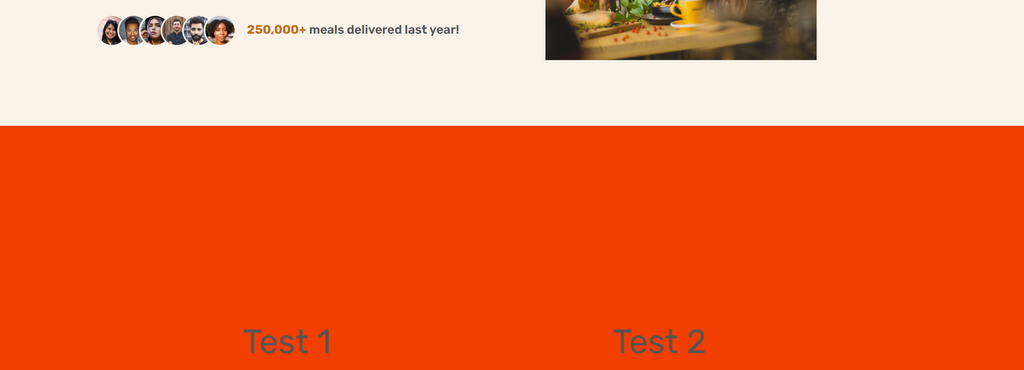
How it works 섹션 만들기
이미지 뒤에 원 만들기
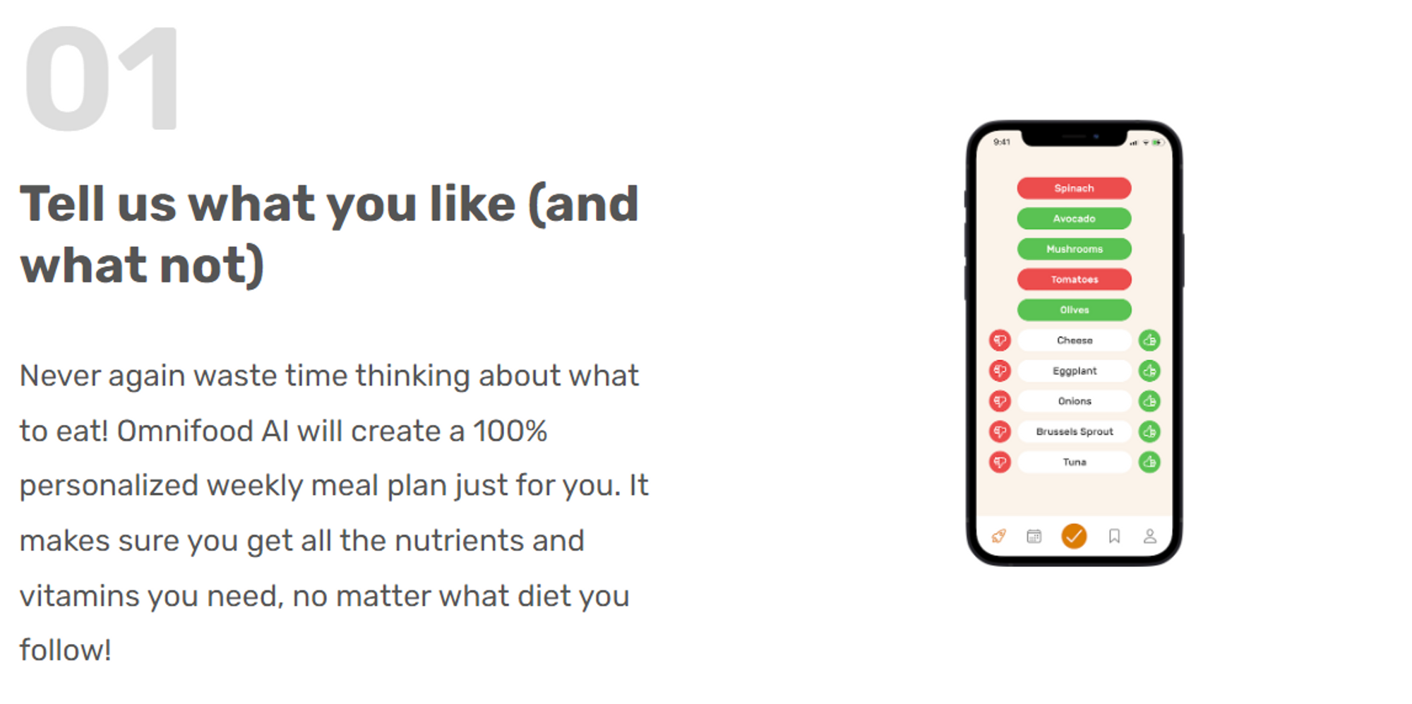
<div class="step-img-box">
  <img
    src="img/app/app-screen-3.png"
    class="step-img"
    alt="iPohone
  app delivery screen"
  />
</div>step-img-box안에::before를 사용해 자식 요소를 만든다.- 이 때, 부모 요소의 너비는 정해져 있지만 높이가 정해져 있지 않아
width: 60%;는 적용되지만height: 60%;는 적용되지 않는다.
⇒ 이를 위한 트릭으로padding-bottom:60%;를 사용하면 된다.
⇒ padding-bottom은 부모 요소의 너비에 의해 정의되기 때문에width: 60%;와 같은 길이를 가진다.
.step-img-box::before{
  content: "";
  display: block;
  width: 60%;
  /* flexible하기 위해 %를 사용하는 것 */
  /* height: 60% 부모 요소의 높이는 설정되어 있지 않아, 60%가 적용되지 않는다. */
  padding-bottom: 60%;
  /* 원을 만들기 위해, 정사각형을 만들어야 하므로, 높이가 너비와 같은 60%를 만들기 위한 트릭 */
  /* 부모 요소의 너비에 의해 정의됨. */
  background-color: #fdf2e9;

  position: absolute;
  /* 주의: 부모 요소 step-img-box에 realtive 설정해주기! */
  top: 50%;
  left: 50%;
  transform: translate(-50%,-50%);

  border-radius: 50%;
  z-index: -1;
}
Featured In 섹션 만들기
<div class="container">
  <h2 class="heading-featured-in">As featured in</h2>
  <div class="logos">
    <img src="img/logos/techcrunch.png" alt="Techcrunch logo" />
    <img
      src="img/logos/business-insider.png"
      alt="Business Insider logo"
    />
    <img
      src="img/logos/the-new-york-times.png"
      alt="The New York Times logo"
    />
    <img src="img/logos/forbes.png" alt="Forbes logo" />
    <img src="img/logos/usa-today.png" alt="USA Today logo" />
  </div>
</div>
filter 속성
- grayscale
흑백으로 변경해준다. 우리가 원하는 것은 전부 회색빛을 띄게 하는 거라 다른 기능을 써야한다.
.logos img{
  height: 3.2rem;
  filter: grayscale(100%);
}
- brightness
brightness가 0이면 모든 로고가 검은색이 되고, 여기에 opacity를 추가하면 회색빛을 띈다.
.logos img{
  height: 3.2rem;
  filter: brightness(0);
  opacity:50%;
}
- 그 외에 많은 특성들이 있다.
blur, saturate, contrast, …
Meal 섹션 만들기
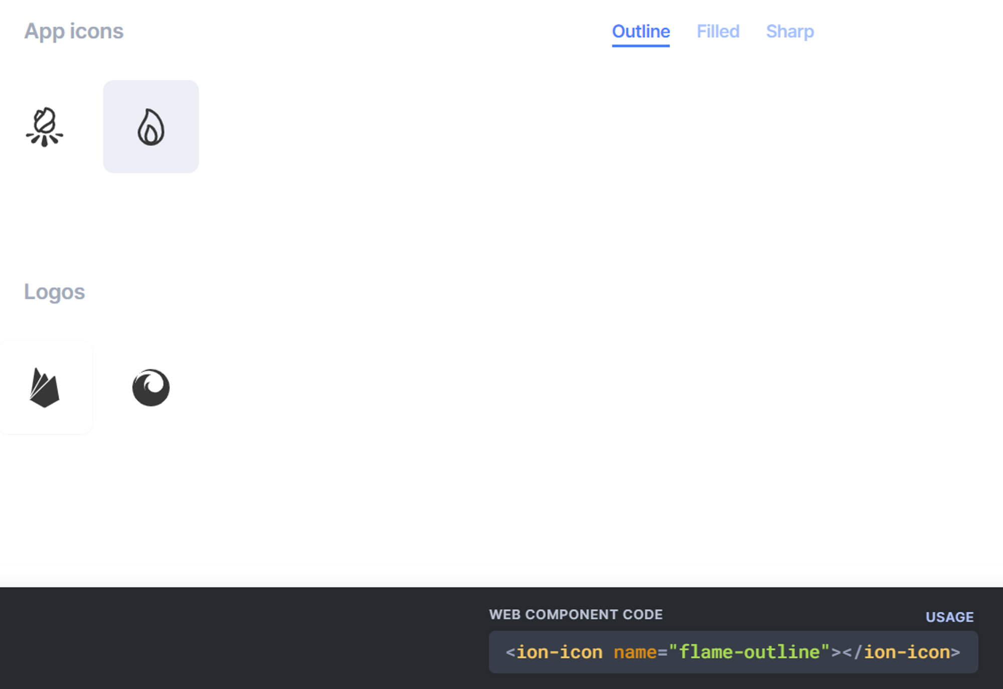
icon 추가하기: icon 코드를 html 안에 추가했을 때의 문제점
heroicon과 같은 사이트에서 svg 아이콘 코드를 복사해 html에 추가하면, 코드가 길어져 가독성이 떨어지고 이해하기 어려워진다.
이를 해결하기 위해 ionicons에서 아이콘 팩을 <script>를 html의 body 끝에 붙여넣고, 아이콘 눌러 복사된 내용을 사용하면 된다.
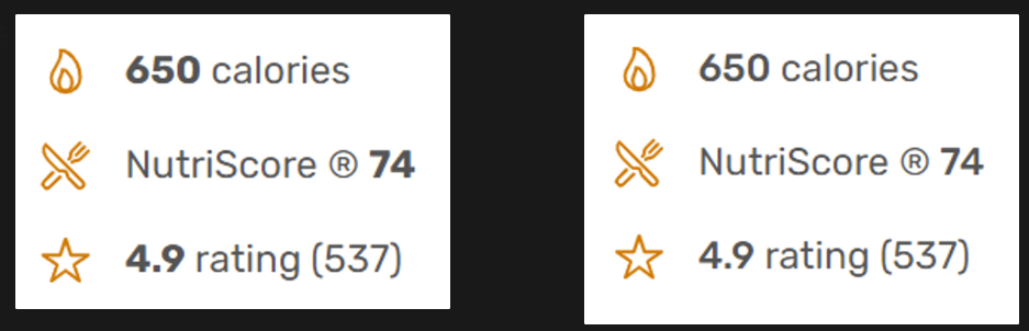
잉여 텍스트가 있을 때 래핑하기
<li class="meal-attribute">
  <ion-icon name="flame-outline"></ion-icon>650 calories ❌
</li>
<li class="meal-attribute">
  <ion-icon name="flame-outline"></ion-icon>
  <span>650 calories</span>✅보기가 더 좋다.
</li>
아이콘 속성 파악하기
icon을 제공하는 곳마다 어떤 곳은 색깔에 대해 stroke를 쓸 수도 있고, fill을 쓸 수도 있고, color를 쓸 수도 있다.
글자 크기에 대해서는 height, width, font-size 등을 쓸 수 있다.
개발자 도구를 통해 확인해보는 습관을 가지자.
strong 태그를 사용했는데 글씨가 너무 굵을 때
- strong 태그에 대해 font-weight를 따로 지정해주면 된다.
strong{
  font-weight: 500;
}
카드 만들기
- 그림자
카드를 만들 때 수직으로만 그림자를 주고,
blur는 수직 그림자 크기의 2배가 되도록 하면 편하다.
.meal{
	/* offset-x | offset-y | blur-radius | color */
  box-shadow: 0 2.4rem 4.8rem rgba(0,0,0,0.075);
}- 카드 끝을 둥글게 만들기

.meal{
	/* offset-x | offset-y | blur-radius | color */
  box-shadow: 0 2.4rem 4.8rem rgba(0,0,0,0.075);
  border-radius: 11px;
}
위와 같이 하면 meal 클래스 안에 있는 이미지의 끝은 여전히 뾰족하다.
이를 해결하기 위해 아래처럼 overflow: hidden을 사용할 수 있다.
.meal{
/* offset-x | offset-y | blur-radius | color */
box-shadow: 0 2.4rem 4.8rem rgba(0,0,0,0.075);
border-radius: 11px;
overflow: hidden;
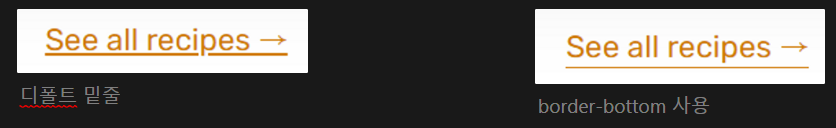
}링크에 밑줄 칠 때 border-bottm 사용하기
- 디폴트로 있는 밑줄을 없애고 border-bottom을 사용하는 것이 좋다.
currentColor를 사용하면 현재 텍스트 색깔과 동일한 색을 선택한다.
그래서:hover,:active에 색깔이 변하는 효과를 주면 border-bottom 색깔도 같이 변한다.
.link:link,.link:visited{
  display: inline-block;
  color: #e67e22;
  text-decoration: none;
  border-bottom: 1px solid currentColor;
  padding-bottom: 2px;
}
링크 hover할 때 전체 레이아웃이 흔들리는 효과 방지하기
- 1px의 border-bottom이 있는 링크를 hover할 때,
border: none;효과를 주면 1px 차이로 전체 레이아웃이 흔들린다. - 이를 방지하기 위해
transparent키워드를 사용할 수 있다.
.link:hover, .link:active{
  color: #cf711f;
  /* border-bottom: none; */
  border-bottom: 1px solid transparent;
}
카드에 hover했을 때 올라가는 효과 주기
.meal{
  box-shadow: 0 2.4rem 4.8rem rgba(0,0,0,0.075);

  border-radius: 11px;
  overflow: hidden;

  transition: all 0.4s;
}

.meal:hover{
  transform: translateY(-1.2rem); /* 위로 올라가면서 */
  box-shadow: 0 3.2rem 6.4rem rgba(0,0,0,0.06); /* 빛에 가까워지므로 그림자는 더 커지도록 */
}transition은 항상 :original class에 써준다.:hover에 써주면 안됨.
Testimonial 섹션 만들기
<figure class="testimonials">
<img
class="testimonial-img"
alt="Photo of customer Dave Bryson"
src="img/customers/dave.jpg"
/>
<blockquote class="testimonial-text">
Inexpensive, healthy and great-tasting meals, without even having
to order manually! It feels truly magical.
</blockquote>
<p class="testimonial-name">—Dave Bryson</p>
</figure><figure>: 사진 등이 함께 들어갈 때 자주 쓰인다.
—: 이름 옆에 자주 쓰인다.
<figcaptuion>: figure의 캡션으로 쓰인다. <figure> 태그 안에서만 쓰일 수 있다.
이미지들 사이에 틈이 생기는 이유
- inline 요소이기 때문에 흰색 틈이 생긴다.
display:block;을 설정해주면 해결할 수 있다.
그리드의 행, 열에 대해 %처럼 비율을 나누는 법
grid-template-columns: 55fr 45fr;- 합쳐서 100이 되도록 하여 위와 같이 55%, 45%처럼 쓸 수 있다.
갤러리에서 사진을 확대할 때 틀을 넘지 않고 확대하는 효과 주기
.gallery-item{
  overflow: hidden;
}

.gallery-item img{
  display:block;
  width:100%;
  transition: all 0.4s;
}

.gallery-item img:hover{
  transform: scale(1.1);
}