Logistic regression (로지스틱 회귀)
- binary classification (이진 분류) 를 위한 선형 모델
- 이름은 regression 이지만 regression (회귀) 이 아닌 classification (분류) 모델
odds ratio (오즈비, 승산비) : 특정 이벤트가 발생할 확률
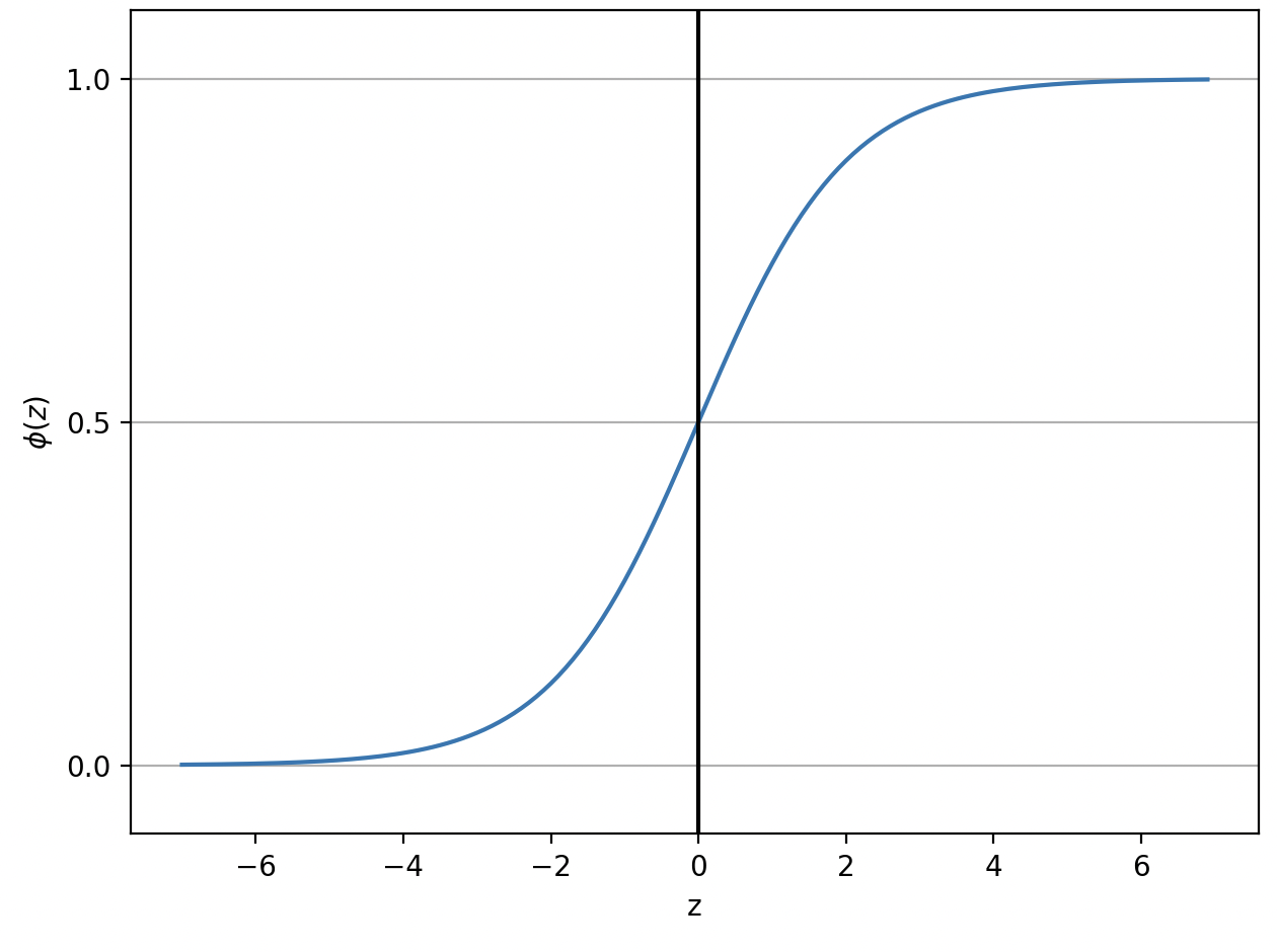
logistic sigmoid funciton (= sigmoid function)
- ϕ(z)=1+e−z1
- 로지스틱 시그모이드 함수, 시그모이드 함수
- 로지스틱 회귀에서
activation function(활성화 홤수) 로 사용
- s자 형태를 그리는 함수
- z 값에 따라 0, 1에 수렴. 중간값 ϕ(0)=0.5
import matplotlib.pyplot as plt
import numpy as np
def sigmoid(z):
return 1.0 / (1.0 + np.exp(-z))
def show_sigmoid():
"""
-7 ~ 7 범위의 sigmoid 시각화
:return:
"""
z = np.arange(-7, 7, 0.1)
phi_z = sigmoid(z)
plt.plot(z, phi_z)
plt.axvline(0.0, color='k')
plt.ylim(-0.1, 1.1)
plt.xlabel('z')
plt.ylabel('$\phi (z)$')
plt.yticks([0.0, 0.5, 1.0])
ax = plt.gca()
ax.yaxis.grid(True)
plt.tight_layout()
plt.show()
if __name__=="__main__":
show_sigmoid()
Scikit-learn 으로 logistic regression training
 pipenv install scikit-learn numpy
 pipenv install matplotlib
from sklearn import datasets
from sklearn.model_selection import train_test_split
from sklearn.preprocessing import StandardScaler
from matplotlib.colors import ListedColormap
from sklearn.linear_model import LogisticRegression
import matplotlib.pyplot as plt
import numpy as np
def train_logistic_regression():
"""
iris(붓꽃) 데이터셋으로 꽃받침 길이, 꽃잎 길이 2개 feature 로 분류하기
:return:
"""
iris_dataset = datasets.load_iris()
x = iris_dataset.data[:, [2, 3]]
y = iris_dataset.target
x_train, x_test, y_train, y_test = train_test_split(x, y, test_size=0.3, random_state=1, stratify=y)
print(f'class label : {np.unique(y)}')
print(f'y original data set label count : {np.bincount(y)}')
print(f'y training data set label count : {np.bincount(y_train)}')
print(f'y test data set label count : {np.bincount(y_test)}')
sc = StandardScaler()
sc.fit(x_train)
x_train_std = sc.transform(x_train)
x_test_std = sc.transform(x_test)
lr = LogisticRegression(C=100.0, random_state=1)
lr.fit(x_train_std, y_train)
print(f'predict_proba (class 소속 확률) :\n {lr.predict_proba(x_test_std[:3, :])}')
print(f'predict (class label) :\n {lr.predict(x_test_std[:3, :])}')
x_combined_std = np.vstack((x_train_std, x_test_std))
y_combined = np.hstack((y_train, y_test))
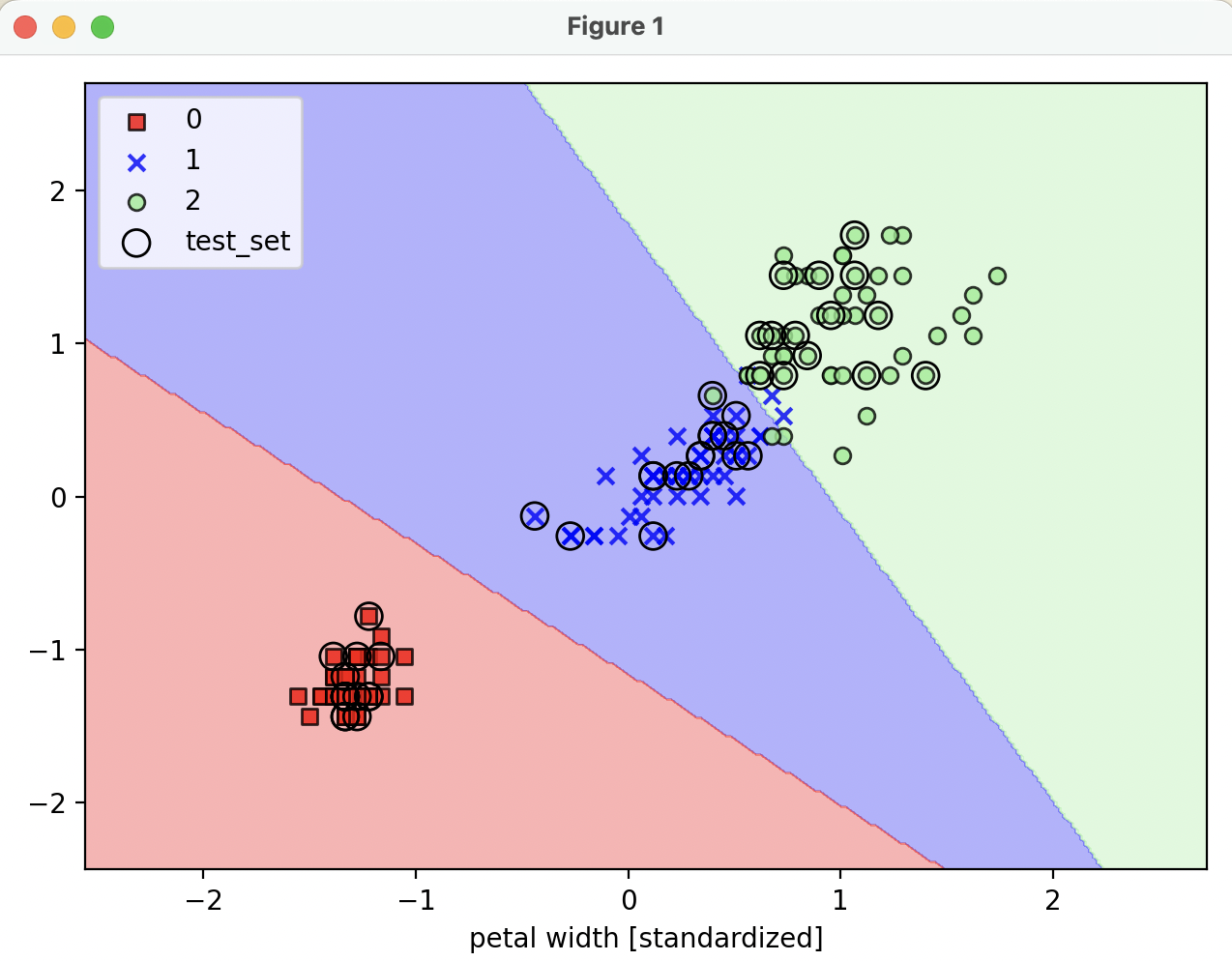
plot_decision_regions(x=x_combined_std, y=y_combined, classifier=lr, test_idx=range(105, 150))
plt.xlabel('petal length [standardized]')
plt.xlabel('petal width [standardized]')
plt.legend(loc='upper left')
plt.tight_layout()
plt.show()
def plot_decision_regions(x, y, classifier, test_idx=None, resolution=0.02):
"""
시각화
:param x: 붓꽃 데이터셋 feature (0번 열 : 꽃받침 길이, 1번 열 : 꽃잎 길이)
:param y: class label
:param classifier: 분류기
:param test_idx:
:param resolution:
:return:
"""
markers = ('s', 'x', 'o', '^', 'v')
colors = ('red', 'blue', 'lightgreen', 'gray', 'cyan')
cmap = ListedColormap(colors[:len(np.unique(y))])
x1_min, x1_max = x[:, 0].min() - 1, x[:, 0].max() + 1
x2_min, x2_max = x[:, 1].min() - 1, x[:, 1].max() + 1
xx1, xx2 = np.meshgrid(np.arange(x1_min, x1_max, resolution),
np.arange(x2_min, x2_max, resolution))
z = classifier.predict(np.array([xx1.ravel(), xx2.ravel()]).T)
z = z.reshape(xx1.shape)
plt.contourf(xx1, xx2, z, alpha=0.3, cmap=cmap)
plt.xlim(xx1.min(), xx1.max())
plt.ylim(xx2.min(), xx2.max())
for idx, cl in enumerate(np.unique(y)):
plt.scatter(x=x[y == cl, 0], y=x[y == cl, 1],
alpha=0.8, c=colors[idx],
marker=markers[idx], label=cl,
edgecolor='black')
if test_idx:
x_test, y_test = x[test_idx, :], y[test_idx]
plt.scatter(x_test[:, 0], x_test[:, 1],
facecolors='none', edgecolor='black', alpha=1.0,
linewidth=1, marker='o',
s=100, label='test_set')
predict_proba : 각 class 에 소속할 확률
- -> 가장 큰 값의 column 이 예측 class label 이 됨
- 직접 사용하기보단
pridict 메소드로 class label 을 가져오는 편
print(f'predict_proba (class 소속 확률) :\n {lr.predict_proba(x_test_std[:3, :])}')
print(f'predict (class label) :\n {lr.predict(x_test_std[:3, :])}')
predict_proba (class 소속 확률) :
[[1.52213484e-12 3.85303417e-04 9.99614697e-01]
[9.93560717e-01 6.43928295e-03 1.14112016e-15]
[9.98655228e-01 1.34477208e-03 1.76178271e-17]]
predict (class label) :
[2 0 0]
reference
- 서적 '머신러닝 교과서 with 파이썬, 사이킷런, 텐서플로 개정 3판'
