
📚 Simple Logistic Regression
저번 글에서 다룬 Simple Logistic Regression을 Winsconsin Breast Cancer Data Set을 이용하여 구현해보자. 이번에도 sklearn과 tensorflow를 사용하여 구현하고, Cross Validation을 사용하여 검증까지 해보자.
from sklearn.datasets import load_breast_cancer

import numpy as np
import pandas as pd
import matplotlib.pyplot as plt

from scipy import stats
from sklearn.preprocessing import MinMaxScaler
from sklearn.model_selection import train_test_split

from sklearn import linear_model
from sklearn.model_selection import cross_val_score

from tensorflow.keras.models import Sequential
from tensorflow.keras.layers import Flatten, Dense
from tensorflow.keras.optimizers import Adam
from tensorflow.keras.metrics import Recall, Precision, BinaryAccuracy
📚 Data Preprocessing
sklearn에서 기본적으로 제공하는 Winsconsin Breast Cancer Data Set을 사용하여 유방암 여부를 예측하는 모델을 구현해보자.
📚 Raw Data Loading
cancer = load_breast_cancer()

print(cancer.data.shape) # (569, 30)
print(cancer.target.shape) # (569,)

x_data = cancer.data # 2차원 ndarray
t_data = cancer.target # 1차원 ndarray

x_data_df = pd.DataFrame(x_data)
t_data_df = pd.DataFrame(t_data.reshape(-1, 1))

df = pd.concat([t_data_df, x_data_df], axis=1)
display(df.head())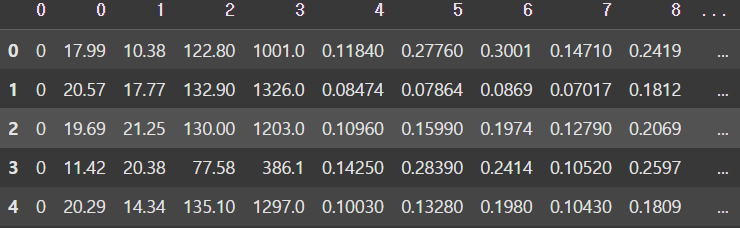
📚 결측치 처리
df.columns[df.isnull().any(axis=0)]
# Index([], dtype='int64')
결측치는 존재하지 않는다.
📚 이상치 처리
Winsconsin Breast Cancer Data Set은 사실 데이터이기 때문에 이상치가 판별은 되지만 실제값이므로 삭제하면 안된다.
📚 데이터 정규화
scaler = MinMaxScaler()
scaler.fit(x_data)
x_data_norm = scaler.transform(x_data)
📚 데이터 분리
x_data_train_norm, x_data_test_norm, t_data_train, t_data_test = \
train_test_split(x_data_norm, t_data,
                 test_size=0.2, stratify=t_data,
                 random_state=2) # stratify : 데이터를 나눌 기준

# 분리된 데이터의 class 비율이 유지되고 있는지 확인
print(np.unique(t_data_train, return_counts=True)) # [170, 285]
print(np.unique(t_data_test, return_counts=True)) # [42, 72]
# [212, 357] => [170, 285], [42, 72]
추후 검증을 위해 train set과 test set으로 나누는 작업이 필요하다. 이때 나누는 비율은 사용자가 지정할 수 있으며, NumPy의 unique() 함수로 출력해보면 지정한 비율에 따라 잘 나눠진 것을 확인할 수 있다.
📚 Simple Logistic Regression 구현 (sklearn)
sklearn_model = linear_model.LogisticRegression()
sklearn_model.fit(x_data_train_norm, t_data_train)

print(sklearn_model.score(x_data_test_norm, t_data_test))
# 0.9649122807017544 (accuracy)
sklearn을 이용하여 Logistic Regression을 구현할 때는 sklearn에서 지원하는 LogisticRegression() 모델을 가져다 사용하면 된다. 이때 score() 함수에 test set을 전달하여 정확도를 출력해 볼 수 있다.
📚 Cross Validation
score = cross_val_score(sklearn_model, x_data_train_norm, t_data_train, cv=5)
# K-fold cross Validation (sklearn 모델만 가능)

print(score.mean()) # 0.9648351648351647
또한, sklearn에서 제공하는 cross_val_score() 사용하여 K-fold cross Validation을 적용하여 모델의 성능을 검증할 수도 있다.
📚 Simple Logistic Regression 구현 (tensorflow)
tensorflow로 구현할 때는 learning_rate를 다르게 학습한 후, evaluate() 함수를 사용하여 test set에 대해 평가를 진행해보고, history 객체에 담긴 데이터를 사용하여 epoch마다 accuracy, validation accuracy, loss, validation_loss의 변화를 그래프로 알아보자.
📚 learing_rate = 1e-4
keras_model = Sequential()

keras_model.add(Flatten(input_shape=(30,)))
keras_model.add(Dense(units=1, activation='sigmoid'))

keras_model.compile(optimizer=Adam(learning_rate=1e-4),
                    loss='binary_crossentropy',
                    metrics=['acc'])

history = keras_model.fit(x_data_train_norm, t_data_train.reshape(-1, 1),
                          epochs=1000, verbose=1,
                          validation_split=0.2,
                          batch_size=100)
                          # val_acc: 0.9121 - val_loss: 0.5112

result = keras_model.evaluate(x_data_test_norm, t_data_test.reshape(-1, 1))

print(result) # [0.544389009475708, 0.8421052694320679]
# 첫번째 값은 loss, 두번째 값은 accuracyplt.xlabel('epochs')
plt.plot(history.history['acc'], color='r')
plt.plot(history.history['val_acc'], color='b')
plt.plot(history.history['loss'], color='g')
plt.plot(history.history['val_loss'], color='magenta')
plt.legend(['acc','val_acc', 'loss', 'val_loss'])
plt.show()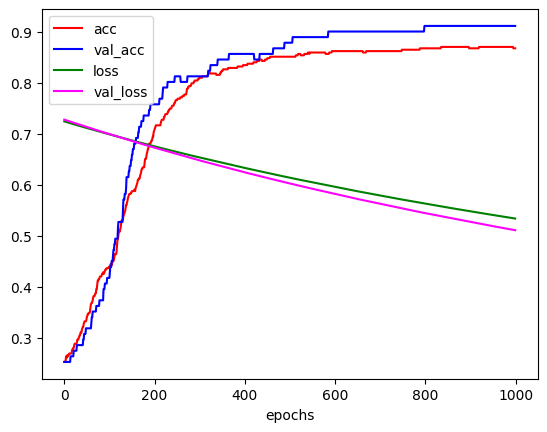
📚 learing_rate = 1e-2
keras_model = Sequential()

keras_model.add(Flatten(input_shape=(30,)))
keras_model.add(Dense(units=1, activation='sigmoid'))

keras_model.compile(optimizer=Adam(learning_rate=1e-2),
                    loss='binary_crossentropy',
                    metrics=['acc'])

history = keras_model.fit(x_data_train_norm, t_data_train.reshape(-1, 1),
                          epochs=1000, verbose=1,
                          validation_split=0.2,
                          batch_size=100)
                          # val_acc: 0.9121 - val_loss: 0.5112

result = keras_model.evaluate(x_data_test_norm, t_data_test)

print(result) # [0.544389009475708, 0.8421052694320679]
# 첫번째 값은 loss, 두번째 값은 accuracyplt.xlabel('epochs')
plt.plot(history.history['acc'], color='r')
plt.plot(history.history['val_acc'], color='b')
plt.plot(history.history['loss'], color='g')
plt.plot(history.history['val_loss'], color='magenta')
plt.legend(['acc','val_acc', 'loss', 'val_loss'])
plt.show()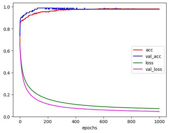
learning_rate에 따라 학습이 어떻게 진행되는지 그래프로 그려보고 비교해 보았다. 이때 그래프의 모습을 보면 일정 epoch가 지나면 더이상 변화가 거의 없는 것을 볼 수 있는데, 이는 EarlyStopping을 사용하여 불필요한 epoch를 줄여 학습시간을 줄일 수 있다. 이는 추후에 더 자세히 다뤄볼 것이다.