복습문제
1. 히스토그램은 자료가 연속적이지 않아도 그림으로 나타낸다 (o x)
[답변] o - 그림으로 나타내기는 하지만 경고가 뜨지 않나..?
[정답] x
[추가 답변] 그림으로 나타낼 수는 있다.
그냥 나타날 수도 있고, 뭐 stat = 'count'를 뒤에 붙여준다거나 해서
하지만 애초에 '히스토그램'이라는거 자체가 연속적인 값을 나타내기 위해서 사용하는 것이므로
자료가 연속적이지 않을때는 사용하지 않는다.


2. 아래 내용 중 shape=cty에서만 에러가 나타났다. 원인은?
(drv, class,rans = char / cty = int)
ggplot(mpg, aes(displ, cty, shape=drv)) + geom_point()
ggplot(mpg, aes(displ, cty, shape=class)) + geom_point()
ggplot(mpg, aes(displ, cty, shape=cty)) + geom_point()
ggplot(mpg, aes(displ, cty, shape=trans)) + geom_point()
[답변] 숫자타입이라서 표현할 수 있는게 제한적이라 오류가 난 거 같다


3. histogram을 실행할 때는 변수가 연속되어야 한다.
그러나 변수가 연속하지 않아도 값이 나오게 하려면?
(아래 괄호안에 들어갈 것을 쓰시오)
geom_histogram(    )
[답변] stat = 'count'


4. 행과 열을 지칭하는 용어들을 세개이상 적어보시오
[답변] 	행 :  row = observation = 관측치
		열 : column = 변수 = variables = 특성 = 속성


5. gplot의 이름을 추가하고
x축, y축 라벨명을 변경하고자 할 때 할 수 있는 2가지 방법은?
[답변] + labs(title="", x="", y="")
or
+ xlab(), + ylab() + labs(title="", x="", y="")


6. 아래처럼 한 화면에 class별로 보고 싶다. 어떤식으로 작성하면 되는가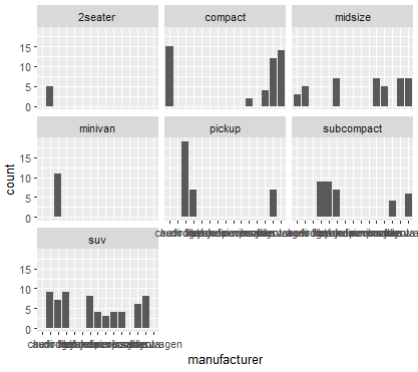
[답변] ggplot(mpg, aes(manufacturer)) + geom_bar()
		+ facet_wrap(vars(class))
[추가답변] ggplot(mpg, aes(manufacturer))
		+ geom_bar()+ facet_wrap( ~ class, ncol=3)


7. mpg속 year의 데이터를 보고싶다.
단, 중복된 값들은 한번만 확인하고 싶다면
[답변] unique(mpg$year)


8. 아래 그림을 보고싶다. 어떻게 작성하면 되는가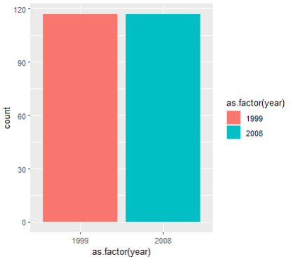
[답변] ggplot(mpg, aes(x = as.factor(year),
			fill=as.factor(year))) + geom_bar()
[추가답변] mpg$year <- as.factor로 값을 변환해준 다음
출력하면 이름이 깔끔하게 "year"로 나오니까
값을 보존할 필요가 없다면 고려해볼만하다


9. ggplot 표를 그리고 라벨을 붙이려 한다.
다음중 사용할 함수가 아닌것은?
1) labs(title=)
2) ncol()
3) xlab()
[답변] 3


10. ggplot(mpg, aes(x=class)) + geom_histogram()을 올바르게 출력하시오
[답변] ggplot(mpg,aes(x=class)) +
  geom_histogram(stat='count')

11. 아래 그림을 완성하시오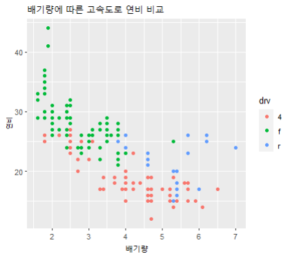
[답변] ggplot(mpg, aes(x=displ, y=hwy)) +
  geom_point(aes(color = drv)) +
  labs(title="배기량에 따른 고속도로 연비 비교", x="배기량", y="연비")


12. 아래 그림처럼 drv 별로 나눠서 보여달라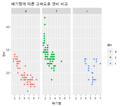
[답변] ggplot(mpg, aes(x=displ, y=hwy)) +
            geom_point(aes(color = drv)) +
            labs(title="배기량에 따른 고속도로 연비 비교",
            		x="배기량", y="연비") +
            facet_wrap(vars(drv))
[추가답변] ggplot(mpg, aes(x=displ, y=hwy)) +
            geom_point(aes(color = drv)) +
            labs(title="배기량에 따른 고속도로 연비 비교",
            		x="배기량", y="연비") +
            facet_wrap(.~drv, ncol=2)
🌱 gapminder
gapminder data
국가별 경제 수준과 의료 수준 동향을 정리한 DataSet으로 세계 각국의 기대수명, 1인당 국내총생산, 인구 데이터 등을 집계해놓은 것이다.
gapminder 속의 gapminder 데이터를 사용하겠다.

install.packages("gapminder")
library("gapminder")

> gapminder %>%
+   filter(year == 2007) %>%
+   group_by(continent) %>%
+   summarise(lifeExp = median(lifeExp))
# A tibble: 5 × 2
  continent lifeExp
  <fct>       <dbl>
1 Africa       52.9
2 Americas     72.9
3 Asia         72.4
4 Europe       78.6
5 Oceania      80.7
bar 형태로 출력해보기
gapminder %>%
  filter(year == 2007) %>%
  group_by(continent) %>%
  summarise(lifeExp = median(lifeExp)) %>%
  ggplot(aes(x=continent, y=lifeExp)) + geom_col()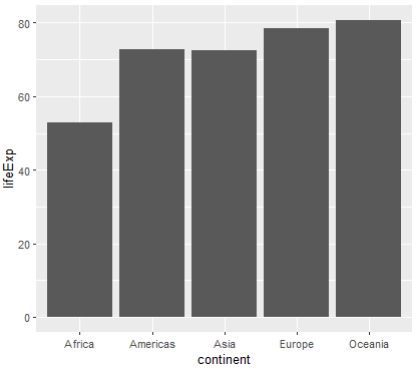
박스플롯 형태로 출력해보기
ggplot(gapminder, aes(x=continent, y=lifeExp, fill=continent)) + geom_boxplot()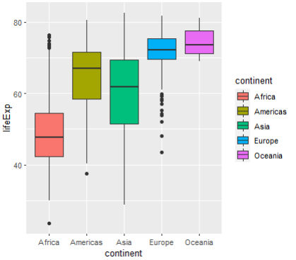
+) 🧃 범례 없애기
범례(=legend)를 제거하고 싶을 때가 있다.
위 그래프에 색을 넣고 옆에 범례는 안보이도록 하고 싶다.
gapminder %>%
  filter(year == 2007) %>%
  group_by(continent) %>%
  summarise(lifeExp = median(lifeExp)) %>%
  ggplot(aes(x=continent, y=lifeExp, fill=continent)) +
  geom_col() +
  theme(legend.position = "none")
> # 아래 코드가 범례를 지우는 코드이다
> # theme(legend.position = "none")
🍃 ggplotly
plotly : 인터랙티브 데이터 시각화를 할 때 사용
install.packages("plotly")
library(plotly)
ggplot2를 사용하여 생성한 객체를 plotly 객체로 전환하는 방법으로 사용하면 된다.
ggplotly(
  mpg %>% ggplot(aes(x=displ, y=cty, color=drv)) +
  geom_point()+
  theme(legend.position = "none")
)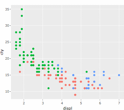
그래프를 만질 수 있게 되었다..!
🍃 색상바꾸기
데이터 변환
사용할 데이터의 형식 변환부터 해주자
현재 num 인 mtcars$cyl 를
as.factor(mtcars$cyl) 를 사용하여 형변환
🧃 scale_fill_manual()
scale_fill_manual() : 변수가 채움색(fill)에 들어가는 값을 직접(manual) 결정하겠다는 의미
구체적으로 보자.
- value는 그래프의 색(헥사코드도 가능)
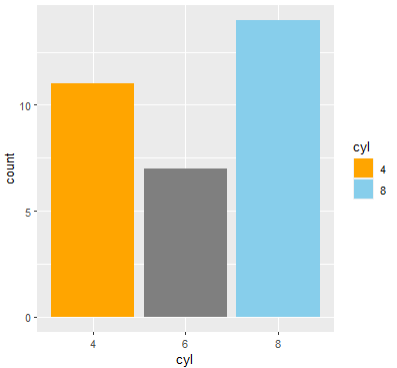
ggplot(mtcars, aes(x=cyl, fill=cyl)) +
  geom_bar() +
  scale_fill_manual(
    values = c("orange", "skyblue", "#ffff65")
  )

# 있는 값 만큼 values 값이 모두 지정해줘야한다.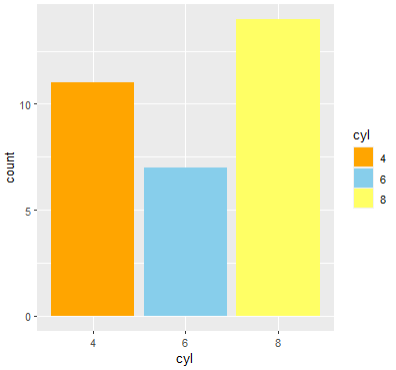
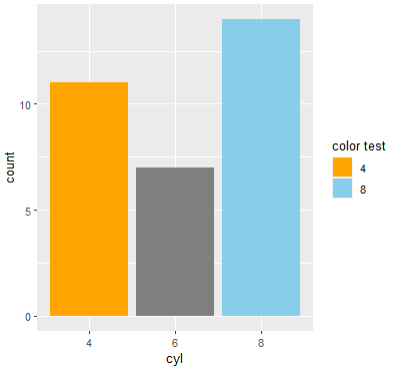
- breaks는 범례에 나타나는 변수값
실행화면을 보면 코드에 적어준 '4,8' 만 범례에 나타난 모습을 확인할 수 있다.
ggplot(mtcars, aes(x=cyl, fill=cyl)) +
  geom_bar() +
  scale_fill_manual(
    values = c("orange", "skyblue", "#ffff65"),
    breaks = c("4", "8")
  )
- name은 범례의 제목이다.
ggplot(mtcars, aes(x=cyl, fill=cyl)) +
  geom_bar() +
  scale_fill_manual(
    values = c("orange", "skyblue", "#ffff65"),
    breaks = c("4", "8"),
    name = "color test"
  )
- labels는 범례의 설명
ggplot(mtcars, aes(x=cyl, fill=cyl)) +
  geom_bar() +
  scale_fill_manual(
    values = c("orange", "skyblue", "#ffff65"),
    breaks = c("4", "8"),
    name = "color test",
    labels = c("오렌지", "파랑")
  )

# 보여지는 범례 값을 2개만 지정해줬기 때문에
# 라벨도 2개만 달 수 있다.
# 더 달면 오류는 안나는데 어차피 안보임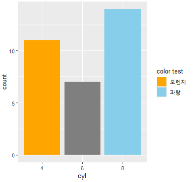
🧃 hcl 각도조정
scal_fill_hue(c = 50)
ggplot(mtcars, aes(x=cyl, fill=cyl)) +
  geom_bar() +
  scale_fill_hue(c = 40)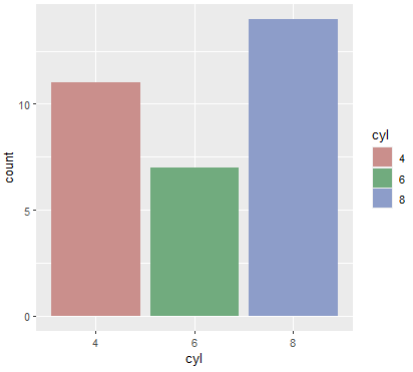
c 값을 90으로 바꾸면
🧃 팔레트 사용
R에서 지원하는 팔레트는 다음의 함수로 살펴볼 수 있다
RColorBrewer::display.brewer.all()
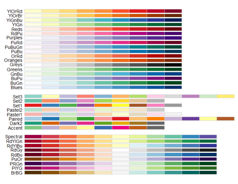
- 팔레트는 이산형 범주를 위해 마련되었으며 순위형, 발산형, 범주형으로 나눠볼 수 있다. 참고
미리 만들어놓은 팔레트 사용하기
scale_fill_brewer(palette = "")
ggplot(mtcars, aes(x=cyl, fill=cyl)) +
  geom_bar() +
  scale_fill_brewer(palette = "Set3")
-------
🧃 산점도 라벨 붙이기
install.packages("ggrepel")
library(ggrepel)


ggplot(mtcars, aes(wt, mpg)) +
  geom_point()+
  geom_text_repel(aes(label = rownames(mtcars)))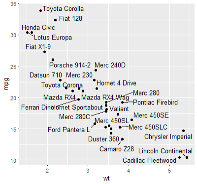
----- +) 문제
칼럼 이름을 rowname으로 칼럼을 만들어주세요
mtcars %>% mutate(rowname = rownames(mtcars))

# 있으면 덮어쓰고 없으면 넣어라
mtcars$rowname <- row.names(mtcars)
🍃 문제
한국복지패널 데이터를 활용한 분석 문제
한국보건사회연구원에서 가구의 경제활동을 연구해
정책 지원에 반영할 목적으로 발간한 자료
🧃 성별에 따른 월급 차이
성별에 따라 월급이 얼마나 다른가를 아래 그림처럼 보여주세요
# 사용하기 위해 불러오기
library(foreign)

# spss 데이터를 읽어와서 변수에 저장시키기
read.spss(file = "Koweps_hpc10_2015_beta1.sav")

# 변수에 저장시켜주기
raw_welfare <- read.spss(file = "Koweps_hpc10_2015_beta1.sav")- as.data.frame
객체가 데이터 프레임인지 확인하거나 가능하면강제로라도데이터 프레임으로 만들어주는 기능
# 복사본 만들기
welfare <- as.data.frame(raw_welfare)

# 변수(칼럼)명 확인
colnames(welfare)

# 변수(컬럼) 갯수 확인
dim(welfare)

# 변수(컬럼) 명 지정
welfare <- welfare %>%
  rename( gender= h10_g3, birth= h10_g4,
          marriage= h10_g10, religion= h10_g11,
          income= p1002_8aq1, job= h10_eco9,
          region= h10_reg7) %>%
  select(gender, birth, marriage,
         religion, income, job, region)

summary(welfare)
# summary로 확인해보니 income과 job에 NA값 있음을 확인

str(welfare)
# 타입확인

# 그림으로 확인해보기
plot(welfare)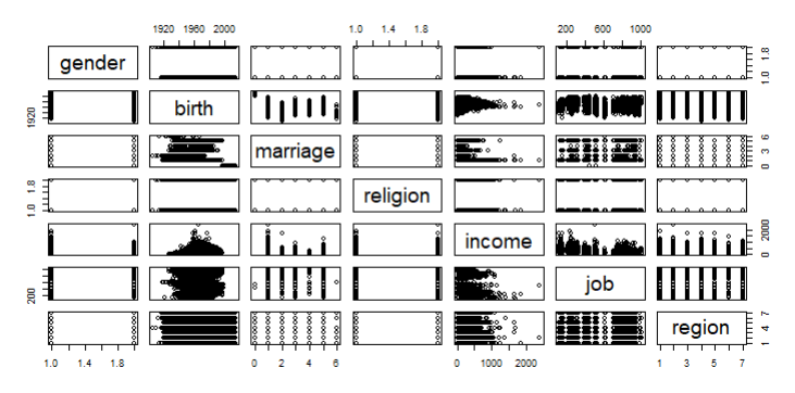
# 그런데 처리해야할 값이 너무 크고 많아서
시간이 오래걸림
# ∴ 필요한 부분만 범위 지정해줘보자. 훨씬 빠르다
pairs(data=welfare, job ~ income + gender)- pairs(산점도 행렬)
두 개 이상의 변수에 대해 모든 가능한 산점도를 그릴 수 있는 함수이다. 여러 변수가 있을 때 모든 변수 간 산점도를 손쉽게 그릴 수 있다.
pairs(
  formula, # ~ x + y ~ z 형태로 지정한 포뮬러. 모든 변수 간의 조합에 대해 산점도가 그려진다.
  data,    # 포뮬러를 적용할 데이터
  ...
)
# 박스플롯으로 보자면?
boxplot(welfare$job, welfare$income, welfare$gender)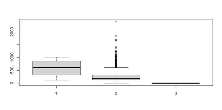
# NA값들을 제외하고 welfare속 모든 값 더하기
> sum(is.na(welfare))
[1] 21165


# NA 값은 제외하고 평균을 내달라
> mean(welfare$income, na.rm=T)
[1] 241.619


# na를 0으로 대체하려면
welfare$income <-
		ifelse(is.na(welfare$income), 0, welfare$income)


# 0을 NA로 대체하려면
welfare$income <-
		ifelse(welfare$income == 0, NA, welfare$income)


# 에러..는 아니지만 원하는 대로 동작하지 않고
# 별안간 모든 값들이 NA로 변해버렸다.
welfare$income <- ifelse(welfare$income == NA, 0, welfare$income)
welfare$income <- ifelse(welfare$income == "NA", 0, welfare$income)
❔ is.na(a) vs a==NA
- is.na(a)
a 객체 안에 NA값이 있으면 그 자리에 True를 반환하고, 없으면 False를 반환한다. - a == NA
a가 NA와 동일한지 확인하기 위해 사용한 것이였겠지만 이렇게 사용하면 무조건 NA가 리턴된다. 논리적인 계산 없이 안에 있는 값들이 무조건 NA로 값이 대체 되는것이다.
다시 이어서 진행해보자
# 시각화로 살펴보기
ggplot(welfare, aes(x=income)) + geom_density()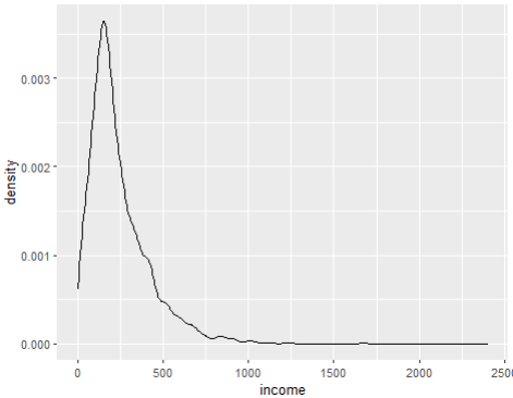
# gender 에 따라 색을 달리 표현해보세요
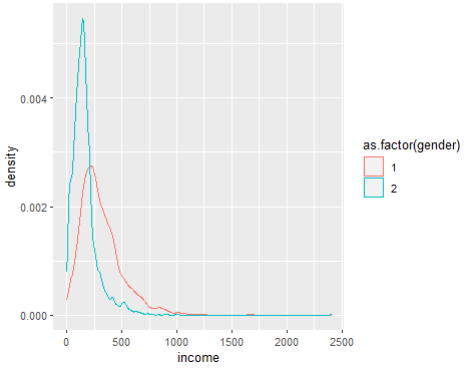
ggplot(welfare, aes(x=income, color = as.factor(gender))) +
geom_density()
+) 추가답변
welfare %>% group_by(gender, income) %>%
ggplot(aes(x=income, color = as.factor(gender))) + geom_density()
# geom_freqpoly() 라는 것도 있다

ggplot(welfare, aes(x=income, color = as.factor(gender))) +
  geom_freqpoly()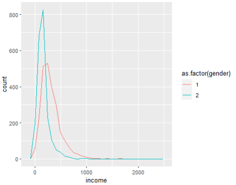
❔ geom_density() vs geom_freqpoly()
geom_density()
1) 커널 밀도 함수. 숫자 변수의 분포를 나타내는 시각화 방법이다
geom_freqpoly()
1) geom_histogram() 과 연산은 동일하지만 빈도수를 나타내기 위해 막대가 아닌 선을 사용한다.
2) 기본 모양은 높이가 빈도수를 나타내기 때문에 그러한 종류의 비교에는 유용하지 않다. 즉, 그룹 중 하나가 다른 값들보다 월등히 작으면 형태의 차이를 파악하기 어렵다
위처럼 사용하면 모양이 비슷해보이지만 fill을 사용하여 색을 넣어보자
ggplot(welfare, aes(x=income, fill = as.factor(gender))) +
  geom_density()

# 이때는 결과가 나오지만 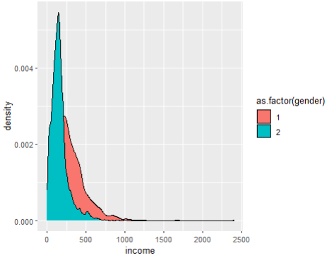
# 이때는 원하는대로 결과가 나오지 않는다.
ggplot(welfare, aes(x=income, fill = as.factor(gender))) +
  geom_freqpoly()


---------------------------------------------------------


# geom_freqpoly()에는 binwidth를 지정해줄수 있다
ggplot(welfare, aes(x=income, color = as.factor(gender))) +
  geom_freqpoly(binwidth=2)
ggplot(welfare, aes(x=income, color = as.factor(gender))) +
  geom_freqpoly(binwidth=500)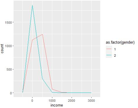
만약 geom_freqpoly() 의 binwidth값을 지정해주지 않고 실행하면

`stat_bin()` using `bins = 30`. Pick better value
with `binwidth`.

이런 알림이 뜨는데 이것은 binwidth를 자동으로 30 잡았다는 이야기이다
다시 이어가보자
# 성별로 이름 붙이기
welfare$gender <- ifelse(welfare$gender == 2, "female", "male")

# 이름을 바꾸면서 형변환까지 되어서 as.factor 없이도
ggplot(welfare, aes(x=income, color = gender)) +
  geom_density()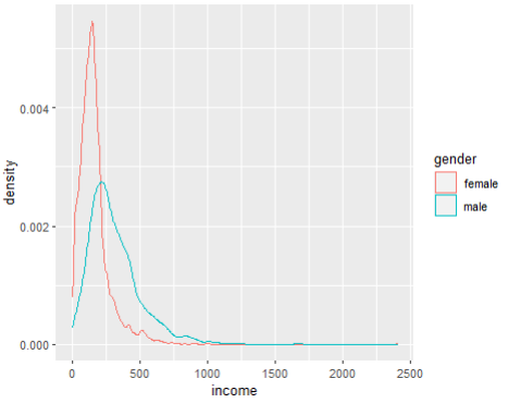
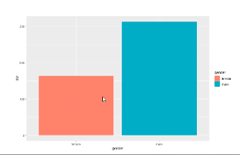
> # 성별 테이블 을 bar 그래프로 그려보세요
> wel_gen <-
	as.data.frame(table(welfare$gender))
> wel_gen
> ggplot(wel_gen, aes(x=Var1, y=Freq, fill=Var1)) +
	geom_col()
# 컬럼 명 변경해주기
names(wel_gen) <- c("성별", "수입")
ggplot(wel_gen, aes(x=성별, y=수입, fill=성별)) + geom_col()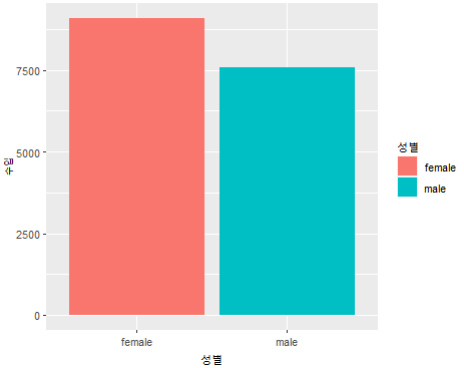
# 수입의 평균을 구해주세요
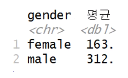
> welfare %>%
+ group_by(gender) %>%
+ summarise(수입 = mean(income,na.rm=T))
# A tibble: 2 × 2
gender 수입
<chr> <dbl>
1 female 163.
2 male 312.
> welfare %>%
group_by(gender) %>%
summarise(수입평균 = mean(income,na.rm=T)) %>%
ggplot(aes(x=gender, y=수입평균, fill=gender)) +
geom_col()