복습문제
1. 마우스에 반응하는 인터랙티브 그래프를 만들깨 보편적으로 사용하는 패키지는?
[답변] plotly, ggplotly


2. geom_col() 함수에 position='dodge' 를 입력하면 어떻게 되는가?
[답변] 막대의 위치를 개별적으로 나란히 표현하라는 명령어


3. welfare$income 안의 NA 값을 0으로 바꾸시오
[답변] ifelse(is.na(welfare$income), 0, welfare$income)


4. 그래프를 꾸밀때 적절하지 않은 코드는?
1) scale_fill_brewer(palette = 'Set1')
2) scale_fill_manual(values=c('red', 'green', 'blue'))
3) geom_text_repel(aes(label=rownames(mtcars)))
4) scale_color_hue(h=50)
[답변] 3
[추가 답변] 문제에서 말하는 '시각화'란 색상을 조작하는 것 으로 보인다.

5.아래 그림을 만들어주세요
[답변] mpg %>% group_by(drv) %>%
      summarise(mean1 = mean(cty)) %>%
      ggplot(aes(x=drv, y=mean1, fill=drv)) + geom_col()


6. 성별 칼럼(gender) 값이 1, 2 값 두가지로 되어있을때
1은 'male' 2는 'female'로 변경하시오
[답변] ifelse(gender == 1, 'male', 'female')


7. 아래 그래프의 범례를 삭제해주세요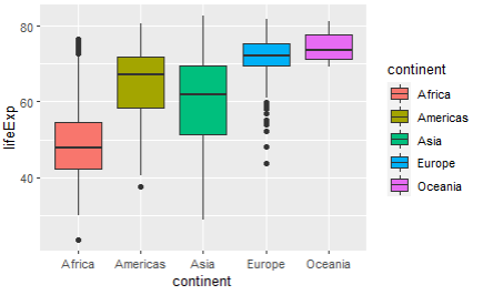
[주어진 코드]
ggplot(gapminder,aes(x=continent,y=lifeExp,fill=continent)) +
  geom_boxplot()
[답변] + theme(legend.position = "none")
[추가질문 및 답변] 범례를 위로 올리고 싶다면
				(legend.position = "top")
                등으로 활용할 수 있다

8. mtcars의 gear별 개수를 나타내는 막대그래프르 그리시오.
[답변] ggplot(mtcars, aes(x=gear, fill=as.factor(gear))) +
  geom_bar()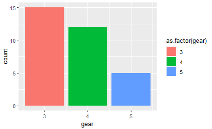
[추가질문] 그래프의 색을 변해주세요 (red, blue, green)
[답변] ggplot(mtcars, aes(x=gear, fill=as.factor(gear))) +
      geom_bar() +
      scale_fill_manual(values = c('red', 'blue', 'green'))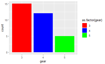
9. 연속형 데이터의 밀집도를 보여주기 적합한 ggplot의 명령어는?
1) geom_histogram()
2) geom_freqploy()
3) geom_bar()
4) geom_density()
[답변] 4


10. ggplot을 이용하여 그래프를 그릴 때 구분마다 색상을
6자리로 된 16진수 GRB 값을 직접 넣으려고 한다
이때, 사용하기 적절한 명령어를 고르시오
1) scale_fill_hue()
2) scale_fill_brewer()
3) scale_fill_manual()
4) scale_fill_grey()
[답변] 3


11. 시각화 자료가 아닌것을 고르세요
1) boxplot(welfare$income)
2) table(selfare$income)
3) plot(welfare$income)
4) ggplot(welfare, aes(x=income)) + geom_destiny()
[답변] 2


12. plot()함수와 pair()함수의 차이는?
[답변] 	plot은 전체데이터를
		pair()은 원하는 데이터를 선택


13. spss 데이터를 읽어올 수 있게하는 패키지 이름은?
[답변] foreign


14. dataset의 열 갯수를 확인하는 방법을 3가지 이상 제시하라
[답변]	1. dim()
		2. ncol()
        3. length()
        4. str() - 몇행몇열인지 나오니까
🌱 문제
한국복지패널 데이터를 활용한 분석 문제
🧃 데이터 현재 모양
> library(foreign)
> raw_welfare <- read.spss("Koweps_hpc10_2015_beta1.sav")
> welfare <- as.data.frame(raw_welfare)
> welfare <- welfare %>%
  rename( gender = h10_g3, birth = h10_g4,
          marriage = h10_g10, religion = h10_g11,
          income = p1002_8aq1, job = h10_eco9,
          region = h10_reg7) %>%
  select(gender, birth, marriage, religion,
         income, job, region )
> welfare$income <- ifelse(welfare$income==0 , NA  , welfare$income  )
> welfare$gender <-  ifelse(welfare$gender == 1, 'male', 'female')

> # 위 과정으로 컬럼명을 변경해주었고
> # gender컬럼의 값을 1,2 에서 'male', 'femaile'로 변경
🍃 나이에 따른 소득차이
데이터 살펴보기
> 데이터 타입보기
> class(welfare$birth)

> table(welfare$birth)
1907 1911 1914 1915 1917 1918 1919 1920 1921
   1    1    1    1    1    3    5   10   13
   ....

> summary(welfare$birth)
   Min. 1st Qu.  Median    Mean 3rd Qu.    Max.
   1907    1946    1966    1968    1988    2014

> # 이상치 확인
> boxplot(welfare$birth)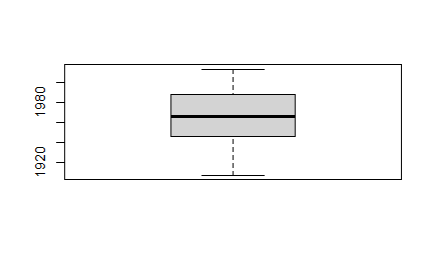
> # 결측치 확인
> sum(is.na(welfare$birth))
[1] 0
>
🧃 나이 컬럼을 만들기
> # 나이 컬럼 만들기
> welfare <- welfare %>% mutate(age = 2015 - welfare$birth)
> summary(welfare)
....
     region           age
 Min.   :1.000   Min.   :  1.00
 1st Qu.:2.000   1st Qu.: 27.00
 Median :3.000   Median : 49.00
 Mean   :3.705   Mean   : 47.43
 3rd Qu.:6.000   3rd Qu.: 69.00
 Max.   :7.000   Max.   :108.00
> # age 컬럼 추가된거 확인


> # 수업을 따라가기 위해 나이변수 맞추기
> welfare <- welfare %>% mutate(age = 2015 - welfare$birth +1)
> summary(welfare$age)
   Min. 1st Qu.  Median    Mean 3rd Qu.    Max.
   2.00   28.00   50.00   48.43   70.00  109.00
🧃 나이별 소득의 평균을 구하기
# 나이에 따라 = 나이로 묶어서 소득 평균을 보고싶다는 거니까
# income 중에 na인것은 제외하고 나이로 묶어준다
# 그리고 묶인 값으로 income의 평균값을 구해준다

income_age <- welfare %>%
  filter(!is.na(income)) %>%
  group_by(age) %>%
  summarise(mean_in = mean(income))
🧃 시각화
ggplot(income_age, aes(x=age, y=mean_in)) + geom_point(size=1)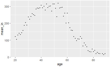
ggplot(income_age, aes(x=age, y=mean_in)) + geom_line()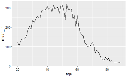
ggplot(income_age, aes(x=age, y=mean_in)) +
  geom_line(color='skyblue') +
  geom_point(color='orange', size=0.5)
> # 뭔가.. 더 자세히 보고싶다. x축을 범위 지정해주자
> # scale_x_continuous(breaks = c())

ggplot(income_age, aes(x=age, y=mean_in)) +
  geom_line(color='skyblue') +
  geom_point(color='orange', size=0.5) +
  scale_x_continuous(breaks = c(20,30,40,50,60,70,80,90))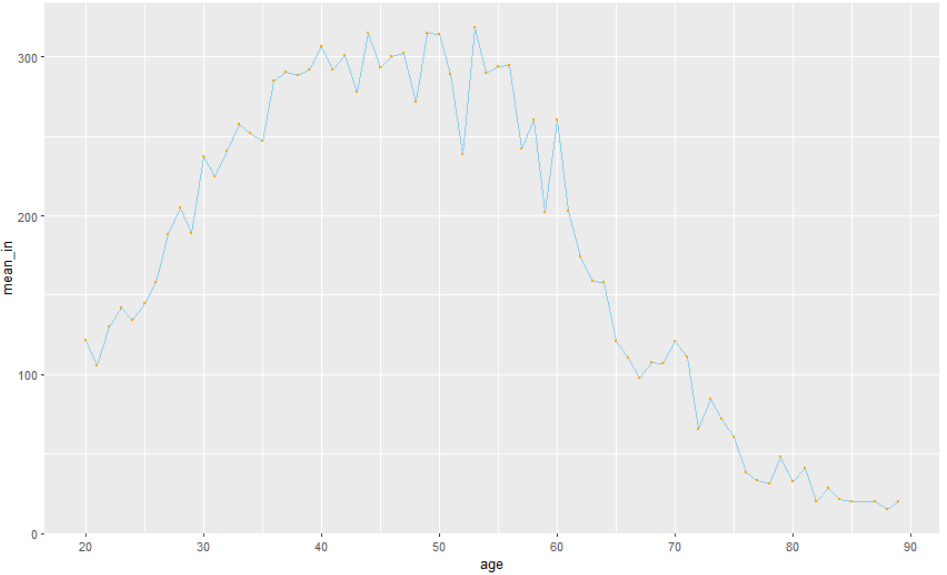
🍃 연령대(세대)별 평균소득
bar형태로 보고싶다면
🧃 세대별로 명칭 지정해주기
welfare <- welfare %>%
  mutate(age_gen = ifelse(age < 30, "young",
                     ifelse(age <= 50, "middle", "old")))


> welfare$age_gen
   [1] "old"    "old"    "old"    "old"
   [5] "old"    "old"    "old"    "young"
🧃 바 그래프 그리기
welfare %>%
  filter(!is.na(income)) %>%
  group_by(age_gen) %>%
  summarise(mean_in = mean(income)) %>%
  ggplot(aes(x=age_gen, y=mean_in, fill=age_gen)) +
  geom_col() +
  theme(legend.position = 'none')
그런데 순서가 마음에 들지 않는다.
young, middle, old 순으로 그래프를 보고 싶어졌다.

welfare %>%
  filter(!is.na(income)) %>%
  group_by(age_gen) %>%
  summarise(mean_in = mean(income)) %>%
  ggplot(aes(x=factor(age_gen, levels=c("young","middle","old")), y=mean_in, fill=age_gen)) +
  geom_col() +
  theme(legend.position = 'none')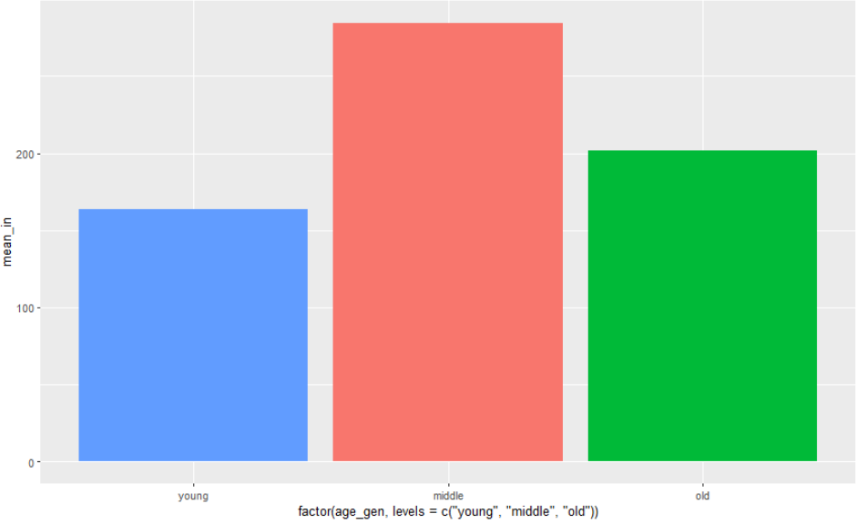
x축의 이름이 너무 길다.
변경하고 싶다면 labs(x="") 으로 지정해주면 된다

welfare %>%
  filter(!is.na(income)) %>%
  group_by(age_gen) %>%
  summarise(mean_in = mean(income)) %>%
  ggplot(aes(x=factor(age_gen, levels=c("young","middle","old")), y=mean_in, fill=age_gen)) +
  geom_col() +
  labs(x="세대") +
  theme(legend.position = 'none')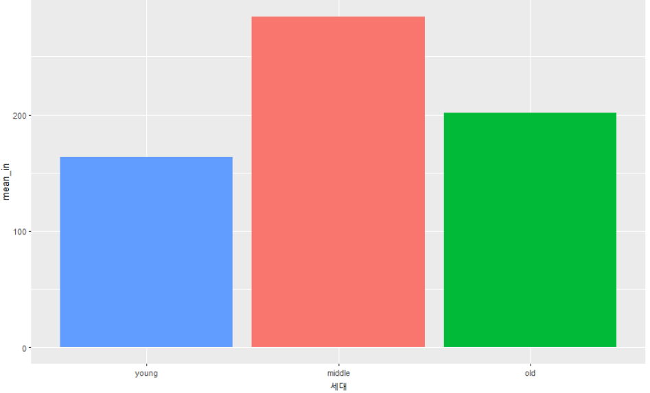
또는


welfare %>%
  filter(!is.na(income)) %>%
  group_by(age_gen) %>%
  summarise(mean_in = mean(income)) %>%
  ggplot(aes(x=age_gen, y=mean_in, fill=age_gen)) +
  geom_col() +
  scale_x_discrete(limits = c("young", "middle", "old"))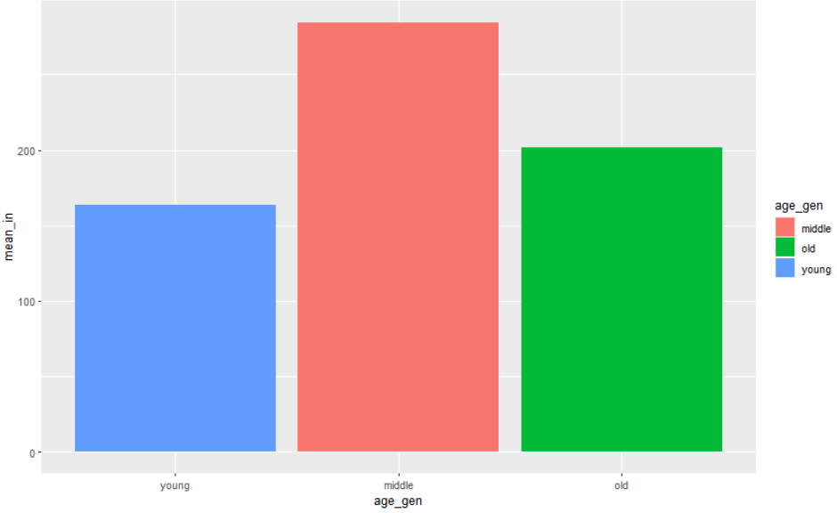
+) scale_x_discrete() vs levels()
levels(): factor 의 옵션으로 label을 지정해줄 수 있는 것scale_x_discrete(): x축 설정에 관한 함수로 limits 외에도 여러 설정을 만질 수 있다.
ex) scale_x_discrete(guide = guide_axis(n.dodge = 2))
위 코드는 xlabel의 겹침을 해결해준다.
🍃 나이와 성별에 따른 소득차이
🧃 세대별, 성별 평균소득 만들기
> gender_in <- welfare %>%
  group_by(age_gen, gender) %>%
  summarise(mean_in = mean(income, na.rm= T))
> gender_in
# A tibble: 6 × 3
# Groups:   age_gen [3]
  age_gen gender mean_in
  <chr>   <chr>    <dbl>
1 middle  female    198.
2 middle  male      347.
...
🧃 시각화
ggplot(gender_in, aes(x=age_gen, y=mean_in, fill=gender)) +
  geom_col(position = 'dodge')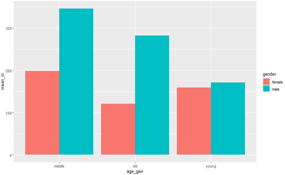
welfare %>%
  filter(!is.na(income)) %>%
  group_by(age, gender) %>%
  summarise(mean_in = mean(income), .groups = "drop_last") %>%
  ggplot(aes(x=age, y=mean_in, color=gender)) +
  geom_line()

또는

welfare %>%
  filter(!is.na(income)) %>%
  group_by(age,gender) %>%
  summarise(mean_income=mean(income, na.rm=T)) %>%
  ggplot(aes(x=age,y=mean_income,color=gender)) +
  geom_line()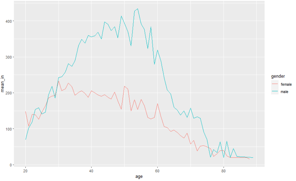
선의 색을 변경하려면

welfare %>%
  filter(!is.na(income)) %>%
  group_by(age,gender) %>%
  summarise(mean_income=mean(income, na.rm=T)) %>%
  ggplot(aes(x=age,y=mean_income,color=gender)) +
  geom_line()+
  scale_color_manual( values = c("red", "green"))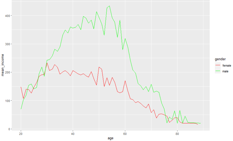
🍃 연설메세지 읽기
🧃 파일읽어오기
read.csv("ahn.txt", fileEncoding = "EUC-kr")
🧃 R 4.0 이상 KoNLP 설치순서
# java 설치
install.packages("multilinguer")
library(multilinguer)
install_jdk()

# Are you sure you want to install jdk?
2
# 의존성 패키지 설치
install.packages(c("hash", "tau", "Sejong", "RSQLite", "devtools", "bit", "rex", "lazyeval", "htmlwidgets", "crosstalk", "promises", "later", "sessioninfo", "xopen", "bit64", "blob", "DBI", "memoise", "plogr", "covr", "DT", "rcmdcheck", "rversions"), type = "binary")
# github 버전 설치
install.packages("remotes")
# KoNLP 설치
remotes::install_github('haven-jeon/KoNLP', upgrade = "never", INSTALL_opts=c("--no-multiarch"))
# 테스트
library(KoNLP)
extractNoun("안녕하세요 반갑습니다 저는 000 입니다")

# 오류 메세지 내용대로
# C:/Users/admin/AppData/Local/R/win-library/4.2/KoNLP/java
# 밑에
# scala-library-2.11.8.jar 파일 넣기

# 재테스트
> library(KoNLP)
> extractNoun("안녕하세요 반갑습니다 저는 000 입니다")
[1] "안녕" "하"   "저"   "000"
# 성공!
🧃 파일을 읽어오기
파일을 읽기위해
data1 <- readL("ahn.txt") 를 하게되면 오류가 난다.
시작하자마자 오류라니
사실 오류는 아니고 안에 있는 파일이 모두 깨지는 현상을 확인할 수 있다
[1] "\xbeȳ\xe7\xc7Ͻʴϱ\xee \xbe\xc8ö\xbc\xf6\xc0Դϴ\xd9."
[2] "\xc0\xfa\xb4\xc2 \xc1\xf6\xb3\xad 7\xbf\xf9\xb8\xbb\xbf\xa1 \xb8\xbb\xbe\xb8 \xb5帰 \xb4\xeb\xb7\xce \xb1\xb9\xb9ε\xe9\xc0\xc7 \xc0ǰ\xdf\xc0\xbb \xb5\xe8\xb0\xed\xc0\xda \xb8\xb9\xc0\xba \xbaе\xe9\xc0\xbb \xb8\xb8\xb3\xb5\xbd\xc0\xb4ϴ\xd9."
위와 같이 말이다.
이때 내가 해결방법으로 선택한 방법은 두가지이다.
파일의 확장자를 확인한다: 내 파일을 확인해본 결과 인코딩 형식이 'ANSI'로 되어있었다. 이것을 'utf-8'로 바꾸어 저장해주기readLines말고 다른 방법으로 읽어오기 : 나는 파일의 확장자를 다시 지정해 바꿔주는 간단하고 사소한 방법보다 이 방법이 먼저 떠올라 삽질을 조금 했다.
> data1 <- read.csv("ahn.txt", fileEncoding = "EUC-kr")
> data1
                                                                 안녕하십니까.ooo입니다.
1           저는 지난 7월말에 말씀 드린 대로 국민들의 의견을 듣고자 많은 분들을 만났습니다.
해결이 되었다. 한글이 깨지지않고 잘 출력된다!
> # 특수문자 같은건 모두 제거해주고 문자열만 남기자
> library(stringr)

> # data1에 있는 특수문자들을 모두 공백으로 치환한다
> data1<-str_replace_all(data1,"\\W"," ")
이때! \W와 \w는 다르다는 것을 주의해야한다.
\W: 문자 혹은 숫자가 아닌 것들을 뜻한다\w: 문자 혹은 숫자들을 뜻한다.
따라서 만약 str_replace_all(data1,"\\w"," ") 를 해주게 되면 생각과는 달리 모든 글자들이 공백이 되는 현상을 맛볼수있다 ^^
당황스러웠다
> text_data <- extractNoun(data1)
  [1] "c"        "저"       "7"        "월"       "말씀"
  [6] "대"       "국민"     "들"       "의견"     "동안"
 [11] "저"       "별명"     "최근"     "저"       "소재"
 ...
🧃 타입 확인
> mode(text_data)
[1] "character"
> is.list(text_data)
[1] FALSE
만약 이때 결과값이 list로 나온다면 아래와 같이
unlist함수를 사용해 벡터로 만들어준다.
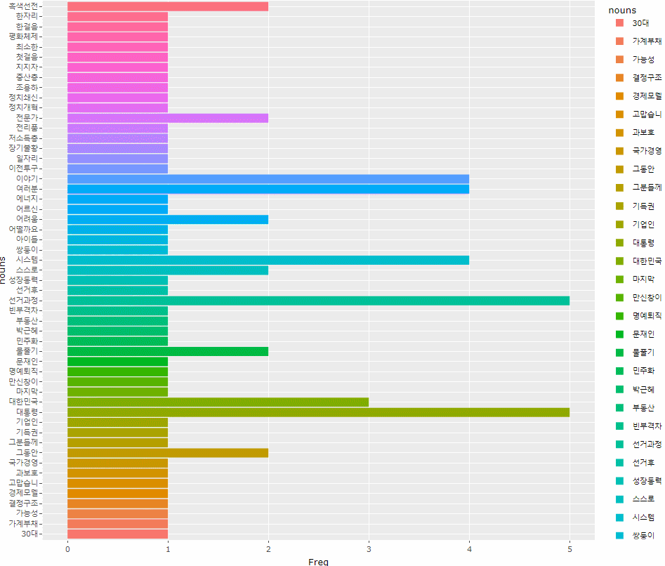
> # nouns <- unlist(text_data)🧃 시각화
nouns <- text_data[nchar(text_data) > 1]nchar: 문자열의 길이를 알아보는 함수
text_data[nchar(text_data) > 1]: '삶' 과 같이 의미있는 한글자도 있지만 '그' '저' 와 같은 의미없는 단어들도 많아보이기 때문에.
한글자 이상의 단어들만을 뽑아서 새로운 변수(nouns)에 넣어준다.
+추가 `nouns <- text_data[nchar(text_data) > 1 | text_data %in% "삶"]` 를 사용하면 원하는 단어("삶")이 아니면 1글자 이상인 단어들을 뽑아서 저장해라 가 된다! 그러니까 원하는 단어도 살리고 필요없는 단어는 날리고!
> # 여과값이 담겨있는 nouns를 데이터 프레임으로 만들고 정렬해서 df에 담아준다
> df <- as.data.frame(table(nouns)) %>% arrange(desc(Freq))
> as.data.frame(table(nouns))
       nouns Freq
1         18    1
2       30대    1
....


> # 그래프가 너무 크길래 확대해서 값을 보고 싶어 ggplotly()에 담아주었다
> ggplotly()
    ggplot(df, aes(x=nouns, y=Freq, fill=nouns)) +
      geom_col() +
      coord_flip()
  )
🧃 wordcloud2로 시각화하기
install.packages("wordcloud2")
library(wordcloud2)
wordcloud2(df)
데이터가 너무 많아서 복잡하다. 20개 정도만 확인하고 싶다

> # df에 저장시 상위 20개만 저장하겠다고 head사용
> df <- as.data.frame(table(nouns)) %>%
  arrange(desc(Freq)) %>% head(20)
> wordcloud2(df)
그렇다.