복습문제
1. ~.txt 파일을 읽는 방법
[답변] 	1) readLines()	2) read.csv()	3) read.table()


2. gapminder에서 2007년 데이터만 추출하여
'국가분류'를 추가하고자 한다.
1인당 GDP를 기준으로 하여
1) 6500달러 미만이면 개발도상국
2) 6500이상 23000미만이면 신흥국
3) 2300 이상이면 선진국으로 분류한다.
[답변]
gapminder <- gapminder %>%
  filter(year == 2007) %>%
  mutate(국가분류 = ifelse(gdpPercap < 6500, "개발도상국",
                       ifelse(gdpPercap < 23000, "신흥국", "선진국")))

> # summary(gapminder)로 생성된것을 확인해 볼수있다.


[추가 질문] 아래 그래프를 작성하시오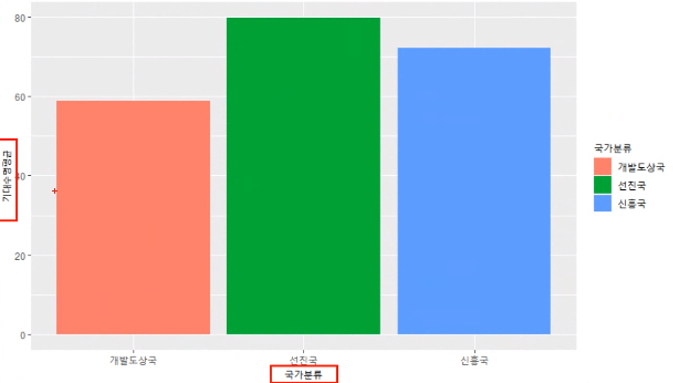
[답변]
gapminder %>% group_by(국가분류) %>%
  summarise(기대수명평균 = mean(lifeExp)) %>%
  ggplot(aes(x=국가분류, y=기대수명평균, fill=국가분류)) +
  geom_col()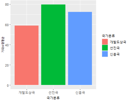
[추가질문] 막대그래프를 수평으로 보려면?
[답변] + coord_flip()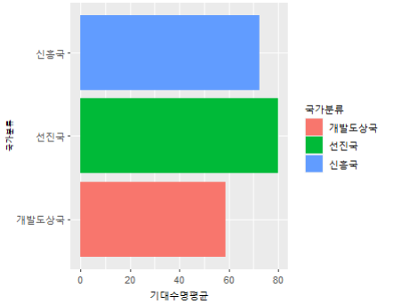
[추가질문] 막대그래프의 순서를 변경하고 싶습니다.
[답변] +  scale_x_discrete(limits=c("개발도상국", "신흥국", "선진국"))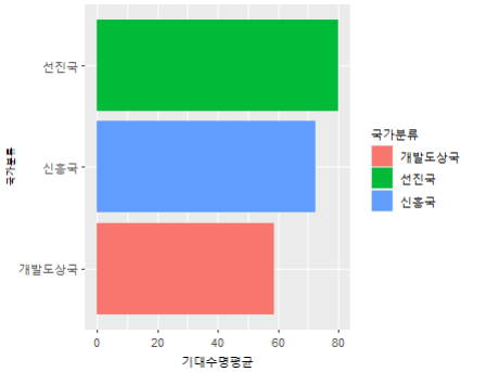
2. mpg 데이터에서 제조사 'toyota'의 모델
'toyota tacoma 4wd'의 배기량(displ)의 범위를 보여주세요
[답변]
> mpg1 <- mpg %>% filter(model=="toyota tacoma 4wd")
> range(mpg1$displ)
[1] 2.7 4.0


3. mpg$manufacturer을 wordcloud()로 표현해보자
[답변]
> install.packages("wordcloud2")
> library(wordcloud2)

> wordcloud2(table(mpg$manufacturer))
🌱 텍스트 마이닝 분석하기
감성분석(Sentiment Analysis)
- 문장에서 사용된 단어의 긍정과 부정의 빈도에 따라 문장의 긍정, 부정을 평가한다
트위터로 텍스트마이닝하기
🧃 필요 패키지, 라이브러리 설치
> package1 <- c("ggplot2", "Rcpp", "dplyr", "ggthemes", "ggmap", "devtools", "RCurl", "igraph", "rgl", "lavaan", "semPlot")
> package2 <- c("twitteR", "XML", "plyr", "doBy", "RJSONIO", "tm", "RWeka", "base64enc")
> list.of.packages <-  c( package1, package2)
> new.packages <- list.of.packages[!(list.of.packages %in% installed.packages()[,"Package"])]
> if(length(new.packages)) install.packages(new.packages)

> library(plyr)
> library(stringr)


# twitteR이 제대로 설치되지 않았다고 하여 추가로 설치
install.packages("twitteR")
library(twitteR)
🧃 파일 읽어오기
1) 삼성
서치 하기 위한 데이터 파일을 load함

> load("samsung_tweets.rda")
> load("apple_tweets.rda")

> # 확인
> samsung_tweets
...
[[668]]
[1] "Eccentech: @DirectTechYT @dalevon_digital Nah that’s one ui been like that ever since my Tab S4 except with the Samsung Experience UI."
...


> # 데이터 프레임의 형태로 해당 트위터의 정보를 추출
> st <- twListToDF(samsung_tweets)
> head(st, 1)
                                             text
1 RT @tetestream_:
....

> # st로 출력해본 형태가 너무 정신없다
> # 열이름만 출력해보자
> names(st)
 [1] "text"          "favorited"     "favoriteCount"
 [4] "replyToSN"     "created
 ...

> # 우리가 필요한건 text 값이니까 그것만 따로 저장
> st_text <- st$text
> head(st_text)
[1] "RT  tetestream_  Hello  SamsungLevant  we noticed that there was no individual post with BTS V in partnership with Samsung on your account "
[2] " bf_woa  Kineti
....


> # 뽑아온 값에서 불필요한 내용 지우기
# gsub :
> st_text <- gsub("\\W", " ", st_text)
> head(st_text)
[1] "RT  tetestream_  Hello  SamsungLevant  we noticed that there was no individual post with BTS V in partnership with Samsung on your account "
[2] " bf_woa  KinetiKGaming N
....
2) 애플
apple_tweets

# 내용확인
at <- twListToDF(apple_tweets)
head(at, 1)
names(at)
at_text <- at$text
head(at_text)

# 불필요한 내용 지우기
at_text <- gsub("\\W", " ", at_text)
head(at_text)
🧃 여과하기
> # [감성단어사전](https://github.com/The-ECG/BigData1_1.3.3_Text-Mining  )
> pos.words <- scan("positive-words.txt", what="character", comment.char=";")
Read 2006 items
> neg.words <- scan("negative-words.txt", what="character", comment.char=";")
Read 4783 items


# https://stackoverflow.com/questions/35222946/score-sentiment-function-in-r-return-always-0
score.sentiment = function(sentences, pos.words, neg.words, .progress='none')
{
  scores = laply(sentences, function(sentence, pos.words, neg.words) {
    sentence = gsub('[^A-z ]','', sentence)
    sentence = tolower(sentence);
    word.list = str_split(sentence, '\\s+');
    words = unlist(word.list);
    pos.matches = match(words, pos.words);
    neg.matches = match(words, neg.words);
    pos.matches = !is.na(pos.matches);
    neg.matches = !is.na(neg.matches);
    score = sum(pos.matches) - sum(neg.matches);
    return(score);
  }, pos.words, neg.words, .progress=.progress );
  scores.df = data.frame(score=scores, text=sentences);
  return(scores.df);
}


> samsung_scores <- score.sentiment(st_text, pos.words, neg.words, .progress = 'text')
> head(samsung_scores,2)
> samsung_scores$score
> hist(samsung_scores$score)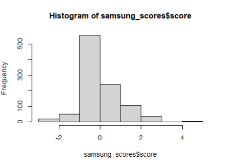
apple_scores <- score.sentiment(at_text, pos.words, neg.words, .progress = 'text')
head(apple_scores,2)
apple_scores$score
hist(apple_scores$score)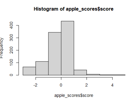
> dim(samsung_scores)
[1] 1000    2
> dim(apple_scores)
[1] 1000    2


> # 두 열 중 하나만 쓰겠다
> a <- dim(samsung_scores)[1]
> b <- dim(apple_scores)[1]
+) cbind() , rep()
cbind()
왼쪽을 기준으로 오른쪽을 붙이겠다.
아래 결과를 보면 왼쪽에 써준 a1을 기준으로 a2가 옆에와서 붙는 것을 확인 할 수 있다.
> a1 <-  data.frame(z = c(1,2,3), x = c(3,4,5))
> a2 <-  data.frame(c = c(1,2,3), v = c(3,4,5))
> cbind(a1, a2)
  z x c v
1 1 3 1 3
2 2 4 2 4
3 3 5 3 5
rep()
반복되는 수를 생성하는 함수
> rep(1, 2)
[1] 1 1
> rep(c(1, 2), 3)
[1] 1 2 1 2 1 2

앞에 있는 수를 뒷 숫자만큼 반복해서 생성해준다.
> alls <- rbind( as.data.frame(cbind(type=rep("samsung",a), score = samsung_scores[ , 1])),
as.data.frame(cbind(type=rep("apple",b), score = apple_scores[ , 1])))
> str(alls)
'data.frame': 2000 obs. of 2 variables:
$ type : chr "samsung" "samsung" "samsung" "samsung" ...
$ score: chr "0" "0" "1" "2" ...
> ggplot(alls, aes(x=score, color=type)) +
geom_density()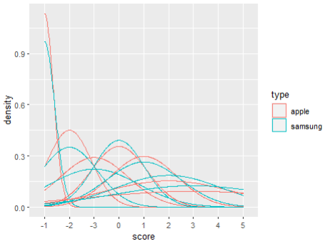
> #그래프가 뭔가 이상하다 형태 바꿔서 정리 해주자
> alls$type <-  factor(alls$type)
> alls$score <- as.integer(alls$score)
> ggplot(alls, aes(x=score, color=type)) +
   geom_density()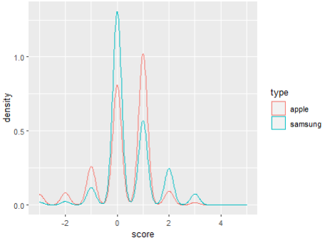
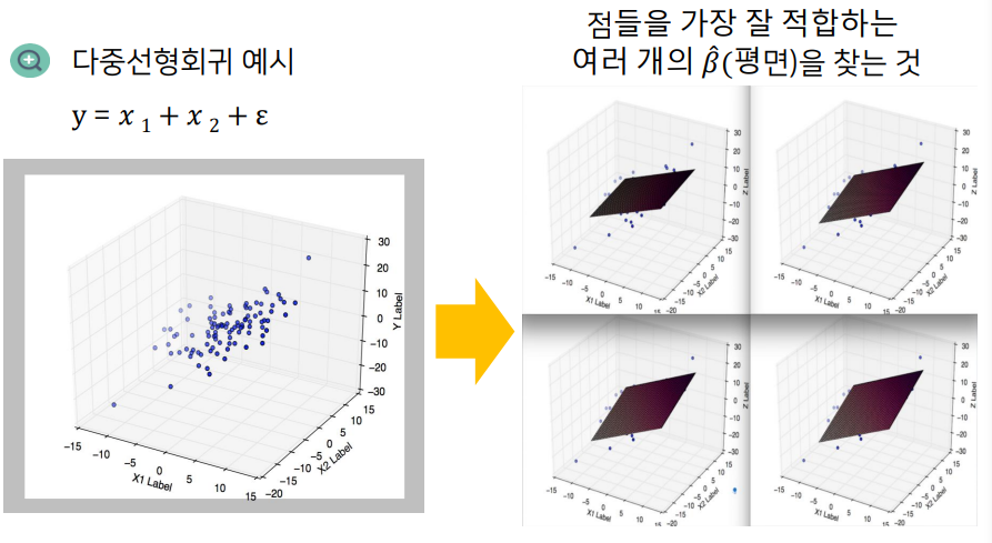
선형회귀분석
단순 선형회귀분성
정의
종석변수 Y와 하나의 독립변수 X와의 선형상관 관계를 모델링하는 회귀분석기법
설명변수
- 원인으로 간주되는 변수
- =독립 변수 (independent variable)=예측 변수 (predictor variable)=입력 변수 (input variable)=특징 (feature)
- x, y
반응 변수
- 결과로 간주되는 변수
- =종속변수
회귀분석의 기본 가정
1) 두 변수의 관계는 선형이다
--- 선형성
2) 오차항의 확률 분포는 정규분포를 이루고 있다
--- 정규성
3) 오차항은 모든 독립변수 값에 대하여 동일한 분산을 가진다
--- 등분산성
4) 오차항의 평균(기대값)은 0이다
5) 오차항들끼리는 독립이다. 어떠한 패턴을 나타내면 안된다
--- 독립성
6) 독립 변수 상호간에는 상관관계가 없어야 한다.
회귀분석의 목표
- 독립변수와 종속변수의 관계를 찾는것
- 종속변수 y와 설명변수 x사이의 관계를 선형으로 가정하고, 이를 가장 잘 설명하는
회귀계수(coefficients)를 추정하는 것
회귀계수β₁은 설명변수x가 한단위(1) 증가할 때 종속변수가 얼마나 변화하는지상관관계(correlation)를 보여주는 지표
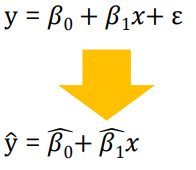
선형 회귀분석(Linear Regression)
반응변수와 설명변수 사이 관계를 선형으로 표현
회귀계수의 추정
- 회귀분석의 목적 : 종속변수 Y와 설명변수 X 사이의 관곌르 선형으로 가정하고 이를 가장 잘 설명하는
회귀계수(coefficients를 추정하는 것
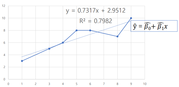
→ 잘 설명한다?
→출력된 직선과실제 데이터사이에y축 거리(의 제곱)합을 최소화
---> 최소제곱법
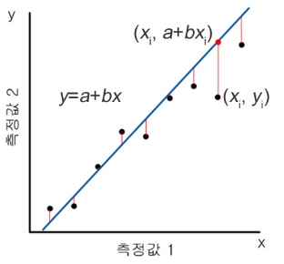
최소제곱법
- OLS; Ordinary Least Squares
ɛ: 오차항(error term) / 불확실성을 표현하는 관측 불가능한 추상적인 개념
ɛ을 관측할 수 없으므로 y와의 차이 존재
→ 목적
ŷ과 y의 차이를 최소화하는것 (정확히는 y축 거리의 제곱의 합)
추정된 회귀식에 의해 결정된 값과 실제 종속변수 값의 차이를 최소화
→ 방법
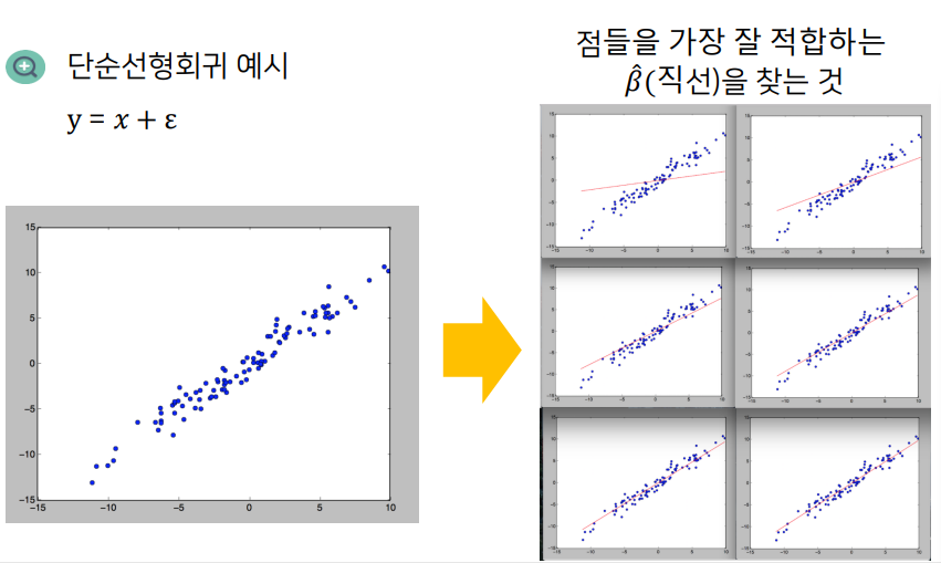
차이의 제곱을 최소화하도록 회귀계수 β₀, β₁을 추정예시로 개념을 알아보자
> cars
A data.frame: 50 × 2
speed	dist
<dbl>	<dbl>
  4			2
  4			10

> str(cars)
'data.frame':	50 obs. of  2 variables:
 $ speed: num  4 4 7 7 8 9 10 10 10 11 ...
 $ dist : num  2 10 4 22 16 10 18 26 34 17 ...

> # speed : 자동차의 주행 속도
> # dist : 자동차의 제동 거리
> # 총 50개의 관측값

> library(ggplot2)
> ggplot(cars, aes(x=speed, y=dist)) + geom_point()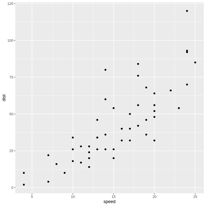
→ 산점도를 보면 대략 선형적인 모양이.. 보이는것 같기도
> # cor() : 상관행렬(correlation matrix)
> cor(cars)
A matrix: 2 × 2 of type dbl
			speed	dist
speed	1.0000000	0.8068949
dist	0.8068949	1.0000000

> # cor.test(x,y) : x,y사이의 상관관계 검정
> # cars$speed와 cars$dist간 상관계수 및 p-value, 신뢰구간을 구할 수 있다.
> cor.test(cars$speed, cars$dist)
	Pearson's product-moment correlation

data:  cars$speed and cars$dist
t = 9.464, df = 48, p-value = 1.49e-12
alternative hypothesis: true correlation is not equal to 0
95 percent confidence interval:
 0.6816422 0.8862036
sample estimates:
      cor
0.8068949
> # p-value = 1.49e-12 → 값이 매우 작게 나왔다
> # 추정된 상관계수 값은 약 0.8068949


> # corrplot : 패키지. 상관관곌르 시각화하는데 사용된다.
> install.packages("corrplot")
> corrplot::corrplot.mixed(cor(cars))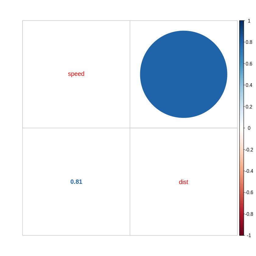
# 예측하기
> fit.cars <- lm(dist~speed, data=cars)

predict(object, newdata, se.fit = FALSE, scale=NULL, df=Inf)
# object : lm 으로 만들어진 결과물 클래스
# newdata : 예측을 수행할 새로운 데이터 프레임
predict(fit.cars, data.frame(speed=c(20, 120)))


predict(object, newdata, interval)
# interval : 구간의 종류. 기본값은 none. 이 경우 신뢰 구간이 계산되지 않는다
#     confidence가 주어진 경우 회귀 계수에 대한 신뢰 구간을 고려하여 종속 변수의 신뢰구간(confidence interval)을 찾는다
#     prediction인 경우 회귀계수의 신뢰 구간과 오차항을 고려한 종속변수의 예측구산(prediction interval)을 찾는다
predict(fit.cars, data.frame(speed=c(20, 120)),
        interval = "confidence")
+) 🌺 gganimate
Haven:네이버블로그-animate()
Haven:네이버블로그-transition_time()
library(gganimate)
library(gapminder)


  ggplot(airquality, aes(Day, Temp))+
  geom_point(size=4, aes(color=factor(Month)))+
  scale_color_discrete_sequential('SunsetDark')+
  theme_minimal()+
  theme(legend.position='bottom')+
  transition_time(Day)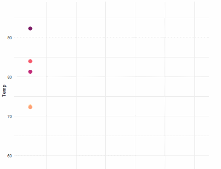
  ggplot(airquality, aes(Day, Temp))+
  geom_point(size=4, aes(color=factor(Month)))+
  scale_color_discrete_sequential('SunsetDark')+
  theme_minimal()+
  theme(legend.position='bottom')+
  transition_time(Day) +
  geom_line(size=1.05, aes(color=factor(Month)))+
  transition_reveal(Day)
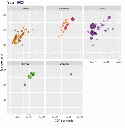
ggplot(gapminder, aes(gdpPercap, lifeExp, size = pop, colour = country)) +
  geom_point(alpha = 0.7, show.legend = FALSE) +
  scale_colour_manual(values = country_colors) +
  scale_size(range = c(2, 12)) +
  scale_x_log10() +
  facet_wrap(~continent) +
  # Here comes the gganimate specific bits
  labs(title = 'Year: {frame_time}', x = 'GDP per capita', y = 'life expectancy') +
  transition_time(year) +
  ease_aes('linear')