뇌 MRI이미지로 알츠하이머와 경도인지장애를 진단하는 CNN 딥러닝 모델 개발과정 정리 및 회고.
(1) 서론과 메타데이터 분석
- Github Repository 바로가기 : Alzheimer_MCI-CNN_Classifier(클릭)

딥러닝 기반 알츠하이머 및 경도인지장애 진단모델
Deep Learning based Alzheimer and MCI Diagnosis Model
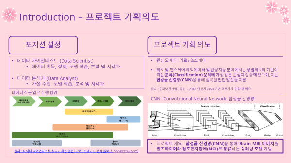
- 합성곱 신경망(CNN)을 통해 Brain MRI 이미지를 알츠하이머와 경도인지장애(MCI)로 분류하는 딥러닝 모델 개발
0. 프로젝트 개요
필수 포함 요소
자유주제(의료/헬스케어)- 설정한
데이터 직무 포지션에서 풀고자하는 문제 정의 - 적합한
데이터셋선정 및 선정 이유 딥러닝 파이프라인구축- 딥러닝 모델
학습 및 검증 한계점과추후 발전 방향
프로젝트 목차
(Part1) Intro & Metadata
- Introduction
서론- Position & Intention
포지션설정, 기획의도 - Alzheimer Dementia, MCI
알츠하이머치매와 경도인지장애 - Necessity of Research
연구의 필요성 - Purposes
목표 및 가설
- Position & Intention
- Dataset & Metadata
데이터셋 및 메타데이터- ADNI dataset
데이터셋 소개 - Data Preparation
데이터 준비 - Metadata Analysis
메타데이터 분석 - Metadata EDA Dashboard
대시보드
- ADNI dataset
(Part2) Modeling
- Modeling
모델링- Overview & Structure
개요 및 구조 - Data Import & Split
데이터 로딩 및 분리 - Preprocessing Layer
전처리 레이어 - Vanilla CNN Model
기본 CNN 모델
- Overview & Structure
- Model Improvement
모델 성능 개선- Transfer Learning
전이학습 - Negative Transfer
네거티브 전이 - Hyperparameter Tuning
하이퍼파라미터 튜닝 - Final Model & Evaluation
최종 모델 학습 및 검증
- Transfer Learning
(Part3) Prediction & Conclusion
- Prediction & Comparing
예측 및 비교분석- Test Dataset
테스트 데이터셋 - Prediction & Confidence
예측 및 신뢰도 - Metrics & Confusion Matrix
평가지표 및 혼동행렬
- Test Dataset
- Conclusion
결론- Overall Summary
요약 - Limitations & Further Research
한계와 추후 발전방향 - Takeaways
핵심과 소감
- Overall Summary
Deep Learning Pipeline

(Part1) Intro & Metadata
1. Introduction 서론

1-1. Position & Intention 포지션설정, 기획의도
포지션 설정
- 들어가기에 앞서 희망하는 데이터 직무를 설정하고서 프로젝트를 기획하고 진행하였음.
- 데이터 분석가(DA) 쪽에 주로 초점을 맞춰서 진행하고자 했으나, 프로젝트 전체적인 업무 수행 범위는 데이터 사이언티스트(DS) 쪽에 가까웠기 때문에 포지션을 명확하게 구분짓기 어려웠음...
- 따라서 포지션은 DA와 DS 둘 모두로 설정하였음.
- 전반적인 프로젝트 진행은 DS로써 진행하되, DA 업무 범위인 학습, 분석, 시각화에 최대한 초점을 맞추어 프로젝트를 진행하였음.
기획 의도
- 관심 도메인 : 의료/헬스케어
- 의료 및 헬스케어 분야의 인공지능 및 빅데이터 분야에선 분류문제에 가장 많은 관심이 집중되어 있음.
- 진단 쪽에 관련이 깊은 분류문제가 정밀의료의 기반이 되기 때문.
- 다양한 영역 중에서도 의료영상분야 쪽에 많은 연구들이 진행되고 있고, 이러한 의료영상분석 분야는 합성곱신경망(CNN)을 통해 괄목할만한 발전을 이루었음.
- 자료 출처 : 한국보건산업진흥원, 2019 인공지능(AI) 기반 의료기기 현황 및 이슈
- 이러한 트렌드에 맞춰서 이번 프로젝트에서는 지난번 머신러닝때와 마찬가지로 분류문제로 정하게되었음!
1-2. Alzheimer Dementia, MCI 알츠하이머치매와 경도인지장애
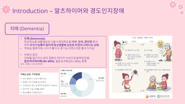

- 치매(Dementia) : 정상적으로 생활해오던 사람이 후천적으로 기억, 언어, 판단력 등의 여러 인지기능들이 떨어져 일상생활에 상당한 지장이 나타나는 상태
- 나이가 들어 생기는 자연스러운 건망증과는 다른 엄연한 질병
- 치매 원인의 50~60%는 알츠하이머병으로 알려져있음
- 알츠하이머병(Alzheimer's Disease) : 진행적인 뇌세포 퇴화로 인해 치매증상이 유발되는 질병
- 뇌가 쪼글아들어 있는 것이 특징임
- 경도인지장애(MCI, Mild Cognitive Impairment) : 생리적 건망증과 알츠하이머 기억장애의 중간 상태
- 치매 전단계 혹은 치매 위험상태라 보면 됨
- 출처 : 대한노인정신의학회, 대한치매학회
1-3. Necessity of Research 연구의 필요성

- 치매 연구 필요성 : 급속한 고령화 -> 치매 유병률은 계속 상승할 것으로 전망
- 경도인지장애 예측 필요성 : 손상된 뇌세포는 재생되지 않음 -> 예방으로 치매 방지 가능
- 뇌영상이미지 분석 필요성 : 알츠하이머 진단에 가장 중요한 검사는 뇌 촬영 검사
- 딥러닝 활용 필요성 : 일반적 통계나 머신러닝의 한계 -> 딥러닝으로 극복 가능
1-4. Purposes 목표 및 가설

- 메타데이터 분석
- 트렌드 파악
- 이미지데이터로 모델링
- CNN 딥러닝 모델
- 모델 개선
- 전이학습(사전학습모델) vs 파라미터 튜닝
- 성능 및 일반화 가능성 확인
- 예측 및 시각화
2. Dataset & Metadata 데이터셋 및 메타데이터
- 이제 본격적으로 데이터를 분석해보도록 하겠음!
2-1. ADNI dataset 데이터셋 소개

- USC LONI IDA
- USC : University of Southern California
- LONI IDA : Laboratory Of Neuro Imaging, Image & Data Archive
- 바로가기 : LONI IDA(클릭)
- ADNI : Alzheimer’s Disease Neuroimaging Initiative
- 알츠하이머 치료법 조사 및 개발을 목적으로 하는 글로벌 종단 연구 사업
- 알츠하이머 관련 각종 검사자료 (영상이미지, 유전자검사, 등...)
- 종단연구(Longitudinal Research)이므로 동일 집단에대한 추적조사 자료도 보유하고 있음
- 온라인 데이터 액세스 요청서 작성 및 제출 -> 심사 -> 통과 후 데이터 조회 및 다운로드
2-2. Data Preparation 데이터 준비
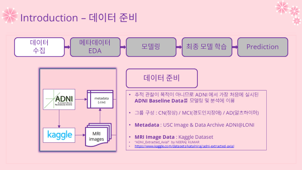
- 추적 관찰 및 연구가 목적이 아니기 때문에 기준선이 되는 검사인 Baseline 데이터를 이용함
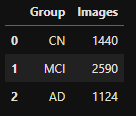
- 레이블 그룹 : CN(정상) / MCI(경도인지장애) / AD(알츠하이머)
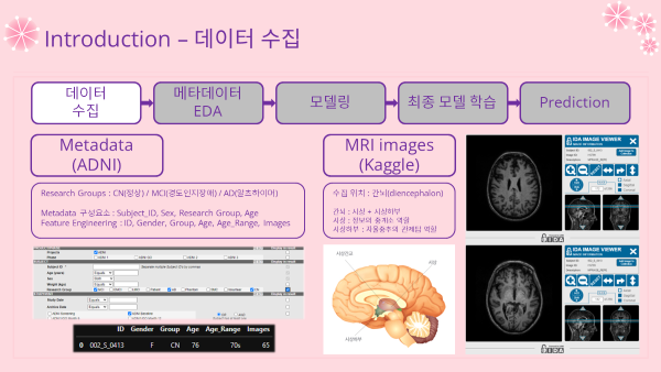
- 오리지널 데이터를 추리고 가공할 시간적 여유는 없으므로 이미지 데이터는 캐글데이터셋을 이용
- Metadata 메타데이터 : ADNI@LONI 에서 직접 다운로드 후 가공해서 분석
- 아래 메타데이터 분석 파트에서 자세히 다룰 것임
- Image Data : Kaggle에 ADNI Baseline 데이터를 추려낸 데이터셋 이용
- MRI 수집 위치 : 간뇌 = 시상 + 시상하부
- MRI 축 : Axial (Horizontal)
- Kaggle Dataset 바로가기 : ADNI Extracted Axial(클릭)
- Metadata 메타데이터 : ADNI@LONI 에서 직접 다운로드 후 가공해서 분석
2-3. Metadata Analysis 메타데이터 분석
- Metadata 가공 및 분석은 로컬 환경에서 실시되었음
- 시각화는 plotly 라이브러리로 실시
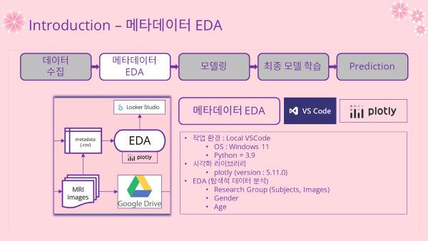
Metadata EDA (탐색적 데이터 분석) 과정
- 바로가기 : Metadata 가공 및 EDA (클릭)
- 메타데이터 가공
- 가공 과정이 여기선 크게 중요한 것은 아니라서 소스코드는 블로그에선 다루지 않겠음
- Image 수는 Kaggle에서 다운로드한 이미지 갯수로 데이터에 포함시킴
- 나이대 별 분석도 시행하기 위해 Age_Range column도 추가
- 가공 전 columns
- Subject_ID, Sex, Research Group, Age
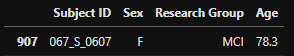
- Subject_ID, Sex, Research Group, Age
- 가공 후 columns
- ID, Gender, Group, Age, Age_Range, Images
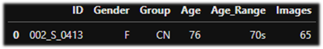
- ID, Gender, Group, Age, Age_Range, Images
- 시각화로 분석할 데이터 불러오기
adni = pd.read_csv('metadata/ADNI-Baseline-dashboard.csv')
adni.info()
'''
RangeIndex: 187 entries, 0 to 186
Data columns (total 6 columns):
 #   Column     Non-Null Count  Dtype
---  ------     --------------  -----
 0   ID         187 non-null    object
 1   Gender     187 non-null    object
 2   Group      187 non-null    object
 3   Age        187 non-null    int64
 4   Age_Range  187 non-null    object
 5   Images     187 non-null    int64
dtypes: int64(2), object(4)
memory usage: 8.9+ KB
'''
"Research Group" (Subject 수)
# Group by "Research Group"
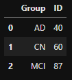
group_count = adni.groupby(['Group'], as_index=False)['ID'].count()
group_count- output
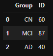
# index 순서 바꾸기
group_count_index = [1,2,0]
group_count_sort = group_count.reindex(group_count_index, axis=0).reset_index(drop=True)
group_count_sort- output
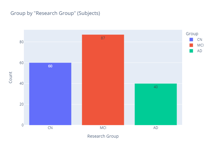
# bar plot
group_count_title = 'Group by "Research Group" (Subjects)'
group_count_bar = plex.bar(data_frame=group_count_sort,
                           x='Group', y='ID', color='Group',
                           text_auto=True, title=group_count_title)
group_count_bar.update_layout(xaxis_title='Research Group',
                              yaxis_title='Count')
group_count_bar.show()- output
# pie plot
group_count_pie = plex.pie(data_frame=group_count_sort, hole=0.3,
                           values='ID', names='Group', color='Group',
                           title=group_count_title)
group_count_pie.update_traces(textposition='inside', textinfo='percent+label')
group_count_pie.update_layout(annotations=[dict(text='Percent', showarrow=False)])
group_count_pie.show()- output

- 인사이트
- 세 그룹 중에선 MCI가 46.5%로 가장 높은 비율을 차지하고 있음
"Research Group" (Image 수)
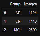
# Group by "Research Group"
group_images = adni.groupby(['Group'], as_index=False)['Images'].sum()
group_images- output
# reindex
group_images_index = [1,2,0]
group_images_sort = group_images.reindex(group_images_index, axis=0).reset_index(drop=True)
group_images_sort- output
# bar plot
group_images_title = 'Group by "Research Group" (Images)'
group_images_bar = plex.bar(data_frame=group_images_sort,
                           x='Group', y='Images', color='Group',
                           text_auto=True, title=group_images_title)
group_images_bar.update_layout(xaxis_title='Research Group',
                              yaxis_title='Count')
group_images_bar.show()- output

# pie plot
group_images_pie = plex.pie(data_frame=group_images_sort, hole=0.3,
                           values='Images', names='Group', color='Group',
                           title=group_images_title)
group_images_pie.update_traces(textposition='inside', textinfo='percent+label')
group_images_pie.update_layout(annotations=[dict(text='Percent', showarrow=False)])
group_images_pie.show()- output

- 인사이트
- Subject 수와 비슷한 분포를 보이고 있음
- MCI그룹이 상당히 높은 비율을 차지하지만 데이터 불균형이 심한 것은 아니라서 upsampling 과정을 거치진 않아도 될 듯함
"Gender"
# Group by "Gender"
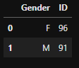
group_gender = adni.groupby(['Gender'], as_index=False)['ID'].count()
group_gender- output
# M -> Male , F -> Female
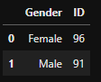
fix_gender = group_gender.copy()
fix_gender.Gender = fix_gender.Gender.replace({'F':'Female', 'M':'Male'})
fix_gender- output
# bar plot
gender_title = 'Group by "Gender"'
gender_bar = plex.bar(data_frame=fix_gender, x='Gender', y='ID', color='Gender',
                   text_auto=True,title=gender_title)
gender_bar.update_layout(xaxis_title = 'Gender', yaxis_title = 'Count')
gender_bar.show()- output

# pie plot
gender_pie = plex.pie(data_frame=fix_gender, hole=0.3,
                   values='ID', names='Gender', color='Gender',
                   title=gender_title)
gender_pie.update_traces(textposition='inside', textinfo='percent+label')
gender_pie.update_layout(annotations=[dict(text='Percent',showarrow=False)])
gender_pie.show()- output
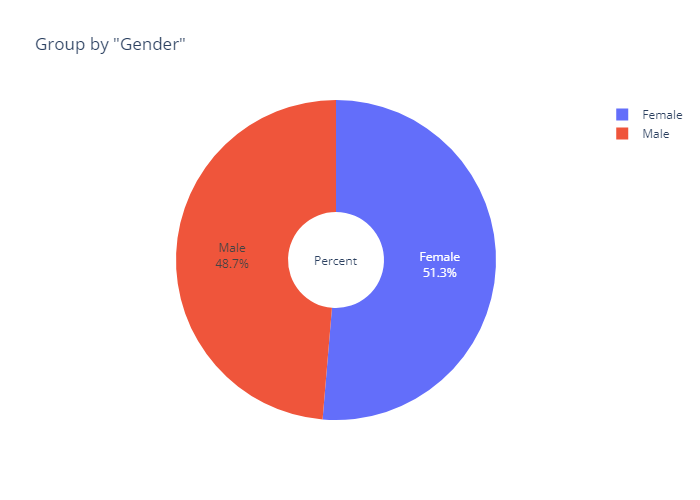
- 인사이트
- 성별 간 비율은 서로 비슷하게 나타나고 있음
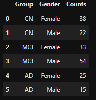
"Reserch Group" & "Gender"
# Group by "Reserch Group" & "Gender"
group_and_gender = adni.groupby(['Group','Gender'], as_index=False)['ID'].count()
group_and_gender- output

# reindex & fix gender
gg_list = [2,3,4,5,0,1]
sort_gg = group_and_gender.reindex(gg_list, axis=0).reset_index(drop=True)
fix_gg = sort_gg.copy()
fix_gg.Gender = fix_gg.Gender.replace({'F':'Female', 'M':'Male'})
fix_gg.columns = ['Group','Gender', 'Counts']
fix_gg- output
gg_bar = plex.bar(data_frame=fix_gg,
                  x='Group',y='Counts',color='Gender',
                  title='Group by "Reserch Group" & "Gender"',
                  text_auto=True, barmode='group')
gg_bar.show()- output

- 인사이트
- 여성의 경우엔 MCI가 상대적으로 높은 비율을 차지하고 있음
- 남성의 경우엔 세 그룹이 비슷한 비율을 보임
"Age"
# 범위 확인
np.min(adni.Age), np.max(adni.Age)
'''
(55, 91)
'''
# Histogram (간격 5)
age_hist = plex.histogram(data_frame=adni, x='Age', nbins=8,
title='Histogram of "Age"',text_auto=True)
age_hist.update_xaxes(dtick=5)
age_hist.show()- output

- 인사이트
- 정규분포에 가까운 분포를 보이는 것이 특징이라 볼 수 있음
- 분포를 맞춰줄 필요는 딱히 없어 보임
"Age" & "Gender"
age_male = adni.query('Gender == "M"')
age_female = adni.query('Gender == "F"')

age_overlaid = go.Figure()
age_overlaid.add_trace(go.Histogram(x=age_male.Age, name='Male',
                       marker_color='purple',texttemplate="%{y}"))
age_overlaid.add_trace(go.Histogram(x=age_female.Age, name='Female',
                       marker_color='pink',texttemplate="%{y}"))

age_overlaid.update_layout(barmode='overlay',
                           title_text='Histogram of "Age" & "Gender"',
                           xaxis_title_text="Age",
                           yaxis_title_text="count")
age_overlaid.update_traces(opacity=0.75)
age_overlaid.update_xaxes(dtick=5)
age_overlaid.show()- output

- 인사이트
- 여성과 남성 모두 정규분포에 가까운 모양을 나타냄
- 이 역시 분포를 맞춰줄 필요는 딱히 없어 보임
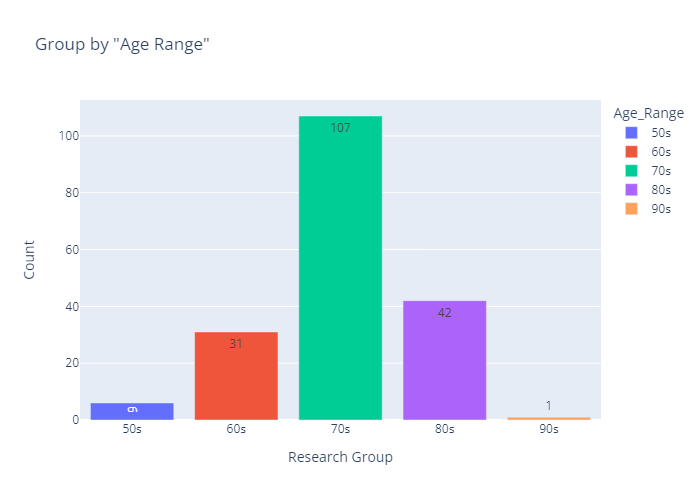
"Age Range"
# Group by "Age Range"
group_ar = adni.groupby(['Age_Range'], as_index=False)['ID'].count()
group_ar.columns = ['Age_Range', 'Counts']
group_ar- output

# bar plot
ar_title = 'Group by "Age Range"'
ar_bar = plex.bar(data_frame=group_ar, x='Age_Range', y='Counts', color='Age_Range',
                   text_auto=True,title=ar_title)
ar_bar.update_layout(xaxis_title = 'Research Group', yaxis_title = 'Count')
ar_bar.show()- output
# pie plot
ar_pie = plex.pie(data_frame=group_ar, hole=0.3,
                   values='Counts', names='Age_Range', color='Age_Range',
                   title=ar_title)
ar_pie.update_traces(textinfo='percent+label')
ar_pie.update_layout(annotations=[dict(text='Percent',showarrow=False)])
ar_pie.show()- output
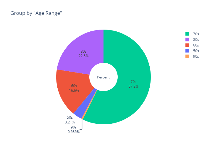
- 인사이트
- 70대의 압도적으로 높은 비율 (57.2%)
- 여기서 더 얻을 만한 인사이트는 없는 듯...?
"Age Range" & "Reserch Group"
# Group by "Age Range" & "Reserch Group"
group_ag = adni.groupby(['Age_Range','Group'], as_index=False)['ID'].count()
group_ag- output
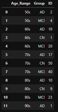
# 그래프 순서를 맞추기위해 행 추가
group_ag.loc[12] = ['50s', 'CN', 0]
group_ag- output
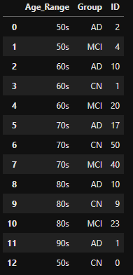
# reindex
ag_list = [12,1,0,3,4,2,6,7,5,9,10,8,11]
sort_ag = group_ag.reindex(ag_list, axis=0).reset_index(drop=True)
sort_ag.columns = ['Age_Range', 'Group', 'Counts']
sort_ag- output

ag_bar = plex.bar(data_frame=sort_ag,
                  x='Age_Range',y='Counts',color='Group',
                  title='Group by "Age Range" & "Reserch Group"',
                  text_auto=True,barmode='group')
ag_bar.show()- output

- 인사이트
- 그룹 별로 나이대 분포의 차이는 있긴 하지만, 전반적으로는 정규분포에 가까운 분포를 보임
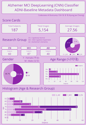
2-4. Metadata EDA Dashboard 대시보드 제작
- 메타데이터를 가공한 데이터로 대시보드 제작 및 배포
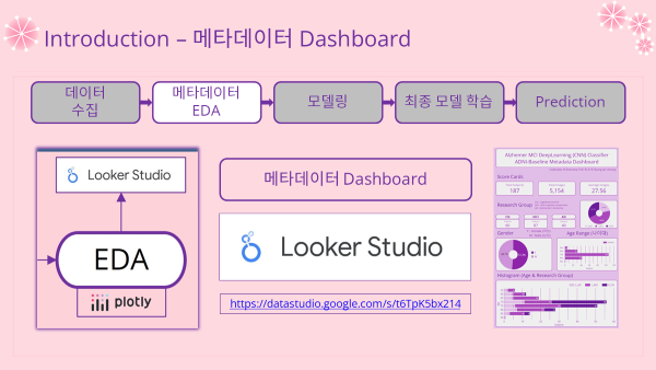
- 대시보드 링크 : ADNI-Baseline Metadata Dashboard (클릭)
- 대시보드 캡쳐 이미지
(Part2~) 이후 과정들
- 이후 과정은 다음 포스팅에서 다루도록 하겠음
- 남아있는 과정들
- (2) 모델링 과정 Modeling
- Modeling 모델링
- Model Improvement 모델 성능 개선
- (3) 예측 및 결론 Prediction & Conclusion
- Prediction & Comparing 예측 및 비교분석
- Conclusion 결론
- (2) 모델링 과정 Modeling

일 때문에 포스팅은 잠시 쉬어요 ㅠ // Now. 수학 강사 (광교) // Prev. Machine Learning (AI) Engineer & BackEnd Engineer
안녕하세요 현재 캐글 링크가 삭제되어서 그런데 데이터셋 .csv 파일을 혹시 깃허브에 올려주실 수 있으신가요🥹🥹