
데이터 시각화
데이터 시각화
- 데이터의 특징을 한눈에 표현하는 방법
- 데이터가 가진 특징을 가장 잘 표현할 수 있는 형식으로 시각화
- 각 상황에 맞게 필요한 정보를 정확하게 전달
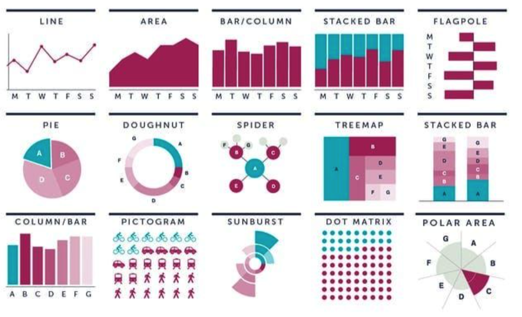
좋은 데이터 시각화? 나쁜 데이터 시각화?
- 데이터의 특징이 한 눈에 들어오는가?
- 시각화 유형, 그룹별 차이 등
- 너무 많은 정보를 담고 있는가?
- 가시성이 좋은가?
- 글자의 크기, 색상 조합 등
- 데이터가 깔끔한지?
Pandas Visualization Functions
- Line Chart : 'line'
- Bar Chart : 'bar'
- 박스 차트 :'box'
- 파이 차트 : pie'
- 산정도 : 'scatter'
- 히스토그램 : 'his'
- 커널 밀도 차트 : 'kde'
- Hexbin
- ...
Pandas Visualization
실습을 위한 데이터 준비
- 날짜 데이터
np.random.seed(0)
df1 = pd.DataFrame(np.random.randn(100, 3), # 2018.1.1 부터 100일간의 랜덤 숫자 세개 지정
                   index=pd.date_range('1/1/2018', periods=100),
                   columns=['A', 'B', 'C']).cumsum()
df1.tail()- Seaborn Iris & Titatnic 데이터
iris = sns.load_dataset("iris")    # 붓꽃 데이터
titanic = sns.load_dataset("titanic")    # 타이타닉호 데이터
Pandas Plot()
Pandas 기본 Plot() 함수
- 수치형 데이터프레임에서 plot() 함수를 실행
- df.plot() 함수는 index를 기준으로 line graph 를 출력
- Arguments of Plot()
- Kind : 그래프 타입을 결정. 'bar', 'box', 등
- figsize : output 그림의 크기
- fontsize : chart내 글자 크기
Pandas Plot - Line
Line Chart
- Line 차트는 주로 연속적으로 변하는 수치형 자료를 표현
- 각 컬럼별 index값이 변함에 따라 수치가 변하는 것을 나타냄
df1.plot()  # 기본 선차트

plt.title("Pandas의 Plot메소드 사용 예")
plt.xlabel("시간")
plt.ylabel("Data")
plt.show()
Pandas Plot - Bar
Bar Chart
- Bar 차트는 연속적인 선 차트와 달리 각 index 당 정확한 수치를 보여줌
- 하나/전체 컬럼에 대한 값을 그릴 수 있음
- 하나의 컬럼에 대한 graph
iris.sepal_length[:20].plot(kind='bar', rot=0)
plt.title("꽃받침의 길이 시각화")
plt.xlabel("Data")
plt.ylabel("꽃받침의 길이")
plt.show()- Kind='bar 이외에도 plot.bar() 형식으로 사용가능
- 하나/전체 컬럼에 대한 값을 그릴 수 있음
- 전체 컬럼에 대한 graph
iris[:5].plot.bar(rot=0)
plt.title("Iris 데이터의 Bar Plot")
plt.xlabel("Data")
plt.ylabel("각 Feature의 값")
plt.ylim(0, 7)
plt.show()
Pandas Plot - Barh
Barh Chart
- kind = 'barh' & plot.barh()
- 수직이 아닌 수평 방향 막대 그래프 생성
iris[:5].plot.barh(rot=0)   # 수평 방향 막대그래프
plt.title("Iris 데이터의 Bar Plot")
plt.xlabel("Data")
plt.ylabel("각 Feature의 값")
plt.ylim(0, 7)
plt.show()
Pandas Plot - Bar (With groupby())
Bar Chart
- 데이터 전체의 통계치를 그래프로 그리기 위해 groupby() 활용
- 통계적 수치를 시각화하기 위해 통계함수를 적용한 데이터프레임 생성
df2 = iris.groupby(iris.species).mean() # species 에 다른 각 수치별 평균값의 차이
df2.columns.name = "feature"
df2
Pandas Plot - Bar (With groupby())
Bar Chart
- 데이터 전체의 통계치를 그래프로 그리기 위해 groupby() 활용
- 통계적 수치를 시각화하기 위해 통계함수를 적용한 데이터프레임 생성
- 표본들의 컬럼에 따른 통계적 수치를 시각화
df2.plot.bar(rot=0) # 새롭게 정의된 데이터에 대해 바 그래프
plt.title("각 종의 Feature별 평균")
plt.xlabel("평균")
plt.ylabel("종")
plt.ylim(0, 8)
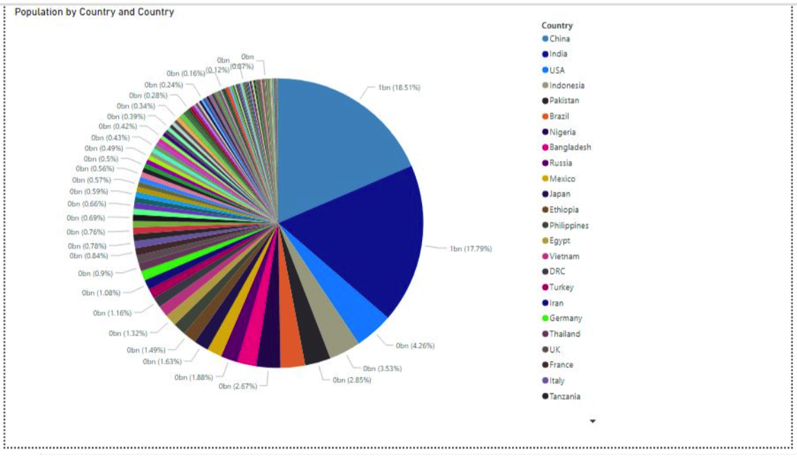
plt.show()Pandas Plot - Pie
Pie Chart
- kind = 'pie'
- 특정 컬럼 내에서 category가 차지하는 비율을 시각화
- 그룹간의 차이가 명확할 수록 가시성 좋음
- 그룹의 수가 과도하게 많지 않은 컬럼에 대해 적용
df3 = titanic.pclass.value_counts() # value_counts 를 통해 pclass 마다의 인원수
df3.plot(kind='pie',autopct='%.2f%%')
plt.title("선실별 승객 수 비율")
plt.axis('equal')
plt.show()
Pandas Plot - Histogram
Histogram
- kind = 'hist' | plot.hist)
- 전체 데이터의 분포를 시각화
- 연속성 데이터를 사용자가 지정한 범위로 압축
- 그래프의 개형을 통해 어느 구간에 표본이 집중되는지
iris.plot.hist()    # plot.hist()로 히스토그램 생성
plt.title("각 Feature 값들의 빈도수 Histogram")
plt.xlabel("데이터 값")
plt.show()
Pandas Plot - KDE
커널 밀도 함수(KDE)
- kind = 'kde' | plot.kde()
- 히스토그램이 박스 단위로 분포를 보였다면, 연속적인 분포를 확인
- 분포에 근사한 커널 밀도 함수의 개형을 제공
iris.plot.kde() # 커널 밀도 함수 생성
plt.title("각 Feature 값들의 빈도수에 대한 Kernel Density Plot")
plt.xlabel("데이터 값")
plt.show()
Pandas Plot - Box
Box Chart
- kind = 'box' | plot.box)
- 각 컬럼별 표본의 분포를 박스의 형태로 나타냄
- 각 박스는 1~4 분위값, 평균값, 최대/최소 값을 한번에 전달
- 다양한 분포 정보를 쉽게 전달함
iris.plot.box()
plt.title("각 Feature 값들의 빈도수에 대한 Box Plot")
plt.xlabel("Feature")
plt.ylabel("데이터 값")
plt.show()
Recap : Titanic 데이터 분석
Titanic 데이터에서 확인했던 차이들을 Pandas plot으로 표현해보자
- pclass 와 사용한 Fare을 여러 차트로 표현해보자
- Sex와 Survived의 counts 를 표현해보자
- Pie Chart로 각 성별 생존 비율을 그려보자
- 나이를 구간이 아닌 범주형으로 바꾸어 특징을 그려보자
Pandas Plot - Scatter
Scatter Chart (산점도)
- kind = 'scatter'
- 표본의 각 하나의 데이터를 점에 대응시켜 좌표에 나타냄
- 각 점들의 분포를 여러 축으로 확장하여 관찰 가능
- 단 너무 많은 데이터를 그릴 시 가독성이 떨어질 수 있음.
- 2차원 차트이기 때문에 x와 y 값을 입력받음
iris.plot.scatter(x='sepal_length',y='sepal_width')  # sepal_length와 width의 관계를 산점도로 표현
plt.title("각 Feature의 종 별 데이터에 대한 SCatter Plot")
plt.show()