해당 코드는 https://www.kaggle.com/code/willkoehrsen/a-complete-introduction-and-walkthrough/notebook#Costa-Rican-Household-Poverty-Level-Prediction 의 코드를 참고하였습니다
import pandas as pd
import numpy as np

import matplotlib.pyplot as plt
import seaborn as sns

from collections import OrderedDict

plt.style.use('fivethirtyeight')
plt.rcParams['font.size'] = 18
plt.rcParams['patch.edgecolor'] = 'k'
df_train = pd.read_csv('../input/costa-rican-household-poverty-prediction/train.csv')
df_test = pd.read_csv('../input/costa-rican-household-poverty-prediction/test.csv')1. 데이터셋 확인
df_train.head()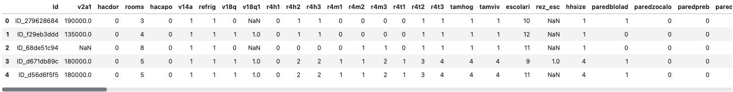
df_train.describe()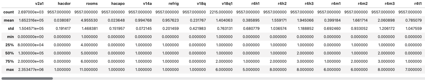
df_train.info()
- Integer type이 130개, float type이 8개, object type이 5개 있다
- object type은 그대로 머신러닝에 사용할 수 없으므로 후에 수정 필요
- Integer type은 0 혹은 1의 불리안 값을 나타내는 값과 실제 추시를 나타내는 값 2가지로 나뉘므로 어느정도로 분포되어 있는지 확인한다
Integer Columns
df_train.select_dtypes(np.int64).nunique().value_counts().sort_index().plot.bar(color = 'blue',
								figsize = (8, 6), edgecolor = 'k', linewidth = 2)
plt.xlabel('Number of Unique Values'); plt.ylabel('Count')
plt.title('Count of Unique Values in Integer Columns')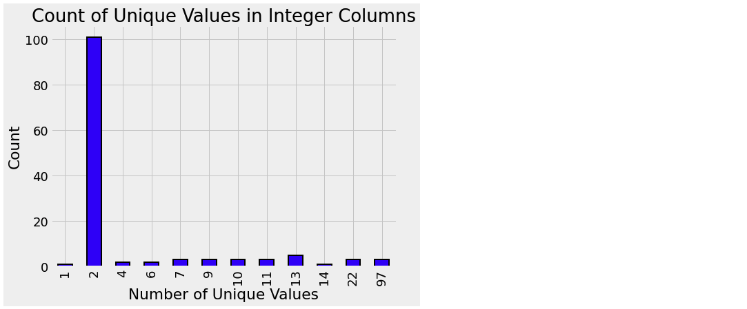
- 그래프를 확인해보면, 2가지 값을 가진 column이 가장 많은 것을 볼 수 있다
- 고로, 참/거짓을 0과 1로 나타낸 column의 수가 가장 많다
Float Columns
plt.figure(figsize = (20, 16))

# 컬러 매핑
colors = OrderedDict({1: 'red', 2: 'orange', 3:'blue', 4: 'green'})
poverty_mapping = OrderedDict({1: 'extreme', 2: 'moderate', 3: 'vulnerable', 4: 'non vulnerable'})

# float type의 column 반복문
for i, col in enumerate(df_train.select_dtypes('float')):
	ax = plt.subplot(4, 2, i + 1)

    # 가난 레벨 반복문
    for poverty_level, color in colors.items():

        # 각 가난 레벨을 구분된 선으로 plotting
        sns.kdeplot(df_train.loc[df_train['Target'] == poverty_level, col].dropna(), ax = ax,
        			color = color, label = poverty_mapping[poverty_level])
    plt.title(f'{col.capitalize()} Distribution'); plt.xlabel(f'{col}'); plt.ylabel('Density')
plt.subplots_adjust(top = 2)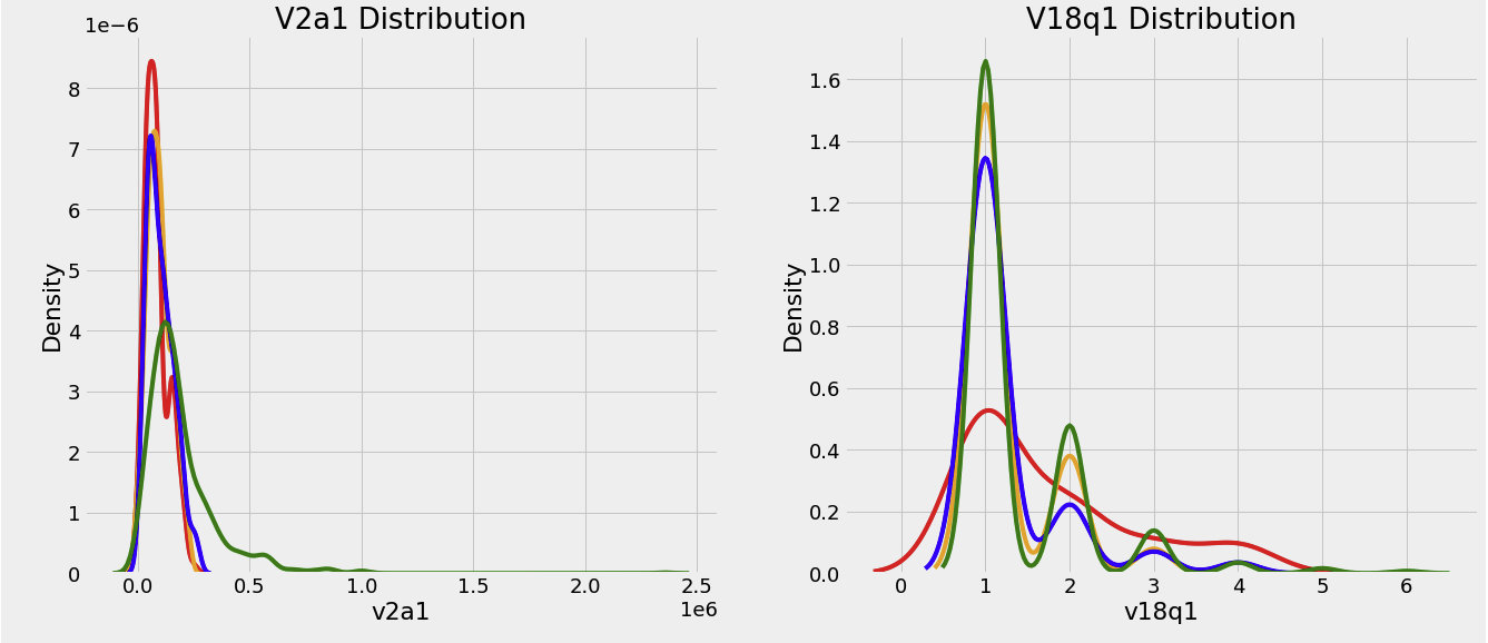
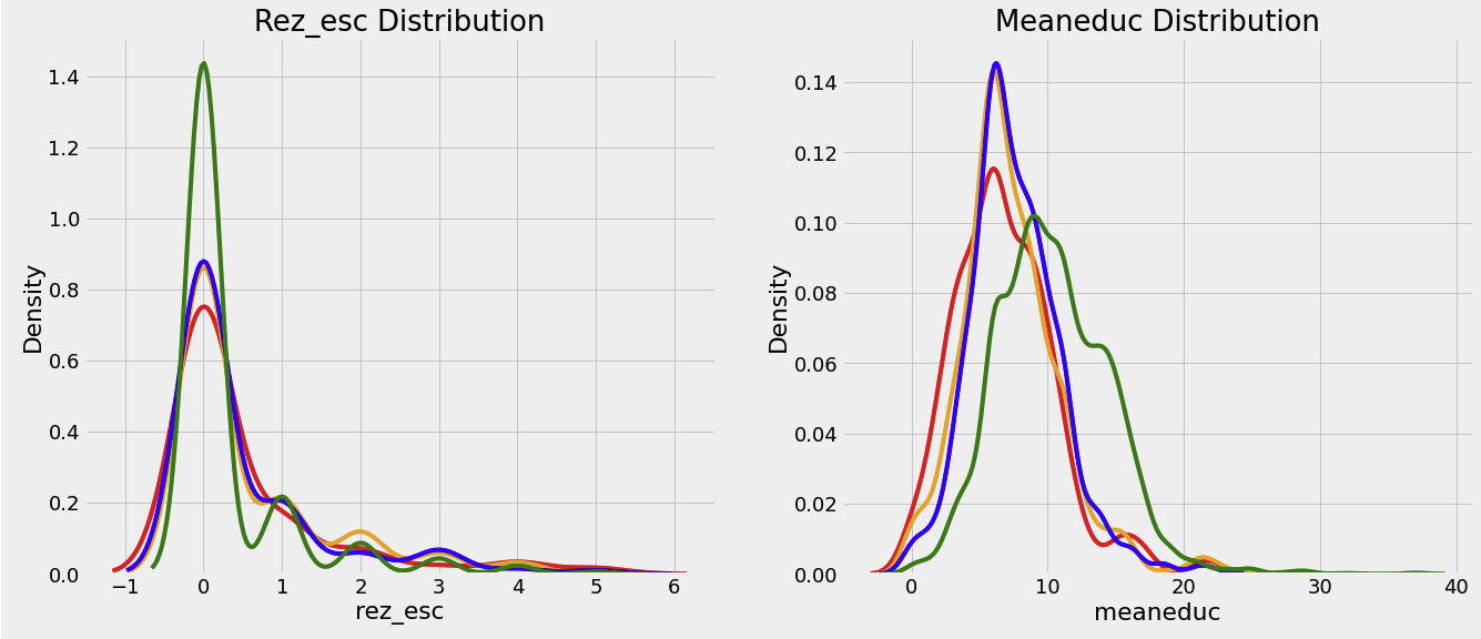

- 후에 상관계수를 계산해봐야 정확한 인사이트를 얻을 수 있겠지만, 어느정도 직관적으로 보이는 지표들이 있다
meaneduc의 경우, 교육수준을 나타내는 지표인데, 해당 수치가 높을수록 빈곤하지 않을 확률이 높다
Object Columns
df_train.select_dtypes('object').head()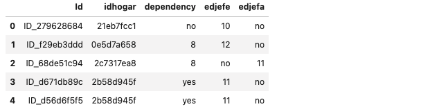
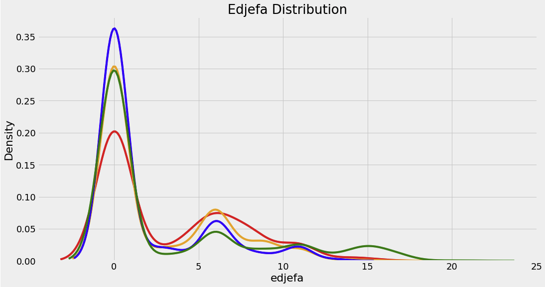
Id와idhogar는 개인 식별을 하는 변수이기 때문에 object type으로 들어가는 것이 맞다dependency: 부양비. 19 ~ 64세를 제외한 인구 / 19 ~ 64세 인구edjefe: 가장이 남자인 경우의 교육 년차edjefa: 가장이 여자인 경우의 교육 년차
mapping = {'yes': 1, 'no': 0}

for df in [df_train, df_test]:
	df['dependency'] = df['dependency'].replace(mapping).astype(np.float64)
    df['edjefe'] = df['edjefe'].replace(mapping).astype(np.float64)
    df['edjefa'] = df['edjefa'].replace(mapping).astype(np.float64)

df_train[['dependency', 'edjefa', 'edjefe']].describe()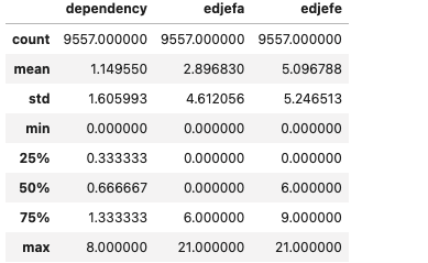
plt.figure(figsize = (16, 12))

for i, col in enumerate(['dependency', 'edjefe', 'edjefa']):
	ax = plt.subplot(3, 1, i + 1)

    for poverty_level, color in colors.items():
    	sns.kdeplot(df_train.loc[df_train['Target'] == poverty_level, col].dropna(), ax = ax,
        				color = color, label = poverty_mapping[poverty_level])
    plt.title(f'{col.capitalize()} Distribution'); plt.xlabel(f'{col}'); plt.ylabel('Density')
plt.subplots_adjust(top = 2)

# test 데이터셋에 Target column, 값은 null 넣기
df_test['Target'] = np.nan

# data라는 이름의 DataFrame은 트레이닝셋에 테스트셋을 합친 데이터프레임
data = df_train.append(df_test, ignore_index = True)
1.1 Exploring Label Distribution
parentesco1값이 1인 경우 가장이다. 가장은 각 가정에 1명씩이므로 정확한 값을 확인하기 위해parentesco1이 1인 값에 대한 가난 레벨을 확인한다
# heads라는 데이터프레임에 가장 데이터 카피
heads = data.loc[data['parentesco1'] == 1].copy()

train_labels = data.loc[(data['Target'].notnull()) & (data['parentesco1'] == 1,['Target', 'idhogar']]

label_counts = train_labels['Target'].value_counts().sort_index()

# 각 라벨의 Bar plot
label_counts.plot.bar(figsize = (8, 6), color = colors.values(), edgecolor = 'k', linewidth = 2)

# Formatting
plt.xlabel('Poverty Level'); plt.ylabel('Count');
plt.xticks([x - 1 for x in poverty_mapping.keys()], list(poverty_mapping.values()), rotation = 60)
plt.title('Poverty Level Breakdown')

label_counts
1.2 Addressing Wrong Labels
Identify Errors
- 몇몇 가정에서, 가족구성원끼리 가난 레벨이 다른 것을 확인할 수 있다
# 각 가정을 묶은 뒤 유니크 값 얻어내기
all_equal = df_train.groupby('idhogar')['Target'].apply(lambda x: x.nunique() == 1)

# 가족 구성원끼리 타겟값이 같지 않은 가정
not_equal = all_equal[all_equal != True]

print('There are {} households where the family members do not all have the same target'
																.format(len(not_equal)))
df_train[df_train['idhogar'] == not_equal.index[0]][['idhogar','parentesco1','Target']]
parentesco1가 1인 데이터의Target값이 1인 것을 찾으면 된다
Families without Heads of Household
households_leader = df_train.groupby('idhogar')['parentesco1'].sum()

# 가장이 없는 가정 검색
households_no_head = df_train.loc[df_train['idhogar'].isin(households_leader[households_leader == 0].index), :]

print('There are {} households without a head'.format(households_no_head['idhogar'].nunique()))
# 라벨이 다른 것 중에 가장이 없는 가정 찾기
households_no_head_equal = households_no_head.groupby('idhogar')['Target'].apply(lambda x: x.nunique() == 1)
Correct Errors
# 각 가정마다 반복문
for household in not_equal.index:
	# 올바른 라벨 찾기
    true_target = int(df_train[(df_train['idhogar'] == household) &
    							(df_train['parentesco1'] == 1.0)]['Target'])
    # 가족 구성원 모두에게 올바른 라벨 넣기
    df_train.loc[df_train['idhogar'] == household, 'Target'] = true_target
# 가정으로 그룹화하고 유니크 값 개수 구하기
all_equal = df_train.groupby('idhogar')['Target'].apply(lambda x: x.nunique() == 1]

# 타겟이 모두 같지 않은 가정 구하기
not_equal = all_equal[all_equal != True]
print('There are {} households where the family members do not all have the same target'
										.format(len(not_equal)))
Missing Variables
# 각 칼럼마다 missing value 개수 구하기
missing = pd.DataFrame(data.isnull().sum()).rename(columns = {: 'total'})

# missing value 비율 구하기
missing['percent'] = missing['total'] / len(data)

missing.sort_values('percent', ascending = False).head(10).drop('Target')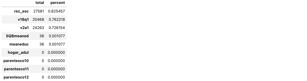
vq8q1: 태블릿 개수
def plot_value_counts(df, col, heads_only = False):
	if heads_only:
    	df = df.loc[df['parentesco1'] == 1].copy()

    plt.figure(figsize = (8, 6))
    df[col].value_counts().sort_index().plot.bar(color = 'blue', edgecolor = 'k', linewidth = 2)
    plt.xlabel(f'{col}'); plt.title(f'{col} Value counts'); plt.ylabel('Count')

plt.show()plot_value_counts(heads, 'v18q1')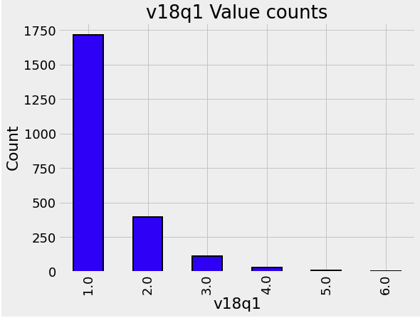
heads.groupby('v18q')['v18q1'].apply(lambda x: x.isnull().sum())
v18q1칼럼에 대해nan값을 가지는 가정에는 tablet이 없다- missing value를 0으로 설정한다
data['v18q1'] = data['v18q1'].fillna(0)v2a1 : 월세
- 여기서
tipovivi_칼럼은 집 소유 여부를 나타낸다. 이 경우v2a1칼럼이 nan인tipovivi_칼럼을 검색한다
# 자가 여부를 나타내는 변수
own_variables = [x for x in data if x.startswith('tipo')]

data.loc[data['v2a1'].isnull(), own_variables].sum().plot.bar(figsize = (10, 8), color = 'green',
																edgecolor = 'k', linewidth = 2)

plt.xticks([0, 1, 2, 3, 4], ['Owns and paid off', 'Owns and paying', 'Rented', 'Precarious', 'Other'], rotation = 60)
plt.title('Home Ownership Status for Households Missing Rent Payments', size = 18)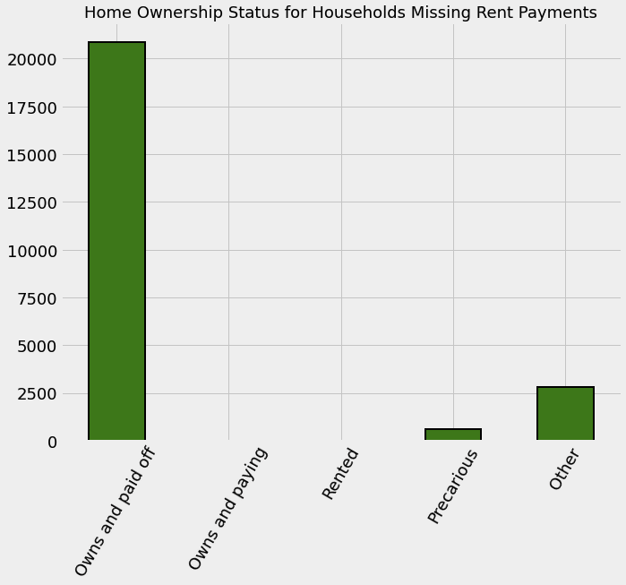
- 자가 소유 관련 변수는 아래와 같다
tipovivi1 = 1: 자가를 소유중이며, 모든 돈을 지불한 상태tipovivi2 = 1: 자가를 소유중이며, 현재 대출금을 내고있는 상태tipovivi3 = 1: 대여tipovivi4 = 1: 신뢰할 수 없는 데이터tipovivi5 = 1: 그 외
# 완전히 집을 소유한 가정
data.loc[(data['tipovivi1'] == 1), 'v2a1'] = 0

data['v2a1-missing'] = data['v2a1'].isnull()

data['v2a1-missing'].value_counts()
rez_esc: 학년을 나타내는 칼럼
data.loc[data['rez_esc'].notnull()]['age'].describe()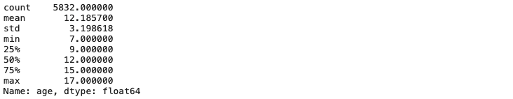
data.loc[data['rez_esc'].isnull()]['age'].describe()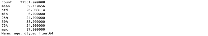
rez_esc의 최대값은 5이므로 5를 넘기는 값은 모두 5로 변환
data.loc[data['rez_esc'] > 5, 'rez_esc'] = 5Plot two Categorical Variables
def plot_categoricals(x, y, data, annotate = True):
    """Plot counts of 2 categoricals
    Size is raw count for each grouping
    Percentages are for a given value of y"""

    # Raw counts
    raw_counts = pd.DataFrame(data.groupby(y)[x].value_counts(normalize = False))
    raw_counts = raw_counts.rename(columns = {x: 'raw_count'})

    # Calculate counts for each group of x and y
    counts = pd.DataFrame(data.groupby(y)[x].value_counts(normalize = True))

    # Rename the column and reset the index
    counts = counts.rename(columns = {x: 'normalized_count'}).reset_index()
    counts['percent'] = 100 * counts['normalized_count']

    # Add the raw count
    counts['raw_count'] = list(raw_counts['raw_count'])

    plt.figure(figsize = (10, 14))
    # Scatter plot sized by percent
    plt.scatter(counts[x], counts[y], edgecolor = 'k', color = 'lightgreen',
    		s = 100 * np.sqrt(counts['raw_count']), marker = 'o', alpha = 0.6, linewidth = 1.5)

    if annotate:
        # Annotate the plot with text
        for i, row in counts.iterrows():
            # Put text with appropriate offsets
            plt.annotate(xy = (row[x] - (1 / counts[x].nunique()),
            		row[y] - (0.15 / counts[y].nunique())),color = 'navy',text = f"{round(row['percent'], 1)}%")

    # Set tick marks
    plt.yticks(counts[y].unique())
    plt.xticks(counts[x].unique())

    # Transform min and max to evenly space in square root domain
    sqr_min = int(np.sqrt(raw_counts['raw_count'].min()))
    sqr_max = int(np.sqrt(raw_counts['raw_count'].max()))

    # 5 sizes for legend
    msizes = list(range(sqr_min, sqr_max, int((sqr_max - sqr_min) / 5)))

    markers = []

    # Markers for legend
    for size in msizes:
        markers.append(plt.scatter([], [], s = 100 * size, label =
        							f'{int(round(np.square(size) / 100) * 100)}', color = 'lightgreen',
                                    					alpha = 0.6, edgecolor = 'k', linewidth = 1.5))

    # Legend and formatting
    plt.legend(handles = markers, title = 'Counts', labelspacing = 3, handletextpad = 2, fontsize = 16, loc = (1.10, 0.19))

    plt.annotate(f'* Size represents raw count while % is for a given y value', xy = (0, 1),
    														xycoords = 'figure points', size = 10)

    # Adjust axes limits
    plt.xlim((counts[x].min() - (6 / counts[x].nunique()), counts[x].max() + (6 / counts[x].nunique())))
    plt.ylim((counts[y].min() - (4 / counts[y].nunique()), counts[y].max() + (4 / counts[y].nunique())))

    plt.grid(None)
plt.xlabel(f"{x}"); plt.ylabel(f"{y}"); plt.title(f"{y} vs {x}");plot_categoricals('rez_esc', 'Target', data);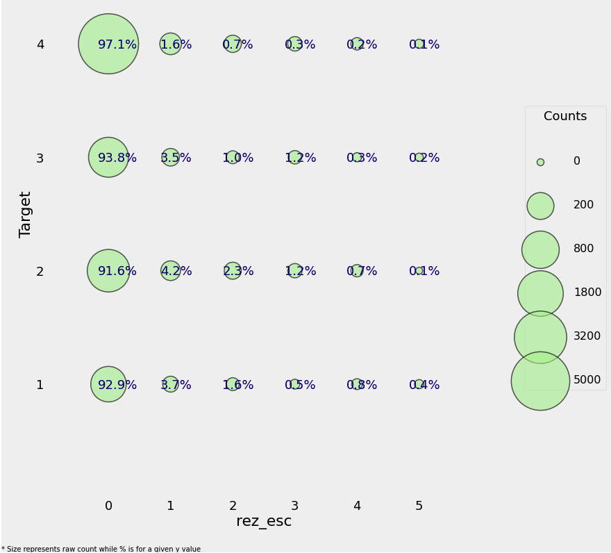
plot_categoricals('escolari', 'Target', data, annotate = False)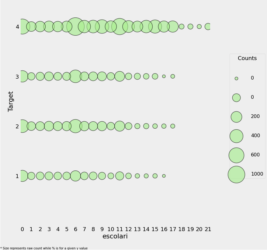
plot_value_counts(data[(data['rez_esc-missing'] == 1)], 'Target')
plot_value_counts(data[(data['v2a1-missing'] == 1)], 'Target')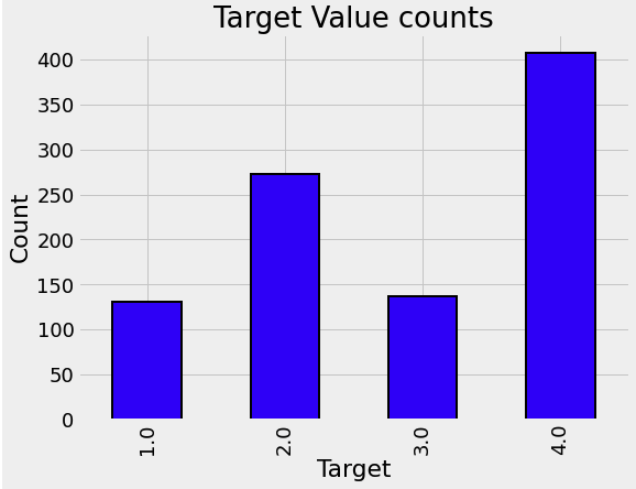

데이터 엔지니어로 전향중인 백엔드 개발자입니다