부제: Text classification using CNN acc 95%
파일 설명
- 이모티콘을 통한 감정분석
- Emotions dataset for NLP이라는 데이터셋을 사용함
라이브러리 및 패키지 설치
import pandas as pd
import numpy as np
import matplotlib.pyplot as plt
import seaborn as sns
from sklearn.metrics import classification_report, confusion_matrix
from tensorflow.keras.preprocessing.text import Tokenizer
from tensorflow.keras.optimizers import Adamax
from tensorflow.keras.metrics import Precision, Recall
from tensorflow.keras.layers import Dense, ReLU
from tensorflow.keras.layers import Embedding, BatchNormalization, Concatenate
from tensorflow.keras.layers import Conv1D, GlobalMaxPooling1D, Dropout
from tensorflow.keras.models import Sequential, Model
from sklearn.preprocessing import LabelEncoder
from tensorflow.keras.preprocessing.sequence import pad_sequences
from keras.utils import to_categorical
from tensorflow.keras.layers import Input
from tensorflow.keras.models import Model
데이터로드
df = pd.read_csv("/input/emotions-dataset-for-nlp/train.txt",
                 delimiter=';', header=None, names=['sentence','label'])

val_df = pd.read_csv("/input/emotions-dataset-for-nlp/val.txt",
                 delimiter=';', header=None, names=['sentence','label'])

ts_df = pd.read_csv("/input/emotions-dataset-for-nlp/test.txt",
delimiter=';', header=None, names=['sentence','label'])- 테스트, 훈련 검증 데이트를 각각 input해주었음.
데이터 살펴보기
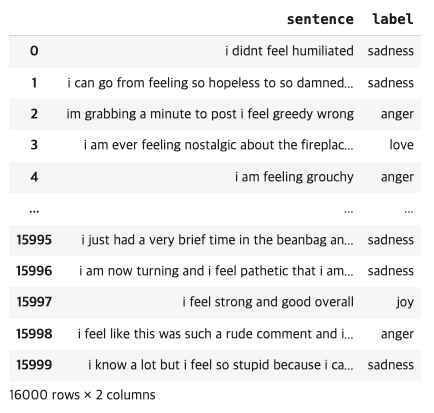
df
df['label'].unique()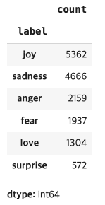
df.label.value_counts()-
df
-
df['label'].unique()

-
df.label.value_counts()
-
데이터가 고르지 못한것이 보임으로,개선 필요
데이터 시각화
label_counts = df['label'].value_counts()
light_colors = sns.husl_palette(n_colors=len(label_counts))
sns.set(style="whitegrid")
plt.figure(figsize=(8, 8))
plt.pie(label_counts, labels=label_counts.index, autopct='%1.1f%%', startangle=140, colors=light_colors)
plt.title('Emotion Train Distribution')
plt.show()


label_counts = val_df['label'].value_counts()
light_colors = sns.husl_palette(n_colors=len(label_counts))
sns.set(style="whitegrid")
plt.figure(figsize=(8, 8))
plt.pie(label_counts, labels=label_counts.index, autopct='%1.1f%%', startangle=140, colors=light_colors)
plt.title('Emotion Valid Distribution')
plt.show()

label_counts = ts_df['label'].value_counts()
light_colors = sns.husl_palette(n_colors=len(label_counts))
sns.set(style="whitegrid")
plt.figure(figsize=(8, 8))
plt.pie(label_counts, labels=label_counts.index, autopct='%1.1f%%', startangle=140, colors=light_colors)
plt.title('Emotion Test Distribution')
plt.show()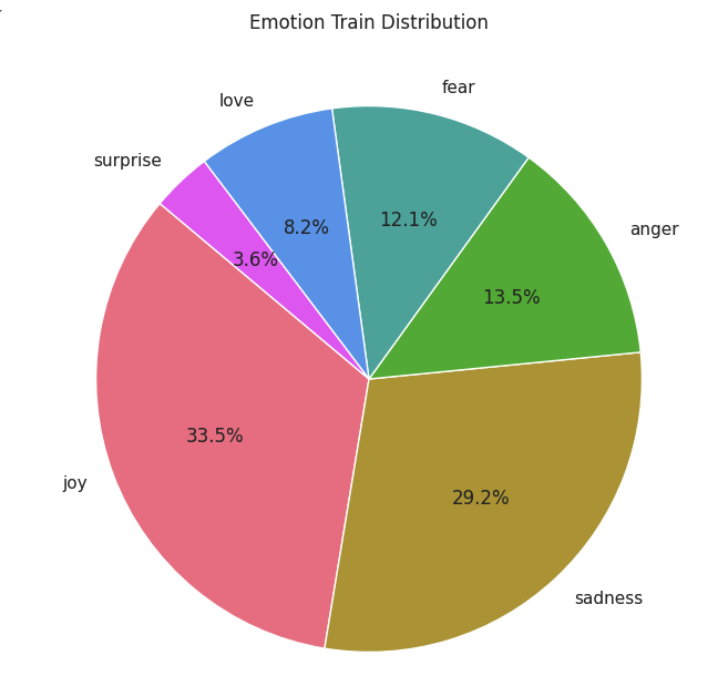
훈련데이터
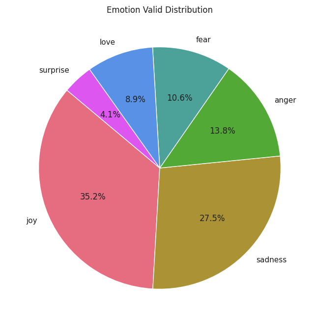
검증데이터
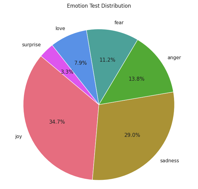
테스트 데이터
데이터 전처리
# 훈련 부분
df = df[~df['label'].str.contains('love')]
df = df[~df['label'].str.contains('surprise')]

joy = df[df['label'] == 'joy'].sample(n=2200, random_state=20)
sad = df[df['label'] == 'sadness'].sample(n=2200, random_state=20)
fear = df[df['label'] == 'fear'].sample(n=1937, random_state=20)
anger = df[df['label'] == 'anger'].sample(n=2159, random_state=20)

df_sampled = pd.concat([joy, sad, fear, anger])

df = df_sampled.sample(frac=1, random_state=20).reset_index(drop=True)

df.label.value_counts()
# 검증 부분
val_df = val_df[~val_df['label'].str.contains('love')]
val_df = val_df[~val_df['label'].str.contains('surprise')]

joy = val_df[val_df['label'] == 'joy'].sample(n=250, random_state=20)
sad = val_df[val_df['label'] == 'sadness'].sample(n=250, random_state=20)
fear = val_df[val_df['label'] == 'fear'].sample(n=212, random_state=20)
anger = val_df[val_df['label'] == 'anger'].sample(n=275, random_state=20)

df_sampled = pd.concat([joy, sad, fear, anger])

val_df = df_sampled.sample(frac=1, random_state=20).reset_index(drop=True)
# 테스트 부분
ts_df = ts_df[~ts_df['label'].str.contains('love')]
ts_df = ts_df[~ts_df['label'].str.contains('surprise')]

joy = ts_df[ts_df['label'] == 'joy'].sample(n=250, random_state=20)
sad = ts_df[ts_df['label'] == 'sadness'].sample(n=250, random_state=20)
fear = ts_df[ts_df['label'] == 'fear'].sample(n=224, random_state=20)
anger = ts_df[ts_df['label'] == 'anger'].sample(n=275, random_state=20)

df_sampled = pd.concat([joy, sad, fear, anger])

ts_df = df_sampled.sample(frac=1, random_state=20).reset_index(drop=True)- 불균형한 데이터 세트가 있으므로 서프라이즈 라벨과 러브 라벨이 가장 낮기 때문에 라벨을 모두 제거
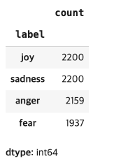
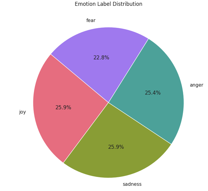
- 불균등한 데이터 제거 및 평균화 작업 결과
데이터 전처리2
# Split data into X, y
tr_text = df['sentence']
tr_label = df['label']

val_text = val_df['sentence']
val_label = val_df['label']

ts_text = ts_df['sentence']
ts_label = ts_df['label']

# Encoding
encoder = LabelEncoder()
tr_label = encoder.fit_transform(tr_label)
val_label = encoder.transform(val_label)
ts_label = encoder.transform(ts_label)

# 전처리
tokenizer = Tokenizer(num_words=10000)
tokenizer.fit_on_texts(tr_text)

sequences = tokenizer.texts_to_sequences(tr_text)

tr_x = pad_sequences(sequences, maxlen=50)
tr_y = to_categorical(tr_label)

sequences = tokenizer.texts_to_sequences(val_text)
val_x = pad_sequences(sequences, maxlen=50)
val_y = to_categorical(val_label)

sequences = tokenizer.texts_to_sequences(ts_text)
ts_x = pad_sequences(sequences, maxlen=50)
ts_y = to_categorical(ts_label)
모델 구성 및 훈련
# 모델 훈련 및 구성
max_words = 10000
max_len = 50
embedding_dim = 32

# Branch 1 Input
branch1_input = Input(shape=(max_len,))
branch1 = Embedding(max_words, embedding_dim, input_length=max_len)(branch1_input)
branch1 = Conv1D(64, 3, padding='same', activation='relu')(branch1)
branch1 = BatchNormalization()(branch1)
branch1 = ReLU()(branch1)
branch1 = Dropout(0.5)(branch1)
branch1 = GlobalMaxPooling1D()(branch1)

# Branch 2 Input
branch2_input = Input(shape=(max_len,))
branch2 = Embedding(max_words, embedding_dim, input_length=max_len)(branch2_input)
branch2 = Conv1D(64, 3, padding='same', activation='relu')(branch2)
branch2 = BatchNormalization()(branch2)
branch2 = ReLU()(branch2)
branch2 = Dropout(0.5)(branch2)
branch2 = GlobalMaxPooling1D()(branch2)

# Concatenate outputs
concatenated = Concatenate()([branch1, branch2])

# Define the rest of the model
hid_layer = Dense(128, activation='relu')(concatenated)
dropout = Dropout(0.3)(hid_layer)
output_layer = Dense(4, activation='softmax')(dropout)

# Create the model
model = Model(inputs=[branch1_input, branch2_input], outputs=output_layer)

model.compile(optimizer='adamax',
              loss='categorical_crossentropy',
              metrics=['accuracy', Precision(), Recall()])

model.summary()


batch_size = 256
epochs = 25
history = model.fit([tr_x, tr_x], tr_y, epochs=epochs, batch_size=batch_size,
                    validation_data=([val_x, val_x], val_y))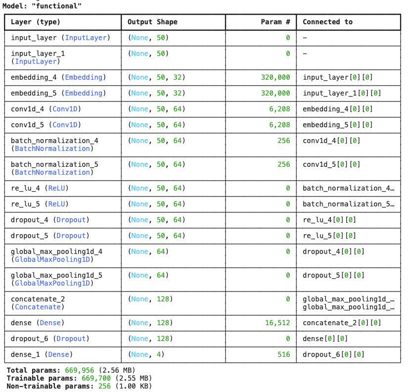
- 모델생성
모델 구성 및 훈련
tr_acc = history.history['accuracy']
tr_loss = history.history['loss']
tr_per = history.history['precision']
tr_recall = history.history['recall']
val_acc = history.history['val_accuracy']
val_loss = history.history['val_loss']
val_per = history.history['val_precision']
val_recall = history.history['val_recall']

index_loss = np.argmin(val_loss)
val_lowest = val_loss[index_loss]
index_acc = np.argmax(val_acc)
acc_highest = val_acc[index_acc]
index_precision = np.argmax(val_per)
per_highest = val_per[index_precision]
index_recall = np.argmax(val_recall)
recall_highest = val_recall[index_recall]


Epochs = [i + 1 for i in range(len(tr_acc))]
loss_label = f'Best epoch = {str(index_loss + 1)}'
acc_label = f'Best epoch = {str(index_acc + 1)}'
per_label = f'Best epoch = {str(index_precision + 1)}'
recall_label = f'Best epoch = {str(index_recall + 1)}'


plt.figure(figsize=(20, 12))
plt.style.use('fivethirtyeight')

plt.subplot(2, 2, 1)
plt.plot(Epochs, tr_loss, 'r', label='Training loss')
plt.plot(Epochs, val_loss, 'g', label='Validation loss')
plt.scatter(index_loss + 1, val_lowest, s=150, c='blue', label=loss_label)
plt.title('Training and Validation Loss')
plt.xlabel('Epochs')
plt.ylabel('Loss')
plt.legend()
plt.grid(True)

plt.subplot(2, 2, 2)
plt.plot(Epochs, tr_acc, 'r', label='Training Accuracy')
plt.plot(Epochs, val_acc, 'g', label='Validation Accuracy')
plt.scatter(index_acc + 1, acc_highest, s=150, c='blue', label=acc_label)
plt.title('Training and Validation Accuracy')
plt.xlabel('Epochs')
plt.ylabel('Accuracy')
plt.legend()
plt.grid(True)

plt.subplot(2, 2, 3)
plt.plot(Epochs, tr_per, 'r', label='Precision')
plt.plot(Epochs, val_per, 'g', label='Validation Precision')
plt.scatter(index_precision + 1, per_highest, s=150, c='blue', label=per_label)
plt.title('Precision and Validation Precision')
plt.xlabel('Epochs')
plt.ylabel('Precision')
plt.legend()
plt.grid(True)

plt.subplot(2, 2, 4)
plt.plot(Epochs, tr_recall, 'r', label='Recall')
plt.plot(Epochs, val_recall, 'g', label='Validation Recall')
plt.scatter(index_recall + 1, recall_highest, s=150, c='blue', label=recall_label)
plt.title('Recall and Validation Recall')
plt.xlabel('Epochs')
plt.ylabel('Recall')
plt.legend()
plt.grid(True)

plt.suptitle('Model Training Metrics Over Epochs', fontsize=16)
plt.show()tr_acc = history.history['accuracy']
tr_loss = history.history['loss']
tr_per = history.history['precision']
tr_recall = history.history['recall']
val_acc = history.history['val_accuracy']
val_loss = history.history['val_loss']
val_per = history.history['val_precision']
val_recall = history.history['val_recall']

index_loss = np.argmin(val_loss)
val_lowest = val_loss[index_loss]
index_acc = np.argmax(val_acc)
acc_highest = val_acc[index_acc]
index_precision = np.argmax(val_per)
per_highest = val_per[index_precision]
index_recall = np.argmax(val_recall)
recall_highest = val_recall[index_recall]


Epochs = [i + 1 for i in range(len(tr_acc))]
loss_label = f'Best epoch = {str(index_loss + 1)}'
acc_label = f'Best epoch = {str(index_acc + 1)}'
per_label = f'Best epoch = {str(index_precision + 1)}'
recall_label = f'Best epoch = {str(index_recall + 1)}'


plt.figure(figsize=(20, 12))
plt.style.use('fivethirtyeight')

plt.subplot(2, 2, 1)
plt.plot(Epochs, tr_loss, 'r', label='Training loss')
plt.plot(Epochs, val_loss, 'g', label='Validation loss')
plt.scatter(index_loss + 1, val_lowest, s=150, c='blue', label=loss_label)
plt.title('Training and Validation Loss')
plt.xlabel('Epochs')
plt.ylabel('Loss')
plt.legend()
plt.grid(True)

plt.subplot(2, 2, 2)
plt.plot(Epochs, tr_acc, 'r', label='Training Accuracy')
plt.plot(Epochs, val_acc, 'g', label='Validation Accuracy')
plt.scatter(index_acc + 1, acc_highest, s=150, c='blue', label=acc_label)
plt.title('Training and Validation Accuracy')
plt.xlabel('Epochs')
plt.ylabel('Accuracy')
plt.legend()
plt.grid(True)

plt.subplot(2, 2, 3)
plt.plot(Epochs, tr_per, 'r', label='Precision')
plt.plot(Epochs, val_per, 'g', label='Validation Precision')
plt.scatter(index_precision + 1, per_highest, s=150, c='blue', label=per_label)
plt.title('Precision and Validation Precision')
plt.xlabel('Epochs')
plt.ylabel('Precision')
plt.legend()
plt.grid(True)

plt.subplot(2, 2, 4)
plt.plot(Epochs, tr_recall, 'r', label='Recall')
plt.plot(Epochs, val_recall, 'g', label='Validation Recall')
plt.scatter(index_recall + 1, recall_highest, s=150, c='blue', label=recall_label)
plt.title('Recall and Validation Recall')
plt.xlabel('Epochs')
plt.ylabel('Recall')
plt.legend()
plt.grid(True)

plt.suptitle('Model Training Metrics Over Epochs', fontsize=16)
plt.show()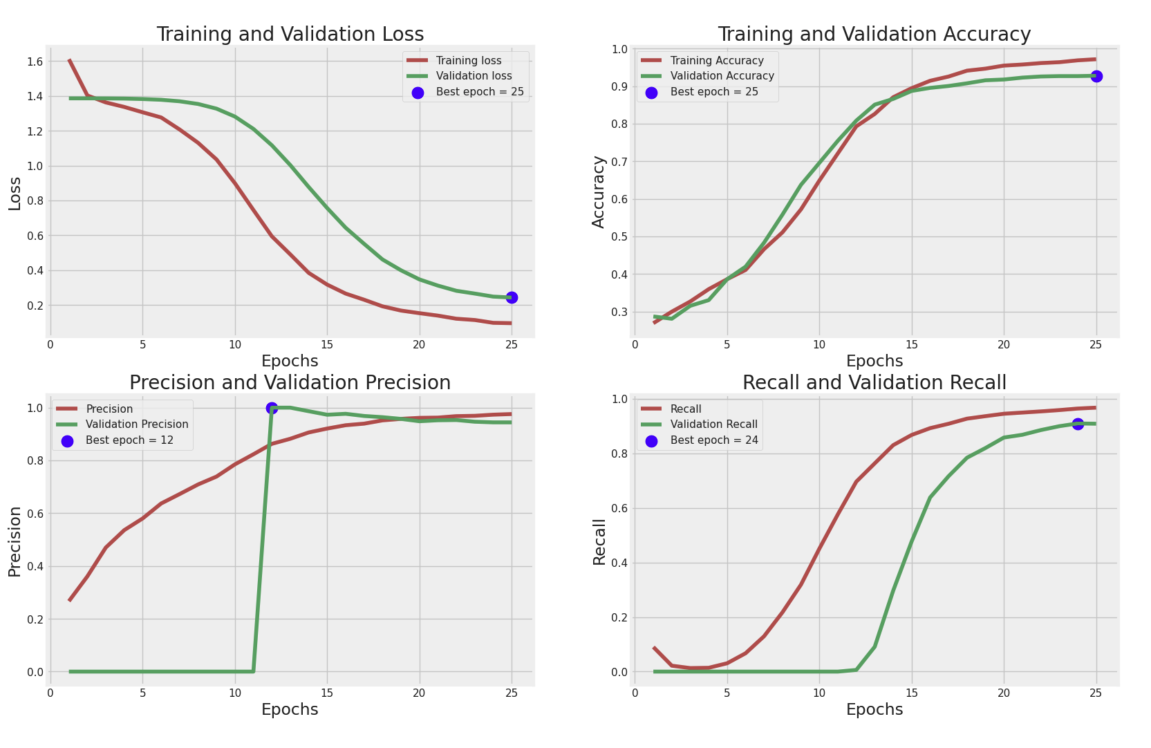
Training and Validation Loss
- Training Loss와 Validation Loss를 에포크(epoch)별로 비교한 그래프
- 초기에는 Training Loss와 Validation Loss 모두 높지만, 점차적으로 감소하여 최종적으로 낮은 손실을 보임.
- 에포크가 진행될수록 두 손실의 값이 비슷해지며, 25번째 에포크에서 최적의 손실(Best epoch = 25)을 기록.
- Validation Loss가 Training Loss보다 조금 높은데, 이는 과적합(overfitting)이 일부 발생했음을 시사할 수 있음.
Training and Validation Accuracy
- Training Accuracy와 Validation Accuracy를 에포크별로 비교한 그래프
에포크가 증가함에 따라 두 정확도가 상승하고, 거의 일치하는 모습을 보임. - 25번째 에포크에서 최고의 정확도를 기록하고 있습니다 (Best epoch = 25).
- 전반적으로 모델이 학습 데이터를 잘 학습했으며 검증 데이터에 대해서도 비슷한 성능을 유지하고 있음을 알 수 있음
Precision and Validation Precision
- 정밀도(Precision)와 검증 정밀도(Validation Precision)를 비교한 그래프
- 검증 정밀도가 12번째 에포크에서 매우 급격히 상승하고 있으며 (Best epoch = 12), 이후 일정하게 유지되고 있음
- 이는 모델이 12번째 에포크 이후 특정 패턴을 잘 학습했음을 의미할 수 있습니다.
다만 검증 정밀도의 급격한 상승 이후 일정하게 유지되는 점이 다소 비정상적으로 보일 수 있으며, 과적합 문제를 의심해 볼 필요가 있음
Recall and Validation Recall
- 재현율(Recall)과 검증 재현율(Validation Recall)을 비교한 그래프
- 재현율은 점진적으로 증가하며 24번째 에포크에서 최고(Best epoch = 24)를 기록
- Validation Recall은 초기에 매우 낮지만 에포크가 진행됨에 따라 급격히 증가
- 재현율이 안정적으로 증가한 것처럼 보이지만, 검증 재현율이 초기에 매우 낮고 나중에 급격히 증가하는 양상을 보이는 것은 데이터의 불균형이나 모델의 학습 문제를 시사할 수 있음
종합
- 모델은 전반적으로 학습 손실과 정확도가 안정적으로 감소하고 증가하고 있지만, 일부 과적합의 징후
- 정밀도와 재현율 측면에서 검증 지표의 변화가 급격하고, 일정하게 유지되는 패턴이 나타나며 이는 과적합이나 데이터 문제를 시사할 수 있음
- 최적의 에포크(Best epoch)는 각 지표마다 다르게 나타나므로, 과적합을 피하기 위해 Validation Loss와 Validation Accuracy의 최적 에포크(25)를 기준으로 모델을 선택하는 것이 좋을 것으로 보임
해결방안
이 그래프들을 바탕으로 과적합을 줄이기 위해 드롭아웃(dropout)이나 조기 종료(early stopping) 등을 고려할 수 있음
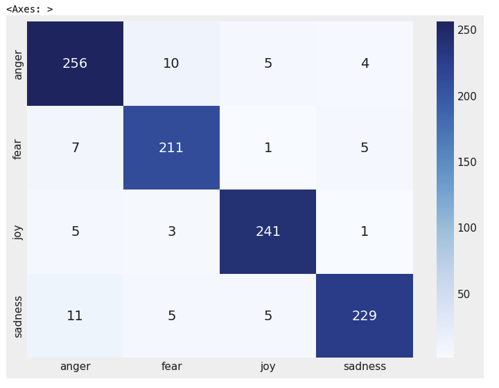
예측 결과를 시각화
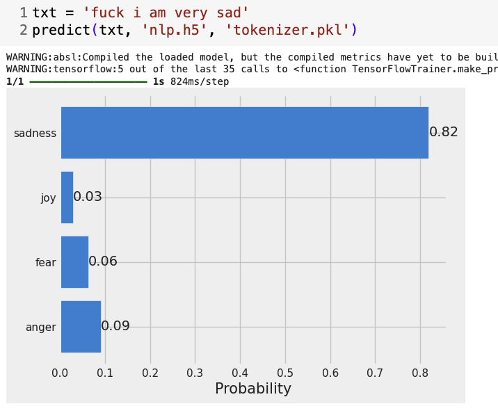
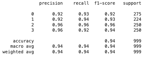
💡문장을 실험한 결과 잘나오고 다소 과격한 문장을 실험했지만 영향을 크게 주지는 않음
결론: 약간의 모델 수정 및 에폭 수정이 필요하면 더 나은 결과가 나올 것으로 예상한다.

개발자를 위한 첫시작