[머신러닝] 간단한 머신러닝 알고리즘 with Python scikit-learn

회귀
회귀는 지도 학습의 일종으로, 데이터의 경향을 파악하고 변수 사이의 관계를 예측한다.
1. Dataset
주택 가격 예측을 위한 데이터셋으로는 California Housing 데이터셋을 사용하기로 한다
- 독립 변수 : 예측이나 설명의 기준이 되는 (원인이 되는) 변수 (예측에 사용되는 입력 값)
- 목적 변수 : 그 결과로 나타나는 변수 (예측된 결과값)
# 실행 안되는 코드 (403 Error 발생)
import pandas as pd
from sklearn.datasets import fetch_california_housing

# California Housing 데이터셋 로드
california = fetch_california_housing()

# data : 독립변수
california_df = pd.DataFrame(california.data, columns=california.feature_names)

# target : 종속변수
california_df['PRICE'] = california.target

# 데이터프레임의 처음 5행 출력
california_df.head()
위 코드는 403 에러로 데이터셋에 접근이 되지 않아서 직접 csv파일을 dataframe으로 변환하였다.
import pandas as pd
import tarfile
import urllib.request

# 파일 다운로드
url = "https://www.dcc.fc.up.pt/~ltorgo/Regression/cal_housing.tgz"
file_path = "cal_housing.tgz"
urllib.request.urlretrieve(url, file_path)

# tar 파일 해제
with tarfile.open(file_path) as tar:
    tar.extractall()

# CSV 파일을 읽어 데이터프레임 생성
california_df = pd.read_csv("CaliforniaHousing/cal_housing.data", header=None)

# 열 이름 설정
column_names = [
    'longitude', 'latitude', 'housing_median_age', 'total_rooms',
    'total_bedrooms', 'population', 'households', 'median_income', 'median_house_value'
]
california_df.columns = column_names

# 'median_house_value'를 'Price'로 이름 변경 (이후에 종속 변수로 사용할 것)
california_df.rename(columns={'median_house_value': 'PRICE'}, inplace=True)

# 데이터프레임의 처음 5행 출력
california_df.head()| index | longitude | latitude | housing_median_age | total_rooms | total_bedrooms | population | households | median_income | PRICE |
|---|---|---|---|---|---|---|---|---|---|
| 0 | -122.23 | 37.88 | 41.0 | 880.0 | 129.0 | 322.0 | 126.0 | 8.3252 | 452600.0 |
| 1 | -122.22 | 37.86 | 21.0 | 7099.0 | 1106.0 | 2401.0 | 1138.0 | 8.3014 | 358500.0 |
| 2 | -122.24 | 37.85 | 52.0 | 1467.0 | 190.0 | 496.0 | 177.0 | 7.2574 | 352100.0 |
| 3 | -122.25 | 37.85 | 52.0 | 1274.0 | 235.0 | 558.0 | 219.0 | 5.6431 | 341300.0 |
| 4 | -122.25 | 37.85 | 52.0 | 1627.0 | 280.0 | 565.0 | 259.0 | 3.8462 | 342200.0 |
이 데이터셋에서 독립 변수와 종속 변수는 다음과 같다.
- 독립 변수 (Independent Variables):
longitude,latitude,housing_median_age,total_rooms,total_bedrooms,population,households,median_income- housing median age : 지역별 주택의 중간 연령, 특정 지역의 주택이 얼마나 오래되었는지를 보여주는 지표
- 종속 변수 (Dependent Variable):
PRICE(즉,median_house_value)
데이터셋의 평균값, 표준편차 등의 통계량을 보고 싶다면 pandas의 describe 메서드를 사용한다. describe 메서드에서는 데이터프레임의 각 열에 대한 기본 통계량을 계산하여 제공한다. 기본 통계량에는 평균값, 표준편차, 최소값, 1사분위수, 중간값, 3사분위수, 최대값 등이 포함되어 있다.
# 통계량 출력
print("\n캘리포니아 주택 데이터셋의 통계량:")
print(california_df.describe())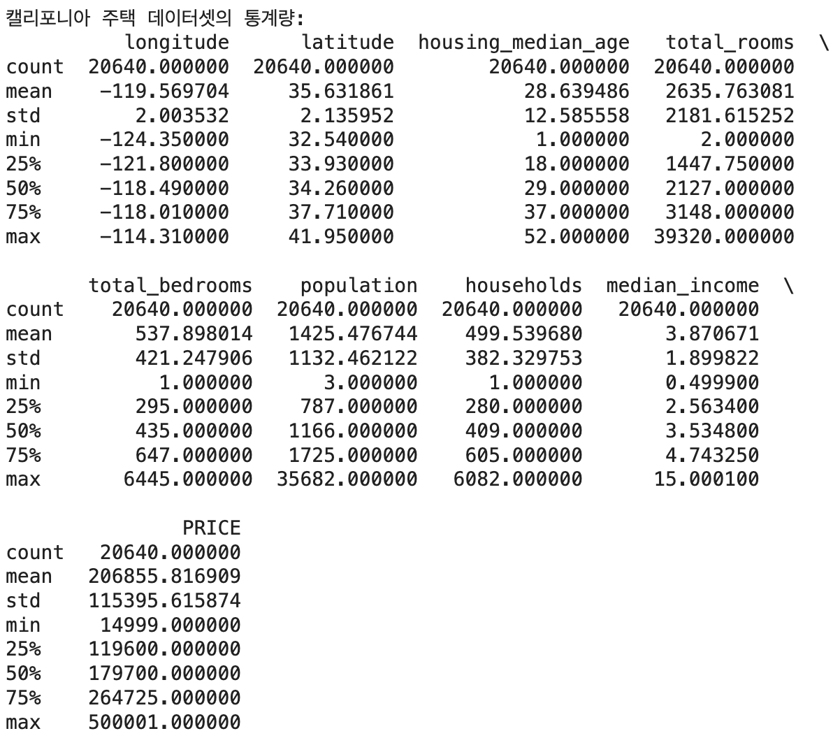
데이터셋을 train_test_split() 함수를 사용하여 훈련용과 테스트용 데이터로 분할한다.
from sklearn.model_selection import train_test_split

# 독립 변수(X)와 종속 변수(y) 설정
X = california_df.drop('PRICE', axis=1)
y = california_df['PRICE']

# 학습 데이터와 테스트 데이터로 분할
X_train, X_test, y_train, y_test = train_test_split(X, y, test_size=0.2, random_state=42)
2. Simple Regression
단순회귀는 1개의 독립변수로 종속변수를 예측한다.
다음 코드에서는 linear_model.LinearRegression() 함수를 사용한다. 독립 변수로는 median income(중간 소득)을 택했다.
from sklearn.linear_model import LinearRegression

# 독립 변수(X)와 종속 변수(y) 설정
X = california_df[['median_income']]  # 단순 선형 회귀를 적용할 독립 변수 선택
y = california_df['PRICE']

# 학습 데이터와 테스트 데이터로 분할
X_train, X_test, y_train, y_test = train_test_split(X, y, test_size=0.2, random_state=42)

# 선형 회귀 모델 학습
model = LinearRegression()
model.fit(X_train, y_train)

# 테스트 데이터에 대해 예측
y_pred = model.predict(X_test)

coef = model.coef_
intercept = model.intercept_

print("coefficient: ", coef)
print("intercept: ", intercept)
실행결과
coefficient:  [41933.84939381]
intercept:  44459.72916907875
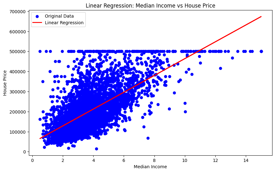
원본 데이터와 회귀 직선을 플롯하면 다음과 같다.
import matplotlib.pyplot as plt

# 산점도 그리기
plt.figure(figsize=(10, 6))
plt.scatter(X_test, y_test, color='blue', label='Original Data')

# 회귀 직선 그리기
plt.plot(X_test, y_pred, color='red', linewidth=2, label='Linear Regression')

# 그래프 라벨과 제목 추가
plt.xlabel('Median Income')
plt.ylabel('House Price')
plt.title('Linear Regression: Median Income vs House Price')

# 범례 추가
plt.legend()

# 그래프 출력
plt.show()
즉 이 직선은 median income이 높아질수록 가격이 오르는 경향을 나타내고 있다고 볼 수 있다.
다음으로는 모델의 Mean Squared Error를 계산한다.
MSE는 를 오차, 를 예측값, 를 타겟(정답), 은 데이터 포인트의 개수로 해서 다음과 같이 정의한다.
다음 코드는 훈련 데이터와 테스트 데이터 각각에 대한 MSE를 mean_squared_error() 함수로 계산한다.
from sklearn.metrics import mean_squared_error

# 모델의 훈련 데이터에 대한 예측
y_train_pred = model.predict(X_train)

# 모델의 테스트 데이터에 대한 예측
y_test_pred = model.predict(X_test)

# 훈련 데이터의 MSE 계산
mse_train = mean_squared_error(y_train, y_train_pred)
print(f"Training MSE: {mse_train}")

# 테스트 데이터의 MSE 계산
mse_test = mean_squared_error(y_test, y_test_pred)
print(f"Test MSE: {mse_test}")
print(f"...") 은 python 3.6부터 도입된 f-string 문자열 포매팅 방식이다. f-string을 사용하면 코드가 간결해지고 디버깅이 쉽다.
실행결과
Training MSE: 6991447170.182823
Test MSE: 7091157771.76555
두 MSE는 비슷한 수준이다. (모델이 훈련 데이터에만 최적이 아님)
3. Multiple Regression
다중회귀는 다수의 독립변수로 종속변수를 예측한다. 식으로 표현하면 다음과 같다.
캘리포니아 주택 가격 데이터셋의 8종류 독립변수를 모두 사용해서 multiple regression을 하는 코드는 아래와 같다.
# 독립 변수(X)와 종속 변수(y) 설정
X = california_df.drop('PRICE', axis=1)
y = california_df['PRICE']

# 학습 데이터와 테스트 데이터로 분할
X_train, X_test, y_train, y_test = train_test_split(X, y, test_size=0.2, random_state=42)

# 선형 회귀 모델 학습
model = LinearRegression()
model.fit(X_train, y_train)
각 독립변수에 대한 계수는 다음과 같다.
# 선형 회귀 모델의 계수(coefficient) 출력
coefficients = model.coef_

# 각 독립 변수와 그에 대응하는 계수 출력
for feature, coef in zip(X.columns, coefficients):
    print(f"{feature}: {coef}")
실행결과
longitude: -42632.391716513404
latitude: -42450.07186350044
housing_median_age: 1182.8096488848714
total_rooms: -8.187977078661788
total_bedrooms: 116.26012768575674
population: -38.49221313129965
households: 46.34257195815735
median_income: 40538.404387336486
모든 독립변수가 0일 때 - 즉 선형회귀모델의 절편은 다음과 같이 계산한다.
# 선형 회귀 모델의 절편(intercept) 출력
intercept = model.intercept_
print(f"Intercept: {intercept}")
실행결과
Intercept: -3578224.234818279훈련 데이터와 테스트 데이터 각각에서 MSE는 다음과 같다.
# 훈련 데이터 MSE 계산
# 선형 회귀 모델 학습
model = LinearRegression()
model.fit(X_train, y_train)

# 훈련 데이터에 대해 예측
y_train_pred = model.predict(X_train)

# 테스트 데이터에 대해 예측
y_test_pred = model.predict(X_test)

# 성능 평가 (예시로 평균 제곱 오차 출력)
mse_train = mean_squared_error(y_train, y_train_pred)
print(f"Mean Squared Error(train) : {mse_train}")

mse_test = mean_squared_error(y_test, y_test_pred)
print(f"Mean Squared Error(test) : {mse_test}")
실행결과
Mean Squared Error(train) : 4811134397.884198
Mean Squared Error(test) : 4918556441.477793
simple regression에서의 경우보다 MSE의 값은 줄어들었으나 테스트 데이터의 오차는 훈련 데이터의 오차보다 크다. (심각한 정도는 아니다) 다만 모델이 여전히 훈련 데이터에 적합되어 있음을 나타내므로, 일반화 성능을 향상시키기 위해 추가적인 모델 튜닝이나 규제화(regularization)를 고려할 필요가 있을 수 있다.
k-means clustering
k-means clustering은 지도 데이터에 의존하지 않고 데이터를 분류하는 비지도 학습 방법이다. 거리를 이용하여 데이터를 개의 클러스터로 분류한다. K-means는 데이터 마이닝, 패턴 인식, 이미지 압축 등 다양한 분야에서 활용되며, 데이터를 자동으로 그룹화하여 특성을 분석하고 이해하는 데 유용하다.
1. Dataset
Iris 데이터셋을 사용하기로 한다. 이때 독립 변수는 다음과 같다.
- sepal length(cm) : 꽃받침의 길이
- sepal width(cm) : 꽃받침의 폭
- petal length(cm) : 꽃잎의 길이
- petal width(cm) : 꽃잎의 폭
종속변수는 class 인데, 이것은 0, 1, 2의 3종류이고 꽃의 품종을 의미한다.
import pandas as pd
import numpy as np
from sklearn.cluster import KMeans
from sklearn.datasets import load_iris

iris = load_iris()
iris_df = pd.DataFrame(iris.data, columns=iris.feature_names) # data : 독립변수
iris_df["class"] = iris.target # target : 종속 변수
iris_df.head()| index | sepal length (cm) | sepal width (cm) | petal length (cm) | petal width (cm) | class |
|---|---|---|---|---|---|
| 0 | 5.1 | 3.5 | 1.4 | 0.2 | 0 |
| 1 | 4.9 | 3.0 | 1.4 | 0.2 | 0 |
| 2 | 4.7 | 3.2 | 1.3 | 0.2 | 0 |
| 3 | 4.6 | 3.1 | 1.5 | 0.2 | 0 |
| 4 | 5.0 | 3.6 | 1.4 | 0.2 | 0 |
DESCR은 데이터셋의 설명(description)을 제공하는 속성이나 메서드로, 일반적으로는 scikit-learn의 내장 데이터셋에서 사용할 수 있다. DESCR에서 제공하는 정보는 데이터셋의 출처, 각 특성(열)에 대한 설명, 데이터셋 크기, 통계적 요약 등이 포함된다.
print(iris.DESCR)**Data Set Characteristics:**
:Number of Instances: 150 (50 in each of three classes)
:Number of Attributes: 4 numeric, predictive attributes and the class
:Attribute Information:
- sepal length in cm
- sepal width in cm
- petal length in cm
- petal width in cm
- class:
- Iris-Setosa
- Iris-Versicolour
- Iris-Virginica
:Summary Statistics:
============== ==== ==== ======= ===== ====================
Min Max Mean SD Class Correlation
============== ==== ==== ======= ===== ====================
sepal length: 4.3 7.9 5.84 0.83 0.7826
sepal width: 2.0 4.4 3.05 0.43 -0.4194
petal length: 1.0 6.9 3.76 1.76 0.9490 (high!)
petal width: 0.1 2.5 1.20 0.76 0.9565 (high!)
============== ==== ==== ======= ===== ====================
...
describe() 함수는 데이터프레임의 각 열에 대한 기술 통계량(descriptive statistics)를 제공한다. 평균(mean), 표준편차(std), 최소값(min), 25%, 50%, 75% 백분위수, 최대값(max) 등을 볼 수 있다.
iris_df.describe()| index | sepal length (cm) | sepal width (cm) | petal length (cm) | petal width (cm) | class |
|---|---|---|---|---|---|
| count | 150.0 | 150.0 | 150.0 | 150.0 | 150.0 |
| mean | 5.843333333333334 | 3.0573333333333337 | 3.7580000000000005 | 1.1993333333333336 | 1.0 |
| std | 0.828066127977863 | 0.4358662849366982 | 1.7652982332594662 | 0.7622376689603465 | 0.8192319205190405 |
| min | 4.3 | 2.0 | 1.0 | 0.1 | 0.0 |
| 25% | 5.1 | 2.8 | 1.6 | 0.3 | 0.0 |
| 50% | 5.8 | 3.0 | 4.35 | 1.3 | 1.0 |
| 75% | 6.4 | 3.3 | 5.1 | 1.8 | 2.0 |
| max | 7.9 | 4.4 | 6.9 | 2.5 | 2.0 |
seaborn 라이브러리를 사용하면 matplotlib만 사용했을 때보다 데이터 시각화를 더 쉽게 할 수있다. seaborn 라이브러리에서 제공하는 pairplot() 함수는 데이터프레임의 각 열을 pairwise로 산점도(scatter plot)를 그려준다. 주어진 데이터프레임에서 모든 수치형 열들 간의 관계를 시각적으로 탐색할 때 유용하고, 주로 데이터의 상관 관계나 분포를 이해하고자 할 때 사용한다.
- 데이터 분석에서 pairwise는 주로 두 변수 간의 관계를 직접적으로 비교하거나 분석하는 것을 의미함
import seaborn as sns

sns.pairplot(iris_df, hue="class")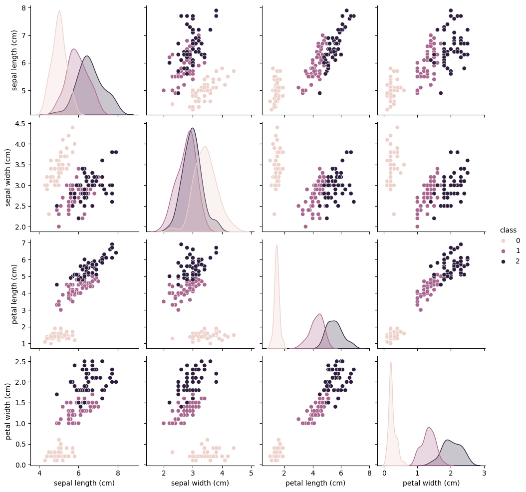
2. k-means clustering
K-means 클러스터링은 비지도 학습(unsupervised learning) 알고리즘 중 하나로, 데이터를 클러스터(cluster, 군집)라는 그룹으로 자동으로 그룹화하는 기법이다. k-means의 실행은 다음 순서로 이루어진다.
- K 개의 중심 선택: 사용자는 클러스터 개수 K를 지정해야 합니다. 이 K는 최종 클러스터의 개수를 나타냄. 초기에는 K개의 중심(centroid)을 임의로 선택함.
- 클러스터 할당: 각 데이터 포인트를 가장 가까운 중심에 할당함. 여기서 거리는 일반적으로 유클리드 거리를 사용
- 중심 업데이트: 각 클러스터에 속한 데이터 포인트들의 평균을 구하여 새로운 중심으로 업데이트
- 반복: 클러스터 할당과 중심 업데이트 과정을 반복함. 데이터 포인트의 클러스터 할당이 변하지 않을 때까지 반복 수행
- 수렴: 알고리즘이 수렴하면, 각 데이터 포인트는 하나의 클러스터에 속하게 되고, 클러스터의 중심은 더 이상 변하지 않음.
다음 코드는 k-means clustering 방법으로 데이터를 그룹화하는 코드이다. iris 품종의 가짓수가 3이므로 K=3으로 설정할 수 있다.
from sklearn.cluster import KMeans

model = KMeans(n_clusters=3)
model.fit(iris.data)
k-means clustering으로 나눠진 각 그룹을 scatter map으로 표시한다.
import matplotlib.pyplot as plt

axis_1 = 2
axis_2 = 3

# label = 0인 클러스터
group_0 = iris.data[model.labels_ == 0]
plt.scatter(group_0[:, axis_1], group_0[:, axis_2], label='Group 0', marker="x")

# label = 1인 클러스터
group_1 = iris.data[model.labels_ == 1]
plt.scatter(group_1[:, axis_1], group_1[:, axis_2], label='Group 1', marker="o")

# label = 2인 클러스터
group_2 = iris.data[model.labels_ == 2]
plt.scatter(group_2[:, axis_1], group_2[:, axis_2], label='Group 2', marker="*")

plt.legend()
plt.show()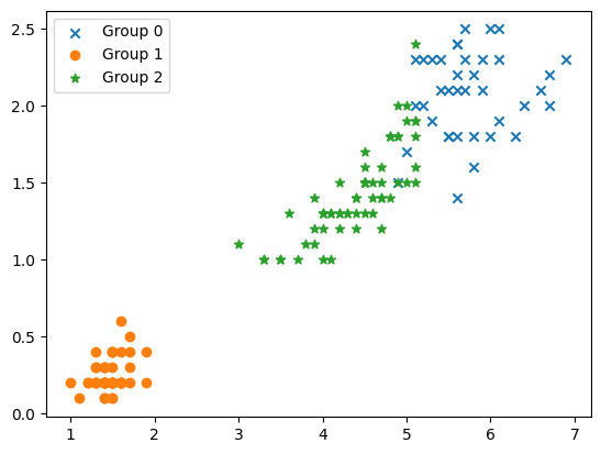
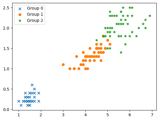
위 이미지는 k-means clustering에 의해 3가지로 그룹화되었다. 원본 데이터에서의 그룹은 원래 아래 이미지와 같다.
Support Vector Machine, SVM
서포트 벡터 머신(Support Vector Machine, SVM)은 지도 학습(Supervised Learning) 알고리즘 중 하나로, 주로 분류(Classification) 문제에서 사용한다. SVM은 데이터 포인트들을 공간에 매핑하고, 이를 분류하는 최적의 결정 경계(Decision Boundary)라는 초평면을 찾는 방법이다. 다른 일반적인 분류 알고리즘과 비교했을 때, SVM은 특히 고차원 데이터에서 잘 작동하며, 두 클래스를 나누는 최대 마진(또는 거리)(Maximum Margin)을 갖는 결정 경계를 찾는 것이 주요 목표이다.
1. Dataset
scikit-learn에 포함된 와인 데이터셋을 사용한다.
from multiprocessing.spawn import WINEXE
import pandas as pd
import numpy as np
from sklearn.datasets import load_wine

wine = load_wine()
wine_df = pd.DataFrame(wine.data, columns=wine.feature_names)
wine_df["class"] = wine.target
wine_df.head()| index | alcohol | malic_acid | ash | alcalinity_of_ash | magnesium | total_phenols | flavanoids | nonflavanoid_phenols | proanthocyanins | color_intensity | hue | od280/od315_of_diluted_wines | proline | class |
|---|---|---|---|---|---|---|---|---|---|---|---|---|---|---|
| 0 | 14.23 | 1.71 | 2.43 | 15.6 | 127.0 | 2.8 | 3.06 | 0.28 | 2.29 | 5.64 | 1.04 | 3.92 | 1065.0 | 0 |
| 1 | 13.2 | 1.78 | 2.14 | 11.2 | 100.0 | 2.65 | 2.76 | 0.26 | 1.28 | 4.38 | 1.05 | 3.4 | 1050.0 | 0 |
| 2 | 13.16 | 2.36 | 2.67 | 18.6 | 101.0 | 2.8 | 3.24 | 0.3 | 2.81 | 5.68 | 1.03 | 3.17 | 1185.0 | 0 |
| 3 | 14.37 | 1.95 | 2.5 | 16.8 | 113.0 | 3.85 | 3.49 | 0.24 | 2.18 | 7.8 | 0.86 | 3.45 | 1480.0 | 0 |
| 4 | 13.24 | 2.59 | 2.87 | 21.0 | 118.0 | 2.8 | 2.69 | 0.39 | 1.82 | 4.32 | 1.04 | 2.93 | 735.0 | 0 |
2. SVM 구현
SVM을 사용해 와인 분류를 실시한다. 데이터셋을 훈련용/테스트용으로 분할하고 StandardScaler() 함수로 표준화(Standardization)한다(평균값을 0, 표준 편차를 1로 만든다).
from sklearn.model_selection import train_test_split
from sklearn.preprocessing import StandardScaler

# 훈련 데이터와 테스트 데이터로 분할
x_train, x_test, t_train, t_test = train_test_split(wine.data, wine.target, random_state=42)

# 데이터의 표준화
std_scl = StandardScaler()
x_train = std_scl.fit_transform(x_train) # fit과 transform 한번에 수행
x_test = std_scl.transform(x_test)
Linear SVM을 사용해 데이터를 분류한다.
from sklearn.svm import LinearSVC

model = LinearSVC(random_state=42)
model.fit(x_train, t_train)
훈련이 끝나면 해당 모델로 훈련 데이터, 테스트 데이터를 사용해 예측하고 정확도를 측정한다.
from sklearn.metrics import accuracy_score

# 예측 결과
y_train = model.predict(x_train)
y_test = model.predict(x_test)

# 정확도 계산
acc_train = accuracy_score(t_train, y_train)
acc_test = accuracy_score(t_test, y_test)

print(f"Training Accuracy : {acc_train}")
print(f"Test Accuracy : {acc_test}")
실행결과
Training Accuracy : 1.0
Test Accuracy : 0.9777777777777777
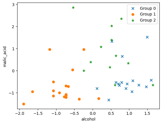
테스트 데이터의 그룹화 결과를 matplotlib scatter로 표현해본다.
import matplotlib.pyplot as plt

axis_1 = 0 # alcohol
axis_2 = 1 # malic_acid

x = x_test
y = y_test

# label = 0
group_0 = x[y==0]
plt.scatter(group_0[:, axis_1], group_0[:, axis_2], label='Group 0', marker="x")

# label = 1
group_1 = x[y==1]
plt.scatter(group_1[:, axis_1], group_1[:, axis_2], label='Group 1', marker="o")

# label = 2
group_2 = x[y==2]
plt.scatter(group_2[:, axis_1], group_2[:, axis_2], label='Group 2', marker="*")

plt.xlabel(wine.feature_names[axis_1])
plt.ylabel(wine.feature_names[axis_2])
plt.legend()
plt.show()