오늘은 플러터에서 가장 많이 사용된다고 해도 과언이 아닌 Text 위젯에 대해 알아보고자 한다. 기본적으로 사용하는 Text 위젯의 다양한 옵션들과 텍스트 위젯을 고급스럽게 사용하는 방법을 알아보자.
Text widget
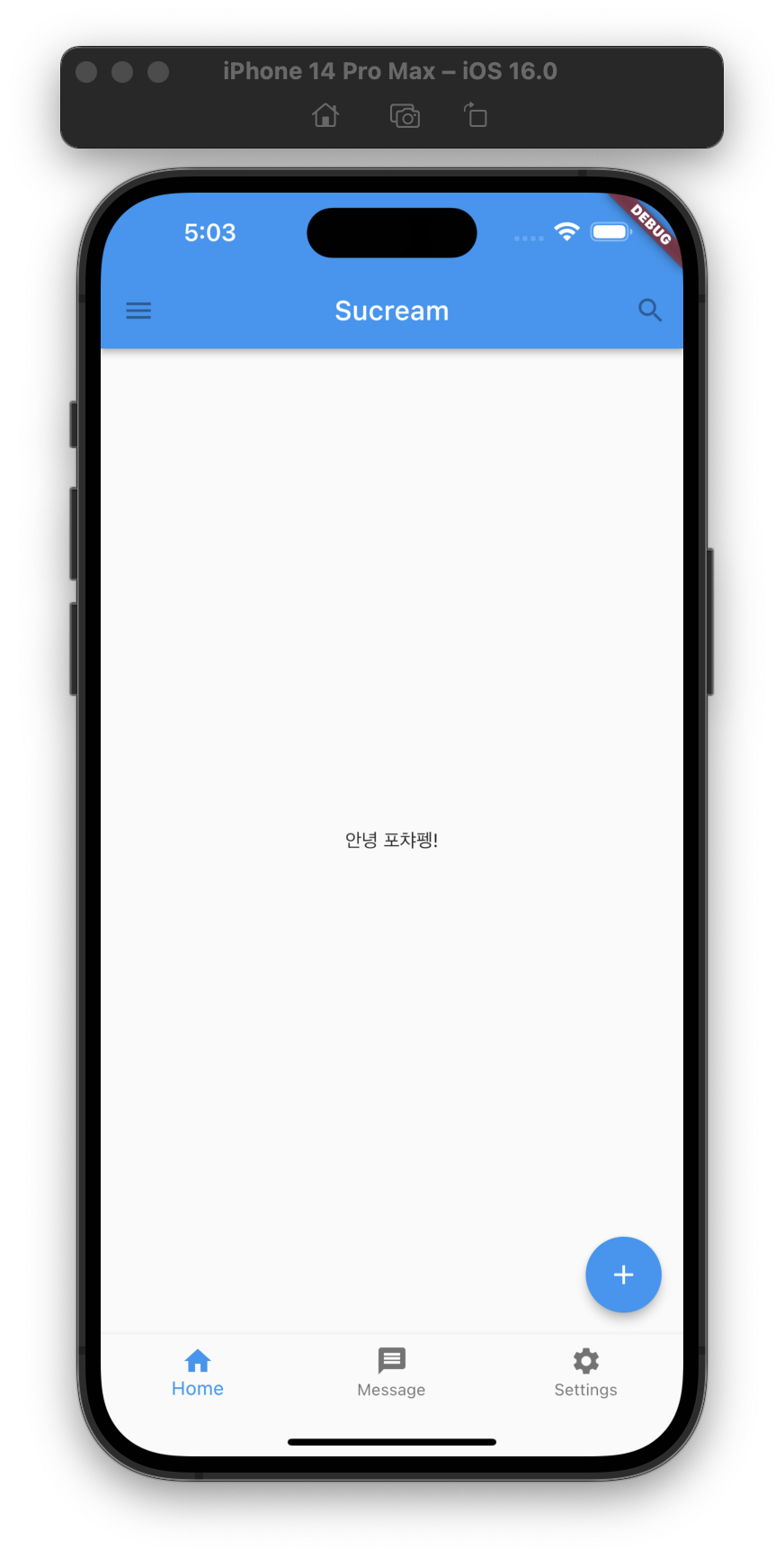
텍스트를 화면에 표시하기 위해 사용하는 기본 위젯으로, Text('표현하고자 하는 문자열') 형식으로 사용한다.
class TextHomeWidget extends StatelessWidget {
const TextHomeWidget({Key? key}) : super(key: key);
Widget build(BuildContext context) {
return const Center(child: Text('안녕 포챠펭!'));
}
}
TextStyle
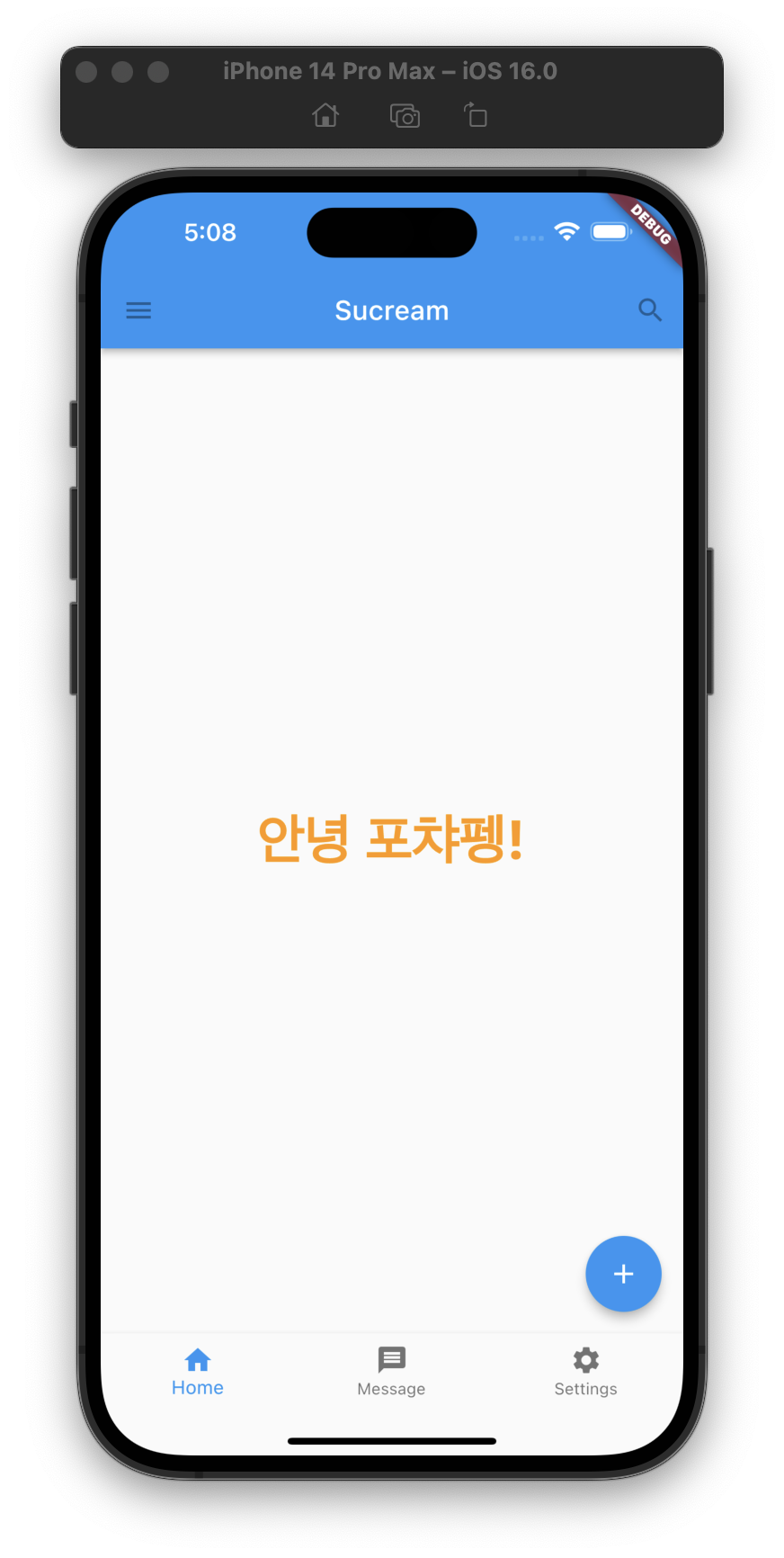
우리는 문자열에 다양한 스타일을 적용할 수 있다는걸 알고 있다. 플러터에서 문자열에 스타일을 지정하기 위해서는 style 파라미터를 사용하면 된다. style은 TextStyle 타입으로 되어있으며, 내부에 폰트 사이즈, 색, 오버플로시 작업 등 다양한 기능을 지정할 수 있다.
class TextHomeWidget extends StatelessWidget {
const TextHomeWidget({Key? key}) : super(key: key);
Widget build(BuildContext context) {
return const Center(
child: Text(
'안녕 포챠펭!',
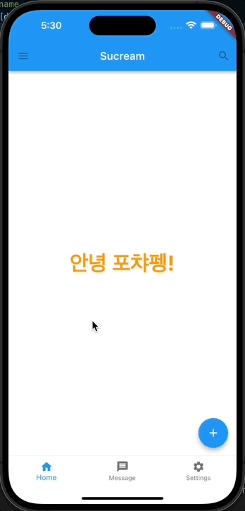
style: TextStyle( // 스타일을 지정했다.
fontSize: 40, // 폰트 사이즈를 40으로 맞췄다.
fontWeight: FontWeight.bold, // 폰트의 두꺼움 정도를 지정할 수 있다.
color: Colors.orange, // 글자의 색을 지정할 수 있다.
),
),
);
}
}
문자열의 길이가 표현 가능한 크기를 넘었을 때에 대한 처리를 위해 overflow를 사용할 수 있으며, 아래 예제는 화면을 넘어가면 생략하도록 하였다.
class TextHomeWidget extends StatelessWidget {
const TextHomeWidget({Key? key}) : super(key: key);
Widget build(BuildContext context) {
return const Center(
child: Text(
'안녕 포챠펭! 오늘도 맛있는거 많이 먹었니?',
// textAlign: TextAlign.center, // textAlign으로 텍스트 정렬을 사용할 수도 있다.
overflow: TextOverflow.ellipsis, // ellipsis 이외에 다른 값도 사용 가능하다.
style: TextStyle(
fontSize: 40,
fontWeight: FontWeight.bold,
color: Colors.orange,
),
),
);
}
}
ClickableText
텍스트가 클릭이 가능하도록 하기 위해 GestureDetector로 Text 위젯을 감싸고 클릭시 다이얼로그 뜨도록 했다. 다이얼로그 내에 있는 텍스트도 동일한 Text 위젯이기 때문에 스타일을 지정할 수 있다. 참고로 Material 디자인에서는 TextButton 또는 InkWell를 권장하고 있다. 또한 더 쉽다...
class ClickableTextHomeWidget extends StatelessWidget {
const ClickableTextHomeWidget({Key? key}) : super(key: key);
Widget build(BuildContext context) {
return Center(
child: GestureDetector( // 텍스트 위젯의 터치를 탐지하기 위해 추가한 위젯
onTap: () => showDialog<String>(
context: context,
builder: (BuildContext context) => AlertDialog( // 다이얼로그를 띄우는 함수
title: const Text(
'포챠펭',
style: TextStyle(
fontSize: 20,
fontWeight: FontWeight.bold,
color: Colors.black,
),
),
content: Column(
mainAxisSize: MainAxisSize.min, // Column이 최소 크기를 가지게 하기 위해 설정
children: [
Image.asset(
'images/pic12.jpeg',
width: 100,
height: 100,
),
const Text(
'펭하!',
style: TextStyle(
fontSize: 30,
fontWeight: FontWeight.bold,
color: Colors.black54,
),
),
],
),
actions: <Widget>[
TextButton(
onPressed: () => Navigator.pop(context, 'OK'),
child: const Text('펭하'),
),
],
),
),
child: const Text(
'안녕 포챠펭!',
// textAlign: TextAlign.center,
overflow: TextOverflow.ellipsis,
style: TextStyle(
fontSize: 40,
fontWeight: FontWeight.bold,
color: Colors.orange,
),
),
),
);
}
}TextButton 사용한 예시
class TextButtonHomeWidget extends StatelessWidget {
const TextButtonHomeWidget({Key? key}) : super(key: key);
Widget build(BuildContext context) {
return Center(
child: TextButton(
onPressed: () => showDialog<String>(
context: context,
builder: (BuildContext context) => AlertDialog(
title: const Text(
'포챠펭',
style: TextStyle(
fontSize: 20,
fontWeight: FontWeight.bold,
color: Colors.black,
),
),
content: Column(
mainAxisSize: MainAxisSize.min,
children: [
Image.asset(
'images/pic12.jpeg',
width: 100,
height: 100,
),
const Text(
'펭하!',
style: TextStyle(
fontSize: 30,
fontWeight: FontWeight.bold,
color: Colors.black54,
),
),
],
),
actions: <Widget>[
TextButton(
onPressed: () => Navigator.pop(context, 'OK'),
child: const Text('펭하'),
),
],
),
),
child: const Text(
'안녕 포챠펭!',
// textAlign: TextAlign.center,
overflow: TextOverflow.ellipsis,
style: TextStyle(
fontSize: 40,
fontWeight: FontWeight.bold,
color: Colors.orange,
),
),
),
);
}
}
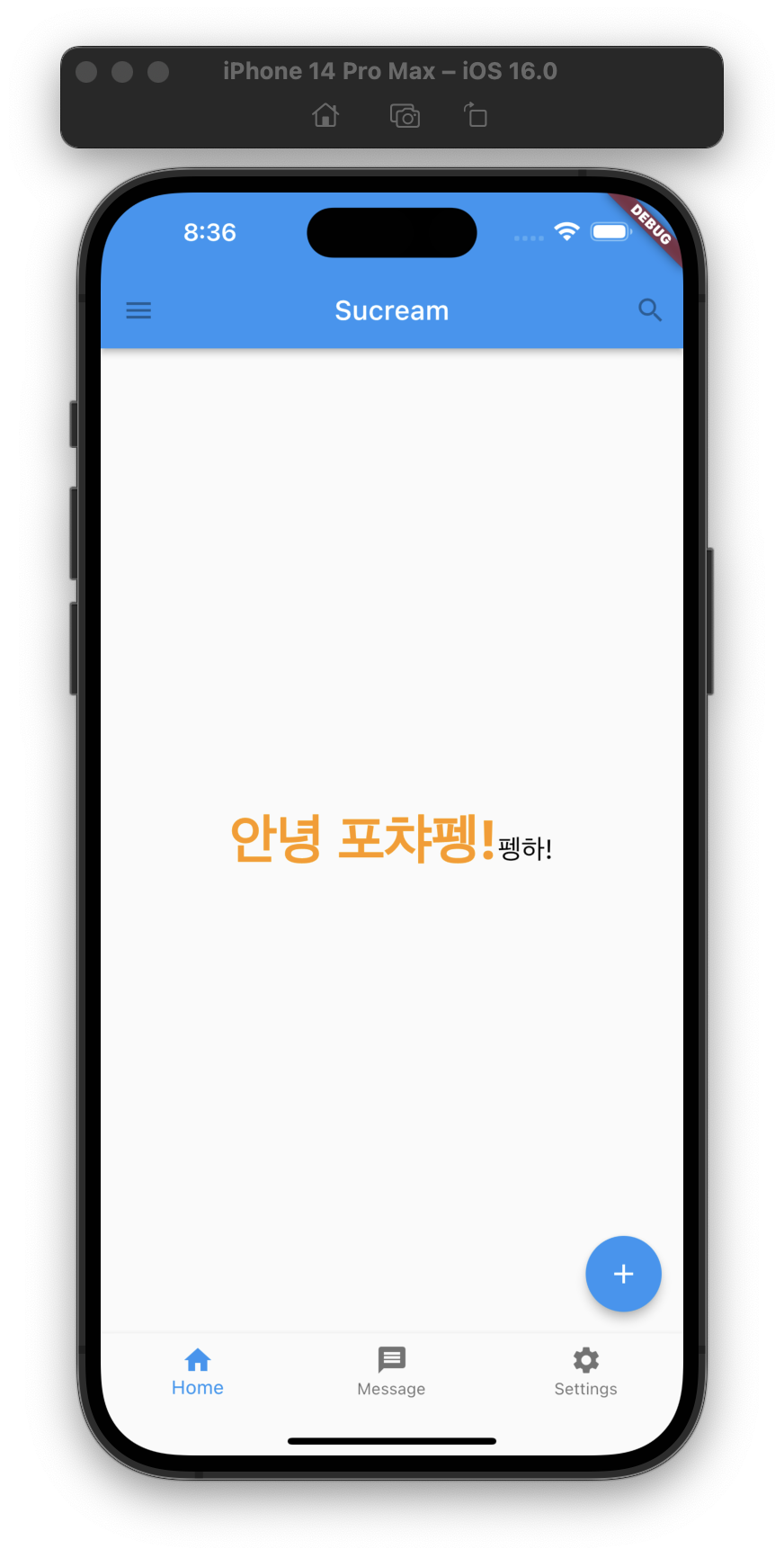
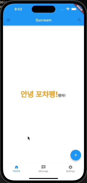
RichText widget
텍스트의 일부에 특정 스타일을 지정할 때 많이 사용한다. 텍스트를 하나의 그룹 형식으로 사용해서 필요한 부분에 스타일을 지정할 수 있다. 하나의 부모 텍스트를 가질수도, 가지지 않을 수도 있는데, 가지면 부모 텍스트의 스타일을 상속받아 사용할 수도 있는 것 같다.
class RichTextHomeWidget extends StatelessWidget {
const RichTextHomeWidget({Key? key}) : super(key: key);
Widget build(BuildContext context) {
return Center(
child: RichText(
text: const TextSpan(
children: [
TextSpan(
text: '안녕 포챠펭!',
style: TextStyle(
fontSize: 40,
fontWeight: FontWeight.bold,
color: Colors.orange,
),
),
TextSpan(
text: '펭하!',
style: TextStyle(
fontSize: 20,
fontWeight: FontWeight.normal,
color: Colors.black,
),
),
],
),
),
);
}
}
SelectableText widget
여러가지 방법으로 텍스트가 선택 가능하게 할 수 있는 것 같은데, SelectableText와 SelectableText.rich를 이용하는 방법이 기존 Text와 RichText 사용하는 방법과 가장 비슷하고 코드도 짧아지는 것 같다.
SelectableText
class SelectableTextHomeWidget extends StatelessWidget {
const SelectableTextHomeWidget({Key? key}) : super(key: key);
Widget build(BuildContext context) {
return const Center(
child: SelectableText(
'안녕 포챠펭!',
style: TextStyle(
fontSize: 40,
fontWeight: FontWeight.bold,
color: Colors.orange,
),
),
);
}
}
SelectableText.rich
class SelectableTextRichHomeWidget extends StatelessWidget {
const SelectableTextRichHomeWidget({Key? key}) : super(key: key);
Widget build(BuildContext context) {
return const Center(
child: SelectableText.rich(
TextSpan(
children: [
TextSpan(
text: '안녕 포챠펭!',
style: TextStyle(
fontSize: 40,
fontWeight: FontWeight.bold,
color: Colors.orange,
),
),
TextSpan(
text: '펭하!',
style: TextStyle(
fontSize: 20,
fontWeight: FontWeight.normal,
color: Colors.black,
),
),
],
),
),
);
}
}
Refference
- Text widgets - flutter.dev
- SelectableText Widget In Flutter - medium.flutterdevs.com
- The Style in Flutter - medium.flutterdevs.com