시작하며
오늘은 수업은 따로 없고 Zoom을 통해서 취업 특강을 들었다. 그래서 마저 정리하지 못했던 그래프 시각화에 대해서 추가로 정리해보았다.
막대 그래프
일변량 막대 그래프 그리기
- 특정 부분만 포인트 추가
- 사용자 팔레트를 추가하려면 hue 매개변수에 x 축 변수명을 지정해야함
- order 매개변수로 x축 눈금명 순서를 변경했다면 hue_order를 추가해야 함
mypal2 = ['red'] + ['silver'] * 24plt.figure: 현재 셀에만 적용되는 환경 설정 함수plt.text: 막대에 값 추가x, y: x, y 좌표를 지정s: 문자열로 출력할 값을 지정ha: 수평정렬 방식을 지정va: 수직정렬 방식을 지정
plt.figure(figsize=(12, 4))

grp = apt['시군구'].value_counts()

sns.countplot(
    data=apt,
    x='시군구',
    color='0.8',
    order=grp.index,
    hue='시군구',
    hue_order=grp.index,
    palette=mypal2
)

# 모든 막대에 값 추가
for i, v in enumerate(grp):
    plt.text(x=i, y=v + 200, s=f'{v:,}', ha='center', va='bottom', size=8, color='blue', fontweight='bold')

plt.ylim(0, 22500)

plt.xlim(-1, 25)

plt.xticks(rotation=90, size=8);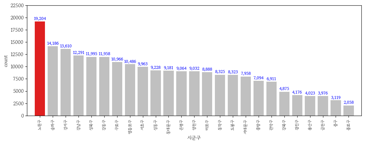
가로막대 그래프 그리기
plt.figure(figsize=(8, 6))
sns.countplot(
data=apt,
y='시군구',
color='0.8',
order=grp.index,
hue='시군구',
hue_order=grp.index,
palette=mypal2
)
for i, v in enumerate(grp):
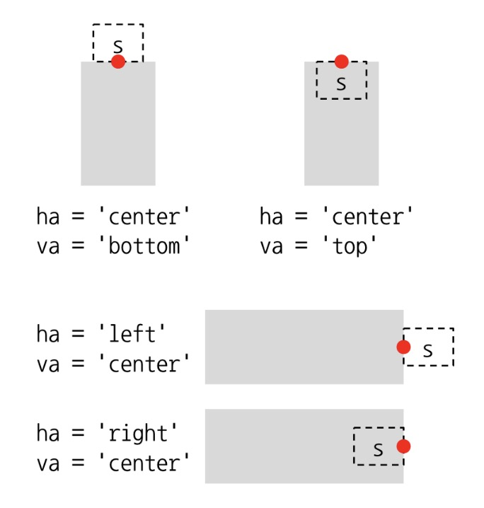
plt.text(
x=v + 200,
y=i,
s=f'{v:,}',
ha='left',
va='center',
color='blue',
size=8,
fontweight='bold'
)
plt.ylim(25, -1)
plt.xlim(0, 22500);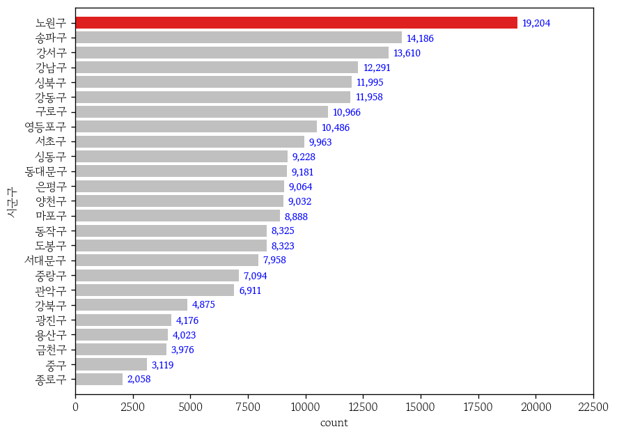
이변량 막대 그래프 그리기
grp = apt.groupby('시군구')['거래금액'].mean().sort_values()estimator: 집계 함수 지정(기본값 : mean)errorbar: 오차막대 설정 (기본값: ('ci), 95) = 95% 신뢰구간
plt.figure(figsize=(12, 4))

sns.barplot(
    data=apt,
    x='시군구',
    y='거래금액',
    color='0.8',
    estimator='mean',
    errorbar=None,
    order=grp.index
)

plt.xticks(rotation=90, size=8)
plt.xlim(-1, 25)
plt.ylim(0, 25)

for i, v in enumerate(grp):
    plt.text(
        x=i, y=v, s=f'{v:.1f}억',
        ha='center', va='bottom',
        color='blue', fontweight='bold', size=8
    )

plt.show()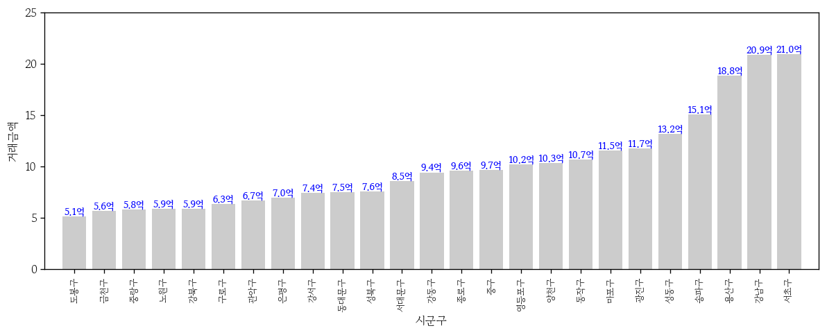
- 그라데이션 색 채우기
sns.barplot(
    x=grp.index,
    y=grp.values,
    hue=grp.values,
    palette='Blues',
    edgecolor='0.8',
    legend=False
)

plt.xticks(rotation=90, size=8)
plt.xlim(-1, 25)
plt.ylim(0, 22.5)

plt.show()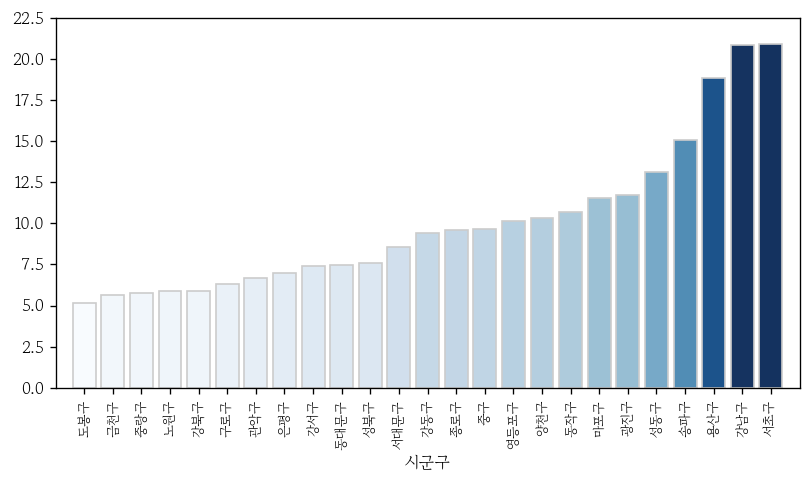
열이름 세로로 변경
- 열이름을 글자별로 분리
grp.index.str.split(pat = '')[0:5]
# Index([['', '도', '봉', '구', ''], ['', '금', '천', '구', ''],
#        ['', '중', '랑', '구', ''], ['', '노', '원', '구', ''],
#        ['', '강', '북', '구', '']],
# dtype='object', name='시군구')- 시리즈로 변경 후
‘\n’(줄바꿈) 추가해서 join으로 병합
sigg = pd.Series(data = grp.index.str.split(pat = ''))
sigg = sigg.apply(func = lambda x: '\n'.join(x).strip())
sigg.head()
# 0    도\n봉\n구
# 1    금\n천\n구
# 2    중\n랑\n구
# 3    노\n원\n구
# 4    강\n북\n구
# Name: 시군구, dtype: objectticks: 열이름 범위 지정labels: 적용할 열이름 지정
plt.figure(figsize = (12, 4))
sns.countplot(data = apt, x = '시군구', color = '0.8', order = grp.index)
plt.xticks(ticks = range(25), labels = sigg);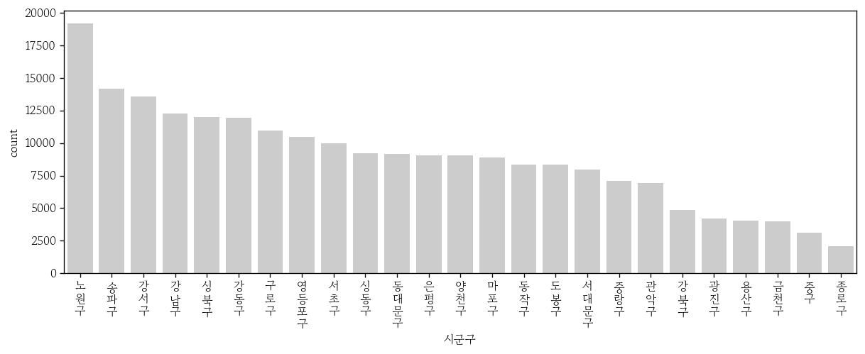
파이차트
파이차트 그리기
- 범주 개수가 3~5개 정도일 때 그리면 좋음
grp = sub['시군구'].value_counts().sort_index()
# 시군구
# 강남구    12291
# 강동구    11958
# 강북구     4875
# Name: count, dtype: int64plt.pie: 3개의 객체(patches, labels, pcts)를 반환- patches : 면을 가진 도형(쐐기)
- labels, pcts : 파이 차트에 추가할 텍스트 객체
x: 쐐기 크기를 범주별 도수로 지정labels: 쐐기의 라벨 지정autopct: 쐐기 백분율 포맷 지정explode: 각 쐐기의 시작 위치를 리스트로 지정(강조)textprops: 글자 굵기 지정wedgeprops: 쐐기의 테두리 색과 선의 두께를 지정
_, _, pcts = plt.pie(
    x=grp,
    labels=grp.index,
    colors=mypal,
    autopct='%.1f%%',
    explode=[0, 0, 0.1],
    textprops={
        'fontweight': 'bold'
    },
    wedgeprops=dict(ec='1', lw=1)
)

pcts[1].set_color('white')

plt.show()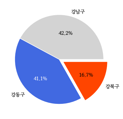
선 그래프
- 시간의 흐름에 따라 연속형 변수가 변하는 양상을 그린 그래프
- x축에 수치형 변수를 사용하면 간격이 자동 계산 됨
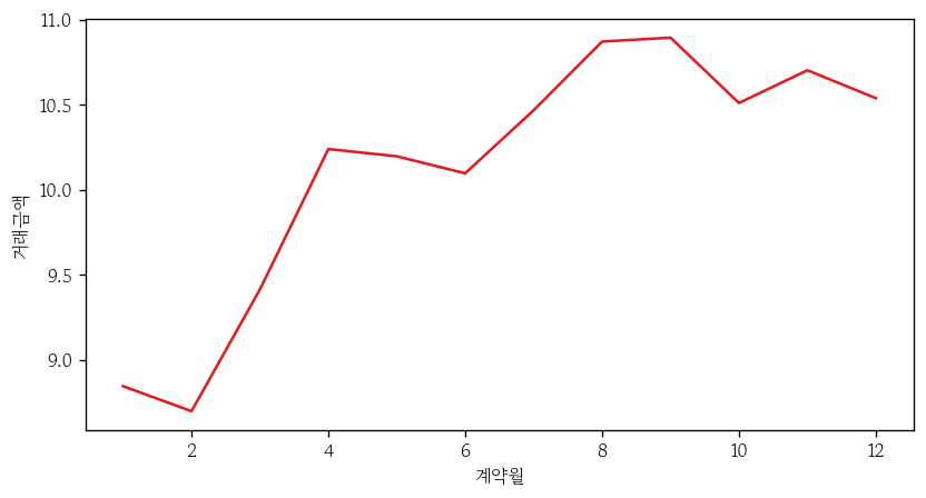
- 열이름 지정 필요
sns.lineplot(
    data=apt,
    x='계약월', y='거래금액',
    errorbar=None,
    estimator='mean'
)

plt.xticks(
    ticks=range(1, 13),
    labels=[f'{i}월' for i in range(1, 13)]
)

plt.show()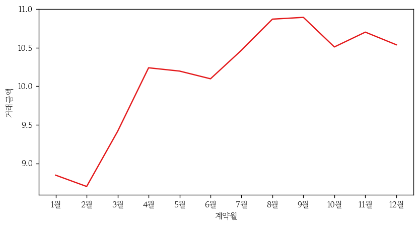
- 처음부터 정렬 후 생성
apt1['계약월'] = apt1['계약월'].astype(str)
apt1 = apt1.sort_values('계약일자')

sns.lineplot(
    data=apt1,
    x='계약월', y='거래금액',
    errorbar=None,
    estimator='mean'
)

plt.show()
선 그래프에 점 추가
sns.lineplot(
    data=apt,
    x='계약월', y='거래금액',
    errorbar=None,
    estimator='mean',
    marker='o'
)

plt.xticks(
    ticks=range(1, 13),
    labels=[f'{i}월' for i in range(1, 13)]
)

plt.show()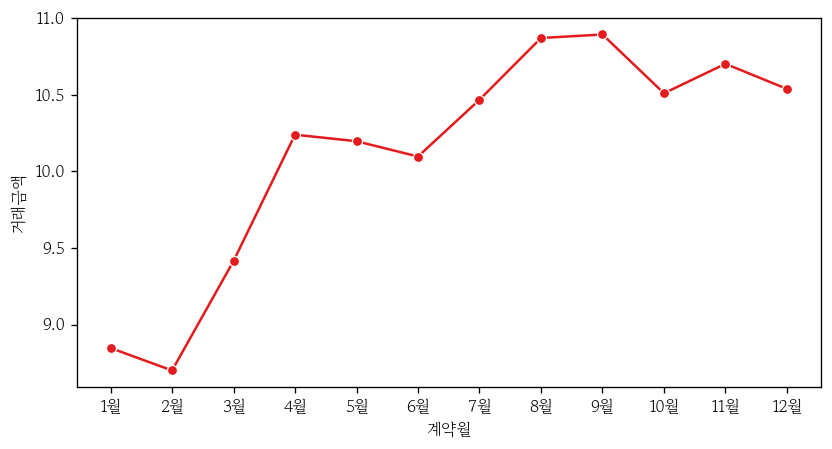
선 그래프 겹쳐서 그리기
style: 범주형 변수명 지정markers: True 시 범주별 마커 모양 다르게 지정dashes: True 시 범주별 선 모양 다르게 지정
sns.lineplot(
    data=apt,
    x='계약월', y='거래금액', hue='계약년도',
    errorbar=None,
    estimator='mean',
    style='계약년도', markers=True, dashes=True
)

plt.xticks(
    ticks=range(1, 13),
    labels=[f'{i}월' for i in range(1, 13)]
)

plt.show()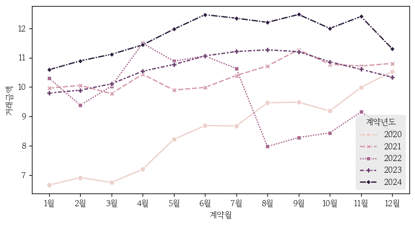
범례 위치 지정
bbox_to_anchor: 범례 기준점의 x, y 좌표를 지정ncol: 범례의 열 개수를 지정
sns.lineplot(
    data=apt,
    x='계약월', y='거래금액', hue='계약년도',
    errorbar=None,
    estimator='mean',
    style='계약년도', markers=True, dashes=True
)

plt.xticks(
    ticks=range(1, 13),
    labels=[f'{i}월' for i in range(1, 13)]
)

plt.legend(
    loc='upper center',
    bbox_to_anchor=(0.5, -0.15),
    ncol=5
)

plt.show()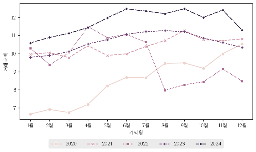
산점도
- 이변량 연속형 변수의 선형성 및 비선형 패턴 / 군집 / 이상치 / 분산 변화를 함께 확인하는 그래프
- 선형 회귀 모델을 적합할 때 입력변수와 목표변수 간에 직선의 관계가 존재하는지 여부를 확인
산점도 그리기
x: 원인이 되는 연속형 변수명 지정y: 결과가 되는 연속형 변수명 지정fc: 점의 채우기 색 지정ec: 점의 테두리 색 지정s: 점의 크기 지정alpha: 채우기 색의 투명도 지정
sns.scatterplot(
    data=apt,
    x='전용면적', y='거래금액',
    fc='0.9',
    ec='0.8',
    s=10,
    alpha=0.5
)

plt.show()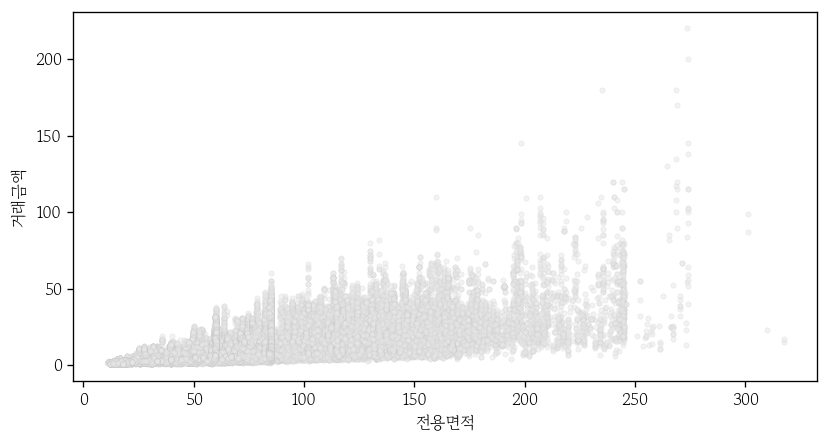
점 채우기 색 변경
apt = apt.sort_values('세대수')
cond = apt['시군구'].eq('강남구')
gng = apt.loc[cond, :]sns.scatterplot(
data=gng,
x='전용면적', y='거래금액',
hue='세대수',
palette='Greys',
ec='0.8',
s=10,
alpha=0.5
)
plt.show()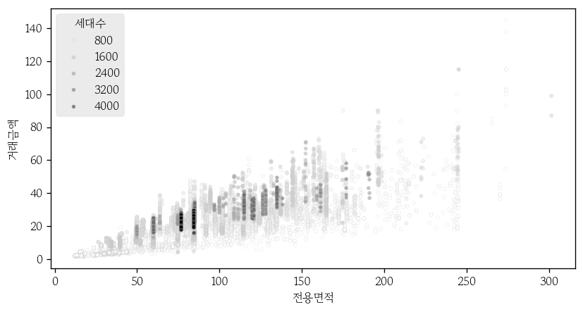
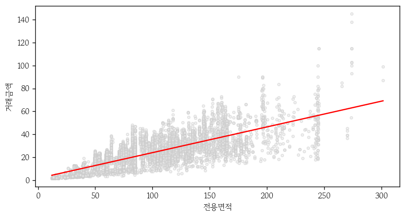
산점도에 회귀직선 추가
point_prop: 점의 그래프 요소 생성line_prop: 회귀직선의 그래프 요소 생성
point_prop = dict(fc='0.9', ec='0.8', s=10, alpha=0.5)
line_prop = dict(color='red', lw=1.5)ci: 95% 신뢰구간 표기
sns.regplot(
    data=gng,
    x='전용면적', y='거래금액',
    ci=None,
    scatter_kws=point_prop,
    line_kws=line_prop
)
마치며
내일부터는 생성형 AI에 대한 내용을 배운다. 어떤 내용일지는 모르겠지만 AI에 관심이 많기 때문에 열심히 배워야겠다.

Hello I'm TaeHyunAn, Currently Studying Data Analysis