Create indicators and Fourier features to capture periodic change
What is Seasonality
시계열의 평균에 규칙적이고 주기적인 변화가 있을 때, 시계열은 계절성(Seasonality)을 나타낸다고 말한다. 계졀적 변화는 일반적으로 시계와 달력을 따라 하루, 일주일 또는 일년에 걸쳐 반복되는 것이 일반적이다. Seasonality는 수일 또는 수년에 걸친 자연계의 주기 또는 날짜와 시간을 둘러싼 사회적 행동의 관습에 의해 좌우되는 경우가 많다.
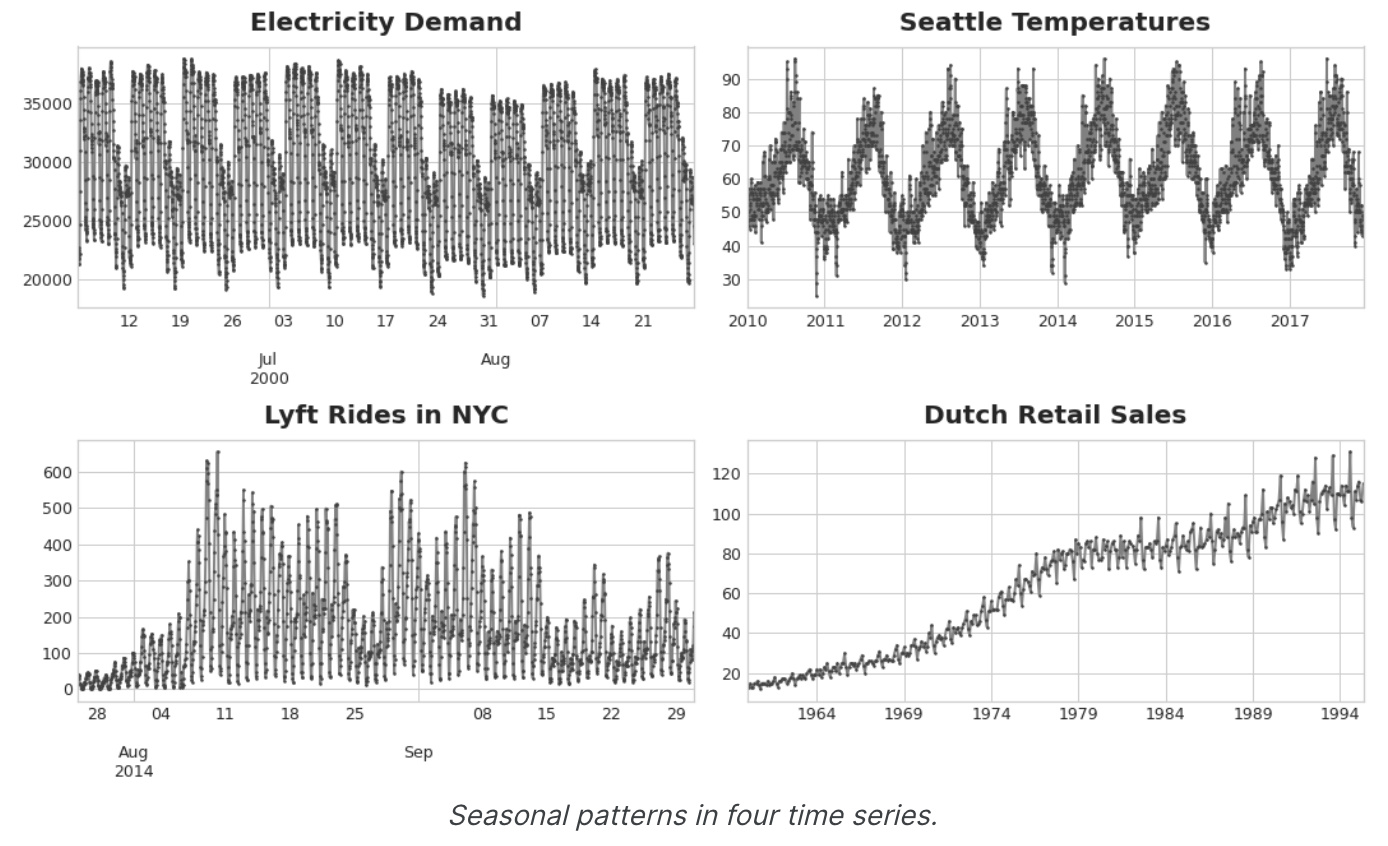
Seasonality를 모델링하는 두 가지 종류의 기능에 대해 알아보겠다. 첫 번째 종류인 지표(indicators)는 일별 관측값의 주간 시즌과 같이 관측값이 적은 시즌에 가장 적합하다. 두 번째 종류인 푸리에 함수(Fourier features)는 일별 관측의 연간 시즌과 같이 관측이 많은 시즌에 가장 적합하다.
Seasonal Plots and Seasonal Indicators
이동 평균 plot을 사용하여 계열의 trend를 발견한 것 처럼, Seasonal Plot을 사용하여 계절별 패턴을 발견할 수 있다.
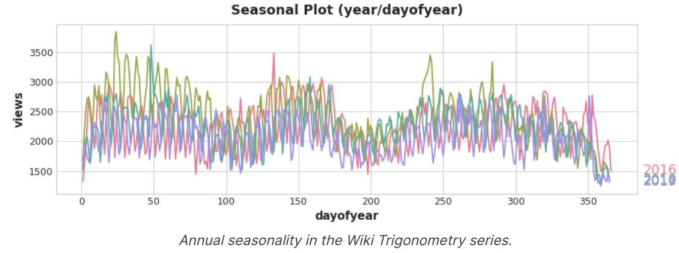
Seasonal Plot은 관찰하려는 '계절'을 공통 기간에 대해 plot한 시계열의 segment를 보여준다. 이 그림은 Wikipedia의 삼각법 관련 문서의 일일 조회수를 일반적인 주간 기간에 대해 plot한 Seasonal Plot이다.
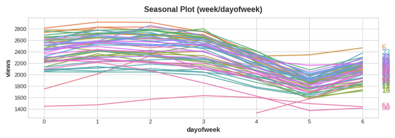
There is a clear weekly seasonal pattern in this series, higher on weekdays and falling towards the weekend.
Seasonal indicators
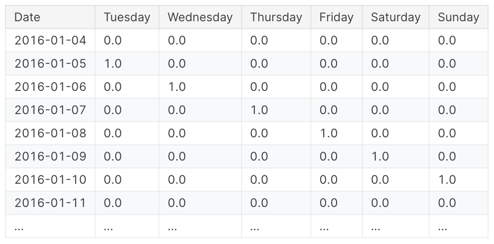
Seasonal Indicators는 시계열 수준에서 계절별 차이를 나타내는 binary features이다. 계절 지표(Seasonal Indicators)는 계절 기간을 categorical features로 취급하고, One-Hot Encoding을 적용하면 얻을 수 있다.
요일을 One-Hot Encoding 하면 주간 Seasonal Indicators를 얻을 수 있다. 그리고 삼각법 관련 문서에 대한 주간 지표를 만들면 6개의 새로운 '더미' 기능이 생긴다.(선형 회귀는 지표 중 하나를 삭제하면 가장 잘 작동한다. 아래 프레임에서는 월요일을 선택했다.)
학습 데이터에 계절 지표를 추가하면 모델이 Seasonal period 내의 mean을 구별하는 데 도움이 된다.
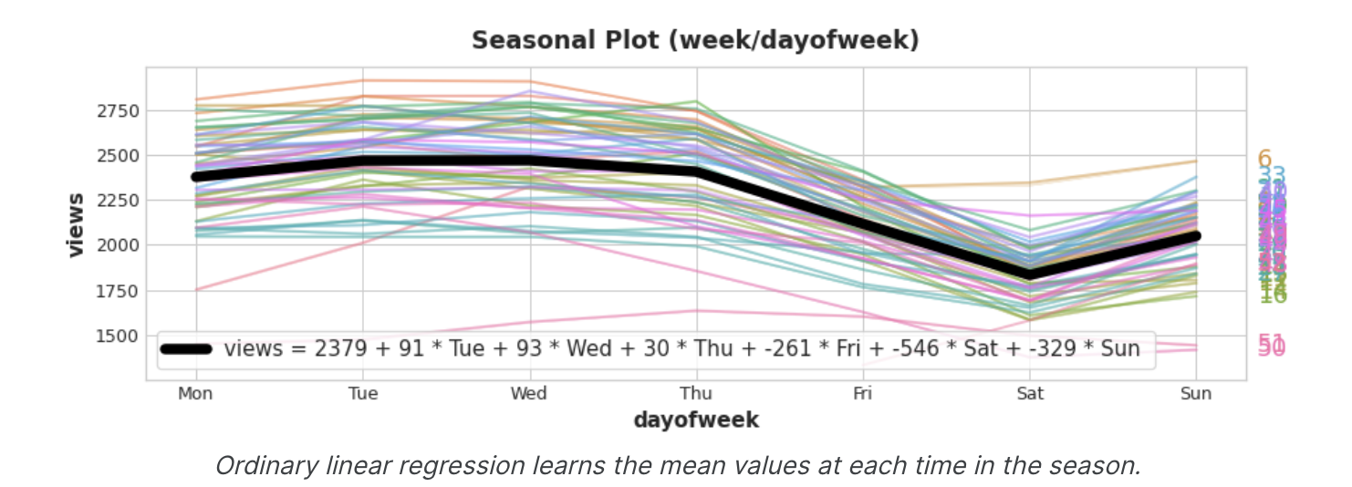
지표는 ON / OFF 스위치 역할을 한다. 언제든지 이러한 지표 중 최대 하나의 값만 1(ON)을 가질 수 있다. 선형 회귀에서는 월에 대한 기준값 2379를 학습한 다음 해당 날짜에 켜져 있는 지표의 값에 따라 조정되며, 나머지는 0이 되어 사라진다.
Fourier Features and the Periodogram
지금 설명하는 종류의 기능은 지표가 비실용적일 수 있는 많은 관측에 걸친 긴 계절에 더 적합하다.
Fourier Features는 각 날짜에 대한 Feature를 만드는 대신 며 가지 feature만으로 계절 곡선의 전체적인 모양을 포착하려고 한다.
삼각법 조회수의 연간 계절에 대한 plot을 살펴보겠다. 1년에 세번 긴 위아래 움직임, 1년의 52번 짧은 주간 움직임 등 다양한 주파수가 반복되는 것을 알 수 있다.
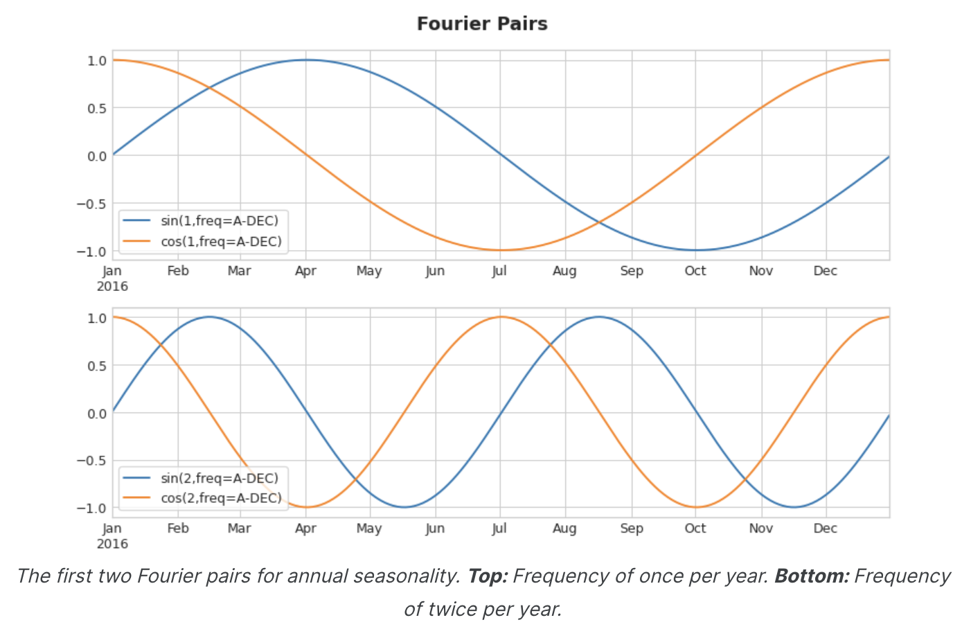
Fourier Features로 포착하려는 것은 한 시즌 내의 이러한 주파수이다. 모델링 하려는 계절과 동일한 주파수를 가진 주기적인 곡선을 훈련 데이터에 포함시키는 것이 핵심이다. 우리가 사용하는 곡선은 삼각 함수 사인과 코사인의 곡선이다.
Fourier Features는 사인과 코사인 곡선의 쌍으로, 가장 긴 곡선부터 시작하여 계절의 각 잠재적 주파수마다 한 쌍씩 있다. 연간 계절성을 모델링하는 Fourier 쌍은 연 1회, 연 2회, 연 3회 등의 빈도를 갖는다.
이러한 사인/코사인 곡선 세트를 학습 데이터에 추가하면, 선형회귀 알고리즘이 대상 계열의 계절 성분에 맞는 가중치를 알아낸다. 이 그림은 선형 회귀가 4개의 푸리에 쌍을 이용하여 삼각법 시리즈의 연간 계절성을 모델링하는 방법을 보여준다.
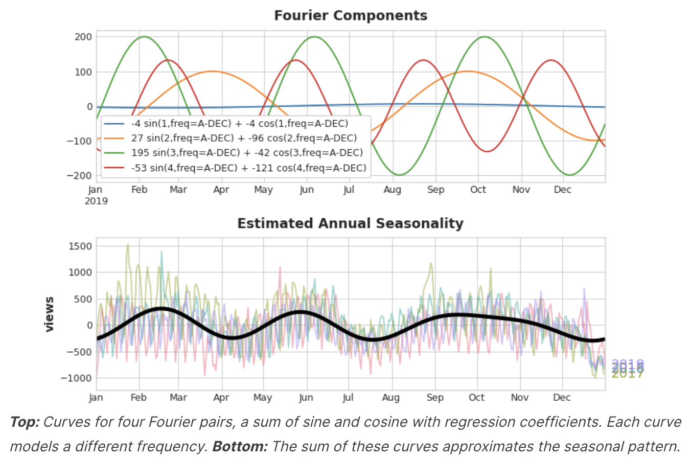
연간 계절성을 잘 추정하기 위해 8개의 feature(4개의 사인/코사인 쌍)만 있으면 된다는 것을 알 수 있다. 수백 개의 feature(연중 각 일마다 하나씩)가 필요했던 Seasonal indicators 방법과 비교하여, 푸리에 피처로 계절성의 'main effect'만 모델링하면 일반적으로 학습 데이터에 훨씬 적은 수의 피처만 추가하면 되므로 계산 시간이 단축되고 과적합의 위험이 줄어든다.
Choosing Fourier features with the Periodogram
실제로 feature set에 몇 개의 푸리에 쌍을 포함해야 할까? 이 질문은 주기율표로 답할 수 있다.
주기 도표는 시계열에서 주파수의 강도를 알려준다. 구체적으로 그래프의 Y축 값은 (a ** 2 + b ** 2) / 2 이며, 여기서 a와 b는 해당 주파수에서 사인과 코사인의 계수이다(푸리에 피쳐 플롯에서와 같이).
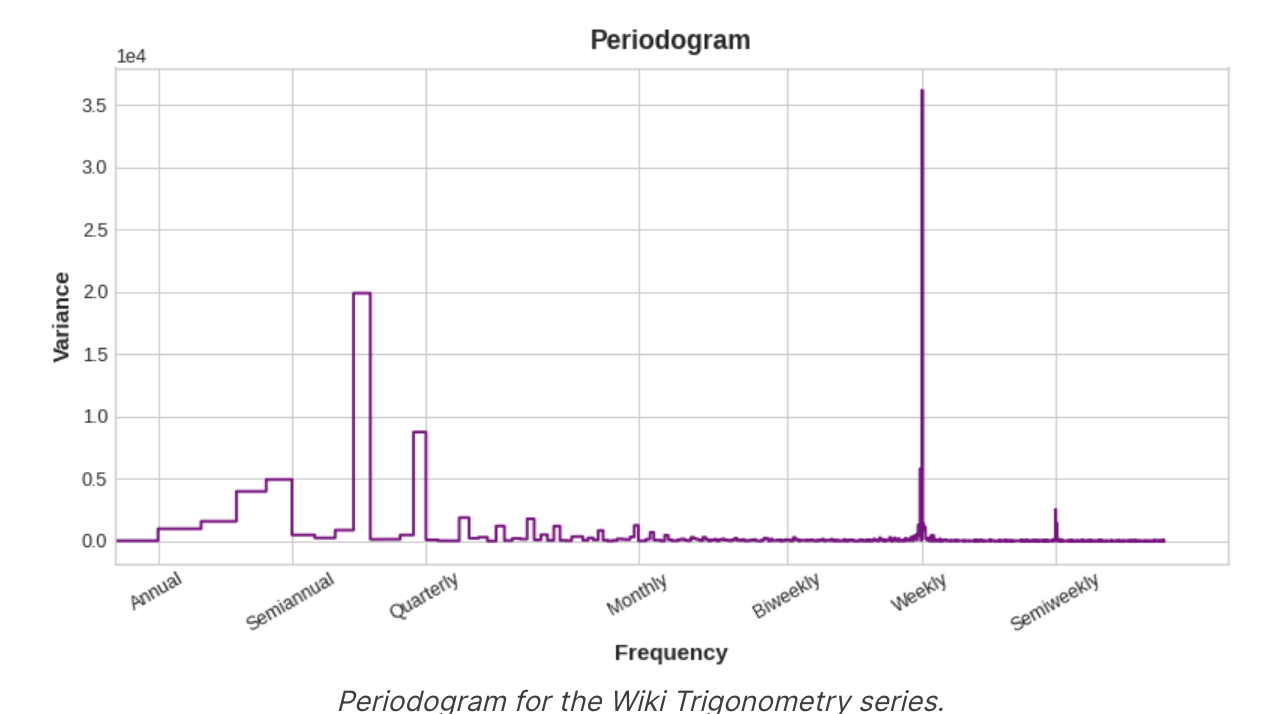
왼쪽에서 오른쪽으로 1년에 네 번, 분기별 이후에는 주기 그래프가 떨어진다. 그래서 연간 시즌을 모델링하기 위해 4개의 푸리에 쌍을 선택했다. 주간 빈도는 지표로 모델링하는 것이 더 좋기 때문에 무시한다.
Computing Fourier features
Fourier features를 계산하는 것이 Fourier feature를 사용하는 데 필수적인 것은 아니지만, 자세한 내용을 보면 이해하기 쉽기 때문에 아래 코드를 첨부한다.
시계열의 인덱스에서 푸리에 특징 집합을 도출하는 코드
import numpy as np

def fourier_features(index, freq, order):
	time = np.arange(len(index), dtype=np.float32)
    k = 2 * np.pi * (1 / freq) * time
    features = {}
    for i in rage(1, order+1):
    	features.update({
        	f"sin_{freq}_{i}": np.sin(i * k),
            f"sin_{freq}_{i}": np.cos(i * k),
        })
    return pd.DataFrame(features, index=index)


# Compute Fourier features to the 4th order (8 new features) for a
# series y with daily observations and annual seasonality
# fourier features(y, freq=365.25, order=4)
Example - Tunnel Traffic
아래 코드는 Seasonal_plot과 plot_periodogram을 정의한다.
from pathlib import Path
from warnings import simplefilter

import matplotlib.pyplot as plt
import pandas as pd
import seaborn as sns
from sklearn.linear_model import LinearRegression
from statsmodels.tsa.deterministic import CalendarFourier, DeterministicProcess

simplefilter("ignore")

# Set Matplotlib defaults
plt.style.use("seaborn-whitegrid")
plt.rc("figure", autolayout=True, figsize=(11, 5))
plt.rc(
    "axes",
    labelweight="bold",
    labelsize="large",
    titleweight="bold",
    titlesize=16,
    titlepad=10,
)
plot_params = dict(
    color="0.75",
    style=".-",
    markeredgecolor="0.25",
    markerfacecolor="0.25",
    legend=False,
)
%config InlineBackend.figure_format = 'retina'

def seasonal_plot(X, y, period, freq, ax=None):
	if ax is None:
    	_, ax = plt.subplots()
    palette = sns.color_palette("husl", n_colors=X[periods].nunique(),)
    ax = sns.lineplot(
    	x=freq,
        y=y,
        hue=period,
        data=X,
        ci=False,
        ax=ax
        palette=palette
        legend=False,
	)
	ax.set_title(F"Seasonal Plot ({period}/{freq})")
    for line, name in zip(ax.lines, X[period].unique()):
    	y_ = line.get_ydata()[-1]
        ax.annotate(
        	name,
            xy=(1, y_),
            xytext=(6, 0),
            color=line.get_color(),
            xycoords=ax.get_yaxis_transform(),
            textcoords="offset points",
            size=14,
            va="center",
        )
	return ax


def plot_periodogram(ts, detrend='linear', ax=None):
	from scipy.signal import periodogram
    fs = pd.Timedelta("365D") / pd.Timedelta("1D")
    frequencies, spectru, = periodogram(
    	ts,
        fs=fs,
        detrend=detrend,
        window="boxcar",
        scaling='spectrum',
    )
    if ax is None:
    	_, ax = plt.subplots()
        ax.step(frequencies, spectrum, color="purple")
        ax.set_xscale("log")
        ax.set_xticks([1, 2, 4, 6, 12, 26, 52, 104])
        ax.set_xticklabels(
        	[
            	"Annual (1)",
                "Semiannual (2)",
                "Quarterly (3)",
                "Bimonthly (6)",
                "Monthly (12)",
                "Biweekly (26)",
                "Weekly" (52)",
                "Semiweekly (104)",
            ],
            rotation=30,
      	)
        ax.ticklabel_format(axis="y", style="sci", scilimits=(0, 0))
        ax.set_ylabel("Variance")
        ax.set_title("Periodogram")
        return ax

tunnel = pd.read_csv(filepath, parse_dates=["Day"})
tunnel = tunnel.set_index("Day").to_period("D")
코드 한번 빡세네..
이제 일주일과 1년 동안의 계절별 plot을 살펴보자
X = tunnel.copy()

# days within a week
X["Day"] = X.index.dayofweek # the x-axis (freq)
X["week"] = X.index.week # the seasonal period (period)

# days within a year
X["dayofyear"] = X.index.dayofyear
X["year"] = X.index.year
fig, (ax0, ax1) = plt.subplots(2, 1, figsize=(11,6))
seasonal_plot(X, y="NumVehicles", period="week", freq="day", ax=ax0)
seasonal_plot(X, y="NumVehicles", period="year", freq="dayofyear", ax=ax1)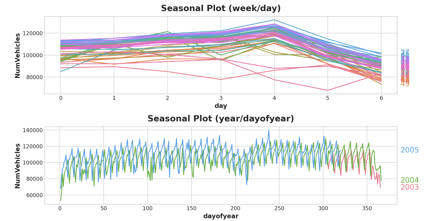
periodogram도 살펴보자
plot_periodogram(tunnel.NumVehicles);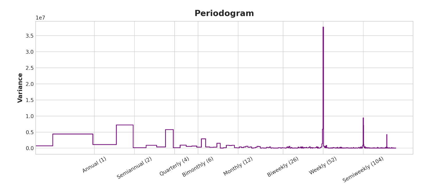
periodogram은 위의 계절별 plot과 일치한다. 주간 시즌은 강하고 연간 시즌은 약하다. 주간 시즌은 indicator로, 연간 시즌은 fourier 함수로 모델링 하겠다. 오->왼으로 보면 주기 그래프가 격월(6)과 월간(12) 사이에서 떨어지므로 10개의 푸리에 상을 사용한다.
Trend 편에서 Trend feature를 만들 때 사용한 것과 동일한 유틸리티인 DeterministicProcess를 사용하여 Seasonal Feature를 만든다. 두 개의 Seasonal periods(주간 및 연간)를 사용하려면 그 중 하나를 'additional term'으로 인스턴스화 해야한다.
from statsmodels.tsa.deterministic import CalendarFourier, DeterministicProcess

fourier = CalendarFourier(freq="A", order=10)  # 10 sin/cos pairs for "A"nnual seasonality

dp = DeterministicProcess(
    index=tunnel.index,
    constant=True,               # dummy feature for bias (y-intercept)
    order=1,                     # trend (order 1 means linear)
    seasonal=True,               # weekly seasonality (indicators)
    additional_terms=[fourier],  # annual seasonality (fourier)
    drop=True,                   # drop terms to avoid collinearity
)

X = dp.in_sample()  # create features for dates in tunnel.index
feature set이 생성되었으므로 이제 모델을 적용하고 예측할 준비가 되었다. 90일 예측을 추가하여 모델이 학습 데이터를 넘어 어떻게 추정하는지 살펴보겠다.
y = tunnel["NumVehicles"]

model = LinearRegression(fit_intercept=False)
_ = model.fit(X, y)

y_pred = pd.Series(model.predict(X), index=y.index)
X_fore = dp.out_of_sample(steps=90)
y_fore = pd.Series(model.predict(X_fore), index=X_fore.index)

ax = y.plot(color='0.25', style='.', title="Tunnel Traffic - Seasonal Forecast")
ax = y_pred.plot(ax=ax, label="Seasonal")
ax = y_fore.plot(ax=ax, label="Seasonal Forecast", color='C3')
_ = ax.legend()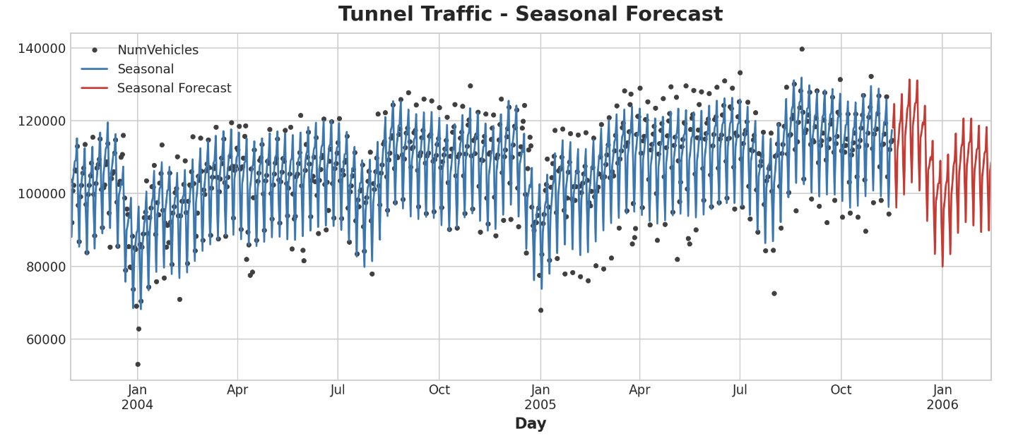
다음 강에서는 시계열 그 자체를 feature로 사용하는 법을 배운다네요. 주기(cycles)를 찾을 수 있게 된답니다.