인터렉티브 웹 만들기🌼
css나 화면을 잘 다루고싶어서 들은 강의였다. flex-box, transition, animation의 개념을 정립하고, 여러번 연습하면서 익숙해질 수 있었다. css뿐만 아니라 javascript의 객체, 이벤트위임, 생성자, 프로토타입에 대한 내용도 유익했다. 글로만 봤을 때는 이해안가던 내용을 직접해보면서 이해할 수 있었다. 1분 코딩의 캐릭터가 귀엽고 강사님의 강의톤이 좋아서 강의 듣기가 수월했다.
구현기능 🌈
- 3d 화면구성
- 마우스 이동에 따라 시점이동
- 스크롤 이벤트
- 캐릭터 애니메이션
- 방향키에 따른 움직임 변화
- 테마변경
새로 알게 된 것 🌊
3D
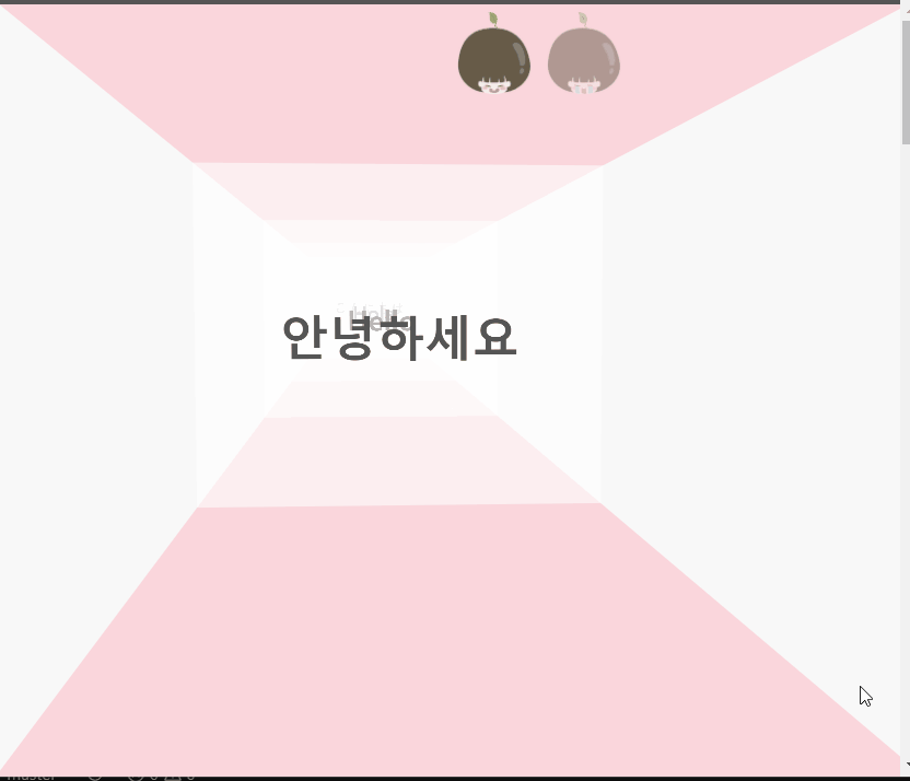
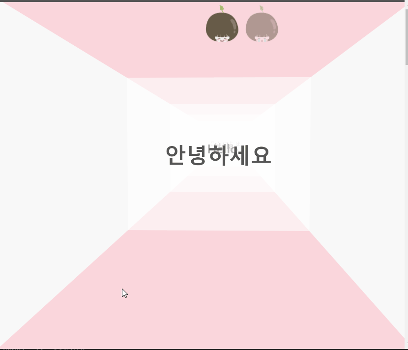
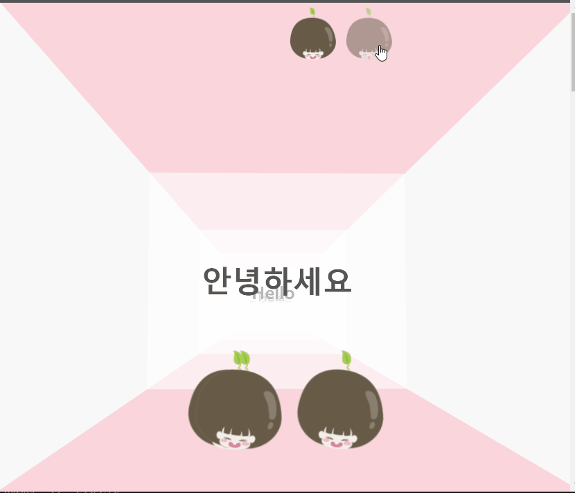
3d 공간을 만드는 핵심은 perspective 속성
<div class="world"> <!-- perspective 속성을 준다-->
    <div class="stage"> <!-- transform-style: preserve-3d; -->

        <div class="house">
        	<!--각 벽은 position:absolute -->
        	<!--왼쪽 오른쪽 벽은 rotateY, translateZ 속성으로-->
            <section class="wall wall-left"></section>
            <section class="wall wall-right"></section>
            <!-- 각 스크린은 transalteZ 속성으로 거리조절 -->
            <section class="wall wall-front wall-front-a">
                <div class="wall-content">
                    <h2 class="wall-title">안녕하세요</h2>
                </div>
            </section>
            <section class="wall wall-front wall-front-b">
                <div class="wall-content">
                    <h2 class="wall-title">Hello</h2>
                </div>
            </section>
            <section class="wall wall-front wall-front-c">
                <div class="wall-content">
                    <h2 class="wall-title">Hola</h2>
                </div>
            </section>
            <section class="wall wall-front wall-front-d">
                <div class="wall-content">
                    <h2 class="wall-title">こんにちは</h2>
                </div>
            </section>
        </div>
</div>
animation
멈췄을 때의 애니메이션
@keyframes stop {
    to{transform: rotateZ(-10deg) }
    from{transform: rotateZ(10deg) }
}

.stop .character-head{
    animation: stop 0.6s infinite alternate cubic-bezier(0.46, 0.18, 0.66, 0.93);
}
움직일 때의 애니메이션
@keyframes moving {
    to{transform: translateY(0px) }
    from{transform: translateY(-20px) }
}

.moving .character-head{
    animation: moving 0.2s infinite alternate cubic-bezier(0.46, 0.18, 0.15, 1.05);

}
생성자, prototype, 메서드, 인스턴스
캐릭터 생성자
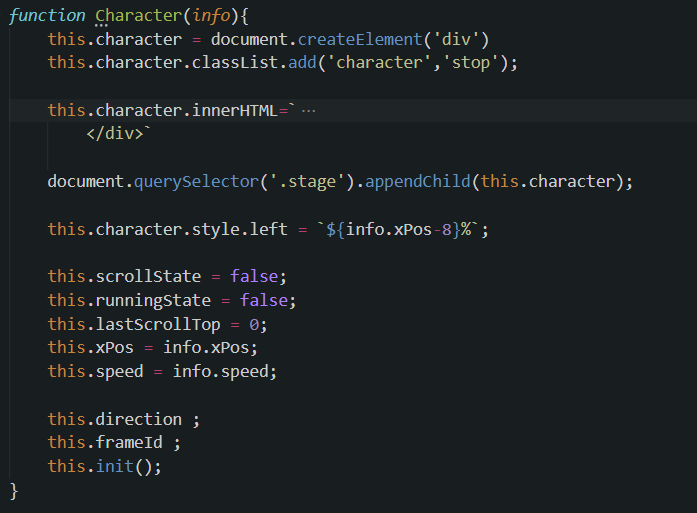
프로토 타입 정의
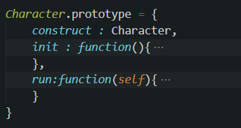
생성자 사용
stage.addEventListener('click',createCharacter)

    function createCharacter(e){

        const xPos = (e.clientX)/window.innerWidth*100
        const speed = Math.random();
                +0.2
        new Character({
            xPos,speed
        });
    }
스크롤 이벤트
이벤트 위임
이벤트 위임 정리 포스트
같은 기능을 하는 두 개의 버튼에 각각 이벤트를 등록하지 않고, button을 감싸는 컨테이너에 이벤트를 등록해, event 객체의 target으로 구분해 사용하는게 메모리 효율이 좋다
// 캐릭터버튼 이벤트
    selectCharacterButton.addEventListener('click',(e)=>{
        const value = e.target.dataset.char;
        document.body.setAttribute('data-char',value)
    })
css에서 data 속성 이용
방향키에 따라 캐릭터 방향이 달라짐
// javascript
window.addEventListener('keydown',function(e){
...
            self.character.setAttribute('data-direction',self.direction);

            self.character.classList.remove('stop');
            self.character.classList.add('moving');
...
        });
/*css*/
.character[data-direction='forward'] { transform: rotateY(190deg); }
.character[data-direction='backward'] { transform: rotateY(0deg); }
.character[data-direction='left'] { transform: rotateY(-90deg); }
.character[data-direction='right'] { transform: rotateY(90deg); }문제와 해결 🎉
- 뒤로 가는 애니메이션일 때 뒷 얼굴이 안보이는 문제
- css의 상속관계?를 정확히 해야함
.moving { /*처음에는 이렇게 정의*/
    animation: moving 0.2s infinite alternate cubic-bezier(0.46, 0.18, 0.15, 1.05);
}

.moving .character-head{ /*해결*/
    animation: moving 0.2s infinite alternate cubic-bezier(0.46, 0.18, 0.15, 1.05);
}- 방향키로 움직였을 때 쭉가는 문제 -- makeFrame
📑 reference

한약은 거들뿐