시작하며
오늘부터 머신러닝, 딥러닝 파트가 다시 시작되었다. XAI라는 설명 가능한 인공지능에 대해 배웠는데, 이전에 프로젝트를 준비하면서 관심을 가졌던 내용이라 상당히 흥미롭게 수업을 들었다.
은행 고객 데이터 분석
데이터 확인
df.head()
기술통계량 확인
df.describe().round(3)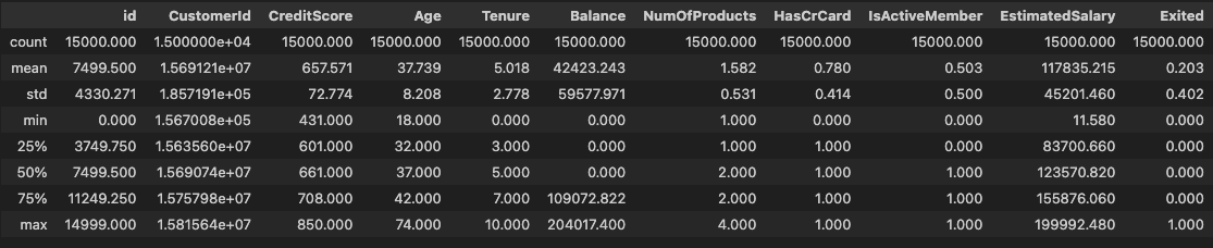
- 범주형 데이터 조회
df['Geography'].value_counts(dropna=False).sort_index()
# Geography
# France     9053
# Germany    2663
# Spain      3283
# NaN           1
# Name: count, dtype: int64df['Gender'].value_counts(dropna=False).sort_index()
# Gender
# Female 6545
# Male 8455
# Name: count, dtype: int64crosstab으로 함께 조회
pd.crosstab(index=df['Geography'], columns=df['Gender'], normalize='index')
# Gender	Female	    Male
# Geography
# France	0.426047	0.573953
# Germany	0.478408	0.521592
# Spain	    0.430399	0.569601
데이터 전처리
df = df.drop(columns=['id', 'Surname'])
df = df.set_index(keys='CustomerId')
df.columns = ['Credit', 'Geography', 'Gender', 'Age', 'Tenure', 'Balance',
            'NumProd', 'HasCard', 'Active', 'Salary', 'Exited']
EDA
- 연속형 입력변수 간 산점도 행렬 시각화
train_num = df.select_dtypes(include=[int, float]).drop(columns='Exited')sns.pairplot(
data=train_num, diag_kind='kde', corner=True,
diag_kws={
'color': '0.5',
'edgecolor': '0'
},
plot_kws={
'fc': '0.8',
'ec': '0',
's': 10,
'alpha': 0.2
}
)
plt.show()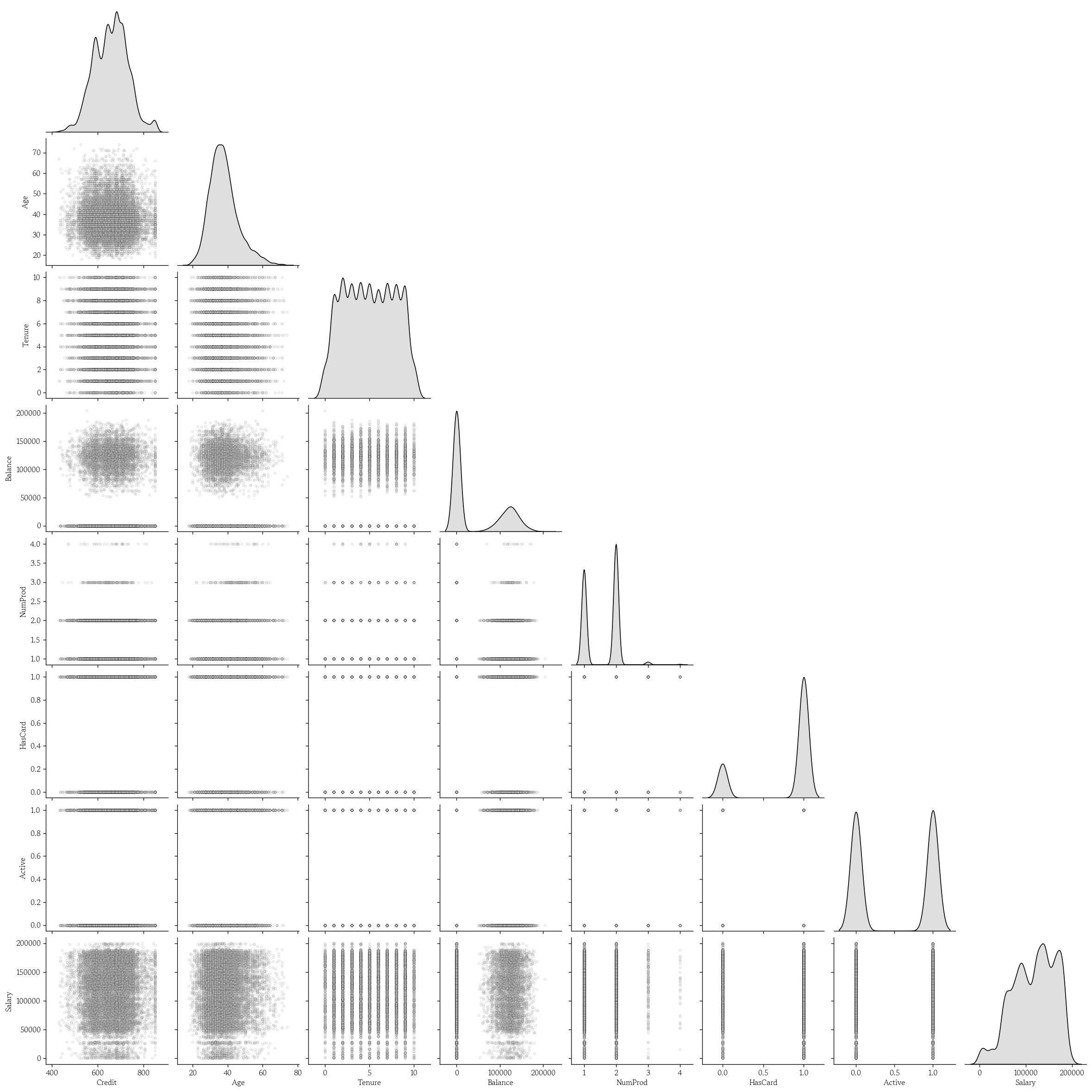
원-핫 인코딩
df = pd.get_dummies(data=df, prefix='', prefix_sep='', dtype=int)- 성별은 더미 변수로 변환
df = df.drop(columns='Male').rename(columns={'Female': 'Gender'})데이터 분리 및 데이터셋 분할
- 특성 행렬과 타겟 벡터로 분리
yvar = 'Exited'
X = df.drop(columns=yvar)
y = df[yvar].copy()- 데이터셋 분할
from sklearn.model_selection import train_test_split

X_train, X_valid, y_train, y_valid = train_test_split(
    X, y, test_size=0.2, random_state=0, stratify=y
)
랜덤 포레스트 분류 모델 학습
from sklearn.ensemble import RandomForestClassifiermodel = RandomForestClassifier(random_state=0)
model.fit(X=X_train, y=y_train)- 학습 결과 확인
model.score(X=X_train, y=y_train)
# 0.9999166666666667
model.score(X=X_valid, y=y_valid)
# 0.9- 특성중요도 확인
pd.Series(
    data=model.feature_importances_,
    index=model.feature_names_in_
).sort_values(ascending=False)
# Age        0.302313
# NumProd    0.167192
# Salary     0.126829
# Credit     0.122589
# Balance    0.087362
# Tenure     0.068599
# Active     0.039076
# Germany    0.029903
# Gender     0.024597
# HasCard    0.014111
# France     0.010037
# Spain      0.007391
# dtype: float64
분류 모델 성능 평가
- 특성 행렬 및 F1 스코어
y_pred = model.predict(X=X_valid)
hds.stat.clfmetrics(y_true=y_valid, y_pred=y_pred)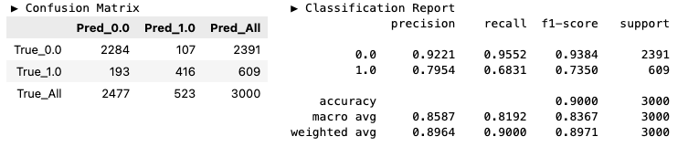
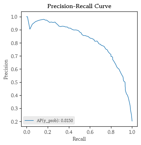
- ROC/PR 커브
hds.plot.roc_curve(y_true=y_valid, y_prob=y_prob)
hds.plot.pr_curve(y_true=y_valid, y_prob=y_prob)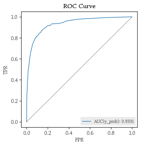
설명 가능한 인공지능
설명 가능한 인공지능
- 머신러닝, 딥러닝 모델은 높은 예측 성능을 보이지만, 의사결정 근거를 사람이 직관적으로 이해하기 어려움
- 설명 가능한 인공지능은 모델의 예측 결과를 사람이 이해할 수 있는 형태로 설명
- 모델의 투명성과 신뢰성 확보
- 결과를 설명할 수 있고 검증 가능한 모델을 만드는 것이 목표
- 설명 가능한 인공지능 : XAI(Explainable Artificial Intelligence)
XAI가 제공하는 핵심 질문
- 전역 설명 : 어떤 입력변수들이 전체적으로 예측에 가장 큰 영향을 미쳤는지
- 방향/크기 : 각 변수는 예측값을 어느 방향으로, 얼마나 변화시키는 데 기여하는지
- 국소 설명 : 각 행에서 이 특정 예측 결과가 나온 이유는 무엇인지
XAI 활용 효과
- 도메인 전문가와 의사소통을 통해 모델의 오류를 탐지하고 개선 포인트 발견
- 규제 대응 및 책임 있는 인공지능 거버넌스를 구현
- 예측 결과를 행동으로 연결하는 의사결정을 지원
XAI 기법 비교
| 구분 | 방식 | 장점 | 단점 | 비고 |
|---|---|---|---|---|
| Permutation Importance | 어떤 변수를 무작위로 섞어 성능 하락 정도를 측정하여 변수 중요도를 평가 | 단순하면서도 직관적 | 상관관계가 높은 변수들의 중요도를 과소평가할 수 있음 | 전역 |
| Partial Dependence | 어떤 변수의 값을 변화시키면서 평균 예측값의 변화를 관찰 | 변수의 단조적 경향과 임계값 파악 유리 직관적 시각화 가능 | 변수 간 독립성을 가정 실재하지 않는 비현실적 조합이 포함 될 수 있음 | 전역 |
| LIME | 단일 샘플 주변에서 국소 선형 모델을 학습하여 변수 기여도 추정 | 개별 사례를 직관적으로 해석 | 무작위성 및 근방 설정에 민감 | 국소 |
| SHAP | Shapley 값을 이용해 각 변수의 기여도를 공정하게 분배 | 이론적 일관성을 보장 결정 트리 계열 모델에 효율적으로 적용 | 계산량이 많아 대규모 데이터에 부담 | 전역 + 국소 |
순열 중요도
- 어떤 변수의 값을 무작위로 섞어서 변수의 정보를 제거했을 때 모델 성능이 얼마나 감소하는지를 측정하여 변수의 중요도로 해석
- 성능 지표
- 분류 : AUC / LogLoss / F1 / Accuracy
- 회귀 : / MSE / MAE / MAPE
- 모델에 관계 없이 중요도 비교 가능
- 성능 지표
- 변수 간 상관관계가 존재하면 중요도를 과소평가할 수 있음
- 상관관계가 높은 다른 변수가 상당 부분의 정보를 대신 전달하여 모델 성능이 크게 떨어지지 않을 수 있음
- 순열 중요도 값이 큰 변수를 망가뜨리면 모델 성능이 크게 하락
순열 중요도 확인
from sklearn.inspection import permutation_importance- 순열 중요도 생성
- 일반화된 성능 저하를 측정하는 것이 목적 → 검증셋으로 계산
scoring: 기본값은 정확도‘roc_auc’또는‘neg_log_loss’추천
pi = permutation_importance(
    estimator=model, X=X_valid, y=y_valid,
    random_state=0, scoring='roc_auc'
)- 특성별 순열 중요도의 평균 확인
pd.Series(
    data=pi['importances_mean'], index=model.feature_names_in_
).sort_values(ascending=False)
# NumProd    0.148834
# Age        0.107979
# Balance    0.023962
# Active     0.019315
# Germany    0.008270
# Gender     0.006819
# Credit     0.002010
# Tenure     0.001888
# Salary     0.000879
# Spain      0.000133
# France     0.000061
# HasCard   -0.000566
# dtype: float64
부분 의존도
- 어떤 변수의 값이 변할 때 다른 변수들을 고정한 상태에서 모델 예측값의 기대 변화를 추정
- 변수의 양 극단 5%씩 잘라내고 남은 값에서 50분위수로 그리드 생성
- 그리드 값 중 하나로 모든 샘플에 동일하게 고정
- 변형된 데이터셋으로 예측값 계산 후 예측값의 평균으로 부분 의존도 생성
- 그리드의 모든 값으로 반복 실행
- 분류 모델
- Tree, RF : 예측 확률
- GB, XGB : 로짓 → 소프트맥스
- 개별 조건부 예측(ICE, Individual Conditional Expectation) 곡선 시각화
- 데이터 내 서로 다른 패턴을 가진 이질적인 하위 집단 존재 확인
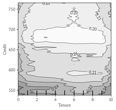
- 이변량 부분 의존도 플랏(PDP, Partial Dependence Plot)
- 두 변수 간 상호작용 효과 파악
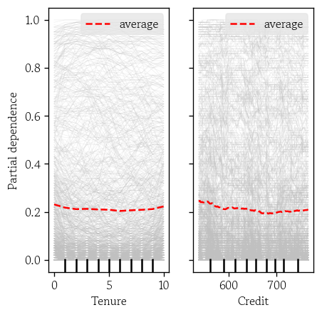
단변량 PDP 시각화
from sklearn.inspection import PartialDependenceDisplay- 단변량 PDP 시각화
features: 시각화할 변수명 리스트 지정
PartialDependenceDisplay.from_estimator(
    estimator=model, X=X_valid,
    features=['Age', 'NumProd'],
    line_kw={'color': 'red', 'linewidth': 1.5}
)
plt.show()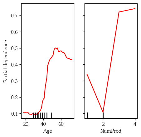
단변량 PDP와 ICE 곡선 시각화
kindaverage: PD 곡선(기본값)individual: ICE 곡선both: 둘다- 이변량인 경우
average만 가능
PartialDependenceDisplay.from_estimator(
    estimator=model, X=X_valid,
    features=['Age', 'NumProd'],
    kind='both',
    random_state=0,
    pd_line_kw={'color': 'red', 'linewidth': 1.5},
    ice_lines_kw={'color': 'silver', 'alpha': 0.2}
)
plt.show()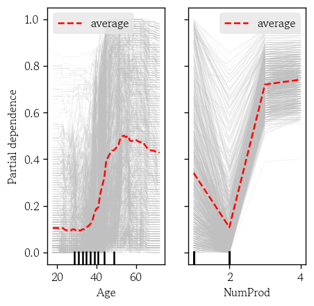
'Tenure', 'Credit’기준
이변량 PDP 시각화
features: 이변량의 경우 DF로 입력
PartialDependenceDisplay.from_estimator(
    estimator=model, X=X_valid,
    features=[['Age', 'NumProd']],
    random_state=0,
    contour_kw={'cmap': 'Greys', 'alpha': 0.5}
)
plt.show()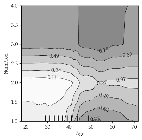
'Tenure', 'Credit’기준
LIME
- 각 특성 분포를 추정하여 어떤 샘플 주변의 무작위 샘플을 생성
- 원래 모델의 예측값을 타겟, 주변 샘플을 입력으로 설정하여 단순하고 해석 가능한 선형 회귀 모델을 학습
- L1 / L2 사용
- 국소 모델 계수의 절대값이 큰 상위 k개의 특성을 통해 예측에 대해 설명
LIME 설명기 생성
from lime.lime_tabular import LimeTabularExplainerdiscretize_continuous에True지정 시 연속형 변수를 사분위 구간으로 나누어 범주형처럼 취급
lime_explainer = LimeTabularExplainer(
    training_data=X_train.values,
    feature_names=model.feature_names_in_,
    mode='classification',
    class_names=['유지(0)', '이탈(1'],
    discretize_continuous=True,
    random_state=0
)
LIME 국소 설명 생성
- 검증셋 예측 확률이 최대값인 인덱스 설정
index = np.argsort(y_prob[:,1])[-1]- LIME 국소 설명 생성
lime_exp = lime_explainer.explain_instance(
    data_row=X_valid.values[index],
    predict_fn=model.predict_proba,
    num_features=5
)- 결과 확인
from IPython.display import HTML, display

lime_exp.save_to_file('LIME_Explanation.html')
display(HTML('LIME_Explanation.html'))- 실제값 확인
pd.Series(data=X_valid.values[index], index=model.feature_importances_)
# 0.122589       553.00
# 0.302313        60.00
# 0.068599         6.00
# 0.087362         0.00
# 0.167192         1.00
# 0.014111         1.00
# 0.039076         0.00
# 0.126829    143635.33
# 0.010037         1.00
# 0.029903         0.00
# 0.007391         0.00
# 0.024597         1.00
# dtype: float64
SHAP
- 협력 게임이론에서 정의 Shapley 값을 응용한 기법
- 예측값에 대해 각 특성이 예측값을 기준값으로부터 얼마나 증가 또는 감소시키는지 기여도 분배
- 전역 해석과 국소 해석 모두 가능
- 트리 계열 모델에 효과적
- SHAP 값을 통해 어떤 특성이 값이 커질수록 예측을 증가/감소 하는지 확인 가능
Shapley 값
- 함께 만들어낸 전체 성과를 각각의 기여도에 따라 공정하게 분배하기 위해 사용
- 어떠한 값이 추가됐을 때 추가적으로 발생한 이득을 한계 기여도라고 함
- 모든 가능한 합류 순서에 대해 한계 기여도를 계산하고 평균을 각 Shapley 값으로 정의
머신러닝에서 Shapley 값의 적용
- 아무 특성도 추가하지 않은 상태의 모델은 전체 데이터의 평균 예측값을 기본값으로 사용
- 모델에 어떤 특성을 추가하면 모델의 기대 예측 확률이 변하는데, 이 변화량은 해당 특성의 한계 기여도가 됨
- 특정 샘플에 대해 모든 순열에서 계산된 한계 기여도의 평균이 해당 샘플의 SHAP 값
- 개별 샘플의 SHAP 값의 절대값 평균을 계산하면 각 특성의 전체 기여도를 알 수 있음
SHAP 설명기 생성
import shap- 배경 데이터 없이 SHAP 설명기 생성
shap패키지에서 여러 모델에 특화된 전용 설명기를 제공
- SHAP은 개별 특성을 마스킹하여 해당 특성이 없는 상태를 흉내
- 가려진 값을 배경 데이터의 분포에서 대체하여 모델 예측을 계산
shap_explainer = shap.TreeExplainer(model=model)- 검증셋의 샘플 및 특성별 SHAP 값 계산
check_additivity=False: 시간 절약
shap_values = shap_explainer.shap_values(X=X_valid, check_additivity=False)SHAP 값 확인
- RF 모델로 SHAP 값 계산 시 3차원 배열(검증셋 샘플 수, 특성 수, 클래스 수) 반환
shap_values.shape
# (3000, 12, 2)- 이탈 클래스를 선택하여 DF로 변환
shap_1 = pd.DataFrame(data=shap_values[:, :, 1], columns=model.feature_names_in_)- 특성별 SHAP 값의 절대값 평균 확인
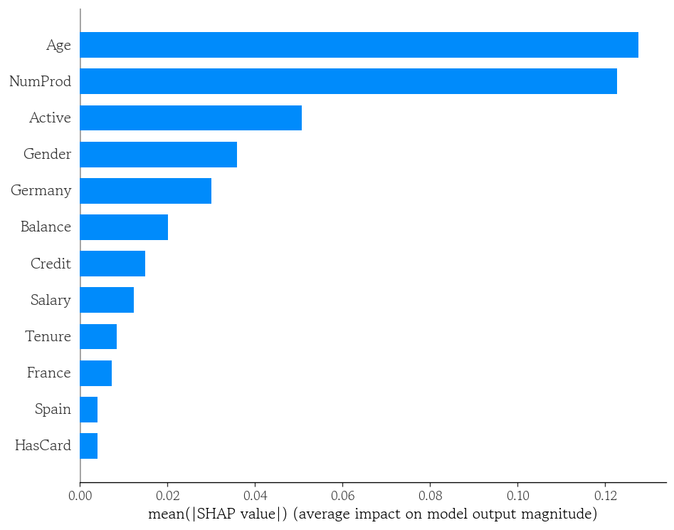
shap_1.abs().mean().sort_values(ascending=False)
# Age 0.127524
# NumProd 0.122611
# Active 0.050641
# Gender 0.035896
# Germany 0.030100
# Balance 0.020121
# Credit 0.014884
# Salary 0.012301
# Tenure 0.008378
# France 0.007261
# Spain 0.004098
# HasCard 0.004063
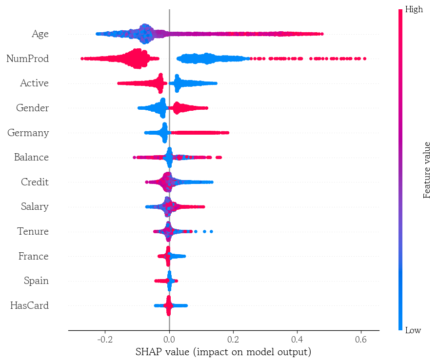
# dtype: float64SHAP 특성 중요도 시각화
shap.summary_plot(
    shap_values=shap_1.values,
    features=X_valid,
    plot_type='bar'
)
shap.summary_plot(
    shap_values=shap_1.values,
    features=X_valid,
    plot_type='dot'
)
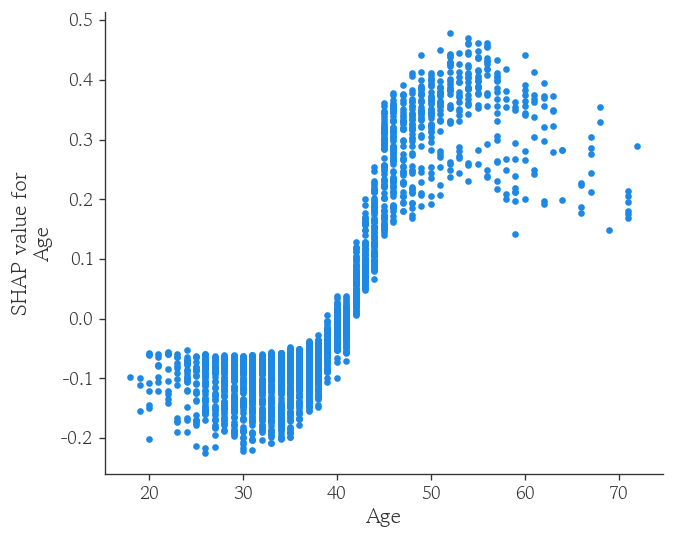
SHAP 의존도 플랏 시각화
shap.dependence_plot(
    ind='Age',
    shap_values=shap_1.values,
    features=X_valid,
    interaction_index=None
)
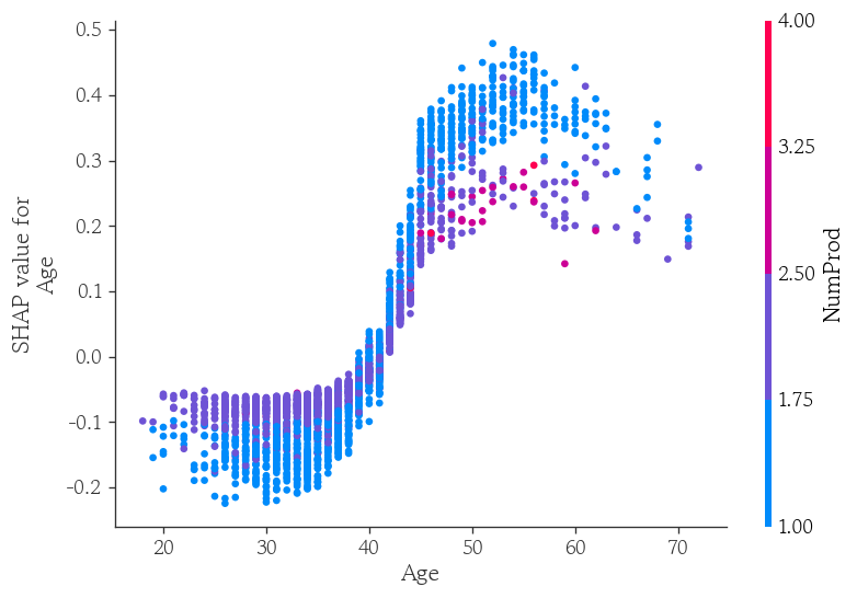
shap.dependence_plot(
    ind='Age',
    shap_values=shap_1.values,
    features=X_valid,
    interaction_index='NumProd'
)
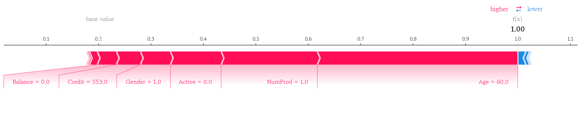
국소 샘플의 SHAP 기여도 확인
- 모델의 이탈 확률의 기댓값을 변수에 할당
base_value = shap_explainer.expected_value[1]
base_value
# np.float64(0.20317583333333328)- 검증셋에서 이탈 확률이 가장 높은 샘플의 SHAP값 확인
pd.Series(data=shap_1.values[index, :], index=model.feature_names_in_).sort_values(ascending=False)
# Age        0.382354
# NumProd    0.183389
# Active     0.096855
# Gender     0.057051
# Credit     0.045831
# Balance    0.036531
# Salary     0.014848
# Spain      0.003778
# HasCard    0.001516
# France    -0.003179
# Tenure    -0.006706
# Germany   -0.015444
# dtype: float64
국소 샘플의 SHAP 기여도 누적 플랏 시각화 결과
shap.force_plot(
    base_value=base_value,
    shap_values=shap_1.values[index, :],
    features=X_valid.iloc[index, :],
    matplotlib=True
)
마치며
일주일간 이론 위주보다 제조업 현장의 이야기를 듣다가 오랜만에 이론 위주의 수업을 들으니까 평소보다 더 피곤한 것 같다. 그래도 관심 있던 주제에 대한 내용을 배우기도 했고, 새로운 시각화도 배워서 재밌게 들었던 것 같다. 내일 SQLD 시험을 마무리한 뒤, 통계부터 시작해서 이론적인 내용들을 정리하고 싶다.

Hello I'm TaeHyunAn, Currently Studying Data Analysis