pandas + matplotlib
- 가장 범용적인 조합이다.
import pandas as pd
import seaborn as sns

# tips 데이터 가져오기
tips = sns.load_dataset("tips")

#df의 첫 5행을 확인
df.head()
>>> total_bill	tip	sex	smoker	day	time	size
0	16.99	1.01	Female	No	Sun	Dinner	2
1	10.34	1.66	Male	No	Sun	Dinner	3
2	21.01	3.50	Male	No	Sun	Dinner	3
3	23.68	3.31	Male	No	Sun	Dinner	2
4	24.59	3.61	Female	No	Sun	Dinner	4

# tip 컬럼을 성별에 대한 평균으로 표현
grouped = df['tip'].groupby(df['sex'])

# 성별에 따른 팁의 평균
grouped.mean()
>>> sex
    Male      3.089618
    Female    2.833448
    Name: tip, dtype: float64

# 성별에 따른 데이터 량(팁 횟수)
grouped.size()
>>> sex
    Male      157
    Female     87
    Name: tip, dtype: int64


import numpy as np
import matplotlib.pyplot as plt

#평균 데이터를 딕셔너리 형태로 변형
sex = dict(grouped.mean())

plt.bar(x = x, height = y)
plt.ylabel('tip[$]')
plt.title('Tip by Sex')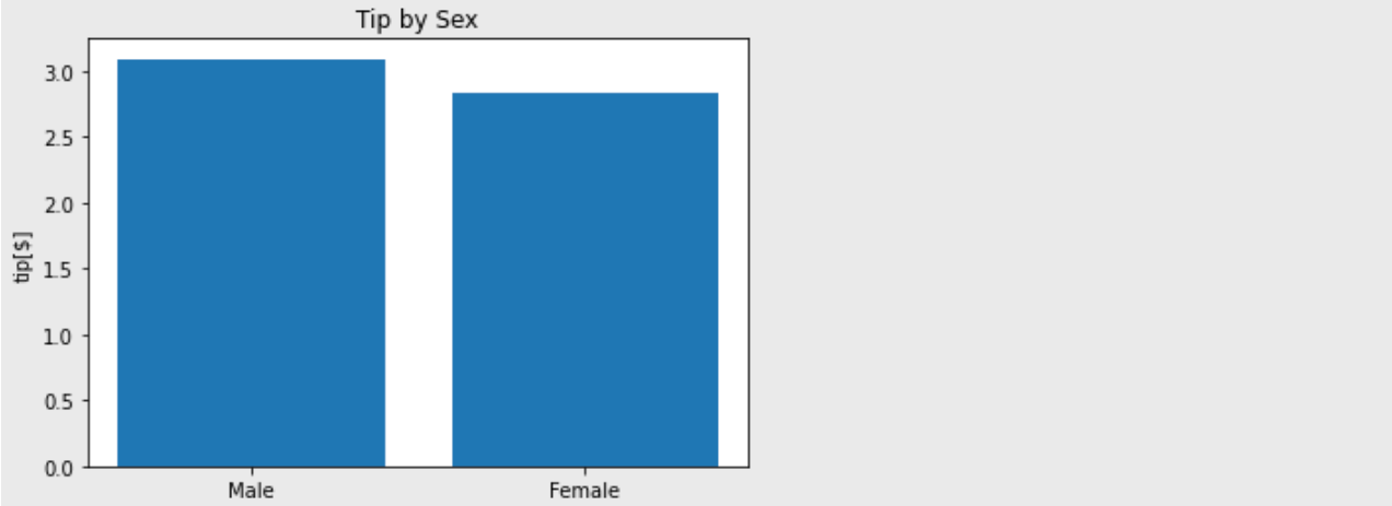
seaborn + matplotlib
- 일반적으로
seaborn을 사용하면 훨씬 간편하고 보기 좋은 그래프를 그릴 수 있다.
import seaborn as sns

# 성별에 따른 tip의 평균
sns.barplot(data=df, x='sex', y='tip')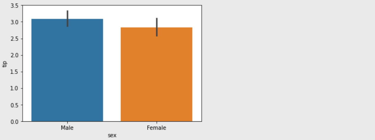
matplotlib을 써서 figsize, title 등 그래프에 옵션을 추가할 수 있다.
# 도화지 사이즈
plt.figure(figsize=(10,6))
sns.barplot(data=df, x='sex', y='tip')

# y값의 범위
plt.ylim(0, 4)

# 그래프 제목
plt.title('Tip by sex')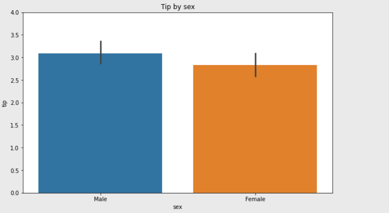
- 요일별로 보는 것도 가능하다.
plt.figure(figsize=(10,6))
sns.barplot(data=df, x='day', y='tip')
plt.ylim(0, 4)
plt.title('Tip by day')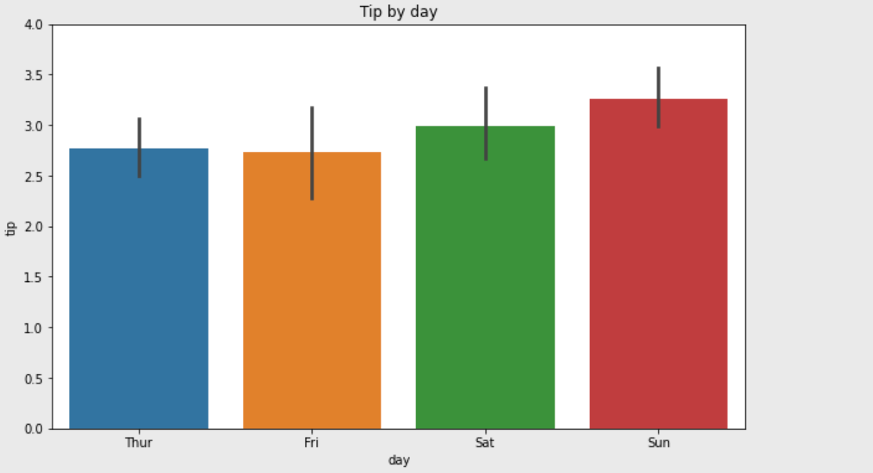
- subplot, violin plot 등을 사용하거나 palette 옵션으로 색상을 변경할 수도 있다.
fig = plt.figure(figsize=(10,7))

ax1 = fig.add_subplot(2,2,1)
sns.barplot(data=df, x='day', y='tip',palette="ch:.25")

ax2 = fig.add_subplot(2,2,2)
sns.barplot(data=df, x='sex', y='tip')

ax3 = fig.add_subplot(2,2,4)
sns.violinplot(data=df, x='sex', y='tip')

ax4 = fig.add_subplot(2,2,3)
sns.violinplot(data=df, x='day', y='tip',palette="ch:.25")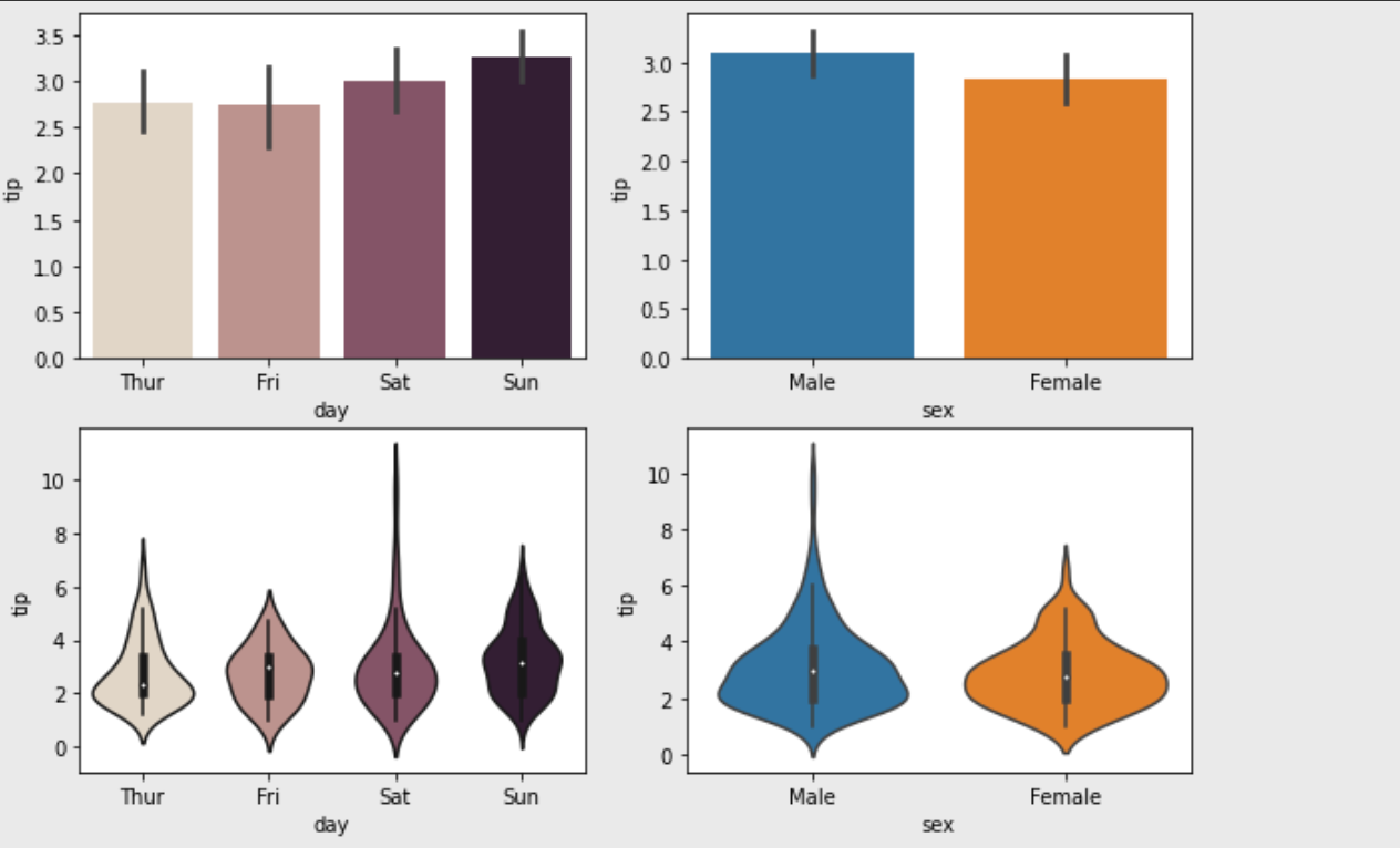
- carplot도 사용할 수 있다.
sns.catplot(x="day", y="tip", jitter=False, data=tips)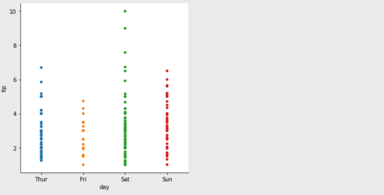

재미있게 살고 싶은 대학원생