시작하며
오늘은 주성분 분석과 군집화에 대한 내용을 배웠다. 주성분 분석이 엄청 복잡하지만 이후 작업을 할 때 매우 유용하게 사용할 수 있는 내용이라 어렵지만 최대한 이해하려고 들어서 대략적인 이미지는 그릴 수 있었다.
주성분 분석
주성분 분석 개요
- 주성분 분석 : 고차원의 데이터를 저차원으로 축소하는 기법
- 열 개수가 p개 → p차원 데이터
- 고차원 데이터는 차원의 저주 문제에 직면할 가능성이 높음
- p차원의 데이터를 m차원으로 축소 (p > m)
- 다차원 변수 간의 복잡한 구조를 파악하는 데 유용
- 각 주성분마다 상관관계가 높은 변수일수록 로딩의 절대값이 큼
- 로딩 : 원 변수와 주성분 점수간의 상관계수
- 각 주성분마다 상관관계가 높은 변수일수록 로딩의 절대값이 큼
- 고차원 데이터셋을 2차원으로 축소하면 전체 데이터셋을 직관적으로 파악 가능
- 차원 축소 과정에서 일부 정보를 손실
차원의 저주
- 데이터의 차원이 증가할수록 데이터 간 거리가 멀어지고 학습 및 일반화 성능 저하
- 차원이 증가하면 빈 공간이 생겨 정보가 없는 값(희소행렬)으로 채워야 하므로 성능 감소
- 변수 선택, 차원 축소법 또는 벡터 임베딩 등으로 해결
주성분 분석 프로세스
- 표준화된 데이터의 분산-공분산 행렬(상관계수 행렬)을 고유값(eigenvalue)과 고유벡터(eigenvector)로 분해
- 고유벡터는 해당 주성분 축의 방향
- 고유값은 해당 주성분의 분산
- 분산-공분산 행렬(상관계수 행렬) = 정방행렬(행개수 = 열개수)
- 고유값이 큰 일부(m개) 주성분을 선택하여 차원을 축소
- p차원 → m차원 축소 과정에서 불가피한 정보 손실이 발생
- 전체 분산의 일정 비율 이상 설명할 수 있는 주성분을 선택하는 것이 일반적
- 고유값이 클수록 해당 주성분이 데이터의 구조를 잘 설명한다고 해석
분산-공분산 행렬
- 고유값과 고유벡터를 추출하려면 평균 중심화된 p x p 정방행렬이 필요
- n x p 행렬 와 그 전치 행렬 의 행렬곱 연산을 수행하면 p x p 정방행렬을 얻을 수 있음
- n x p 행렬 를 중심화(성분 - 평균) 처리하고 생성한 p x p 정방행렬을 표본 개수(n)로 나눔 → 분산-공분산 행렬이 됨, 행렬 X를 표준화하면 상관계수 행렬
고유값과 고유벡터의 정의
- 정방행렬 A와 영벡터가 아닌 열벡터 v에 대해 다음 조건을 만족하는 스칼라 와 벡터 v를 A의 고유값과 고유벡터라고 함
- = p x p
- = p x 1
- = 항등행렬
- 계수행렬의 역행렬은 존재하지 않음
고유값과 고유벡터의 의미
- 고유벡터 : 선형 변환 되었을 때 방향을 유지하면서 크기만 변하는 열벡터
- 고유값 : 고유벡터의 크기를 변화시키는
주성분의 정의
- n x p 크기의 행렬 X로부터 평균중심화한 분산-공분산 행렬(전방행렬) A를 계산한 뒤
- 고유값과 고유벡터를 구하고 고유값을 내림차순 정렬하면 다음 관계가 성립
- : m번째 주성분의 고유값
- : 고유벡터
- ≥ ≥ - - - > 0
- m번째 주성분 은 번째 변수와 번째 고유벡터 성분 간 선형 결합
- 고유벡터의 각 성분은 주성분에 대한 해당 변수의 방향성을 나타내는 계수
주성분의 성질
- 번째 주성분 의 분산 =
- 주성분 간에는 서로 직교이니 서로 독립이며 공분산은 0 → 상관계수 0
- 원래 데이터셋 X의 전체 분산은 각 변수의 분산을 모두 더한 값과 같음
- 전체 분산은 고유값의 합과도 정확하게 일치
주성분 개수() 선정 기준
- 전체 분산을 약 70~80% 설명할 수 있는 상위 주성분까지만 선택하는 것이 일반적
- 탐색적 데이터 분석이 목적이라면 제 1 주성분과 제 2 주성분을 선택
- 스크리 도표에서 감소 속도가 완만해지는 Elbow Point를 찾아 판단
- 요인분석에서는 보통 고유값이 1 이상인 주성분을 모두 선택
- 누적 설명량이 전체 분산의 80% 미만일 수 있음
주성분 분석의 장점과 단점
- 장점
- 선형 차원 축소 기법으로 계산 속도가 빠름
- 상관관계를 활용하여 노이즈를 제거하고 정보 손실을 최소화함
- 고차원 → 저차원 시각화로 데이터의 구조를 파악하기 쉬움
- 통계적으로 독립으로 다중공선성 문제를 해결 가능
- 단점
- 비선형 구조를 포착하지 못할 수 있음
- 주성분이 의미하는 바를 해석하기 어려울 수 있음
- 이상치에 민감하여 이상치를 제거해야함
- 변수 간 스케일에 민감하여 데이터 표준화가 필수적
주성분 분석의 주요 용어 설명
- 원 변수
- 분석 대상이 되는 p차원 데이터의 각 특성
- 평균 중심화
- 각 변수값에서 변수의 평균을 뺀 값으로 데이터를 변환하는 과정
- 분산-공분산 행렬
- 원 변수 간 분산과 공분산을 모아놓은 대칭 행렬
- 표준화된 데이터를 사용하면 상관계수 행렬과 동일
- 고유값 분해
- 분산-공분산 행렬을 고유값과 고유벡터로 분해하는 과정
- 고유값
- 분산-공분산 행렬이 특정 방향으로 얼마나 늘어나는지(분산의 크기)를 나타내는 스칼라
- 고유벡터
- 고유값 분해 결과로 얻어지는 단위 벡터
- 주성분 축의 방향을 정의
- 선형 변환
- 원 변수 공간에서 주성분 공간으로 변환하는 과정
- 고유값 분해를 통해 축별 확대 및 축소를 적용
- 로딩
- 원 변수와 주성분 점수 간 상관계수
- 고유벡터의 성분에 고유값의 제곱근을 곱한 값
- 주성분
- 원 변수를 고유벡터 성분을 계수로 하는 선형 결합으로 만든 서로 직교하는 축
- 주성분 점수
- 각 관측값을 주성분 축에 투영하여 얻은 값
- 설명된 분산 비율
- 전체 분산 대비 각 주성분 고유값(분산)의 비율
데이터 표준화 및 정방행렬 확인
from scipy.stats import zscore- 원본 데이터셋의 분산-공분산 행렬 확인
df.cov().round(3)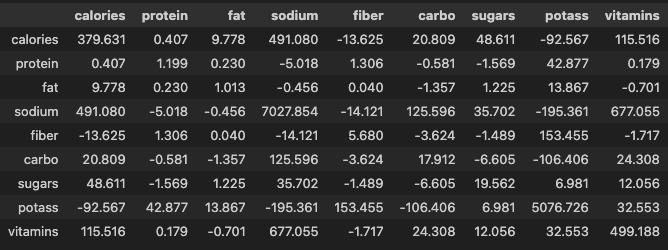
- 표준화
df_scaled = pd.DataFrame(data=zscore(a=df, ddof=1), columns=df.columns)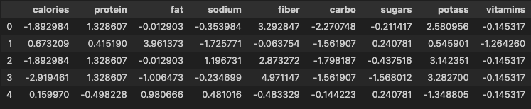
- 표준화된 데이터셋의 분산-공분산 행렬 확인
df_scaled.cov().round(3)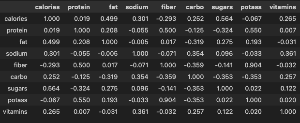
주성분 점수 행렬 생성
from sklearn.decomposition import PCA- 주성분 분석 모델 생성
model_pca = PCA()- 표준화된 데이터로 주성분 점수 행렬 생성
pca_score = model_pca.fit_transform(X=df_scaled)주성분 점수 행렬 전처리
cols = ['PC' + str(i + 1) for i in range(df_scaled.shape[1])]
# ['PC1', 'PC2', 'PC3', 'PC4', 'PC5', 'PC6', 'PC7', 'PC8', 'PC9']
pca_score = pd.DataFrame(data=pca_score, columns=cols)
pca_score.head()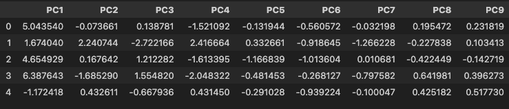
고유값 확인
- 고유값 벡터 확인
model_pca.explained_variance_
# array([2.66992336, 2.04667073, 1.61992396, 0.99566901, 0.64310064,
# 0.52622864, 0.37703769, 0.07052773, 0.05091824])- 고유값 합계 확인
- 고유값 합계는 변수의 개수와 같음
model_pca.explained_variance_.sum()
# np.float64(9.0)- 주성분의 분산 비율
model_pca.explained_variance_ratio_
# array([0.29665815, 0.22740786, 0.17999155, 0.11062989, 0.07145563,
# 0.05846985, 0.04189308, 0.00783641, 0.00565758])- 주성분의 누적 분산 비율 확인
model_pca.explained_variance_ratio_.cumsum()
# array([0.29665815, 0.52406601, 0.70405756, 0.81468745, 0.88614308,
#        0.94461293, 0.986506  , 0.99434242, 1.        ])
고유벡터 확인
- 주성분의 고유벡터 행렬 생성
eigenVectors = pd.DataFrame(
    data=model_pca.components_.T,
    index=df_scaled.columns,
    columns=cols
)
eigenVectors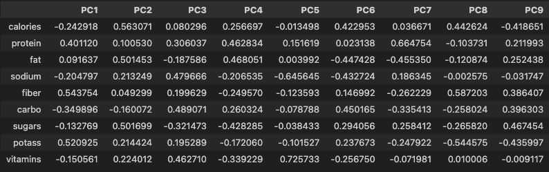
- 고유벡터 조회
eigenVectors['PC1']
# calories   -0.242918
# protein     0.401120
# fat         0.091637
# sodium     -0.204797
# fiber       0.543754
# carbo      -0.349896
# sugars     -0.132769
# potass      0.520925
# vitamins   -0.150561
# Name: PC1, dtype: float64- 주성분 점수 계산
- 주성분 점수 행렬은 다변량의 관계를 확인할 수 있는 값이 됨
- 제 1 주성분의 고유벡터 성분(절대값)이 큰 변수가 제 1 주성분 점수에 큰 영향을 줌
np.dot(a=eigenVectors['PC1'], b=df_scaled.iloc[0, :])
# np.float64(5.043540242255567)
주성분 분석 시각화
- 스크리 도표
hds.plot.screeplot(X=pca_score)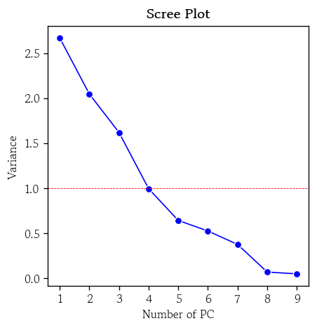
- 행렬도
hds.plot.biplot(score=pca_score, coefs=eigenVectors, zoom=4)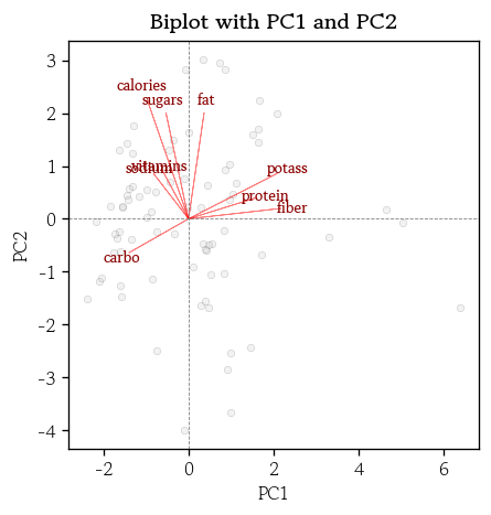
군집화
군집화 개요
- 분석 대상 데이터셋에 대한 사전정보(타겟 데이터) 없이 유사한 관측값들을 같은 군집으로 묶는 비지도 학습
- 관측값 간 비유사성 정도를 측정하기 위해 거리를 활용
- 거리가 가까울수록 두 관측값은 유사하다고 간주하고 같은 군집에 포함
- 전체 데이터셋을 몇 개의 소그룹으로 분할
- 주로 고객 세분화와 같은 분야에 활용
- 소그룹간 공통적인 특성이나 대표적인 패턴을 파악할 수 있음
- 군집화 종류
- 계층적 군집화
- 연산량이 많음 → 시간이 오래걸림
- 그룹을 알기 쉬움
- 비계층적 군집화
- 연산량 적음 → 빠름
- 그룹의 기준(k)을 지정해야 됨
- 계층적 군집화
계층적 군집화
- 관측값 간 거리를 계산하고, 가장 가까운 관측값들부터 차례로 같은 군집으로 병합하는 비지도학습 기법
군집 간 거리 판단 기준
- 최단 연결법
- 두 군집에서 가장 가까운 두 관측값 간의 거리를 군집 간 거리로 정의
- 하나의 큰 군집과 몇 개의 작은 군집(이상치)이 생성되는 경향이 있음
- 최장 연결법
- 각 군집에서 가장 멀리 떨어진 관측값 간 거리로 정의
- 상대적으로 안정적이며 해석 가능한 군집 결과를 얻을 수 있음
- 평균 연결법
- 모든 관측값 쌍의 거리 평균으로 정의
- 연쇄 효과와 과도한 응집성 집중을 보완
- 중심 연결법
- 군집의 중심점간의 거리를 군집 간 거리로 정의
- 추상화된 거리 개념을 사용하므로 전체 거리 구조가 왜곡될 수 있음
- 와드 연결법
- 군집 내 거리 제곱합의 증가량을 기준으로 군집 간 거리를 정의
- 군집 내 응집도를 최대화
- 분산크기를 최소화
계층적 군집화 모델 학습
from scipy.cluster.hierarchy import linkagemethod: 판단 기준 설정single: 최단 연결법(기본값)complete: 최장 연결법average: 평균 연결법centroid: 중심 연결법ward: 와드 연결법
optimal_ordering: 행렬 재정렬 → 시각화 결과 개선- 기본값 :
False
- 기본값 :
hc = linkage(
    y=df_scaled, method='single', metric='euclidean',
    optimal_ordering=True
)
덴드로그램 시각화
from scipy.cluster.hierarchy import dendrogramorientation: 덴드로그램 출력 방향 지정- 기본값 : top
labels: 관측값 인덱스 대신 출력할 라벨 목록 지정
plt.figure(figsize=(12, 4))
dendrogram(Z=hc, orientation='top', labels=df.index)
plt.show()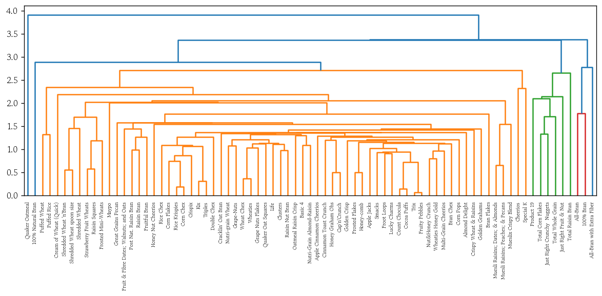
계층적 군집화 시각화 함수 생성
def plot_dendrogram(y, method):
    hc = linkage(
    y=y, method=method, metric='euclidean',
    optimal_ordering=True
)
    plt.figure(figsize=(12, 4))
    dendrogram(Z=hc, orientation='top', labels=df.index)
plt.show()- 최장 연결법
plot_dendrogram(y=df_scaled, method='complete')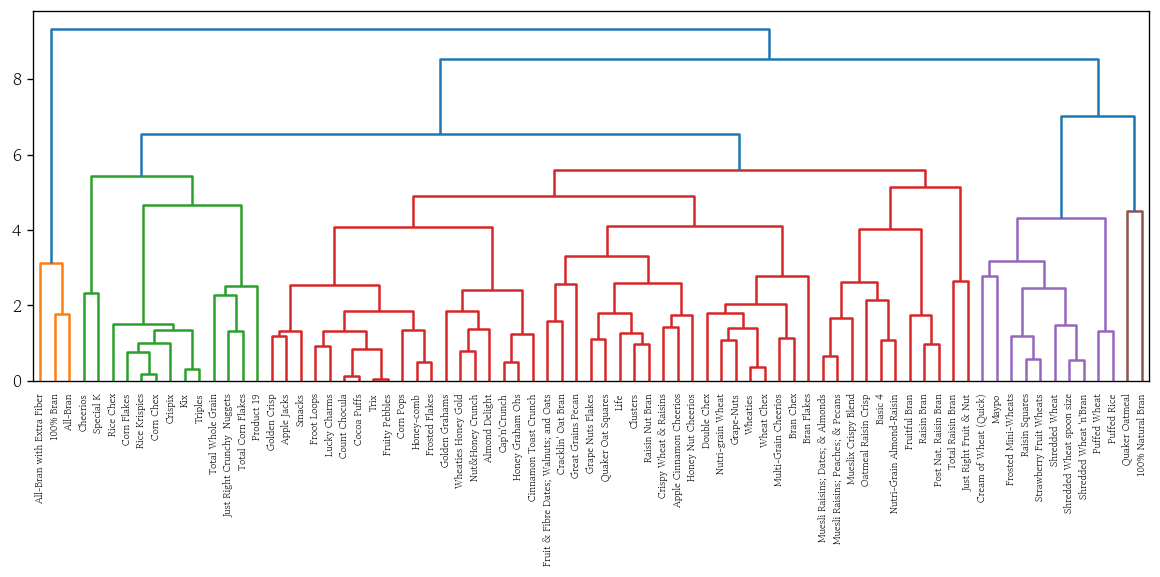
- 평균 연결법
plot_dendrogram(y=df_scaled, method='average')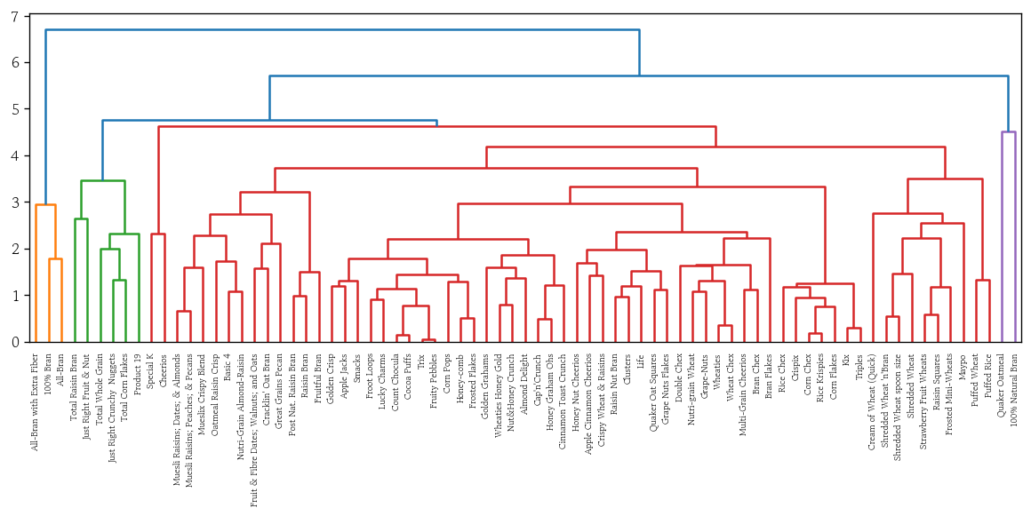
- 중앙 연결법
plot_dendrogram(y=df_scaled, method='centroid')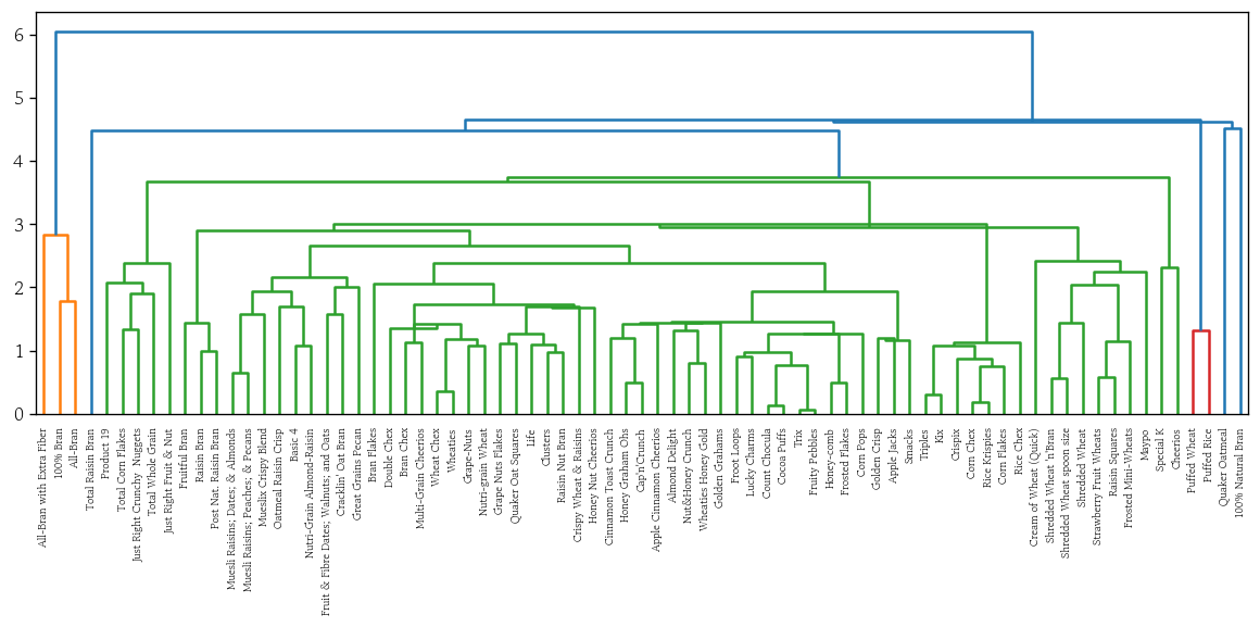
- 와드 연결법
plot_dendrogram(y=df_scaled, method='ward')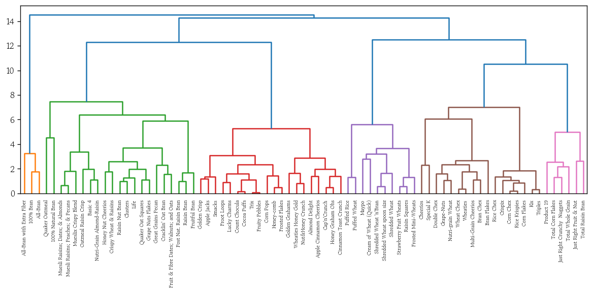
비계층적 군집화
- 비계층적 군집의 중심(k개)과 각 관측값 간의 거리를 계산하여 가장 가까운 군집에 관측값 할당 → 군집 중심을 반복적으로 업데이트하여 최적의 군집 구조를 찾음
- 군집 수(k)를 미리 지정
- 군집의 중심은 무작위 값으로 초기화
- 군집을 갱신하고 새로 계산된 중심을 기준으로 다시 군집화하는 과정을 중심이 변하지 않을 때까지 반복
- 최적의 군집 수를 찾는 방법은 엘보우 방법, 실루엣 분석 등
- 대표적인 알고리즘으로는 k-means, k-medoids가 있음
k-means 군집화 모델 학습
from sklearn.cluster import KMeansn_clusters: 군집 수 k 지정- 기본값 : 8
init: 초기 중심정 생성 방법 지정- 기본값 :
‘k-means++’
- 기본값 :
- k-means 군집화 모델 생성
model = KMeans(n_clusters=8, init='k-means++', random_state=0)- 표준화된 데이터로 군집화 모델 학습
model.fit(X=df_scaled)- 군집 정보 확인
cluster_labels = model.predict(X=df_scaled)
# array([4, 6, 4, 4, 0, 0, 0, 6, 5, 5, 0, 5, 0, 6, 0, 2, 2, 0, 0, 6, 3, 2,
#        0, 2, 0, 0, 3, 1, 1, 0, 0, 0, 5, 5, 6, 0, 0, 0, 7, 7, 2, 5, 0, 3,
#        6, 6, 6, 5, 0, 6, 5, 6, 1, 7, 3, 3, 5, 4, 1, 6, 3, 2, 2, 3, 3, 3,
# 0, 5, 3, 7, 1, 7, 2, 0, 5, 5, 0], dtype=int32)- 시리즈 변환 후 군집별 도수 확인
pd.Series(data=cluster_labels).value_counts().sort_index()
# 0    22
# 1     5
# 2     8
# 3    10
# 4     4
# 5    12
# 6    11
# 7     5
# Name: count, dtype: int64
군집분석 성능 평가 지표
내부평가 : 군집 정보가 없을 때
외부평가 : 군집 정보가 있을 때
- 내부평가
- 군집 내 거리 제곱합
- 각 군집 내 데이터 포인트들이 군집 중심으로부터 얼마나 떨어져 있는지
- 군집 응집도를 나타내며 작을수록 중심에 가깝게 있다는 것
- 실루엣 계수
- 각 데이터 포인트가 자신의 군집에 잘 속해 있는지
- -1~1 값으로 1에 가까울수록 자신의 군집 내에서 응집력이 높고 이웃 군집과 잘 분리되어 있음
- 데이비스 볼딘 지수
- 군집 내 응집도와 군집 간 분리도를 동시에 고려
- 값이 작을수록 군집화 성능이 우수
- 군집 내 거리 제곱합
- 외부평가
- 조정 랜드 지수
- 정규화 상호 정보량
군집 내 거리 제곱합
- 전체 군집의 총 거리 제곱합을 확인
model.inertia_
# 215.61245219621284- 시각화
hds.plot.wcss(X=df_scaled, k=10)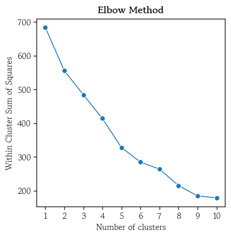
실루엣 계수
- 각 관측값이 적절한 군집에 속해 있는지를 측정한 지표
- 1에 가까울수록 좋음
하나의 관측값 선택 → 가장 인접한 이웃 군집에 속한 개별 관측값과의 거리 평균 계산(a)
→ 같은 군집에 속한 관측값들과의 거리 평균 계산(b)
→ (a) - (b) 를 (a)로 나눈값 = 해당 관측값의 실루엣 계수
→ 모든 관측값에 대해 실루엣 계수 평균을 계산
from sklearn.metrics import silhouette_score- 전체 관측값의 실루엣 계수 평균 확인
silhouette_score(X=df_scaled, labels=cluster_labels)
# 0.3075777347145458- 시각화
hds.plot.silhouette(X=df_scaled, k=10)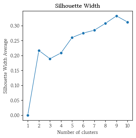
최적의 k를 적용한 k-means 군집화 모델 학습
- 기존 모델에 최적의 k를 설정 후 재학습
model.set_params(n_clusters=6).fit(X=df_scaled)- 최적 모델의 군집 정보를 추가
df['k-means'] = model.predict(X=df_scaled)- 최적 모델에 대한 실루엣 계수의 평균 확인
silhouette_score(X=df_scaled, labels=df['k-means'])
# 0.2750794137284007
군집별 특징 시각화
sns.scatterplot(
    data=pca_score, x='PC1', y='PC2',
    s=50, alpha=0.5,
    hue=df['k-means'], palette='Set1'
)
plt.title(label='k-means with PCA', fontweight='bold')
plt.axvline(x=0, color='0.5', linewidth=0.5, linestyle='--')
plt.axhline(y=0, color='0.5', linewidth=0.5, linestyle='--')
plt.legend(loc='center left', bbox_to_anchor=(1, 0.5), title='k-means')
plt.show()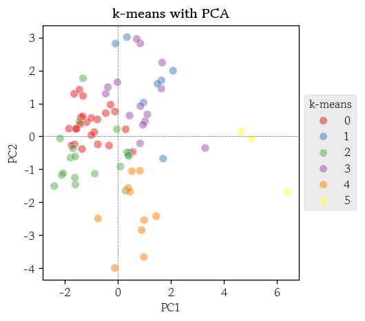
t-SNE
- 고차원 데이터를 2~3차원으로 줄여서 시각화할 수 있게 해주는 기법
- 비선형적인 복잡한 구조를 잘 표현
- 각 데이터 포인트가 주변 이웃들과 얼마나 가까운지 정규 분포 확률로 계산
- 저차원으로 줄인 공간에서는 t-분포를 사용
- 유사도 분포가 비슷해지도록 KL발산값이 최소화 되도록 갱신을 반복
- 장점
- 비선형적인 구조나 숨겨진 패턴도 효과적으로 시각화
- 서로 유사한 데이터 포인트를 저차원 공간으로 줄였을 때도 가깝게 배치
- 단점
- 계산 과정이 복잡하여 실행 시간이 오래 걸림
- 대규모 데이터셋에는 적용하기 어려울 수 있음
t-SNE 변환
from sklearn.manifold import TSNE- t-SNE 모델 생성
tsne = TSNE(n_components=2, perplexity=15, random_state=0)- 표준화된 데이터를 사용하여 t-SNE 변환 수행
X_tsne = tsne.fit_transform(X=df_scaled)- t-SNE 변환 결과를 데이터프레임으로 저장
df_tsne = pd.DataFrame(data=X_tsne, columns=['tSNE1', 'tSNE2'])- 시각화
sns.scatterplot(
    data=df_tsne, x='tSNE1', y='tSNE2',
    s=50, alpha=0.5,
    hue=df['k-means'], palette='Set1'
)
plt.title(label='k-means with t-SNE(perplexity: 15)', fontweight='bold')
plt.axvline(x=0, color='0.5', linewidth=0.5, linestyle='--')
plt.axhline(y=0, color='0.5', linewidth=0.5, linestyle='--')
plt.legend(loc='center left', bbox_to_anchor=(1, 0.5), title='k-means')
plt.show()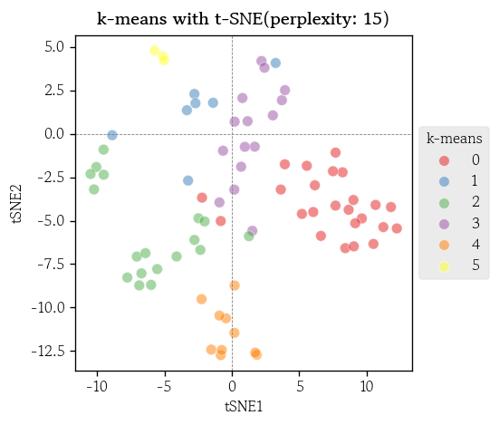
DBSCAN
- 밀도 기반 클러스터링 알고리즘
- 밀집된 영역을 군집으로 정의
- 희소한 영역은 군집에서 제외
- 일정 반경 안에 충분한 수의 이웃(질량)이 존재하면 군집으로 간주
- 군집 수(k)를 미리 지정할 필요 없음
- 이상치는 군집에 포함되지 않고 제외 처리
DBSCAN 군집화
from sklearn.cluster import DBSCAN- DBSCAN 모델 생성
dbscan = DBSCAN(eps=2.0, min_samples=5)- 표준화된 데이터로 DBSCAN 군집화 모델 학습
df['dbscan'] = dbscan.fit_predict(X=df_scaled)- DBSCAN 군집별 도수 확인
df['dbscan'].value_counts().sort_index()
# dbscan
# -1    22
#  0    50
#  1     5
# Name: count, dtype: int64- 시각화
sns.scatterplot(
    data=df_tsne, x='tSNE1', y='tSNE2',
    s=50, alpha=0.5,
    hue=df['dbscan'], palette='Set1'
)
plt.title(label='DBSCAN with t-SNE(perplexity: 15)', fontweight='bold')
plt.axvline(x=0, color='0.5', linewidth=0.5, linestyle='--')
plt.axhline(y=0, color='0.5', linewidth=0.5, linestyle='--')
plt.legend(loc='center left', bbox_to_anchor=(1, 0.5), title='DBSCAN')
plt.show()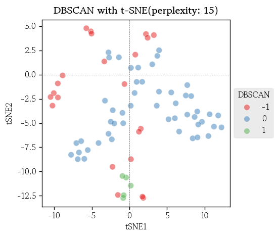
마치며
사람은 보통 3차원까지만 이미지를 그릴 수 있기 때문에 고차원 데이터를 다루는 내용이 많이 나오면 처음 큰 그림을 그리는 부분이 꽤나 힘든 것 같다.

Hello I'm TaeHyunAn, Currently Studying Data Analysis